Qt Quick - Popup使用总结
- 一、概述
- 二、Popup 的布局
- 三、弹出分级
- 四、弹出定位
- 五、定制化
一、概述
Popup是类似弹出式用户界面控件的基本类型。它可以与Window或ApplicationWindow一起使用。
  import QtQuick.Window 2.2
  import QtQuick.Controls 2.12

  ApplicationWindow {
      id: window
      width: 400
      height: 400
      visible: true

      Button {
          text: "Open"
          onClicked: popup.open()
      }

      Popup {
          id: popup
          x: 100
          y: 100
          width: 200
          height: 300
          modal: true
          focus: true
          closePolicy: Popup.CloseOnEscape | Popup.CloseOnPressOutsideParent
      }
  }
为了确保场景中其他项目上方显示一个弹出框,建议使用ApplicationWindow。
ApplicationWindow还提供背景调光效果。
Popup不提供自己的布局,这就要求我们自己定位其内容,例如通过创建RowLayout或ColumnLayout。
声明为弹出框子元素的项自动成为弹出框内容项的父元素。动态创建的项需要显式地赋给contentItem。
二、Popup 的布局
下图展示了窗口中弹出框的布局:
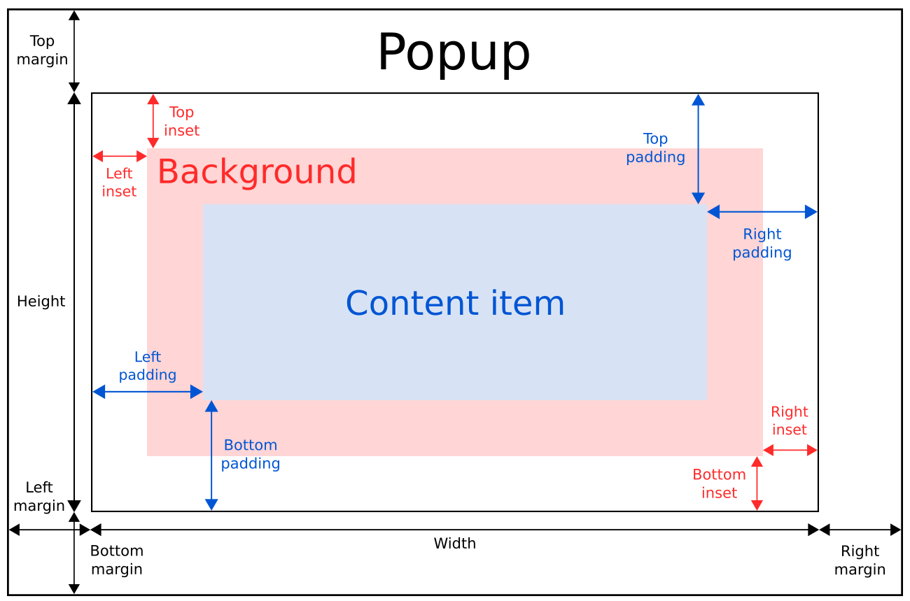
弹出框的implicitWidth和implicittheight通常是基于背景和内容项的隐式大小加上任何内嵌和内边距。当没有明确指定宽度或高度时,这些属性决定了弹出框的大小。
内容项的几何形状由内边距决定。下面的例子在弹出框的边界和内容之间保留了10px的内边距:
  Popup {
      padding: 10

      contentItem: Text {
          text: "Content"
      }
  }
背景元素会填满整个弹出框的宽度和高度,除非为其设置了insets或明确的尺寸。
负插图可以用来使背景比弹出框大。下面的例子使用负插图在弹出框边界外放置阴影:
  Popup {
      topInset: -2
      leftInset: -2
      rightInset: -6
      bottomInset: -6

      background: BorderImage {
          source: ":/images/shadowed-background.png"
      }
  }
三、弹出分级
如果在弹出框中只使用单个元素,它将调整大小以适应其包含的元素的隐式大小。这使得它特别适合与布局一起使用。
  Popup {
      ColumnLayout {
          anchors.fill: parent
          CheckBox { text: qsTr("E-mail") }
          CheckBox { text: qsTr("Calendar") }
          CheckBox { text: qsTr("Contacts") }
      }
  }
有时,弹出框中可能有两项:
  Popup {
      SwipeView {
          // ...
      }
      PageIndicator {
          anchors.horizontalCenter: parent.horizontalCenter
          anchors.bottom: parent.bottom
      }
  }
在这种情况下,Popup无法计算出合理的隐式大小。由于我们将PageIndicator锚定在了SwipeView上,我们可以简单地将内容大小设置为视图的隐式大小:
  Popup {
      contentWidth: view.implicitWidth
      contentHeight: view.implicitHeight

      SwipeView {
          id: view
          // ...
      }
      PageIndicator {
          anchors.horizontalCenter: parent.horizontalCenter
          anchors.bottom: parent.bottom
      }
   }
四、弹出定位
与Qt Quick中的Item类似,Popup的x和y坐标是相对于其父元素的。这意味着打开一个按钮的子弹出框,将导致该弹出框相对于按钮的位置。
下面的例子使用附加的覆盖层。属性Overlay将一个弹出窗口定位在窗口的中心,而不管打开弹出窗口的按钮在什么位置:
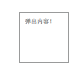
  Button {
      onClicked: popup.open()

      Popup {
          id: popup

          parent: Overlay.overlay

          x: Math.round((parent.width - width) / 2)
          y: Math.round((parent.height - height) / 2)
          width: 100
          height: 100

		  Label{
                text: "弹出内容!"
         }
      }
  }
另一种让弹出窗口居中的方法是使用anchors.centerIn,而不用考虑它的父元素:
  ApplicationWindow {
      id: window
      // ...

      Pane {
          // ...

          Popup {
              anchors.centerIn: Overlay.overlay
          }
      }
  }
为了确保弹出窗口位于包围窗口的边界内,可以将margin属性设置为非负值。
五、定制化
  import QtQuick 2.12
  import QtQuick.Controls 2.12

  Popup {
      id: popup
      background: Rectangle {
          implicitWidth: 200
          implicitHeight: 200
          border.color: "#444"
      }
      contentItem: Column {}
  }