作者:newki
定制圆角与背景的自定义ViewGroup实现
前言
目前线上的一些第三方圆角容器大部分都只支持四周固定圆角,我们一些使用场景只需要顶部圆角,或者底部圆角,或者一个角圆角。
(话说为什么我们的UI这么喜欢各种奇葩圆角,想哭。。。)
对于这些定制化的圆角需求,我们如何自定义实现呢?又有哪些实现方式呢?
之前我们讲过圆角图片的自定义,那么和我们的自定义圆角容器又有哪些区别呢?
带着这些问题,我们一步一步往下看。
技术选型
可能有同学问了,用shape画一个圆角不就行了吗?各种的圆角都能画,实在不行还可以找UI要各种圆角的切图。有必要用自定义ViewGroup来实现吗?
确实在一部分场景中我们可以通过这样设置圆角背景的方式来解决问题,一般设计都有内间距,我们设置了背景,然后再通过设置间距来确保内部的控件不会和父容器交叉重叠。
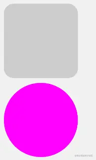
因为这样设置的背景只是欺骗了视觉,并没有裁剪控件,如果在特定的场景下,如挨着角落布局,或者滚动起来的时候,就会发现内部的控件’超过’了父容器的范围。
一句话说不清楚,大家看下面这张图应该能理解:

我使用自定义的 FrameLayout 设置异性圆角,并且设置异性圆角的图片背景,然后内部添加一个子View,那么子View就不会超过左上角的圆角范围。
如果在这样的特殊场景下,要达到这样的效果,我们就需要自定义View的方式来裁剪父容器,让它真正的就是那样的形状!
一共有 ClipPath Xfermode Shader 另外还有一种 Outline 的方式。
之前我们的图片裁剪是利用 Shader 来实现的。现在我们裁剪ViewGroup我们最方便的方式是 Outline 但是我们需要对一些 Outline 实现不了的版本和效果,我们使用 Shader 做一些兼容处理即可。
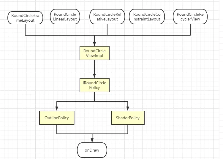
需求整理
首先在动手之前我们理清一下思路,我们需要哪些功能,以及如何实现。
- 通过策略模式来管理不同版本的裁剪实现
- 通过一个接口来封装逻辑管理这些策略
- 通过实现不同的自定义View来管理接口实现类间接的通过不同的策略来裁剪
- 使用自定义属性来动态的配置需要的属性
- 裁剪完成之后需要接管系统的背景的绘制,由自己实现
- 使用Shader的方式绘制背景
- 对原生背景属性的兼容处理
说明:
根据不同的版本和需求,使用不同的策略来裁剪 ViewGroup,需要考虑到不同的圆角,统一的圆角和圆形的裁剪。
裁剪完成之后在部分方案中我们设置背景还是会覆盖到已裁剪的区域,这时候我们统一处理背景的绘制。
由于系统 View 自带背景的设置,和我们的背景绘制有冲突,我们需要接管系统的 View 的背景绘制,并且需要处理 Xml 中设置背景与 Java 代码中设置背景的兼容性问题。
最后使用 Shader 的方式绘制各种形状的背景绘制。需要注意处理不同的圆角,圆角和圆形的绘制方式。
整体框架的大致构建图如下:
下面跟着我一步一步的来实现吧。
使用策略模式兼容裁剪的方式
其实市面上大部分的裁剪都是使用的 Outline 的方式,这是一种极好的方案。我也是使用这种方案,那我为什么不直接使用第三方库算了。。。 就是因为兼容性问题和一些功能性问题不能解决。
Outline可以绘制圆形和统一圆角,但是它无法设置异形的圆角。并且它只能在5.0以上的系统才能使用。所以我们需要对异形的圆角和低版本做兼容处理。
核心代码如下:
 private fun init(view: View, context: Context, attributeSet: AttributeSet?, attrs: IntArray, attrIndexs: IntArray) {

        if (Build.VERSION.SDK_INT >= Build.VERSION_CODES.LOLLIPOP) {
            //5.0版本以上与5.0一下的兼容处理

            //判断是否包含自定义圆角
            val typedArray = context.obtainStyledAttributes(attributeSet, attrs)
            val topLeft = typedArray.getDimensionPixelOffset(attrIndexs[2], 0).toFloat()
            val topRight = typedArray.getDimensionPixelOffset(attrIndexs[3], 0).toFloat()
            val bottomLeft = typedArray.getDimensionPixelOffset(attrIndexs[4], 0).toFloat()
            val bottomRight = typedArray.getDimensionPixelOffset(attrIndexs[5], 0).toFloat()
            typedArray.recycle()

            roundCirclePolicy = if (topLeft > 0 || topRight > 0 || bottomLeft > 0 || bottomRight > 0) {
                //自定义圆角使用兼容方案
                RoundCircleLayoutShaderPolicy(view, context, attributeSet, attrs, attrIndexs)
            } else {
                //使用OutLine裁剪方案
                RoundCircleLayoutOutlinePolicy(view, context, attributeSet, attrs, attrIndexs)
            }
        } else {
            // 5.0以下的版本使用兼容方案
            roundCirclePolicy = RoundCircleLayoutShaderPolicy(view, context, attributeSet, attrs, attrIndexs)
        }

    }
我们需要对5.0一下的版本使用 clipPath 的方案裁剪,5.0以上的方案实现 Outline的方案裁剪。
Outline的裁剪:
    override fun beforeDispatchDraw(canvas: Canvas?) {
        //5.0版本以上,采用ViewOutlineProvider来裁剪view
        mContainer.clipToOutline = true
    }

    @TargetApi(Build.VERSION_CODES.LOLLIPOP)
    override fun afterDispatchDraw(canvas: Canvas?) {
        //5.0版本以上,采用ViewOutlineProvider来裁剪view
        mContainer.outlineProvider = object : ViewOutlineProvider() {
            override fun getOutline(view: View, outline: Outline) {

                if (isCircleType) {
                    //如果是圆形裁剪圆形
                    val bounds = Rect()
                    calculateBounds().roundOut(bounds)
                    outline.setRoundRect(bounds, bounds.width() / 2.0f)
//                    outline.setOval(0, 0, mContainer.width, mContainer.height);  //两种方法都可以

                } else {
                    //如果是圆角-裁剪圆角
                    if (mTopLeft > 0 || mTopRight > 0 || mBottomLeft > 0 || mBottomRight > 0) {
                        //如果是单独的圆角
                        val path = Path()
                        path.addRoundRect(
                            calculateBounds(),
                            floatArrayOf(mTopLeft, mTopLeft, mTopRight, mTopRight, mBottomRight, mBottomRight, mBottomLeft, mBottomLeft),
                            Path.Direction.CCW
                        )

                        //不支持2阶的曲线
                        outline.setConvexPath(path)

                    } else {
                        //如果是统一圆角
                        outline.setRoundRect(0, 0, mContainer.width, mContainer.height, mRoundRadius)
                    }

                }
            }
        }
    }
clipPath 方案的核心代码
    override fun beforeDispatchDraw(canvas: Canvas?) {
        canvas?.clipPath(mPath)
    }

    override fun afterDispatchDraw(canvas: Canvas?) {
    }

    //裁剪的路径
    private fun setupRoundPath() {
        mPath.reset()

        if (isCircleType) {

            mPath.addOval(0f, 0f, mContainer.width.toFloat(), mContainer.height.toFloat(), Path.Direction.CCW)

        } else {

            //如果是圆角-裁剪圆角
            if (mTopLeft > 0 || mTopRight > 0 || mBottomLeft > 0 || mBottomRight > 0) {

                mPath.addRoundRect(
                    calculateBounds(),
                    floatArrayOf(mTopLeft, mTopLeft, mTopRight, mTopRight, mBottomRight, mBottomRight, mBottomLeft, mBottomLeft),
                    Path.Direction.CCW
                )

            } else {

                mPath.addRoundRect(mDrawableRect, mRoundRadius, mRoundRadius, Path.Direction.CCW)
            }

        }

    }
其中调用的时机我们通过策略的接口,定义的一系列的钩子函数。
// 策略的接口定义
interface IRoundCirclePolicy {

    fun beforeDispatchDraw(canvas: Canvas?)

    fun afterDispatchDraw(canvas: Canvas?)

    fun onDraw(canvas: Canvas?): Boolean

    fun onLayout(left: Int, top: Int, right: Int, bottom: Int)
}
RoundCircleViewImpl:
    fun beforeDispatchDraw(canvas: Canvas?) {
        roundCirclePolicy.beforeDispatchDraw(canvas)
    }

    fun afterDispatchDraw(canvas: Canvas?) {
        roundCirclePolicy.afterDispatchDraw(canvas)
    }

    fun onDraw(canvas: Canvas?): Boolean {
        return roundCirclePolicy.onDraw(canvas)
    }
最终在具体的ViewGroup中实现。
    override fun onLayout(changed: Boolean, left: Int, top: Int, right: Int, bottom: Int) {
        super.onLayout(changed, left, top, right, bottom)
        roundCircleViewImpl.onLayout(changed, left, top, right, bottom)
    }

    override fun dispatchDraw(canvas: Canvas?) {
        roundCircleViewImpl.beforeDispatchDraw(canvas)
        super.dispatchDraw(canvas)
        roundCircleViewImpl.afterDispatchDraw(canvas)
    }

    override fun onDraw(canvas: Canvas?) {
        if (roundCircleViewImpl.onDraw(canvas)) {
            super.onDraw(canvas)
        }
    }
在绘制,绘制前,绘制后我们都有对应的拦截和实现。通过上面的裁剪核心代码我们就能实现不同功能不同版本的具体策略实现。
到此我们就能裁剪ViewGroup完成,并且能裁剪到指定的形状。
抽取自定义属性配置
这里我们把常用的自定义属性抽取出来,然后再我们抽象的策略类中拿到对应的属性,取出设置的一些值,然后再具体的策略实现类中就可以操作使用了。
自定义属性定义如下:
    <attr name="is_circle" format="boolean" />
    <attr name="round_radius" format="dimension" />
    <attr name="topLeft" format="dimension" />
    <attr name="topRight" format="dimension" />
    <attr name="bottomLeft" format="dimension" />
    <attr name="bottomRight" format="dimension" />
    <attr name="round_circle_background_color" format="color" />
    <attr name="round_circle_background_drawable" format="reference" />
    <attr name="is_bg_center_crop" format="boolean" />
    <declare-styleable name="RoundCircleConstraintLayout">
        <attr name="is_circle" />
        <attr name="round_radius" />
        <attr name="topLeft" />
        <attr name="topRight" />
        <attr name="bottomLeft" />
        <attr name="bottomRight" />
        <attr name="round_circle_background_color" />
        <attr name="round_circle_background_drawable" />
        <attr name="is_bg_center_crop" />
    </declare-styleable>
   ...
在具体的ViewGroup中我们把属性封装到对象中,最终传递给策略类去取出来实现
    private fun init(view: View, context: Context, attributeSet: AttributeSet?) {
        roundCircleViewImpl = RoundCircleViewImpl(
            view,
            context,
            attributeSet,
            R.styleable.RoundCircleNestedScrollView,
            intArrayOf(
                R.styleable.RoundCircleNestedScrollView_is_circle,
                R.styleable.RoundCircleNestedScrollView_round_radius,
                R.styleable.RoundCircleNestedScrollView_topLeft,
                R.styleable.RoundCircleNestedScrollView_topRight,
                R.styleable.RoundCircleNestedScrollView_bottomLeft,
                R.styleable.RoundCircleNestedScrollView_bottomRight,
                R.styleable.RoundCircleNestedScrollView_round_circle_background_color,
                R.styleable.RoundCircleNestedScrollView_round_circle_background_drawable,
                R.styleable.RoundCircleNestedScrollView_is_bg_center_crop,
            )

        )
        nativeBgDrawable?.let {
            roundCircleViewImpl.setNativeDrawable(it)
        }
    }
这里实现了 roundCircleViewImpl 对象, roundCircleViewImpl 对象内部又持有策略的对象,我们就可以在策略类中拿到属性。
internal abstract class AbsRoundCirclePolicy(
    view: View,
    context: Context,
    attributeSet: AttributeSet?,
    attrs: IntArray,
    attrIndex: IntArray
) : IRoundCirclePolicy {

    var isCircleType = false
    var mRoundRadius = 0f
    var mTopLeft = 0f
    var mTopRight = 0f
    var mBottomLeft = 0f
    var mBottomRight = 0f
    var mRoundBackgroundDrawable: Drawable? = null
    var mRoundBackgroundBitmap: Bitmap? = null
    var isBGCenterCrop = true;

    val mContainer: View = view

    init {
        initialize(context, attributeSet, attrs, attrIndex)
    }

    private fun initialize(context: Context, attributeSet: AttributeSet?, attrs: IntArray, attrIndexs: IntArray) {
        val typedArray = context.obtainStyledAttributes(attributeSet, attrs)

        isCircleType = typedArray.getBoolean(attrIndexs[0], false)

        mRoundRadius = typedArray.getDimensionPixelOffset(attrIndexs[1], 0).toFloat()

        mTopLeft = typedArray.getDimensionPixelOffset(attrIndexs[2], 0).toFloat()
        mTopRight = typedArray.getDimensionPixelOffset(attrIndexs[3], 0).toFloat()
        mBottomLeft = typedArray.getDimensionPixelOffset(attrIndexs[4], 0).toFloat()
        mBottomRight = typedArray.getDimensionPixelOffset(attrIndexs[5], 0).toFloat()

        val roundBackgroundColor = typedArray.getColor(attrIndexs[6], Color.TRANSPARENT)
        mRoundBackgroundDrawable = ColorDrawable(roundBackgroundColor)
        mRoundBackgroundBitmap = getBitmapFromDrawable(mRoundBackgroundDrawable)

        if (typedArray.hasValue(attrIndexs[7])) {
            mRoundBackgroundDrawable = typedArray.getDrawable(attrIndexs[7])
            mRoundBackgroundBitmap = getBitmapFromDrawable(mRoundBackgroundDrawable)
        }

        isBGCenterCrop = typedArray.getBoolean(attrIndexs[8], true)

        typedArray.recycle()
    }
抽象的策略类拿到了属性值之后,在具体的策略裁剪类中我们就可以使用这些定义的属性了。
圆角背景的处理
我们在自定义属性中设置了背景的属性,颜色和图片的背景,此时我们需要拿到这些Bitmap去绘制出来。
绘制的代码我们之前在RoundImageView中有详细的讲过,通过BitmapShader的方式绘制。
    private fun initViewData() {
        mContainer.setWillNotDraw(false)

        mDrawableRect = RectF()
        mPath = Path()
        mBitmapPaint = Paint()
        mShaderMatrix = Matrix()

    }

    //设置画笔和BitmapShader等
    private fun setupBG() {

        mDrawableRect.set(calculateBounds())

        if (mRoundBackgroundDrawable != null && mRoundBackgroundBitmap != null) {

            mBitmapWidth = mRoundBackgroundBitmap!!.width
            mBitmapHeight = mRoundBackgroundBitmap!!.height

            mBitmapShader = BitmapShader(mRoundBackgroundBitmap!!, Shader.TileMode.CLAMP, Shader.TileMode.CLAMP)

            if (mRoundBackgroundBitmap!!.width != 2) {
                updateShaderMatrix()
            }

            mBitmapPaint.isAntiAlias = true
            mBitmapPaint.shader = mBitmapShader

        }

    }
需要注意的是ViewGroup默认是不走 onDraw 方法的,我们通过 setWillNotDraw(false) 的方法,允许ViewGroup能绘制。
然后我们在onDraw的钩子函数中使用Canves来绘制
 override fun onDraw(canvas: Canvas?): Boolean {

        if (isCircleType) {

            canvas?.drawCircle(
                mDrawableRect.centerX(), mDrawableRect.centerY(),
                Math.min(mDrawableRect.height() / 2.0f, mDrawableRect.width() / 2.0f), mBitmapPaint
            )

        } else {
            if (mTopLeft > 0 || mTopRight > 0 || mBottomLeft > 0 || mBottomRight > 0) {
                //使用单独的圆角

                val path = Path()
                path.addRoundRect(
                    mDrawableRect, floatArrayOf(mTopLeft, mTopLeft, mTopRight, mTopRight, mBottomRight, mBottomRight, mBottomLeft, mBottomLeft),
                    Path.Direction.CW
                )
                canvas?.drawPath(path, mBitmapPaint)

            } else {
                //使用统一的圆角
                canvas?.drawRoundRect(mDrawableRect, mRoundRadius, mRoundRadius, mBitmapPaint)

            }
        }

        //是否需要super再绘制
        return true
    }
这里需要注意的是,在我们设置 BitmapShader 的 Matrix 时候,我们需要设置缩放,这时候设置的图片背景是从左上角开始的,并没有居中。
所以我们需要自定义属性来配置,是否需要背景图片居中展示,默认让背景图片居中显示,核心代码如下:
    private fun updateShaderMatrix() {
        var scale = 1.0f
        var dx = 0f
        var dy = 0f

        mShaderMatrix.set(null)

        if (mBitmapWidth * mDrawableRect.height() > mDrawableRect.width() * mBitmapHeight) {
            scale = mDrawableRect.height() / mBitmapHeight.toFloat()
            dx = (mDrawableRect.width() - mBitmapWidth * scale) * 0.5f
        } else {
            scale = mDrawableRect.width() / mBitmapWidth.toFloat()
            dy = (mDrawableRect.height() - mBitmapHeight * scale) * 0.5f
        }

        mShaderMatrix.setScale(scale, scale)

        if (isBGCenterCrop) {
            mShaderMatrix.postTranslate((dx + 0.5f).toInt() + mDrawableRect.left, (dy + 0.5f).toInt() + mDrawableRect.top)
        }

        mBitmapShader?.let {
            it.setLocalMatrix(mShaderMatrix)
        }
    }
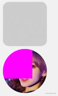
可以看一下裁剪控件和绘制背景之后的效果图:

这些效果都是ViewGroup,不是ImageView加载的,其中图二是故意设置为背景不居中展示的效果。在图一中我们内部添加子View就可以看到裁剪的效果与背景的效果。
原生背景属性的处理
虽然我们简单的实现了控件的裁剪和背景的绘制,但是我们的健壮性还不够,当我们再xml里面设置background的时候,而不使用自定义属性,就会没效果。
我们需要接管系统View的setBackground的一些方法,让它走到我们自定义的背景绘制中来。
例如:
    <RoundCircleFrameLayout
        android:layout_width="@dimen/d_150dp"
        android:layout_height="@dimen/d_150dp"
        android:background="@color/gray"
        app:round_radius="@dimen/d_20dp"/>

    <RoundCircleConstraintLayout
        android:id="@+id/layout_2"
        android:layout_width="@dimen/d_150dp"
        android:layout_height="@dimen/d_150dp"
        android:layout_marginTop="@dimen/d_10dp"
        app:is_circle="true"
        app:round_circle_background_color="#ff00ff"
        app:round_radius="@dimen/d_40dp"/>
我们直接设置 android:background 的时候我们需要重写这些方法,然后取到其中的值,然后再交给策略类去具体的绘制。
核心代码如下:
    private fun init(view: View, context: Context, attributeSet: AttributeSet?) {
        roundCircleViewImpl = RoundCircleViewImpl(
            view,
            context,
            attributeSet,
            R.styleable.RoundCircleFrameLayout,
            intArrayOf(
                R.styleable.RoundCircleFrameLayout_is_circle,
                R.styleable.RoundCircleFrameLayout_round_radius,
                R.styleable.RoundCircleFrameLayout_topLeft,
                R.styleable.RoundCircleFrameLayout_topRight,
                R.styleable.RoundCircleFrameLayout_bottomLeft,
                R.styleable.RoundCircleFrameLayout_bottomRight,
                R.styleable.RoundCircleFrameLayout_round_circle_background_color,
                R.styleable.RoundCircleFrameLayout_round_circle_background_drawable,
                R.styleable.RoundCircleFrameLayout_is_bg_center_crop,
            )

        )
        nativeBgDrawable?.let {
            roundCircleViewImpl.setNativeDrawable(it)
        }
    }

    private var nativeBgDrawable: Drawable? = null
    override fun setBackground(background: Drawable?) {
        if (!this::roundCircleViewImpl.isInitialized) {
            nativeBgDrawable = background
        } else {
            roundCircleViewImpl.setBackground(background)
        }
    }

    override fun setBackgroundColor(color: Int) {
        if (!this::roundCircleViewImpl.isInitialized) {
            nativeBgDrawable = ColorDrawable(color)
        } else {
            roundCircleViewImpl.setBackground(background)
        }
    }

    override fun setBackgroundResource(resid: Int) {
        if (!this::roundCircleViewImpl.isInitialized) {
            nativeBgDrawable = context.resources.getDrawable(resid)
        } else {
            roundCircleViewImpl.setBackground(background)
        }
    }

    override fun setBackgroundDrawable(background: Drawable?) {
        if (!this::roundCircleViewImpl.isInitialized) {
            nativeBgDrawable = background
        } else {
            roundCircleViewImpl.setBackground(background)
        }
    }
我们对Java中设置的背景与xml中设置的背景单独的处理。
internal abstract class AbsRoundCirclePolicy(
    view: View,
    context: Context,
    attributeSet: AttributeSet?,
    attrs: IntArray,
    attrIndex: IntArray
) : IRoundCirclePolicy {

    var isCircleType = false
    var mRoundRadius = 0f
    var mTopLeft = 0f
    var mTopRight = 0f
    var mBottomLeft = 0f
    var mBottomRight = 0f
    var mRoundBackgroundDrawable: Drawable? = null
    var mRoundBackgroundBitmap: Bitmap? = null
    var isBGCenterCrop = true;

    val mContainer: View = view

    override fun setNativeDrawable(drawable: Drawable) {
        mRoundBackgroundDrawable = drawable
        mRoundBackgroundBitmap = getBitmapFromDrawable(mRoundBackgroundDrawable)
    }
}
在xml中设置的背景最终会调用到策略的抽象类中,赋值给Bitmap,然后我们的策略具体实现类就会绘制出背景。
而Java中的手动设置背景则会走到我们策略接口定义的方法中
// 策略的接口定义
interface IRoundCirclePolicy {

    fun isCustomRound(): Boolean

    fun beforeDispatchDraw(canvas: Canvas?)

    fun afterDispatchDraw(canvas: Canvas?)

    fun onDraw(canvas: Canvas?): Boolean

    fun onLayout(left: Int, top: Int, right: Int, bottom: Int)

    fun setBackground(background: Drawable?)

    fun setBackgroundColor(color: Int)

    fun setBackgroundResource(resid: Int)

    fun setBackgroundDrawable(background: Drawable?)

    fun setNativeDrawable(drawable: Drawable)

}
而它的具体实现不是由抽象策略类实现,是交给策略的具体实现类去实现,因为需要及时的刷新,所以是具体实现类去实现这些方法。
核心代码如下:
    //手动设置背景的设置
    override fun setBackground(background: Drawable?) {
        setRoundBackgroundDrawable(background)
    }

    override fun setBackgroundColor(color: Int) {
        val drawable = ColorDrawable(color)
        setRoundBackgroundDrawable(drawable)
    }

    override fun setBackgroundResource(resid: Int) {
        val drawable: Drawable = mContainer.context.resources.getDrawable(resid)
        setRoundBackgroundDrawable(drawable)
    }

    override fun setBackgroundDrawable(background: Drawable?) {
        setRoundBackgroundDrawable(background)
    }

    //重新设置Drawable
    private fun setRoundBackgroundDrawable(drawable: Drawable?) {
        mRoundBackgroundDrawable = drawable
        mRoundBackgroundBitmap = getBitmapFromDrawable(mRoundBackgroundDrawable)

        setupBG()

        //重绘
        mContainer.invalidate()
    }
也是同样的赋值操作,只是多了手动刷新的功能。
到处xml中的背景设置 和 Java 中手动设置我们就都接管了过来自己绘制了。
试试吧!
xml里面设置的背景可以正常显示,那我们设置一个点击事件,换一下图片背景试试
    findViewById<ViewGroup>(R.id.layout_2).click {
        it.background = drawable(R.drawable.chengxiao)
    }
注意由于我们接管了背景的绘制,这里我们使用的是View原生的方法即可
第二张图就换成了图片背景,内部的子View也能正常的显示,也是显示在正常的位置,符合我们的要求。
到此基本上就完成了我们的自定义圆角ViewGroup了。但是对应一些列表与滚动的容器我们能不能做同样的裁剪呢?
对RecyclerView和ScrollView的支持
除了一些常用的容器,我们还有列表的处理,在一些场景中我们常见一些圆角的列表,比如 RecyclerView、 ScrollView 等。
都是可以实现的,其实它们扩展起来非常的方便。我们只需要加上对应的自定义属性,只需要修改获取自定义属性的方法,其他的方法都是一样的。
例如:
class RoundCircleScrollView : ScrollView, IRoundCircleView {

    private lateinit var roundCircleViewImpl: RoundCircleViewImpl

    constructor(context: Context) : this(context, null)

    constructor(context: Context, attrs: AttributeSet?) : super(context, attrs) {
        init(this, context, attrs)
    }

    constructor(context: Context, attrs: AttributeSet?, defStyleAttr: Int) : super(context, attrs, defStyleAttr) {
        init(this, context, attrs)
    }

    private fun init(view: View, context: Context, attributeSet: AttributeSet?) {
        roundCircleViewImpl = RoundCircleViewImpl(
            view,
            context,
            attributeSet,
            R.styleable.RoundCircleScrollView,
            intArrayOf(
                R.styleable.RoundCircleScrollView_is_circle,
                R.styleable.RoundCircleScrollView_round_radius,
                R.styleable.RoundCircleScrollView_topLeft,
                R.styleable.RoundCircleScrollView_topRight,
                R.styleable.RoundCircleScrollView_bottomLeft,
                R.styleable.RoundCircleScrollView_bottomRight,
                R.styleable.RoundCircleScrollView_round_circle_background_color,
                R.styleable.RoundCircleScrollView_round_circle_background_drawable,
                R.styleable.RoundCircleScrollView_is_bg_center_crop,
            )

        )
        nativeBgDrawable?.let {
            roundCircleViewImpl.setNativeDrawable(it)
        }
    }

     ...
}
使用起来也是和普通的容器是一样样的。
    <RoundCircleNestedScrollView
        android:layout_width="match_parent"
        android:layout_height="wrap_content"
        app:round_radius="@dimen/d_30dp">
    <RoundCircleRecyclerView
        android:id="@+id/recyclerView"
        app:topRight="@dimen/d_20dp"
        app:topLeft="@dimen/d_20dp"
        android:layout_width="match_parent"
        android:layout_height="wrap_content" />
换上Scrollview的具体效果:
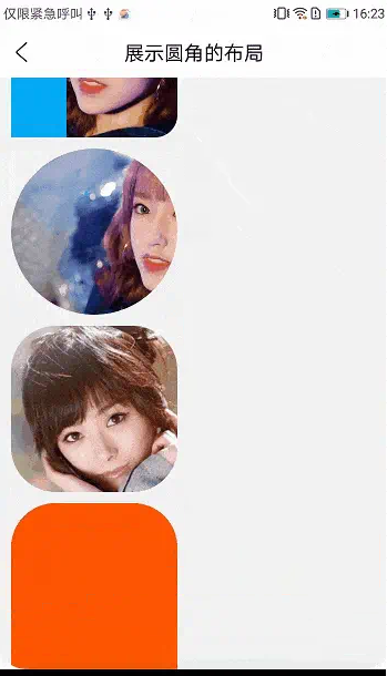
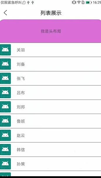
RecyclerView是内部的Item滚动,效果相对更好:

RV带上头布局与脚布局一样不影响圆角的裁剪
录制GIF的时候好像录制范围有点问题,导致录制出来的GIF的圆角有一点裁剪的感觉,其实真实效果和ViewGroup是一样的效果。
如何使用? 其实如果大家使用Scrollview的话,最好是用普通的圆角容器包裹 RoundCircleScrollView ,这样可以达到圆角固定的效果,或者使用shape设置背景也可以,大家可以灵活选择。
RV由于是内部的Item滚动就可以完美的裁剪,可以实现一些特殊的圆角需求。
如果想扩展更多的ViewGroup,或者自己的自定义ViewGroup,可以直接扩展即可,定义对应的自定义属性,封装成对象给 RoundCircleViewImpl 即可。具体可以参考源码。
到此我们就全部实现完毕了,哪里要弯就弯哪里,妈妈再也不用担心圆角的实现了。
总结
使用Shape圆角的背景或图片背景和使用自定义ViewGroup裁剪其实是两种不同的思路,关键是看需求,是否需要贴边的时候需要保持圆角效果。大家按需选择即可。
关于自定义View的裁剪方案,其实上面说了有多种实现,我使用了兼容性和效果都相对比较好的两种方案 Outline 和 Shader ,当然了,如果有更好的方案也欢迎大家一起讨论。
使用自定义ViewGroup的方式,算是解决了我开发中的一些痛点,特别是RV的一些裁剪,在一些特定的场景下很好用,我就不需要对Item做一些特别的处理。
如果想直接使用,我已经传到 Maven 仓库,大家直接依赖即可。
implementation "com.gitee.newki123456:round_circle_layout:1.0.0"
Android 学习笔录
Android 性能优化篇:https://qr18.cn/FVlo89
Android 车载篇:https://qr18.cn/F05ZCM
Android Framework底层原理篇:https://qr18.cn/AQpN4J
Android 音视频篇:https://qr18.cn/Ei3VPD
Jetpack全家桶篇(内含Compose):https://qr18.cn/A0gajp
Kotlin 篇:https://qr18.cn/CdjtAF
Gradle 篇:https://qr18.cn/DzrmMB
OkHttp 源码解析笔记:https://qr18.cn/Cw0pBD
Flutter 篇:https://qr18.cn/DIvKma
Android 八大知识体:https://qr18.cn/CyxarU
Android 核心笔记:https://qr21.cn/CaZQLo
Android 往年面试题锦:https://qr18.cn/CKV8OZ
2023年最新Android 面试题集https://qr18.cn/CgxrRy
音视频面试题锦:https://qr18.cn/AcV6Ap