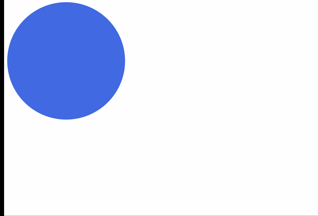
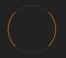
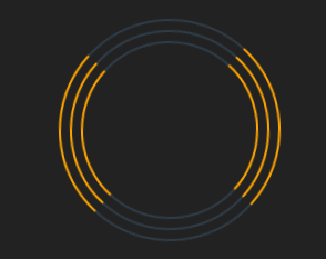
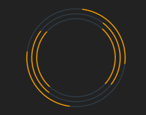
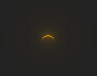
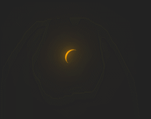
1.实现效果

2.实现原理
2.1 rotate3d
rotate3d:rotate3d() CSS 函数定义一个变换,它将元素围绕固定轴移动而不使其变形。运动量由指定的角度定义; 如果为正,运动将为顺时针,如果为负,则为逆时针。
语法:
rotate3d(x, y, z, a)
含义:
x 类型,可以是 0 到 1 之间的数值,表示旋转轴 X 坐标方向的矢量。
y 类型,可以是 0 到 1 之间的数值,表示旋转轴 Y 坐标方向的矢量。
z 类型,可以是 0 到 1 之间的数值,表示旋转轴 Z 坐标方向的矢量。
a 类型,表示旋转角度。正的角度值表示顺时针旋转,负值表示逆时针旋转。
2.2 rotateZ
rotateZ:函数定义了一个转换,它可以让一个元素围绕横 Z 轴旋转,而不会对其进行变形。旋转轴围绕原点旋转,而这个原点通过transform-origin 属性来定义(默认的转换原点是 center)。
rotateZ(a) 相当于 rotate(a) or rotate3d(0, 0, 1, a)。
语法
rotateZ(a)
含义:
rotateZ() 引起的旋转量由指定。如果为正,则顺时针方向移动;如果为负,则逆时针方向移动。
a 是一个‘angle ’,表示旋转的角度。正数角度表示顺时针旋转,负数则表示逆时针旋转。
1turn:一圈,即360deg。90deg = 0.25turn。
2.3 transform-origin
transform-origin:更改一个元素变形的原点,默认的转换原点是 center。
语法:
transform-origin: center;
含义:
transform-origin属性可以使用一个,两个或三个值来指定,其中每个值都表示一个偏移量。没有明确定义的偏移将重置为其对应的初始值。
如果定义了两个或更多值并且没有值的关键字,或者唯一使用的关键字是center,则第一个值表示水平偏移量,第二个值表示垂直偏移量。
关键字是方便的简写方法,等同于以下角度值:
| keyword | value |
|---|---|
| left | 0% |
| center | 50% |
| right | 100% |
| top | 0% |
| bottom | 100% |
2.4 CSS 滤镜 filter 的drop-shadow
drop-shadow:投影实际上是输入图像的 alpha 蒙版的一个模糊的、偏移的版本,用特定的颜色绘制并合成在图像下面。
函数接受shadow(在CSS3背景中定义)类型的值,除了"inset"关键字是不允许的。该函数与已有的box-shadow 属性很相似;不同之处在于,通过滤镜,一些浏览器为了更好的性能会提供硬件加速。
语法:
drop-shadow(offset-x offset-y blur-radius spread-radius color)
含义:
offset-x offset-y (必须):
offset-x指定水平距离,其中负值将阴影放置到元素的左侧。offset-y指定垂直距离,其中负值将阴影置于元素之上。如果两个值都为 0,则阴影直接放置在元素后面。
blur-radius (可选) :
阴影的模糊半径,指定为 。值越大,阴影就越大,也越模糊。如果未指定,则默认为
0,从而产生清晰、不模糊的边缘。不允许有负值。
spread-radius (可选):
阴影的扩展半径,指定为 .
正的值会导致阴影扩大和变大,而负的值会导致阴影缩小。如果未指定,则默认为 0,阴影的大小将与输入图像相同。
color (可选):
阴影的颜色,指定为 color。如果未指定,则使用 color 属性的值。如果颜色值省略,WebKit中阴影是透明的。
注意:box-shadow 属性在元素的整个框后面创建一个矩形阴影,而 drop-shadow() 过滤器则是创建一个符合图像本身形状 (alpha 通道) 的阴影。
eg:
drop-shadow(16px 16px 10px black)
2.5 css伪元素
CSS 伪元素用于设置元素指定部分的样式。
::before 伪元素可用于在元素内容之前插入一些内容。
::after 伪元素可用于在元素内容之后插入一些内容。
::selection 伪元素匹配用户选择的元素部分。
所有 CSS 伪元素:
| 选择器 | 例子 | 含义 |
|---|---|---|
| ::after | p::after | 在每个 p 元素之后插入内容 |
| ::before | p::before | 在每个 p 元素之前插入内容 |
| ::first-letter | p:first-letter | 选择每个p 元素的首字母 |
| ::first-line | p::first-line | 选择每个 p 元素的首行 |
| ::selection | p::selection | 选择用户选择的元素部分 |
3.实现步骤
3.1.实现外层三个转动的圆
- 假设有一个div标签,设置为圆,border颜色进行区分。
 .box {
        border: 2px solid var(--lineColor);
        border-left: 2px solid var(--color);
        border-right: 2px solid var(--color);
        border-radius: 50%;
  }
- 利用伪元素,再实现两个大小不一的圆。

.box,
.box::after,
.box::before {
   border: 2px solid var(--lineColor);
    border-left: 2px solid var(--color);
    border-right: 2px solid var(--color);
    border-radius: 50%;
}
.box {
   width: 200px;
   height: 200px;
   position: relative;
 }
 .box::before {
     width: 180px;
     height: 180px;
     margin-top: -90px;
     margin-left: -90px;
 }
.box::after {
    width: 160px;
    height: 160px;
    margin-top: -80px;
    margin-left: -80px;
}
- 为div添加rotateZ旋转动画,旋转1圈。
.box {
   animation: turn 1s linear infinite;
   transform-origin: 50% 50%;
}
@keyframes turn {
  100% {
       transform: rotateZ(-1turn);
   }
}
- 重写before和after动画,使三个圆转动有一定层次感。
.box::before {
   animation: turn2 1.25s linear infinite;
}
.box::after {
   animation: turn 1.5s linear infinite;
}
@keyframes turn2 {
    100% {
        transform: rotateZ(1turn);
    }
}
3.2 实现内层三个转动的圆
- 三个div标签,设置为圆。
.box-circle,
.box-circle1,
.box-circle2 {
    border: 2px solid var(--color);
    opacity: .9;
    border-radius: 50%;
    position: absolute;
    left: 50%;
    top: 50%;
    transform-origin: 50% 50%;
    transform: translate(-50%, -50%);
    width: 100px;
    height: 100px;
}
- 分别添加同一个rotate3d旋转动画,设置一定的动画延时。
.box-circle {
	animation-delay: 0.2s;
}

.box-circle1 {
    animation-delay: 1.2s;
}

.box-circle2 {
    animation-delay: 2.2s;
}

@keyframes rotate {
 100% {
     border: none;
     border-top: 2px solid var(--color);
     border-bottom: 2px solid var(--color);
     transform: translate(-50%, -50%) rotate3d(.5, 0.5, 0.5, -720deg);
 }
}
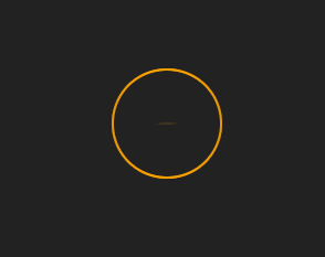
3.3 实现中间转动的月牙
- 一个伪元素,设置为圆,添加上边框 border-top,通过drop-shadow加强阴影效果。
section::before {
  content: '';
  position: absolute;
  height: 10px;
  width: 10px;
  border-radius: 100%;
  border-top: 1px solid orange;
  top: 50%;
  left: 50%;
  margin-top: -5px;
  margin-left: -5px;
  filter:
      drop-shadow(0 0 2px var(--color)) drop-shadow(0 0 5px var(--color)) drop-shadow(0 0 10px var(--color)) drop-shadow(0 0 20px var(--color));
}
- 为其添加rotataZ旋转一圈的动画。
section::before {
	animation: turn 1s infinite linear;
}
4.完整代码
<!DOCTYPE html>
<html lang="en">
<head>
    <meta charset="UTF-8">
    <meta http-equiv="X-UA-Compatible" content="IE=edge">
    <meta name="viewport" content="width=device-width, initial-scale=1.0">
    <title>圆弧转动</title>
</head>
<link rel="stylesheet" href="../common.css">
<style>
    :root {
        --color: orange;
        --lineColor: rgba(102, 163, 224, .2);
    }
    body {
        background: #222;
        overflow: hidden;
    }
    section {
        position: relative;
        width: 200px;
        height: 200px;
    }
    section::before {
        content: '';
        position: absolute;
        height: 10px;
        width: 10px;
        border-radius: 100%;
        border-top: 1px solid orange;
        top: 50%;
        left: 50%;
        margin-top: -5px;
        margin-left: -5px;
        animation: turn 1s infinite linear;
        filter:
            drop-shadow(0 0 2px var(--color)) drop-shadow(0 0 5px var(--color)) drop-shadow(0 0 10px var(--color)) drop-shadow(0 0 20px var(--color));
    }
    .box,
    .box::after,
    .box::before {
        border: 2px solid var(--lineColor);
        border-left: 2px solid var(--color);
        border-right: 2px solid var(--color);
        border-radius: 50%;
    }
    .box::after,
    .box::before {
        position: absolute;
        content: '';
        left: 50%;
        top: 50%;
    }
    .box {
        width: 200px;
        height: 200px;
        position: relative;
        animation: turn 1s linear infinite;
        transform-origin: 50% 50%;
    }
    .box::before {
        width: 180px;
        height: 180px;
        margin-top: -90px;
        margin-left: -90px;
        animation: turn2 1.25s linear infinite;
    }
    .box::after {
        width: 160px;
        height: 160px;
        margin-top: -80px;
        margin-left: -80px;
        animation: turn 1.5s linear infinite;
    }
    .box-circle,
    .box-circle1,
    .box-circle2 {
        border: 2px solid var(--color);
        opacity: .9;
        border-radius: 50%;
        position: absolute;
        left: 50%;
        top: 50%;
        transform-origin: 50% 50%;
        transform: translate(-50%, -50%);
        width: 100px;
        height: 100px;
        animation: rotate 3s linear infinite;
    }
    .box-circle {
        animation-delay: 0.2s;
    }
    .box-circle1 {
        animation-delay: 1.2s;
    }
    .box-circle2 {
        animation-delay: 2.2s;
    }
    @keyframes turn {
        100% {
            transform: rotateZ(-1turn);
        }
    }
    @keyframes turn2 {
        100% {
            transform: rotateZ(1turn);
        }
    }
    @keyframes rotate {
        100% {
            border: none;
            border-top: 2px solid var(--color);
            border-bottom: 2px solid var(--color);
            transform: translate(-50%, -50%) rotate3d(.5, 0.5, 0.5, -720deg);
        }
    }
</style>
<body>
    <section>
        <div class="box"></div>
        <div class="box-circle"></div>
        <div class="box-circle1"></div>
        <div class="box-circle2"></div>
    </section>
</body>

</html>


![[遇到的问题-已解决]Cannot resolve plugin org.apache.maven.plugins:maven-compiler-plugin:3.1](https://img-blog.csdnimg.cn/975d7cd836f84578aad223c8fa78203f.png)