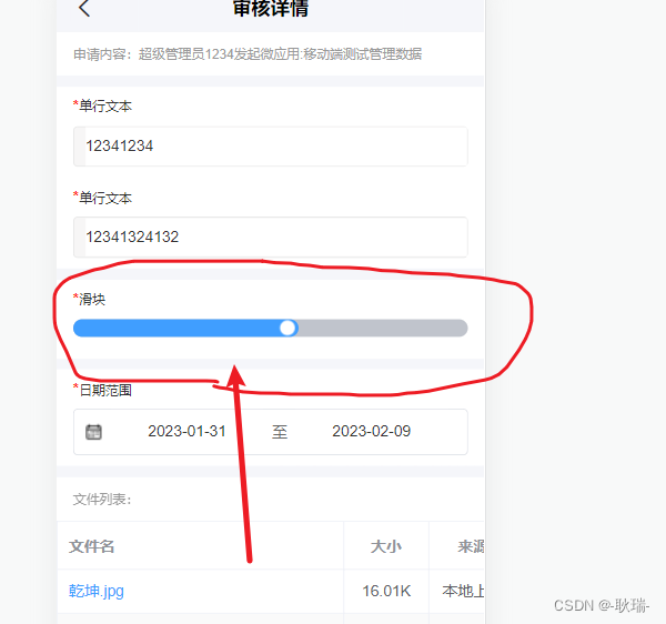
最近 项目中有一个需求 PC端动态设计的表单 移动端要能渲染出来
那么 就要去找到对应的组件 而其中 没有的 就包括滑块 没有又能怎么办 只能自己封装一个
我们直接上代码
<template>
	<view class="u-slider" @tap="onClick" :class="[disabled ? 'u-slider--disabled' : '']" :style="{
		backgroundColor: inactiveColor
	}">
		<view class="u-slider__gap" :style="[
				barStyle,
				{
					height: height + 'rpx',
					backgroundColor: activeColor
				}
			]">
			<view class="u-slider__button-wrap" @touchstart="onTouchStart" @touchmove="onTouchMove"
				@touchend="onTouchEnd" @touchcancel="onTouchEnd" :style="{right: isWidth ? '10px' : '-7px'}">
				<slot v-if="$slots.default  || $slots.$default" />
				<view v-else class="u-slider__button" :style="[blockStyle, {
					height: blockWidth + 'rpx',
					width: blockWidth + 'rpx',
					backgroundColor: blockColor
				}]"></view>
			</view>
		</view>
	</view>
</template>

<script>
	export default {
		name: 'progress',
		props: {
			// 当前进度百分比值,范围0-100
			value: {
				type: [Number, String],
				default: 0
			},
			// 是否禁用滑块
			disabled: {
				type: Boolean,
				default: false
			},
			// 滑块宽度,高等于宽,单位rpx
			blockWidth: {
				type: [Number, String],
				default: 30
			},
			// 最小值
			min: {
				type: [Number, String],
				default: 0
			},
			// 最大值
			max: {
				type: [Number, String],
				default: 100
			},
			// 步进值
			step: {
				type: [Number, String],
				default: 1
			},
			// 滑块条高度,单位rpx
			height: {
				type: [Number, String],
				default: 6
			},
			// 进度条的激活部分颜色
			activeColor: {
				type: String,
				default: '#2979ff'
			},
			// 进度条的背景颜色
			inactiveColor: {
				type: String,
				default: '#c0c4cc'
			},
			// 滑块的背景颜色
			blockColor: {
				type: String,
				default: '#ffffff'
			},
			// 用户对滑块的自定义颜色
			blockStyle: {
				type: Object,
				default () {
					return {};
				}
			},
		},
		data() {
			return {
				startX: 0,
				status: 'end',
				newValue: 0,
				distanceX: 0,
				startValue: 0,
				barStyle: {},
				sliderRect: {
					left: 0,
					width: 0
				},
				isWidth: 0
			};
		},
		watch: {
			value(n) {
				// 只有在非滑动状态时,才可以通过value更新滑块值,这里监听,是为了让用户触发
				if (this.status == 'end') this.updateValue(this.value, false);
			}
		},
		created() {
			this.updateValue(this.value, false);
		},
		mounted() {
			// 获取滑块条的尺寸信息
			const query = uni.createSelectorQuery().in(this)
			query.select(".u-slider").boundingClientRect(rect => {
				this.sliderRect = rect;
			}).exec()
			// this.$uGetRect('.u-slider').then(rect => {
			// 	this.sliderRect = rect;
			// });
		},
		methods: {
			onTouchStart(event) {
				if (this.disabled) return;
				this.startX = 0;
				// 触摸点集
				let touches = event.touches[0];
				// 触摸点到屏幕左边的距离
				this.startX = touches.clientX;
				// 此处的this.value虽为props值,但是通过$emit('input')进行了修改
				this.startValue = this.format(this.value);
				// 标示当前的状态为开始触摸滑动
				this.status = 'start';
			},
			onTouchMove(event) {
				if (this.disabled) return;
				// 连续触摸的过程会一直触发本方法,但只有手指触发且移动了才被认为是拖动了,才发出事件
				// 触摸后第一次移动已经将status设置为moving状态,故触摸第二次移动不会触发本事件
				if (this.status == 'start') this.$emit('start');
				let touches = event.touches[0];
				// 滑块的左边不一定跟屏幕左边接壤,所以需要减去最外层父元素的左边值
				this.distanceX = touches.clientX - this.sliderRect.left;
				// 获得移动距离对整个滑块的百分比值,此为带有多位小数的值,不能用此更新视图
				// 否则造成通信阻塞,需要每改变一个step值时修改一次视图
				this.newValue = (this.distanceX / this.sliderRect.width) * 100;
				this.status = 'moving';
				// 发出moving事件
				this.$emit('moving');
				this.updateValue(this.newValue, true);
			},
			onTouchEnd() {
				if (this.disabled) return;
				if (this.status === 'moving') {
					this.updateValue(this.newValue, false);
					this.$emit('end');
				}
				this.status = 'end';
			},
			updateValue(value, drag) {
				// 去掉小数部分,同时也是对step步进的处理
				const width = this.format(value);
				// 不允许滑动的值超过max最大值,百分比也不能超过100
				if (width > this.max || width > 100) return;
				// 设置移动的百分比值
				let barStyle = {
					width: width + '%'
				};
				// console.log('width', width)
				this.isWidth = width
				// 移动期间无需过渡动画
				if (drag == true) {
					barStyle.transition = 'none';
				} else {
					// 非移动期间,删掉对过渡为空的声明,让css中的声明起效
					delete barStyle.transition;
				}
				// 修改value值
				this.$emit('input', width);
				this.barStyle = barStyle;
			},
			format(value) {
				// 将小数变成整数,为了减少对视图的更新,造成视图层与逻辑层的阻塞
				return Math.round(Math.max(this.min, Math.min(value, this.max)) / this.step) * this.step;
			},
			onClick(event) {
				if (this.disabled) return;
				// 直接点击滑块的情况,计算方式与onTouchMove方法相同
				const value = ((event.detail.x - this.sliderRect.left) / this.sliderRect.width) * 100;
				this.updateValue(value, false);
			}
		}
	};
</script>

<style lang="scss" scoped>
	// @import "../../libs/css/style.components.scss";

	.u-slider {
		position: relative;
		border-radius: 999px;
		border-radius: 999px;
		background-color: #ebedf0;
	}

	.u-slider:before {
		position: absolute;
		right: 0;
		left: 0;
		content: '';
		top: -8px;
		bottom: -8px;
		z-index: -1;
	}

	.u-slider__gap {
		position: relative;
		border-radius: inherit;
		transition: width 0.2s;
		transition: width 0.2s;
		background-color: #1989fa;
	}

	.u-slider__button {
		width: 24px;
		height: 24px;
		border-radius: 50%;
		box-shadow: 0 1px 2px rgba(0, 0, 0, 0.5);
		background-color: #fff;
		cursor: pointer;
	}

	.u-slider__button-wrap {
		position: absolute;
		top: 50%;
		transform: translate3d(50%, -50%, 0);
	}

	.u-slider--disabled {
		opacity: 0.5;
	}
</style>
我们可以这样使用
<vue-progress
	v-model="formDom.__config__.defaultValue"
	height="32"
	min="0"
	max="100"
	@input = "xiuprogress"
	activeColor="#409eff"
	:use-slot="true"
	:disabled="false"
>
	<view style="background: #ffffff;border-radius: 100%;width: 14px;height: 14px;">
	</view>
</vue-progress>
其中 xiuprogress 函数 接收一个value值 这里需要你手动通过这个方法给v-model上绑定的值赋值
其他的都在props上有注释 可以去看一下 整体 在移动端 这还算很不错了