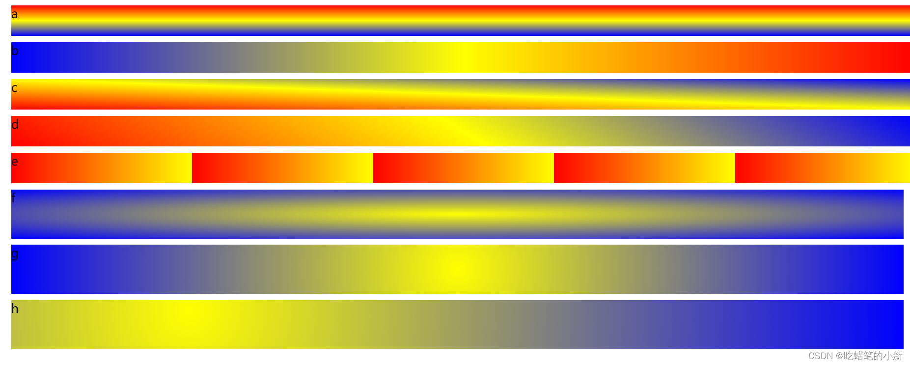
线性渐变和径向渐变
几个常见的例子效果
<!DOCTYPE html>
<html>
	<head>
		<meta charset="utf-8">
		<title></title>
		<style>
			.a{
				font-size: 20px;
				width: 100%;
				height: 50px;
				margin: 10px;
				background-image: linear-gradient(red,yellow,blue);
			}
			.b{
				font-size: 20px;
				width: 100%;
				height: 50px;
				margin: 10px;
				/* 向左边渐变 */
				background-image: linear-gradient(to left,red,yellow,blue);
			}
			.c{
				font-size: 20px;
				width: 100%;
				height: 50px;
				margin: 10px;
				/* 向右上边渐变 */
				background-image: linear-gradient(to right top,red,yellow,blue);
			}
			.d{
				font-size: 20px;
				width: 100%;
				height: 50px;
				margin: 10px;
				/* 向30度角方向渐变 */
				background-image: linear-gradient(30deg,red,yellow,blue);
			}
			.e{
				font-size: 20px;
				width: 100%;
				height: 50px;
				margin: 10px;
				/* 到20%时为yellow,20%~40%时为red,之后就是循环前面部分 */
				background-image: repeating-linear-gradient(to left, yellow 20%,red 40%);
			}
			.f{
				font-size: 20px;
				width: auto;
				height: 80px;
				margin: 10px;
				/* ellipse可以不写,默认就是这个类型,算是椭圆,但如果是正方形就显示的是圆形渐变 */
				background-image: radial-gradient(ellipse,yellow,blue);
			}
			.g{
				font-size: 20px;
				width: auto;
				height: 80px;
				margin: 10px;
				background-image: radial-gradient(circle,yellow,blue);
			}
			.h{
				font-size: 20px;
				width: auto;
				height: 80px;
				margin: 10px;
				/* 圆心以20% 20%这个位置开始发散 */
				background-image: radial-gradient(circle at 20% 20%,yellow,blue);
			}
		</style>
	</head>
	<body>
		<div class="a">a</div>
		<div class="b">b</div>
		<div class="c">c</div>
		<div class="d">d</div>
		<div class="e">e</div>
		<div class="f">f</div>
		<div class="g">g</div>
		<div class="h">h</div>
	</body>
</html>


![[附源码]计算机毕业设计JAVA考研部落](https://img-blog.csdnimg.cn/7f9961dfc6da467fa6fca3a63fd2f412.png)