Flutter + OpenHarmony 进度环组件开发实战
news2026/5/1 4:35:39
Flutter OpenHarmony 进度环组件开发实战欢迎加入开源鸿蒙跨平台社区→ https://openharmonycrosplatform.csdn.net一、效果展示 运行效果预览在鸿蒙虚拟机上运行后的实际效果如下基础样式 实线进度环 - 圆滑的实线进度条渐变进度环 - 蓝紫渐变效果虚线进度环 - 20段虚线组成分段进度环 - 8段分段显示不同尺寸 60px - 小型进度环4px粗细100px - 标准进度环8px粗细140px - 大型进度环12px粗细自定义颜色 红色进度环绿色进度环蓝色进度环橙色进度环渐变效果 红橙渐变 - 暖色调蓝青渐变 - 冷色调紫粉渐变 - 梦幻色调多环进度 三层嵌套进度环蓝、绿、橙三色中心显示完成率自定义中心 爱心图标对勾图标沙漏图标交互式调节 滑块控制进度实时更新显示平滑动画过渡 四种样式对比图示实线样式 渐变样式 虚线样 式 分段样式 ╭───╮ ╭───╮ ╭─┬─╮ ╭─┬─╮ │ 75%│ │░65%│ │ │ │ │ │ │ ╰───╯ ╰───╯ ╰─┴─╯ ╰─┴─╯ 连续实线 渐变色彩 20段虚 线 8段分段 多环进度效果多环嵌套 ╭─────────╮ ╭┤ 85% ├╮ ╭││ 完成率 ││╮ │╰┤ ├╯│ │ ╰─────────╯ │ ╰─────────────╯ 蓝 绿 橙 三环二、组件概述进度环是展示任务完成度、数据加载进度、目标达成率等信息的重要组件。相比线性进度条圆形进度环更加美观、节省空间。在 OpenHarmony 环境下开发 Flutter 应用时进度环组件需要支持多种视觉样式、渐变效果、多环嵌套等功能。三、核心功能特性✅ 四种视觉样式 - 实线、渐变、虚线、分段✅ 渐变色彩支持 - SweepGradient实现渐变✅ 多环进度显示 - 嵌套多层进度环✅ 自定义中心内容 - 图标、文本可配置✅ 平滑动画过渡 - 进度变化时动画效果✅ 灵活尺寸配置 - 大小、粗细可调节四、技术实现架构4.1 进度环样式枚举enum ProgressRingStyle { solid, // 实线样式 gradient, // 渐变样式 dashed, // 虚线样式 segmented // 分段样式 }4.2 进度环动画枚举enum ProgressRingAnimation { smooth, // 平滑动画 bounce, // 弹跳动画 pulse, // 脉冲动画 rotate // 旋转动画 }4.3 组件属性定义class CustomProgressRing extends StatefulWidget { final double progress; // 进度值 0-1 final double size; // 尺寸 final double strokeWidth; // 线条粗细 final Color? backgroundColor; // 背景色 final Color? progressColor; // 进度色 final ListColor? gradientColors; // 渐变色 final ProgressRingStyle style; // 样式 final ProgressRingAnimation animation; // 动画 final bool showPercentage; // 显示百 分比 final TextStyle? percentageStyle; // 百分比样式 final Widget? centerWidget; // 中心组件 final Duration animationDuration; // 动画时长 final double startAngle; // 起始角度 }五、CustomProgressRing 核心实现5.1 动画控制器class _CustomProgressRingState extends StateCustomProgressRing with SingleTickerProviderStateMixin { late AnimationController _controller; late Animationdouble _animation; override void initState() { super.initState(); _controller AnimationController( vsync: this, duration: widget. animationDuration, ); _animation Tweendouble (begin: 0, end: widget.progress. clamp(0.0, 1.0)).animate( CurvedAnimation(parent: _controller, curve: Curves. easeInOutCubic), ); _controller.forward(); } override void didUpdateWidget (CustomProgressRing oldWidget) { super.didUpdateWidget (oldWidget); if (oldWidget.progress ! widget.progress) { _animation Tweendouble( begin: _animation.value, end: widget.progress.clamp (0.0, 1.0), ).animate( CurvedAnimation(parent: _controller, curve: Curves. easeInOutCubic), ); _controller.reset(); _controller.forward(); } } override void dispose() { _controller.dispose(); super.dispose(); } }动画原理 使用 AnimationController 控制动画Curves.easeInOutCubic 实现平滑过渡didUpdateWidget 监听进度变化进度变化时从当前值动画到新值5.2 布局构建override Widget build(BuildContext context) { final isDark Theme.of(context). brightness Brightness.dark; final bgColor widget. backgroundColor ?? (isDark ? Colors.grey[800]! : Colors.grey [200]!); final pColor widget. progressColor ?? Theme.of (context).colorScheme.primary; return AnimatedBuilder( animation: _animation, builder: (context, child) { return SizedBox( width: widget.size, height: widget.size, child: Stack( alignment: Alignment. center, children: [ CustomPaint( size: Size(widget. size, widget.size), painter: _ProgressRingPainter( progress: _animation.value, backgroundColor: bgColor, progressColor: pColor, gradientColors: widget. gradientColors, strokeWidth: widget. strokeWidth, style: widget.style, startAngle: widget. startAngle, ), ), if (widget. showPercentage || widget.centerWidget ! null) widget. centerWidget ?? _buildPercentageText (isDark), ], ), ); }, ); }布局原理 使用 Stack 叠加布局CustomPaint 绘制进度环中心显示百分比或自定义组件5.3 CustomPainter 绘制器class _ProgressRingPainter extends CustomPainter { final double progress; final Color backgroundColor; final Color progressColor; final ListColor? gradientColors; final double strokeWidth; final ProgressRingStyle style; final double startAngle; override void paint(Canvas canvas, Size size) { final center Offset(size. width / 2, size.height / 2); final radius (size.width - strokeWidth) / 2; _drawBackgroundRing(canvas, center, radius); _drawProgressRing(canvas, center, radius, size); } void _drawBackgroundRing(Canvas canvas, Offset center, double radius) { final paint Paint() ..color backgroundColor ..style PaintingStyle.stroke ..strokeWidth strokeWidth ..strokeCap StrokeCap.round; canvas.drawCircle(center, radius, paint); } }5.4 实线样式绘制void _drawSolidRing(Canvas canvas, Offset center, double radius, double startAngle, double sweepAngle) { final paint Paint() ..color progressColor ..style PaintingStyle.stroke ..strokeWidth strokeWidth ..strokeCap StrokeCap.round; canvas.drawArc( Rect.fromCircle(center: center, radius: radius), startAngle, sweepAngle, false, paint, ); }5.5 渐变样式绘制void _drawGradientRing(Canvas canvas, Offset center, double radius, double startAngle, double sweepAngle, Size size) { final colors gradientColors ?? [progressColor, progressColor. withOpacity(0.5)]; final rect Rect.fromCircle (center: center, radius: radius); final paint Paint() ..shader SweepGradient( startAngle: startAngle, endAngle: startAngle sweepAngle, colors: colors, tileMode: TileMode.clamp, ).createShader(rect) ..style PaintingStyle.stroke ..strokeWidth strokeWidth ..strokeCap StrokeCap.round; canvas.drawArc(rect, startAngle, sweepAngle, false, paint); }渐变原理 使用 SweepGradient 创建扫描渐变渐变角度跟随进度角度TileMode.clamp 防止溢出5.6 虚线样式绘制void _drawDashedRing(Canvas canvas, Offset center, double radius, double startAngle, double sweepAngle) { final paint Paint() ..color progressColor ..style PaintingStyle.stroke ..strokeWidth strokeWidth ..strokeCap StrokeCap.round; const dashCount 20; const dashSpace 3. 141592653589793 / 180 * 8; final dashAngle (sweepAngle - dashSpace * (dashCount - 1)) / dashCount; for (int i 0; i dashCount; i ) { final currentStartAngle startAngle i * (dashAngle dashSpace); canvas.drawArc( Rect.fromCircle(center: center, radius: radius), currentStartAngle, dashAngle, false, paint, ); } }虚线原理 固定20段虚线计算每段角度和间隔循环绘制每段弧线5.7 分段样式绘制void _drawSegmentedRing(Canvas canvas, Offset center, double radius, double startAngle, double sweepAngle) { final paint Paint() ..color progressColor ..style PaintingStyle.stroke ..strokeWidth strokeWidth ..strokeCap StrokeCap.round; const segmentCount 8; const segmentSpace 3. 141592653589793 / 180 * 6; final segmentAngle (sweepAngle - segmentSpace * (segmentCount - 1)) / segmentCount; for (int i 0; i segmentCount; i) { final currentStartAngle startAngle i * (segmentAngle segmentSpace); canvas.drawArc( Rect.fromCircle(center: center, radius: radius), currentStartAngle, segmentAngle, false, paint, ); } }六、MultiProgressRing 多环进度实现6.1 多环数据结构class RingData { final double progress; // 进 度值 final Color color; // 颜 色 final Color? backgroundColor; // 背景色 final double strokeWidth; // 线 条粗细 const RingData({ required this.progress, required this.color, this.backgroundColor, this.strokeWidth 8, }); }6.2 多环布局class MultiProgressRing extends StatelessWidget { final ListRingData rings; final double size; final Widget? centerWidget; override Widget build(BuildContext context) { return SizedBox( width: size, height: size, child: Stack( alignment: Alignment.center, children: [ ...rings.asMap().entries. map((entry) { final index entry.key; final ring entry. value; final ringSize size - (index * ring. strokeWidth * 2.5); return Positioned( child: CustomProgressRing( progress: ring. progress, size: ringSize, strokeWidth: ring. strokeWidth, progressColor: ring. color, backgroundColor: ring. backgroundColor, showPercentage: false, ), ); }), if (centerWidget ! null) centerWidget!, ], ), ); } }多环原理 使用 Stack 叠加多个进度环每个环的尺寸递减中心显示自定义组件七、使用示例集锦示例1基础进度环CustomProgressRing( progress: 0.75, )示例2渐变进度环CustomProgressRing( progress: 0.65, style: ProgressRingStyle.gradient, gradientColors: [Colors.blue, Colors.purple], )示例3虚线进度环CustomProgressRing( progress: 0.55, style: ProgressRingStyle.dashed, )示例4分段进度环CustomProgressRing( progress: 0.85, style: ProgressRingStyle. segmented, )示例5自定义尺寸CustomProgressRing( progress: 0.7, size: 140, strokeWidth: 12, )示例6自定义颜色CustomProgressRing( progress: 0.8, progressColor: Colors.red, backgroundColor: Colors.red. withOpacity(0.2), )示例7自定义中心CustomProgressRing( progress: 0.72, centerWidget: Icon(Icons. favorite, color: Colors.red, size: 32), )示例8多环进度MultiProgressRing( size: 160, rings: [ RingData(progress: 0.85, color: Colors.blue, strokeWidth: 10), RingData(progress: 0.65, color: Colors.green, strokeWidth: 10), RingData(progress: 0.45, color: Colors.orange, strokeWidth: 10), ], centerWidget: Text(85%), )八、性能优化策略8.1 绘制优化CustomPainter 高效的自定义绘制shouldRepaint 仅在必要时重绘局部刷新 避免全局重建8.2 动画优化AnimatedBuilder 局部重建Curves.easeInOutCubic 流畅的动画曲线单次动画 避免重复播放8.3 内存优化及时dispose 释放动画控制器轻量绘制 仅绘制必要元素九、常见问题解答Q1: 如何修改进度环大小设置 size 和 strokeWidth 参数CustomProgressRing( progress: 0.7, size: 140, strokeWidth: 12, )Q2: 如何隐藏百分比显示设置 showPercentage: false CustomProgressRing( progress: 0.7, showPercentage: false, )Q3: 如何自定义起始角度设置 startAngle 参数角度制CustomProgressRing( progress: 0.7, startAngle: 0, // 从右侧开始 )Q4: 如何修改动画时长设置 animationDuration 参数CustomProgressRing( progress: 0.7, animationDuration: const Duration (milliseconds: 2000), )Q5: 如何创建多环进度使用 MultiProgressRing 组件MultiProgressRing( rings: [ RingData(progress: 0.8, color: Colors.blue), RingData(progress: 0.6, color: Colors.green), ], )Q6: 如何使用渐变色设置 style: ProgressRingStyle.gradient 和 gradientColors CustomProgressRing( progress: 0.7, style: ProgressRingStyle.gradient, gradientColors: [Colors.red, Colors.orange], )运行效果截图十、总结本文详细介绍了如何在 Flutter OpenHarmony 环境中开发一个功能完善的进度环组件。该组件具备以下技术亮点 丰富的样式选择 - 四种风格适配不同设计 渐变色彩支持 - SweepGradient实现流畅渐变⚡ 多环嵌套显示 - 支持多层进度环叠加 高度可定制 - 尺寸、颜色、动画全面可控实际应用场景 任务完成度数据加载进度目标达成率技能熟练度健康数据展示
本文来自互联网用户投稿,该文观点仅代表作者本人,不代表本站立场。本站仅提供信息存储空间服务,不拥有所有权,不承担相关法律责任。如若转载,请注明出处:http://www.coloradmin.cn/o/2570944.html
如若内容造成侵权/违法违规/事实不符,请联系多彩编程网进行投诉反馈,一经查实,立即删除!相关文章
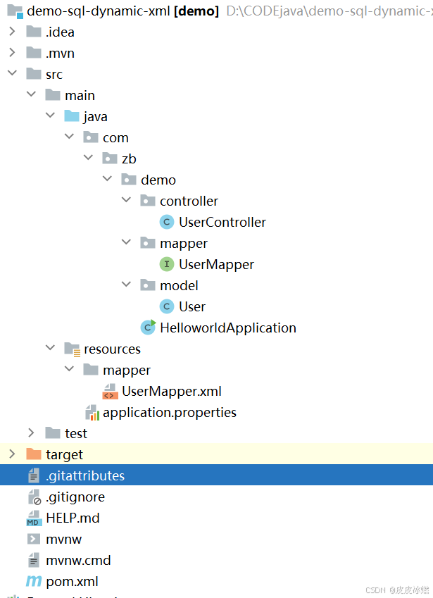
SpringBoot-17-MyBatis动态SQL标签之常用标签
文章目录 1 代码1.1 实体User.java1.2 接口UserMapper.java1.3 映射UserMapper.xml1.3.1 标签if1.3.2 标签if和where1.3.3 标签choose和when和otherwise1.4 UserController.java2 常用动态SQL标签2.1 标签set2.1.1 UserMapper.java2.1.2 UserMapper.xml2.1.3 UserController.ja…
wordpress后台更新后 前端没变化的解决方法
使用siteground主机的wordpress网站,会出现更新了网站内容和修改了php模板文件、js文件、css文件、图片文件后,网站没有变化的情况。
不熟悉siteground主机的新手,遇到这个问题,就很抓狂,明明是哪都没操作错误&#x…
网络编程(Modbus进阶)
思维导图 Modbus RTU(先学一点理论)
概念 Modbus RTU 是工业自动化领域 最广泛应用的串行通信协议,由 Modicon 公司(现施耐德电气)于 1979 年推出。它以 高效率、强健性、易实现的特点成为工业控制系统的通信标准。 包…
UE5 学习系列(二)用户操作界面及介绍
这篇博客是 UE5 学习系列博客的第二篇,在第一篇的基础上展开这篇内容。博客参考的 B 站视频资料和第一篇的链接如下:
【Note】:如果你已经完成安装等操作,可以只执行第一篇博客中 2. 新建一个空白游戏项目 章节操作,重…
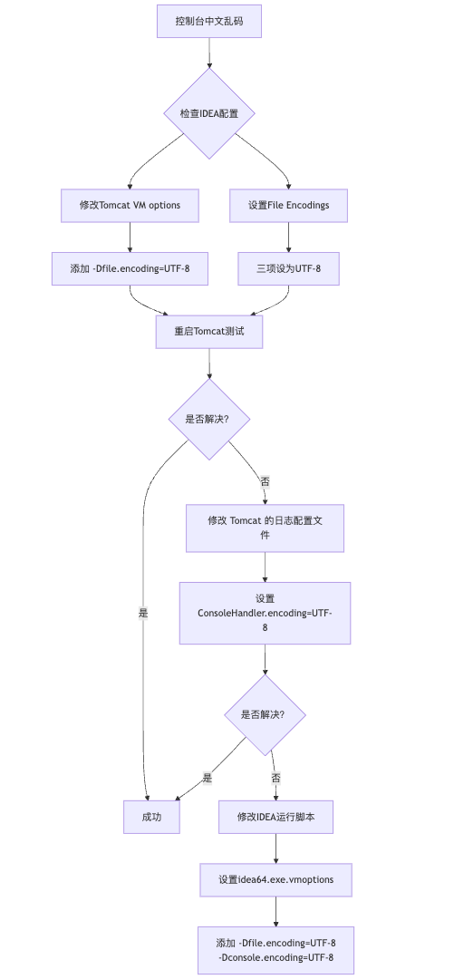
IDEA运行Tomcat出现乱码问题解决汇总
最近正值期末周,有很多同学在写期末Java web作业时,运行tomcat出现乱码问题,经过多次解决与研究,我做了如下整理:
原因:
IDEA本身编码与tomcat的编码与Windows编码不同导致,Windows 系统控制台…
利用最小二乘法找圆心和半径
#include <iostream>
#include <vector>
#include <cmath>
#include <Eigen/Dense> // 需安装Eigen库用于矩阵运算 // 定义点结构
struct Point { double x, y; Point(double x_, double y_) : x(x_), y(y_) {}
}; // 最小二乘法求圆心和半径 …
使用docker在3台服务器上搭建基于redis 6.x的一主两从三台均是哨兵模式
一、环境及版本说明
如果服务器已经安装了docker,则忽略此步骤,如果没有安装,则可以按照一下方式安装: 1. 在线安装(有互联网环境): 请看我这篇文章 传送阵>> 点我查看 2. 离线安装(内网环境):请看我这篇文章 传送阵>> 点我查看
说明:假设每台服务器已…
XML Group端口详解
在XML数据映射过程中,经常需要对数据进行分组聚合操作。例如,当处理包含多个物料明细的XML文件时,可能需要将相同物料号的明细归为一组,或对相同物料号的数量进行求和计算。传统实现方式通常需要编写脚本代码,增加了开…
LBE-LEX系列工业语音播放器|预警播报器|喇叭蜂鸣器的上位机配置操作说明
LBE-LEX系列工业语音播放器|预警播报器|喇叭蜂鸣器专为工业环境精心打造,完美适配AGV和无人叉车。同时,集成以太网与语音合成技术,为各类高级系统(如MES、调度系统、库位管理、立库等)提供高效便捷的语音交互体验。
L…
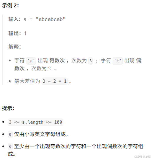
(LeetCode 每日一题) 3442. 奇偶频次间的最大差值 I (哈希、字符串)
题目:3442. 奇偶频次间的最大差值 I 思路 :哈希,时间复杂度0(n)。 用哈希表来记录每个字符串中字符的分布情况,哈希表这里用数组即可实现。
C版本:
class Solution {
public:int maxDifference(string s) {int a[26]…
【大模型RAG】拍照搜题技术架构速览:三层管道、两级检索、兜底大模型
摘要
拍照搜题系统采用“三层管道(多模态 OCR → 语义检索 → 答案渲染)、两级检索(倒排 BM25 向量 HNSW)并以大语言模型兜底”的整体框架: 多模态 OCR 层 将题目图片经过超分、去噪、倾斜校正后,分别用…
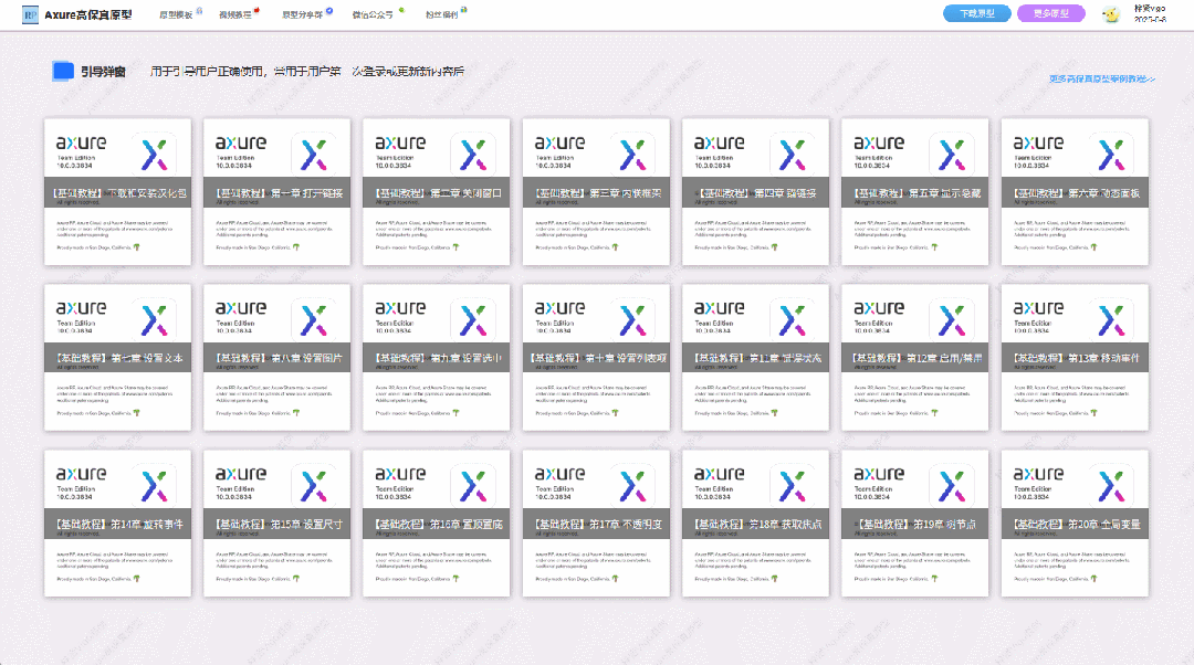
【Axure高保真原型】引导弹窗
今天和大家中分享引导弹窗的原型模板,载入页面后,会显示引导弹窗,适用于引导用户使用页面,点击完成后,会显示下一个引导弹窗,直至最后一个引导弹窗完成后进入首页。具体效果可以点击下方视频观看或打开下方…
接口测试中缓存处理策略
在接口测试中,缓存处理策略是一个关键环节,直接影响测试结果的准确性和可靠性。合理的缓存处理策略能够确保测试环境的一致性,避免因缓存数据导致的测试偏差。以下是接口测试中常见的缓存处理策略及其详细说明:
一、缓存处理的核…
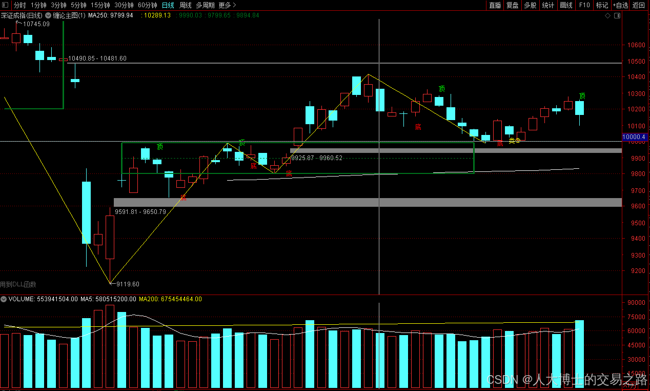
龙虎榜——20250610
上证指数放量收阴线,个股多数下跌,盘中受消息影响大幅波动。 深证指数放量收阴线形成顶分型,指数短线有调整的需求,大概需要一两天。 2025年6月10日龙虎榜行业方向分析 1. 金融科技
代表标的:御银股份、雄帝科技
驱动…
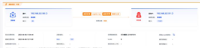
观成科技:隐蔽隧道工具Ligolo-ng加密流量分析
1.工具介绍
Ligolo-ng是一款由go编写的高效隧道工具,该工具基于TUN接口实现其功能,利用反向TCP/TLS连接建立一条隐蔽的通信信道,支持使用Let’s Encrypt自动生成证书。Ligolo-ng的通信隐蔽性体现在其支持多种连接方式,适应复杂网…
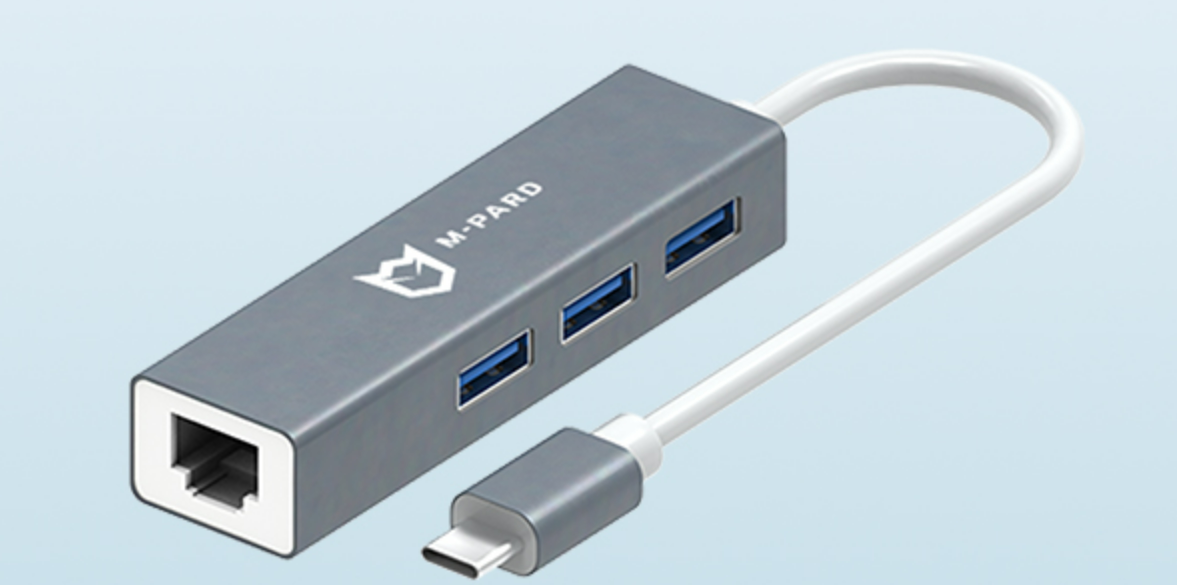
铭豹扩展坞 USB转网口 突然无法识别解决方法
当 USB 转网口扩展坞在一台笔记本上无法识别,但在其他电脑上正常工作时,问题通常出在笔记本自身或其与扩展坞的兼容性上。以下是系统化的定位思路和排查步骤,帮助你快速找到故障原因:
背景:
一个M-pard(铭豹)扩展坞的网卡突然无法识别了,扩展出来的三个USB接口正常。…
未来机器人的大脑:如何用神经网络模拟器实现更智能的决策?
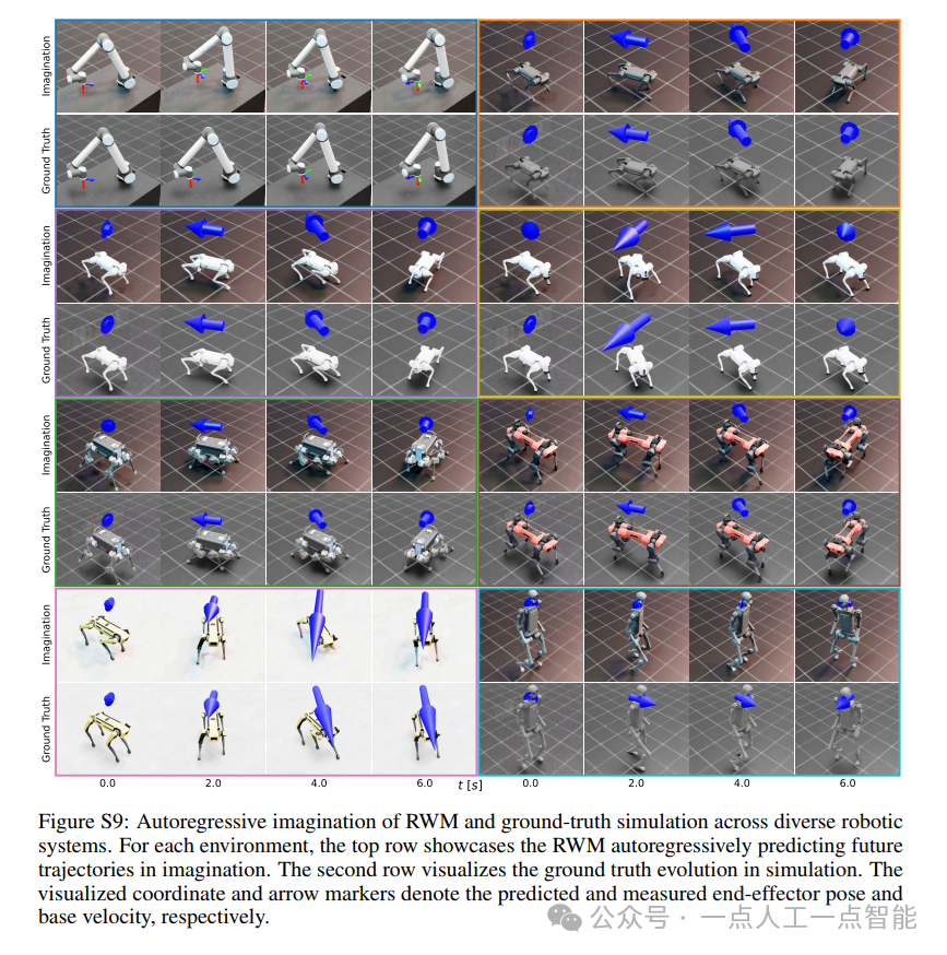
编辑:陈萍萍的公主一点人工一点智能 未来机器人的大脑:如何用神经网络模拟器实现更智能的决策?RWM通过双自回归机制有效解决了复合误差、部分可观测性和随机动力学等关键挑战,在不依赖领域特定归纳偏见的条件下实现了卓越的预测准…
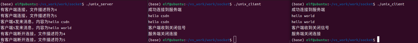
Linux应用开发之网络套接字编程(实例篇)
服务端与客户端单连接
服务端代码
#include <sys/socket.h>
#include <sys/types.h>
#include <netinet/in.h>
#include <stdio.h>
#include <stdlib.h>
#include <string.h>
#include <arpa/inet.h>
#include <pthread.h>
…

华为云AI开发平台ModelArts
华为云ModelArts:重塑AI开发流程的“智能引擎”与“创新加速器”!
在人工智能浪潮席卷全球的2025年,企业拥抱AI的意愿空前高涨,但技术门槛高、流程复杂、资源投入巨大的现实,却让许多创新构想止步于实验室。数据科学家…
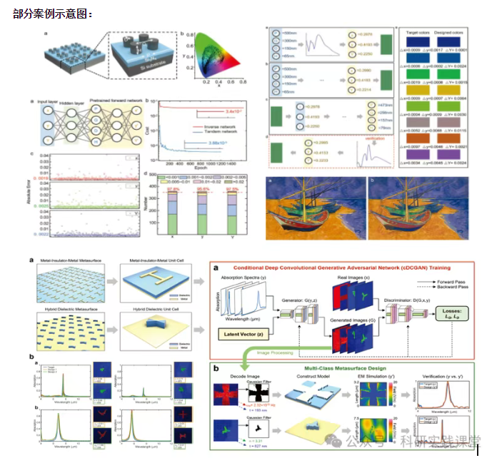
深度学习在微纳光子学中的应用
深度学习在微纳光子学中的主要应用方向
深度学习与微纳光子学的结合主要集中在以下几个方向:
逆向设计 通过神经网络快速预测微纳结构的光学响应,替代传统耗时的数值模拟方法。例如设计超表面、光子晶体等结构。
特征提取与优化 从复杂的光学数据中自…