目录
表格风格图
使用Seaborn函数绘图
设置图表风格
设置颜色主题
图表分面
绘图过程
使用绘图函数绘图
定义主题
分面1
分面2


【声明】:未经版权人书面许可,任何单位或个人不得以任何形式复制、发行、出租、改编、汇编、传播、展示或利用本博客的全部或部分内容,也不得在未经版权人授权的情况下将本博客用于任何商业目的。但版权人允许个人学习、研究、欣赏等非商业性用途的复制和传播。非常推荐大家学习《Python数据可视化科技图表绘制》这本书籍。
表格风格图
import matplotlib.pyplot as plt
import numpy as np
import matplotlib.colors as mcolors
from matplotlib.patches import Rectangle

np.random.seed(19781101)			# 固定随机种子,以便结果可复现

def plot_scatter(ax,prng,nb_samples=100):
    """绘制散点图"""
    for mu,sigma,marker in [(-.5,0.75,'o'),(0.75,1.,'s')]:
        x,y=prng.normal(loc=mu,scale=sigma,size=(2,nb_samples))
        ax.plot(x,y,ls='none',marker=marker)
    ax.set_xlabel('X-label')
    ax.set_title('Axes title')
    return ax

def plot_colored_lines(ax):
    """绘制颜色循环线条"""
    t=np.linspace(-10,10,100)
    def sigmoid(t,t0):
        return 1/(1+np.exp(-(t-t0)))
    nb_colors=len(plt.rcParams['axes.prop_cycle'])
    shifts=np.linspace(-5,5,nb_colors)
    amplitudes=np.linspace(1,1.5,nb_colors)
    for t0,a in zip(shifts,amplitudes):
        ax.plot(t,a*sigmoid(t,t0),'-')
    ax.set_xlim(-10,10)
    return ax

def plot_bar_graphs(ax,prng,min_value=5,max_value=25,nb_samples=5):
    """绘制两个并排的柱状图。"""
    x=np.arange(nb_samples)
    ya,yb=prng.randint(min_value,max_value,size=(2,nb_samples))
    width=0.25
    ax.bar(x,ya,width)
    ax.bar(x+width,yb,width,color='C2')
    ax.set_xticks(x+width,labels=['a','b','c','d','e'])
    return ax

def plot_colored_circles(ax,prng,nb_samples=15):
    """绘制彩色圆形。"""
    for sty_dict,j in zip(plt.rcParams['axes.prop_cycle'](),
						    range(nb_samples)):
        ax.add_patch(plt.Circle(prng.normal(scale=3,size=2),
						         radius=1.0,color=sty_dict['color']))
    ax.grid(visible=True)
  	# 添加标题以启用网格
    plt.title('ax.grid(True)',family='monospace',fontsize='small')
    ax.set_xlim([-4,8])
    ax.set_ylim([-5,6])
    ax.set_aspect('equal',adjustable='box')			# 绘制圆形
    return ax

def plot_image_and_patch(ax,prng,size=(20,20)):
    """绘制图像和圆形补丁。"""
    values=prng.random_sample(size=size)
    ax.imshow(values,interpolation='none')
    c=plt.Circle((5,5),radius=5,label='patch')
    ax.add_patch(c)
    # 移除刻度
    ax.set_xticks([])
    ax.set_yticks([])

def plot_histograms(ax,prng,nb_samples=10000):
    """绘制四个直方图和一个文本注释。"""
    params=((10,10),(4,12),(50,12),(6,55))
    for a,b in params:
        values=prng.beta(a,b,size=nb_samples)
        ax.hist(values,histtype="stepfilled",bins=30,
                alpha=0.8,density=True)
    # 添加小注释。
    ax.annotate('Annotation',xy=(0.25,4.25),
           xytext=(0.9,0.9),textcoords=ax.transAxes,
           va="top",ha="right",
           bbox=dict(boxstyle="round",alpha=0.2),
           arrowprops=dict(arrowstyle="->",
	               connectionstyle="angle,angleA=-95,angleB=35,rad=10"),)
    return ax

def plot_figure(style_label=""):
    """设置并绘制具有给定样式的演示图。"""
    # 在不同的图之间使用专用的RandomState实例绘制相同的“随机”值
    prng=np.random.RandomState(96917002)
    # 创建具有特定样式的图和子图
    fig,axs=plt.subplots(ncols=6,nrows=1,num=style_label,
                 figsize=(14.8,2.8),layout='constrained')

    # 添加统一的标题,标题颜色与背景颜色相匹配
    background_color=mcolors.rgb_to_hsv(
        mcolors.to_rgb(plt.rcParams['figure.facecolor']))[2]
    if background_color<0.5:
        title_color=[0.8,0.8,1]
    else:
        title_color=np.array([19,6,84])/256
    fig.suptitle(style_label,x=0.01,ha='left',color=title_color,
                 fontsize=14,fontfamily='DejaVu Sans',fontweight='normal')
    plot_scatter(axs[0],prng)
    plot_image_and_patch(axs[1],prng)
    plot_bar_graphs(axs[2],prng)
    plot_colored_lines(axs[3])
    plot_histograms(axs[4],prng)
    plot_colored_circles(axs[5],prng)
  	# 添加分隔线
    rec=Rectangle((1+0.025,-2),0.05,16,
                    clip_on=False,color='gray')
    axs[4].add_artist(rec)

# 保存图片
    plt.savefig(f'{style_label}.png', dpi=600)
    plt.close(fig)  # 关闭当前图形以避免内存占用过多

if __name__=="__main__":
  	# 获取所有可用的样式列表,按字母顺序排列
    style_list=['default','classic']+sorted(
        style for style in plt.style.available
        if style !='classic' and not style.startswith('_'))

    # 绘制每种样式的演示图
    for style_label in style_list:
        with plt.rc_context({"figure.max_open_warning":len(style_list)}):
            with plt.style.context(style_label):
                plot_figure(style_label=style_label)
    plt.show()

使用Seaborn函数绘图
import seaborn as sns
import matplotlib.pyplot as plt

# 加载数据集
iris=sns.load_dataset("iris",data_home='seaborn-data',cache=True)
tips=sns.load_dataset("tips",data_home='seaborn-data',cache=True)
car_crashes=sns.load_dataset("car_crashes",data_home='seaborn-data',cache=True)
penguins=sns.load_dataset("penguins",data_home='seaborn-data',cache=True)
diamonds=sns.load_dataset("diamonds",data_home='seaborn-data',cache=True)

plt.figure(figsize=(15,8))				# 设置画布
# 第1幅图:iris数据集的散点图
plt.subplot(2,3,1)
sns.scatterplot(x="sepal_length",y="sepal_width",hue="species",
                   data=iris)
plt.title("Iris scatterplot")

# 第2幅图:tips 数据集的箱线图
plt.subplot(2,3,2)
tips=sns.load_dataset("tips",data_home='seaborn-data',cache=True)
sns.boxplot(x="day",y="total_bill",hue="smoker",data=tips)
plt.title("Tips boxplot")

# 第3幅图:tips 数据集的小提琴图
plt.subplot(2,3,3)
sns.violinplot(x="day",y="total_bill",hue="smoker",data=tips)
plt.title("Tips violinplot")

# 第4幅图:car_crashes 数据集的直方图
plt.subplot(2,3,4)
sns.histplot(car_crashes['total'],bins=20)
plt.title("Car Crashes histplot")

# 第5幅图:penguins 数据集的点图
plt.subplot(2,3,5)
sns.pointplot(x="island",y="bill_length_mm",hue="species",data=penguins)
plt.title("Penguins pointplot")

# 第6幅图:diamonds 数据集的计数图
plt.subplot(2,3,6)
sns.countplot(x="cut",data=diamonds)
plt.title("Diamonds countplot")

plt.tight_layout()

# 保存图片
plt.savefig('P75使用Seaborn函数绘图.png', dpi=600, transparent=True)
plt.show()
设置图表风格
import seaborn as sns
import matplotlib.pyplot as plt

sns.set_style("darkgrid")			# 设置图表风格为 darkgrid
iris=sns.load_dataset("iris")		# 加载 iris 数据集

# 绘制花瓣长度与宽度的散点图
sns.scatterplot(x="petal_length",y="petal_width",
                   hue="species",data=iris)
plt.title("Scatter Plot of Petal Length vs Petal Width")

# 保存图片
plt.savefig('P77设置图表风格.png', dpi=600, transparent=True)
plt.show()
设置颜色主题
import seaborn as sns
import matplotlib.pyplot as plt

sns.set_palette("deep")				# 设置颜色主题为deep
tips=sns.load_dataset("tips")		# 加载 tips 数据集

# 绘制小费金额的小提琴图,按照就餐日期和吸烟者区分颜色
sns.violinplot(x="day",y="total_bill",hue="smoker",data=tips)
plt.title("Tips violinplot")		# 设置图表标题

# 保存图片
plt.savefig('P78设置颜色主题.png', dpi=600, transparent=True)
plt.show()
图表分面
import seaborn as sns
import matplotlib.pyplot as plt

iris=sns.load_dataset("iris")			# 加载iris数据集

# 创建 FacetGrid 对象,按照种类('species')进行分面
g=sns.FacetGrid(iris,col="species",margin_titles=True)
# 在每个子图中绘制花萼长度与花萼宽度的散点图
g.map(sns.scatterplot,"sepal_length","sepal_width")
g.set_axis_labels("Sepal Length","Sepal Width")		# 设置子图标题

# 保存图片
plt.savefig('P80图表分面.png', dpi=600, transparent=True)
plt.show()
绘图过程
from plotnine import *
import seaborn as sns
import warnings

# 忽略 PlotnineWarning
warnings.filterwarnings("ignore", category=UserWarning, module="plotnine")

# 加载数据集
penguins = sns.load_dataset("penguins", data_home='seaborn-data', cache=True)

# 检查并处理缺失值
penguins = penguins.dropna()

# 创建画布和导入数据
p = ggplot(penguins, aes(x='bill_length_mm', y='bill_depth_mm', color='species'))

# 添加几何对象图层-散点图,并进行美化
p = p + geom_point(size=3, alpha=0.7)

# 设置标度
p = p + scale_x_continuous(name='Length (mm)')
p = p + scale_y_continuous(name='Depth (mm)')

# 设置主题和其他参数
p = p + theme(legend_position='top', figure_size=(6, 4))

# 保存绘图
ggsave(p, filename="P82绘图过程.png", width=6, height=4, dpi=600)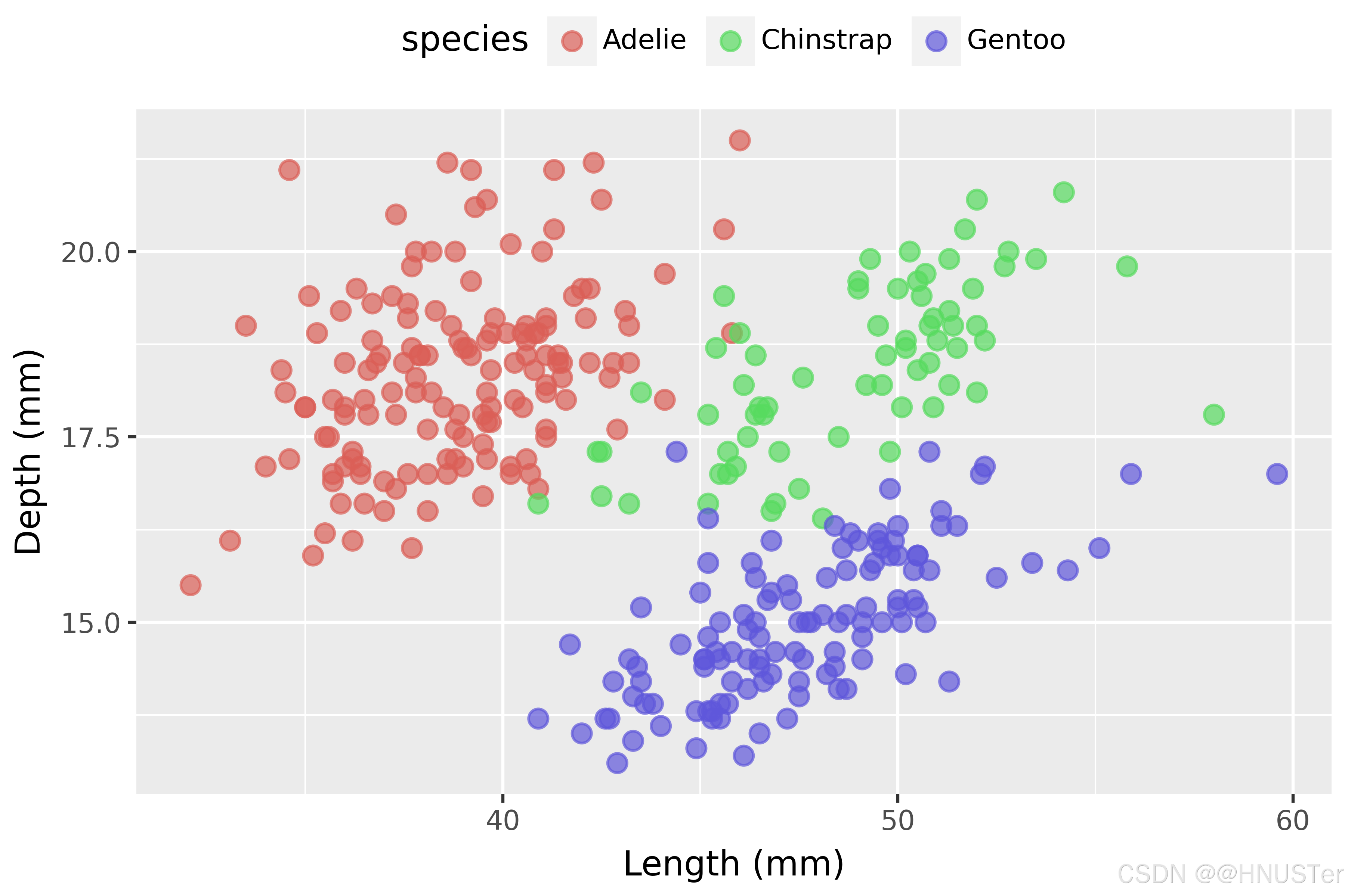
使用绘图函数绘图
import warnings
from plotnine import *
from plotnine.data import *
# 忽略 PlotnineWarning
warnings.filterwarnings("ignore", category=UserWarning, module="plotnine")
# 散点图-mpg 数据集
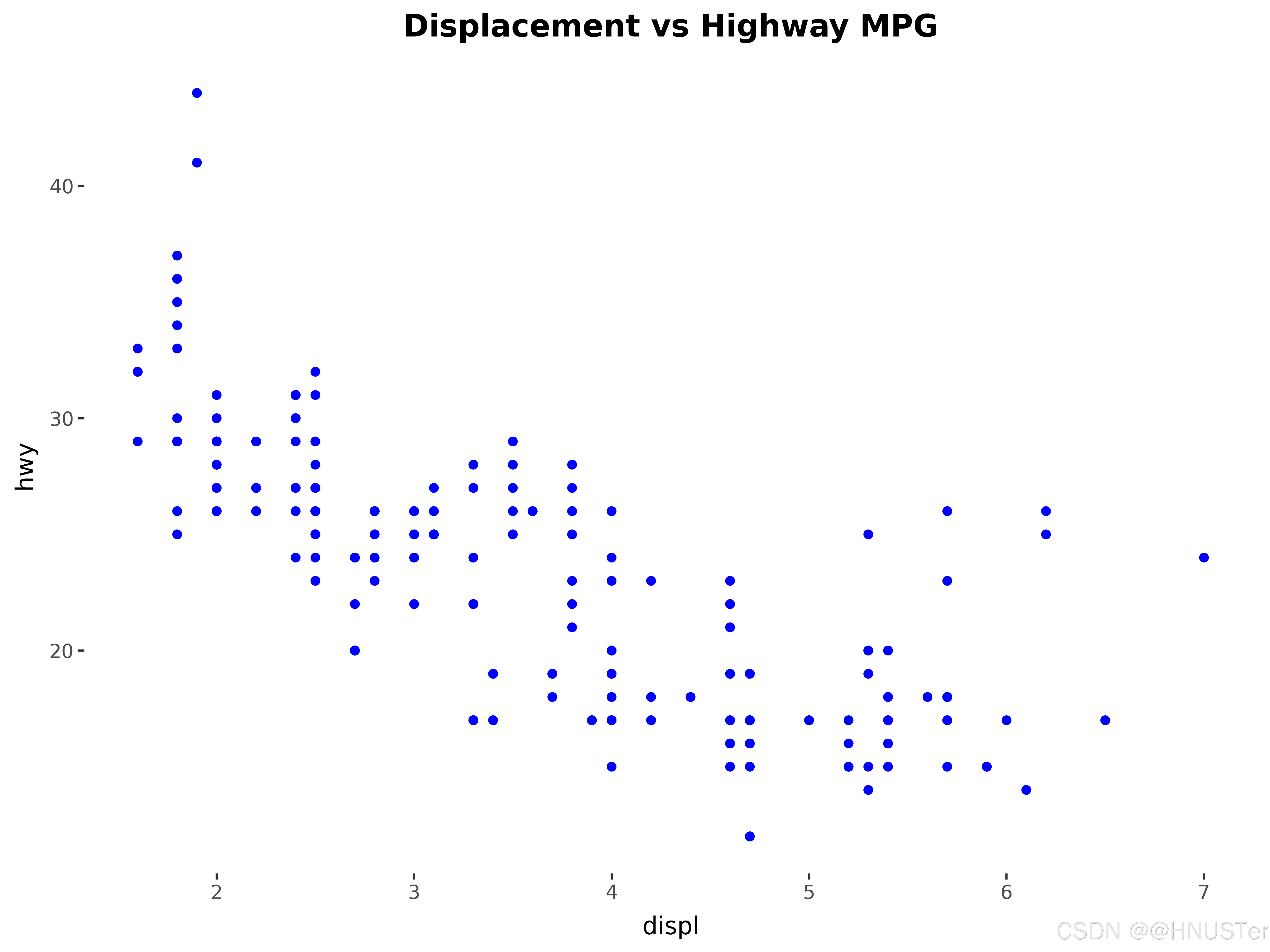
p1 = (ggplot(mpg) +
aes(x='displ', y='hwy') +
geom_point(color='blue') +
labs(title='Displacement vs Highway MPG') +
theme(plot_title=element_text(size=14, face='bold')))
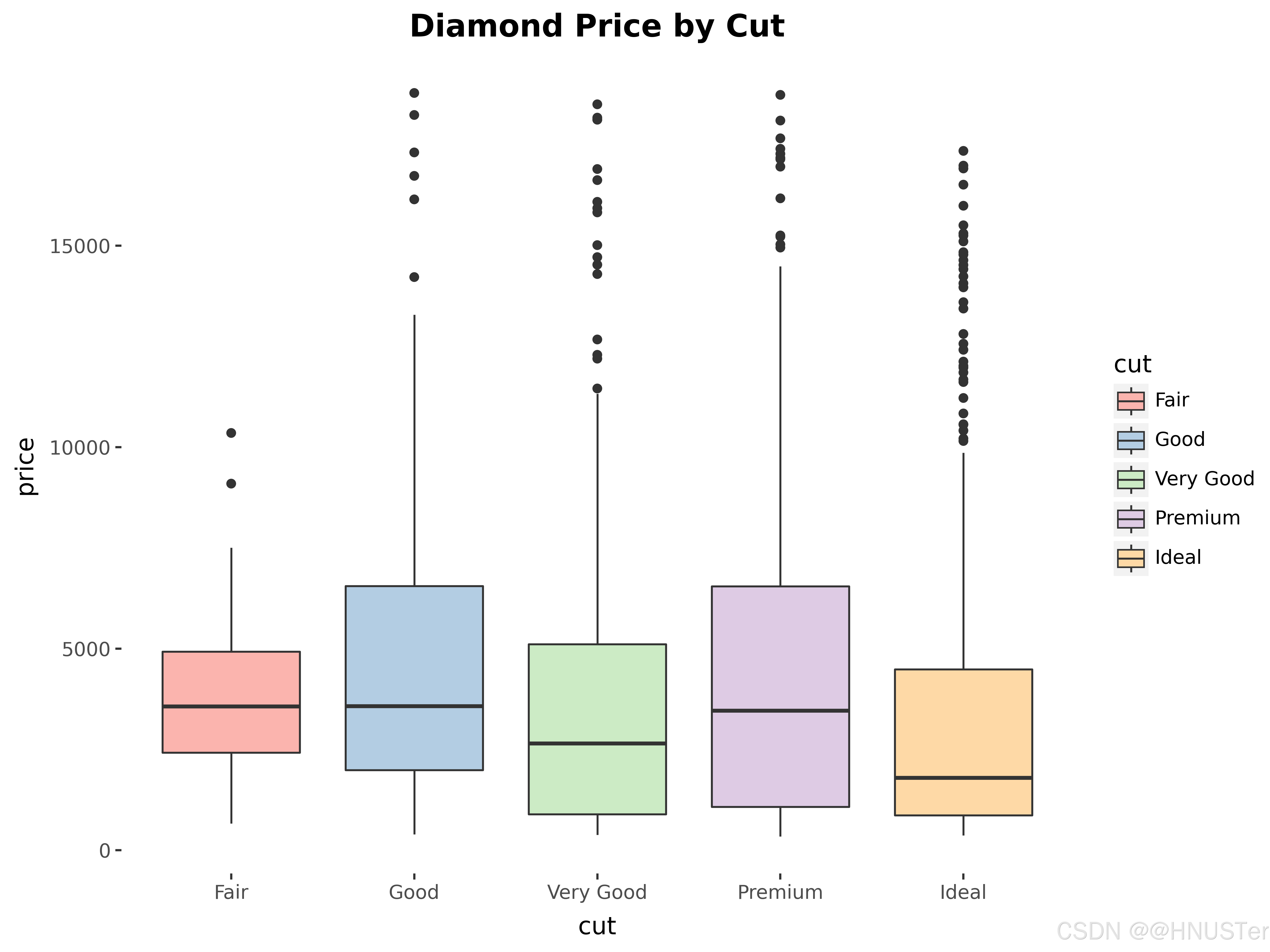
# 箱线图-diamonds 数据集
p2 = (ggplot(diamonds.sample(1000)) +
aes(x='cut', y='price', fill='cut') +
geom_boxplot() +
labs(title='Diamond Price by Cut') +
scale_fill_brewer(type='qual', palette='Pastel1') +
theme(plot_title=element_text(size=14, face='bold')))
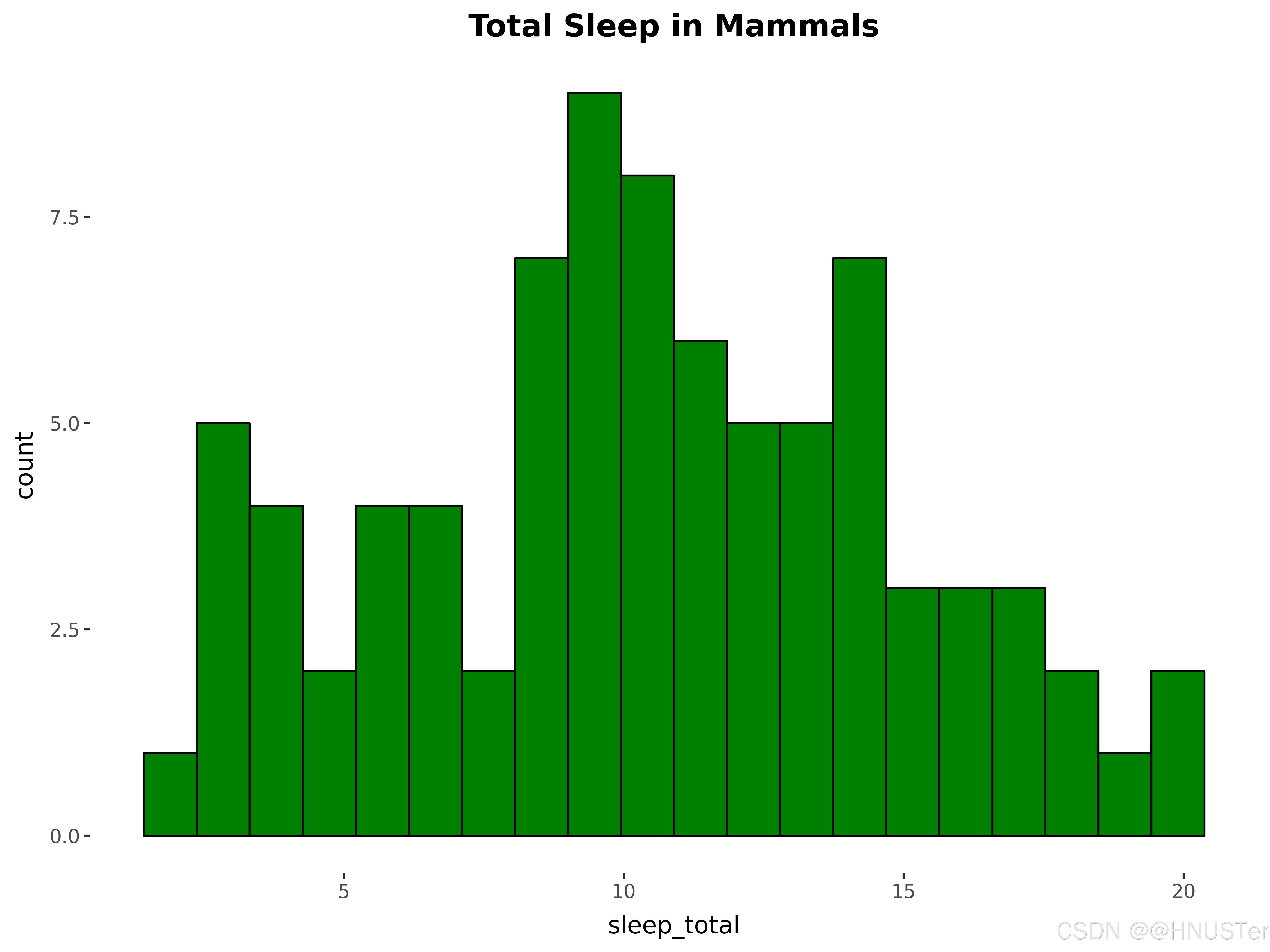
# 直方图-msleep 数据集
p3 = (ggplot(msleep) +
aes(x='sleep_total') +
geom_histogram(bins=20, fill='green', color='black') +
labs(title='Total Sleep in Mammals') +
theme(plot_title=element_text(size=14, face='bold')))
# 线图-economics 数据集
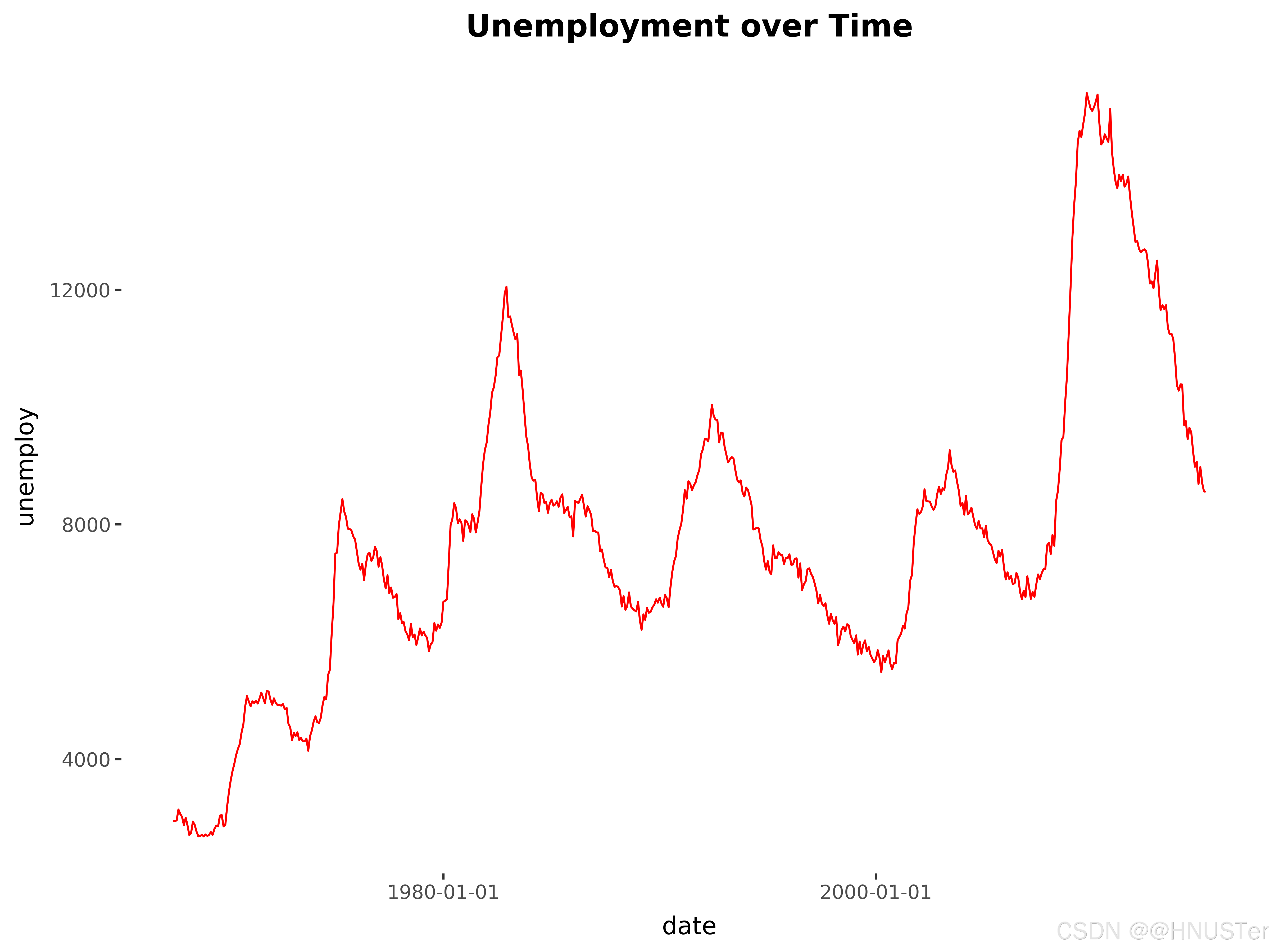
p4 = (ggplot(economics) +
aes(x='date', y='unemploy') +
geom_line(color='red') +
labs(title='Unemployment over Time') +
theme(plot_title=element_text(size=14, face='bold')))
# 条形图-presidential 数据集
presidential['duration'] = (presidential['end'] - presidential['start']).dt.days
p5 = (ggplot(presidential) +
aes(x='name', y='duration', fill='name') +
geom_bar(stat='identity') +
labs(title='Presidential Terms Duration') +
scale_fill_hue(s=0.90, l=0.65) +
theme(axis_text_x=element_text(rotation=90, hjust=1),
plot_title=element_text(size=14, face='bold')))
# 折线图-midwest 数据集
p6 = (ggplot(midwest) +
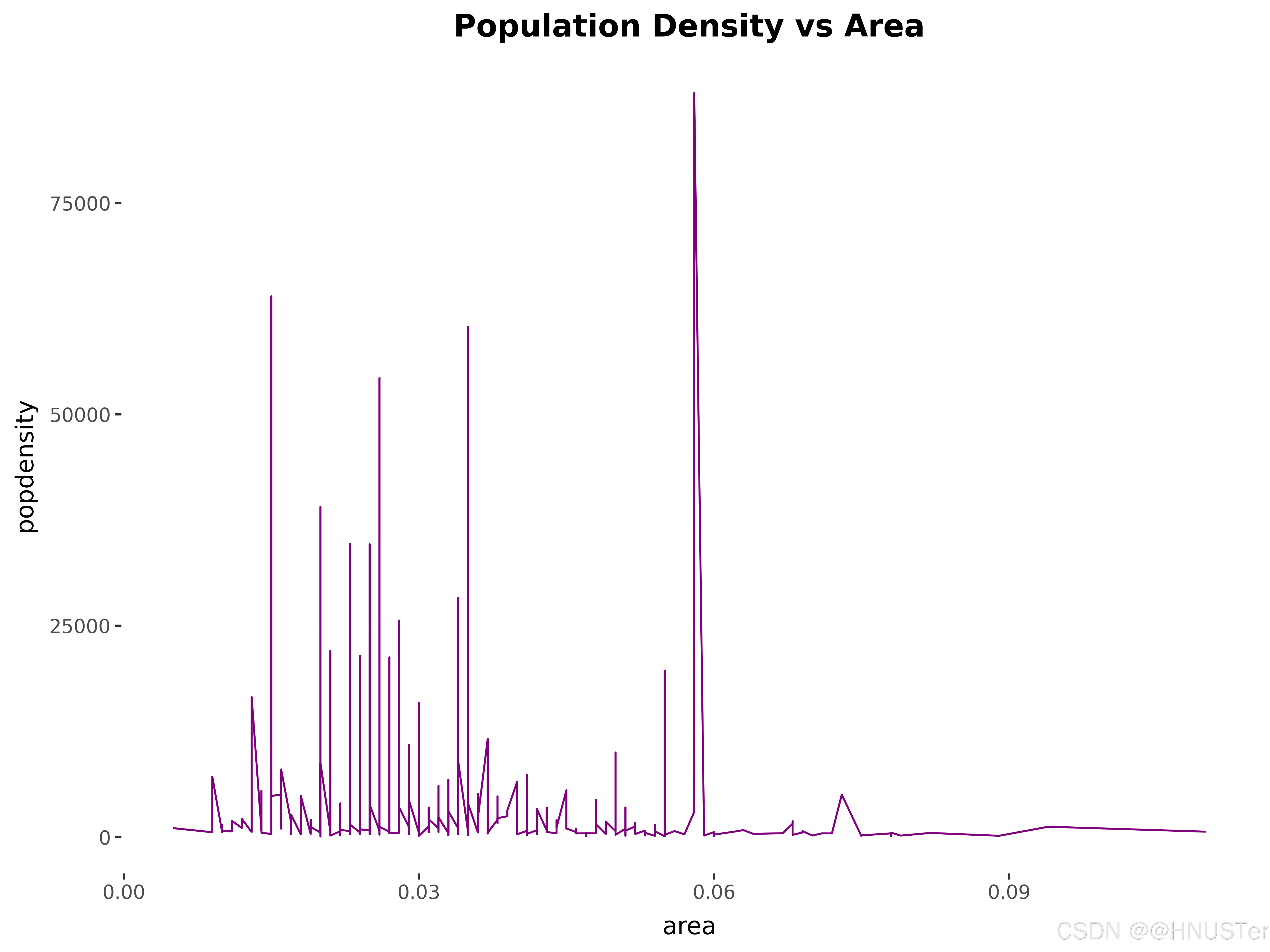
aes(x='area', y='popdensity') +
geom_line(color='purple') +
labs(title='Population Density vs Area') +
theme(plot_title=element_text(size=14, face='bold')))
# 保存图片
plots = [p1, p2, p3, p4, p5, p6]
plot_names = ['scatter_plot', 'boxplot', 'histogram', 'line_plot', 'bar_plot', 'line_chart']
for plot, name in zip(plots, plot_names):
plot.save(f'P85使用绘图函数绘图_{name}.png', width=8, height=6, dpi=600, transparent=True)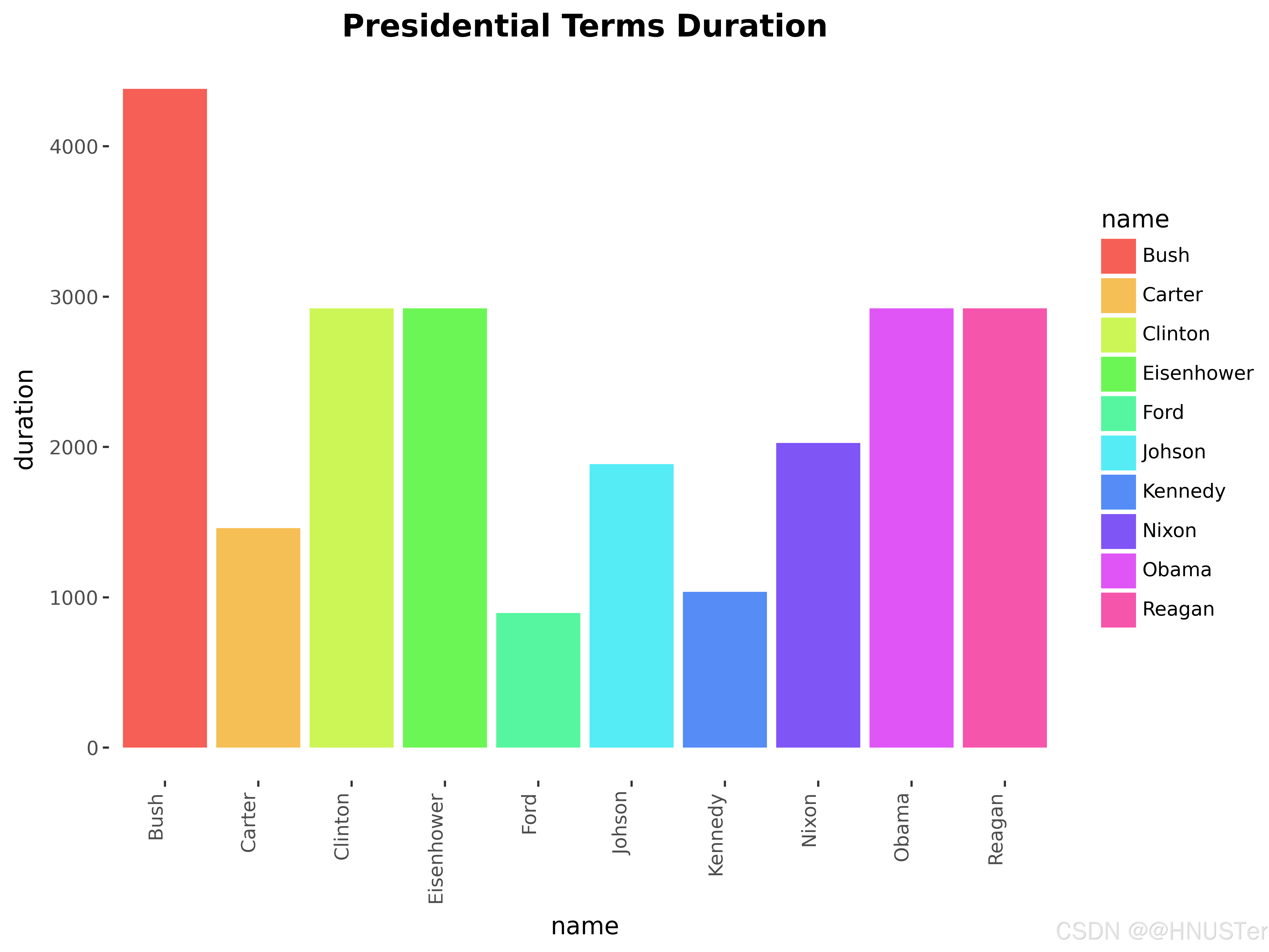
定义主题
from plotnine import *
from plotnine.data import mpg

# 创建散点图
p = (ggplot(mpg, aes(x='displ', y='hwy', color='displ')) +
     geom_point() +  # 添加点图层
     scale_color_gradient(low='blue', high='red') +  # 设置颜色渐变
     labs(title='Engine Displacement vs. Highway MPG',  # 设置图表标题
          x='Engine Displacement (L)',  # 设置x轴标题
          y='Miles per Gallon (Highway)') +  # 设置y轴标题
     theme_minimal() +  # 使用最小主题
     theme(axis_text_x=element_text(angle=45, hjust=1),  # 自定义x轴文字样式
           axis_text_y=element_text(color='darkgrey'),  # 自定义y轴文字样式
           plot_background=element_rect(fill='whitesmoke'),  # 自定义图表背景色
           panel_background=element_rect(fill='white', color='black', size=0.5),  # 自定义面板背景和边框
           panel_grid_major=element_line(color='lightgrey'),  # 自定义主要网格线颜色
           panel_grid_minor=element_line(color='lightgrey', linestyle='--'),  # 自定义次要网格线样式
           legend_position='right',  # 设置图例位置
           figure_size=(8, 6)))  # 设置图形大小

# 保存图片
p.save('P88定义主题.png', dpi=600, transparent=True)

# 显示图形
print(p)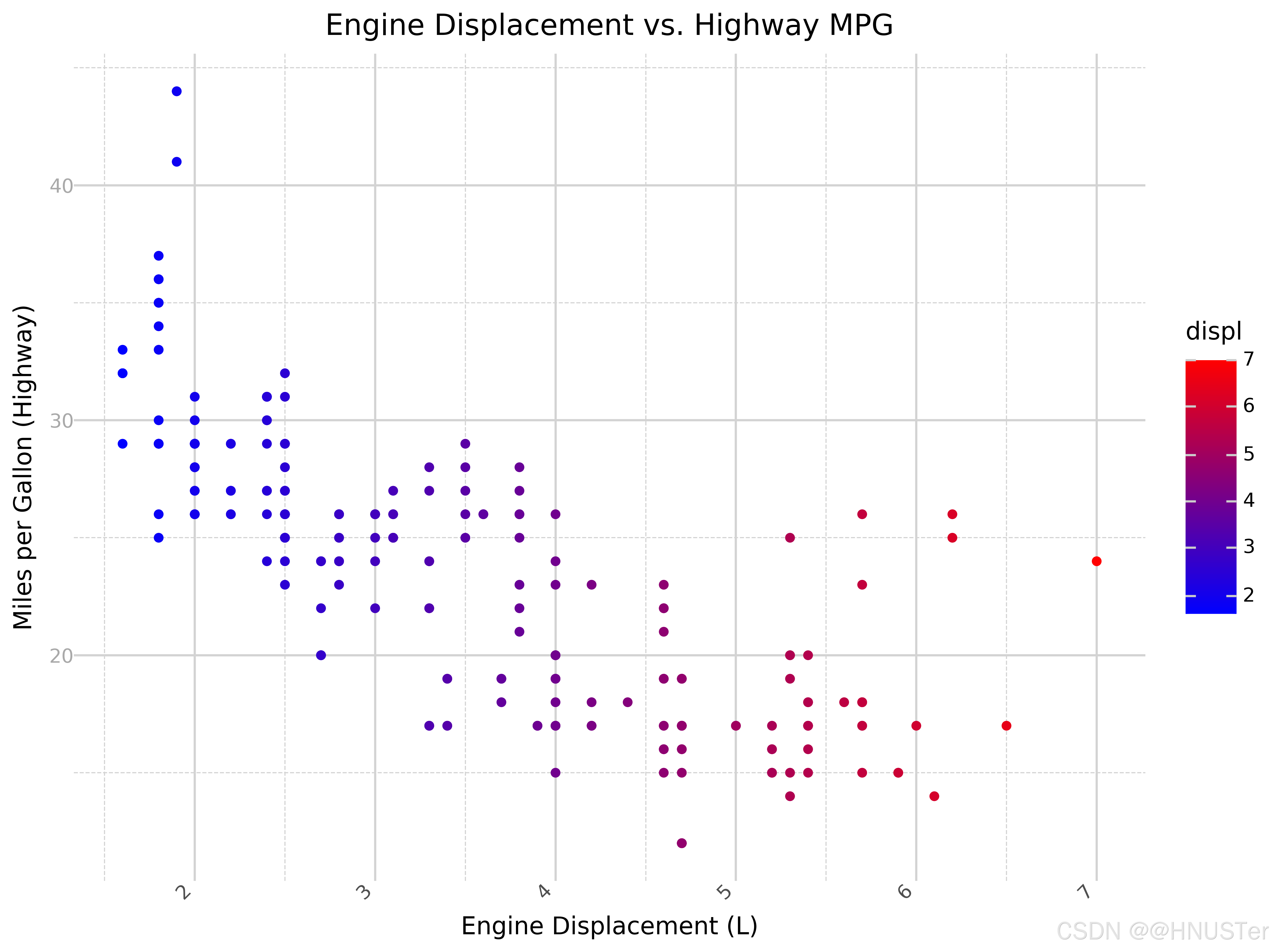
分面1
from plotnine import *
from plotnine.data import mpg

# 创建散点图并按照`class`变量进行分面,添加颜色渐变
p = (ggplot(mpg, aes(x='displ', y='hwy', color='displ')) +
     geom_point() +
     scale_color_gradient(low='blue', high='orange') +  # 添加颜色渐变
     facet_wrap('~class') +  # 按照汽车类型分面
     labs(title='Engine Displacement vs. Highway MPG by Vehicle Class',
          x='Engine Displacement (L)',
          y='Miles per Gallon (Highway)'))

# 保存图片
p.save('P89分面1.png', dpi=600, transparent=True)

# 显示图片
p.draw()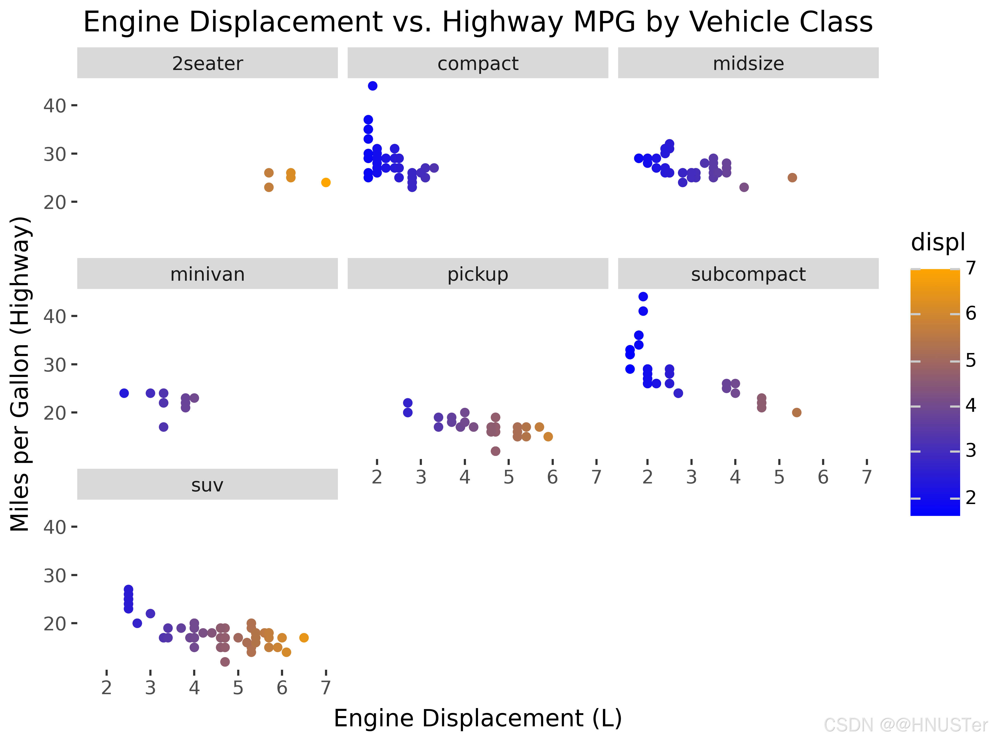
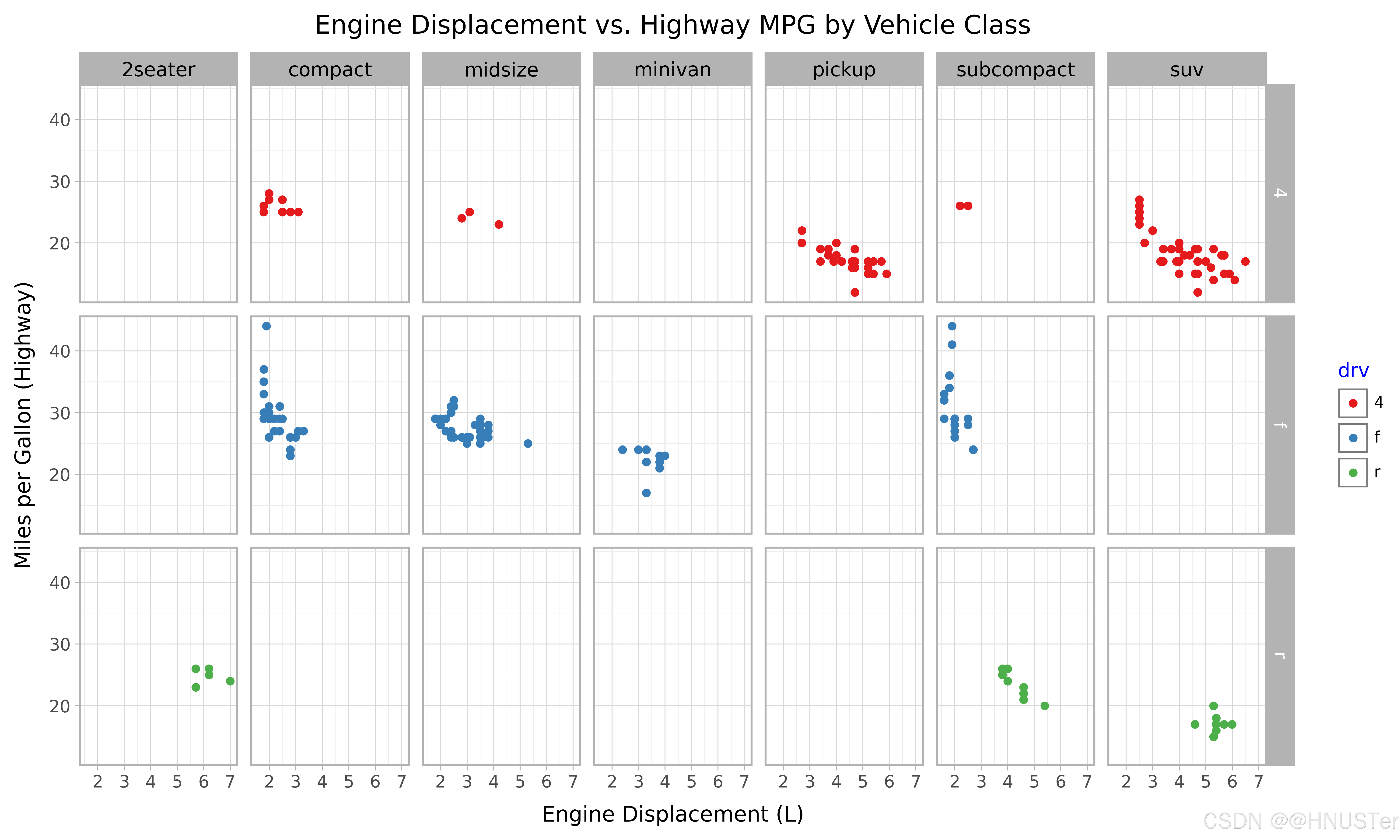
分面2
from plotnine import *
from plotnine.data import mpg

# 创建散点图并按照class变量进行分面,根据drv变量映射颜色
p=(ggplot(mpg,aes(x='displ',y='hwy',color='drv'))+
     geom_point()+						# 添加点图层
     scale_color_brewer(type='qual',palette='Set1')+	# 使用定性的颜色方案
     facet_grid('drv ~ class')+			# 行是驱动类型,列是汽车类型
     labs(title='Engine Displacement vs. Highway MPG by Vehicle Class',
          x='Engine Displacement (L)',
          y='Miles per Gallon (Highway)')+
     theme_light()+ 						# 使用亮色主题
     theme(figure_size=(10,6),			# 调整图形大小
           strip_text_x=element_text(size=10,color='black',angle=0),
						            			# 自定义分面标签的样式
           legend_title=element_text(color='blue',size=10),
						            			# 自定义图例标题的样式
           legend_text=element_text(size=8),		# 自定义图例文本的样式
           legend_position='right'))	# 调整图例位置

# 保存图片
p.save('P90分面2.png', dpi=600, transparent=True)

# 显示图片
p.draw()