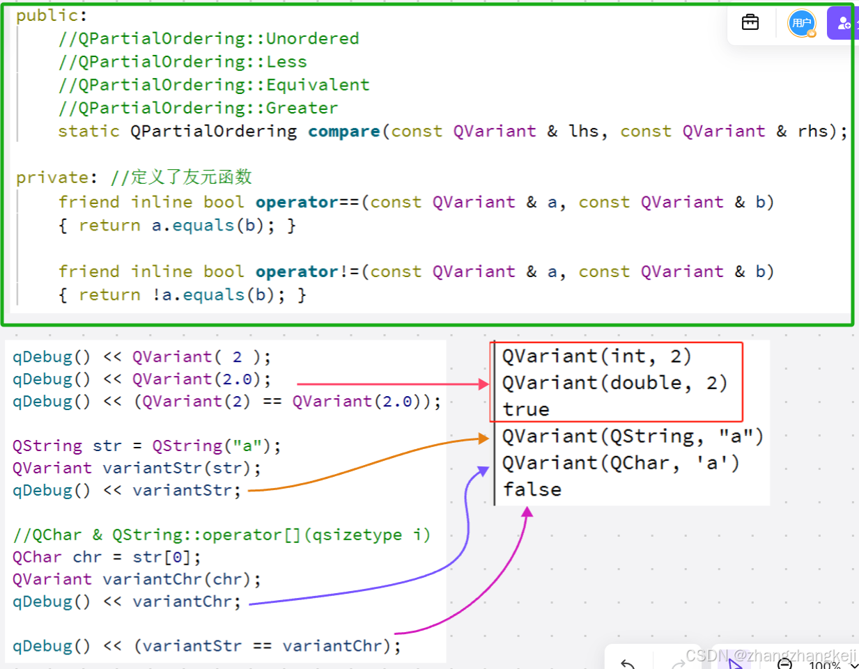
一、定位的定义
定位(Positioning)是CSS中用于控制元素在网页中的具体位置的一种机制。通过定位,可以将元素放置在页面的任意位置,并控制其与其他元素的层叠关系。
二、定位的特点与作用
-
自由摆放位置:
允许元素摆放在网页的任意位置,不受标准流或Flex布局的限制。 -
解决层叠问题:
定位后的元素层级较高,可以覆盖在其他未定位的元素之上。 -
固定位置显示:
可以让元素始终固定在浏览器窗口的某个位置,不随页面滚动而移动。
三、常用的定位类型
3.1、不同定位总视图
| 定位类型 | 属性值 | 参照物 | 是否脱标 | 显示模式变化 | 常见用途示例 |
|---|---|---|---|---|---|
| 相对定位 | relative | 元素自身原来的位置 | 否 | 无 | 微调元素位置,作为绝对定位的祖先容器 |
| 绝对定位 | absolute | 最近已定位的祖先元素或视口 | 是 | 类似 inline-block | 精确定位子元素,实现弹出菜单等效果 |
| 固定定位 | fixed | 浏览器视口 | 是 | 类似 inline-block | 固定导航栏、返回顶部按钮等 |
3.2、相对定位
<!DOCTYPE html>
<html lang="en">
<head>
  <meta charset="UTF-8" />
  <meta name="viewport" content="width=device-width, initial-scale=1.0"/>
  <title>相对定位示例</title>
  <style>
    /* 相对定位:1、相对与自身原来的位置 2、相对定位不会脱标 */
    .box1 {
      width: 200px;
      height: 200px;
      background-color: lightblue;
      position: relative; /* 启用相对定位 */
      top: 50px;
      left: 100px;
    }
    .box2{
        width: 200px;
        height: 200px;
        background-color: lightblue;
        position: relative; /* 启用相对定位 */
        left: 200px;
    }
  </style>
</head>
<body>
        <div class="box1">相对定位的盒子1</div>
        <div class="box2">相对定位的盒子2</div>
</body>
</html>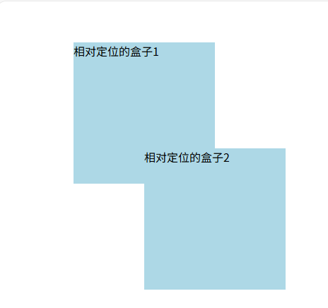
相对定位特点:
1、相对与自身原来的位置
2、相对定位不会脱标
3.3、绝对定位
父容器没有定位时:
<!DOCTYPE html>
<html lang="en">
<head>
  <meta charset="UTF-8" />
  <meta name="viewport" content="width=device-width, initial-scale=1.0"/>
  <title>绝对定位示例</title>
  <style>
    /* 绝对定位:1、相对与父容器的定位(当父容器中没有其他定位的时候,父容器有定位时以有定位的父容器作为参照物)
                2、不会脱标 */
    .parent {
      width: 500px;
      height: 500px;
      background-color: #95d349;
      position: relative; /* 父容器使用相对定位 */
      margin: 100px auto;
    }

    .child1 {
      width: 200px;
      height: 200px;
      background-color: lightcoral;
      position: absolute; /* 子元素使用绝对定位 */
      top: 50px;
      left: 50px;
    }
    .child2 {
      width: 200px;
      height: 200px;
      background-color: lightcoral;
      position: absolute; /* 子元素使用绝对定位 */
      top: 100px;
      left: 100px;
    }
  </style>
</head>
<body>
  <div class="parent">
    <div class="child1">绝对定位的子盒子1</div>
    <div class="child2">绝对定位的子盒子2</div>
  </div>
</body>
</html>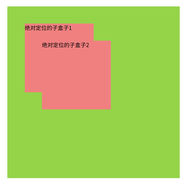
父容器有定位的时(子绝父相):
<!DOCTYPE html>
<html lang="en">
<head>
  <meta charset="UTF-8">
  <meta http-equiv="X-UA-Compatible" content="IE=edge">
  <meta name="viewport" content="width=device-width, initial-scale=1.0">
  <title>绝对定位(子绝父相)</title>
  <style>
    * {
      margin: 0;
      padding: 0;
    }

    img {
      width: 400px;
    }
    .news {
      position: relative;
      border: 1px solid #000000;
      margin: 100px auto;
      width: 400px;
      height: 350px;
      background-color: #f8f8f8;
    }

    /*
      1. 脱标,不占位
      2. 参照物:先找最近的已经定位的祖先元素;如果所有祖先元素都没有定位,参照浏览器可视区改位置
      3. 显示模式特点改变:宽高生效(具备了行内块的特点)
    */

    .news span {
      position: absolute;
      top: 0;
      right: 0;
      /* display: block; */
      width: 92px;
      height: 32px;
      background-color: rgba(0,0,0,0.6);
      text-align: center;
      line-height: 32px;
      color: #fff;
    }
  </style>
</head>
<body>
  <div class="news">
    <img src="./images/news.jpg" alt="">
    <span>展会活动</span>
    <h4>2222世界移动大会</h4>
  </div>
</body>
</html> 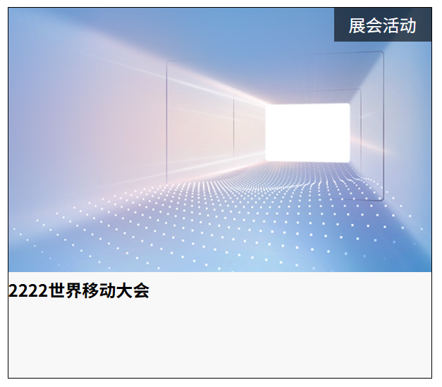
绝对定位特点:
1. 脱标,不占位
2. 参照物:先找最近的已经定位的祖先元素;如果所有祖先元素都没有定位,参照浏览器可视区改位置
3. 显示模式特点改变:宽高生效(具备了行内块的特点)
3.4、固定定位
<!DOCTYPE html>
<html lang="en">
<head>
<meta charset="UTF-8" />
<meta name="viewport" content="width=device-width, initial-scale=1.0"/>
<title>固定定位示例</title>
<style>
body {
height: 2000px; /* 让页面可以滚动 */
}
.fixed-nav {
width: 100%;
height: 60px;
background-color: #333;
color: white;
text-align: center;
line-height: 60px;
position: fixed; /* 固定定位 */
top: 0;
left: 0;
z-index: 1000; /* 保证在其他内容之上 */
}
</style>
</head>
<body>
<div class="fixed-nav">我是固定导航栏</div>
<p style="margin-top: 80px;">向下滚动看看效果吧...</p>
</body>
</html>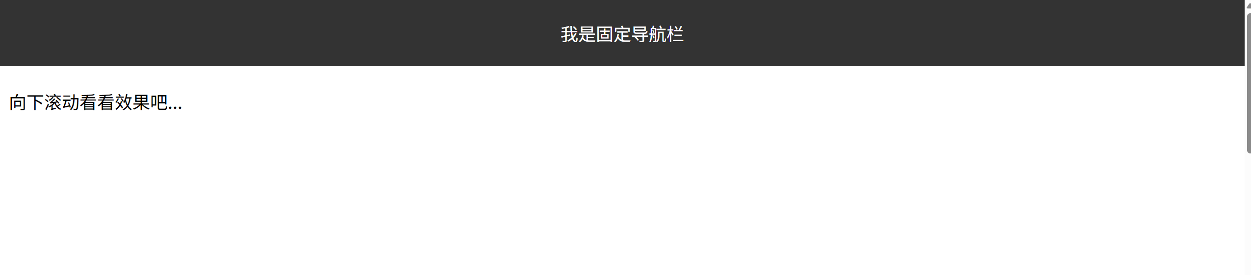 四、定位居中
<!DOCTYPE html>
<html lang="en">
<head>
    <meta charset="UTF-8">
    <meta name="viewport" content="width=device-width, initial-scale=1.0">
    <title>58-定位居中</title>
    <style>
        img {
            /* 1、绝对定位 */
            position: absolute;
            /* 2、水平、垂直边偏移为50% */
            top: 50%;
            left: 50%;
            /* 3、子级向左、上移动自身尺寸的一半 */
            /* margin-top: -127px;
            margin-left: -265px; */
            /* 更方便,此时的50%就是自己宽度的一半 */
            transform: translate(-50%, -50%);
        }
    </style>
</head>
<body>
    <img src="./images/login.webp" alt="">
</body>
</html> 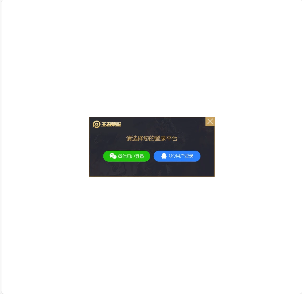
transform: translate(-50%, -50%);能够快速设置设置元素的居中。
五、z-index堆叠层级
<!DOCTYPE html>
<html lang="en">
<head>
    <meta charset="UTF-8">
    <meta name="viewport" content="width=device-width, initial-scale=1.0">
    <title>堆叠层级</title>
    <style>
        /* 定位的层叠属性默认为后来者居上,想要改变的话可以添加z-index属性值改变 */
        div{
            position: absolute;
            width: 200px;
            height: 200px;
        }
        .box1{
            background-color:pink;
            /* 取值是整数,默认是0,取值越大显示顺序越靠上 */
            z-index:1

        }
        .box2{
            z-index: 0;
            background-color: skyblue;
            left:100px;
            top:100px;
        }
        .box3{
            z-index: 2;
            background-color: yellow;
            left:200px;
            top:200px;
        }
    </style>
</head>
<body>
    <div class="box1">div1</div>
    <div class="box2">div2</div>
    <div class="box3">div3</div>
</body>
</html>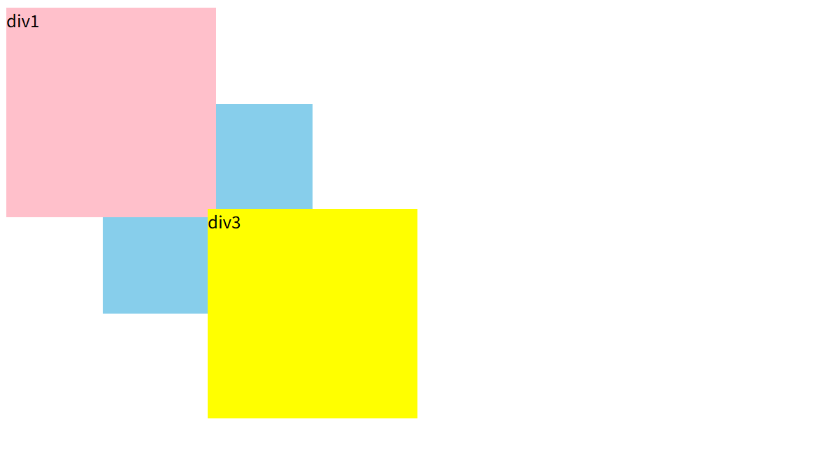
六、总结
常用定位:
| 定位类型 | 属性值 | 参照物 | 是否脱标 | 显示模式变化 | 常见用途示例 |
|---|---|---|---|---|---|
| 相对定位 | relative | 元素自身原来的位置 | 否 | 无 | 微调元素位置,作为绝对定位的祖先容器 |
| 绝对定位(子绝父相) | absolute | 最近已定位的祖先元素或添加了定位的视口 | 是 | 类似 inline-block | 精确定位子元素,实现弹出菜单等效果 |
| 固定定位 | fixed | 浏览器视口 | 是 | 类似 inline-block | 固定导航栏、返回顶部按钮等 |
定位居中:
transform: translate(-50%, -50%);
z-index堆叠层级:
取值是整数,默认是0,取值越大显示顺序越靠上


