AppBar介绍
AppBar是基于Material Design设计风格的应用栏,一般使用在Scaffold内部,作为顶部导航栏。
为什么需要AppBar
1、因为导航栏里面一般由左侧功能键(返回键、菜单键)、标题、右侧功能键组成,而AppBar里面内置封装了这些组件,使用起来非常方便。
2、可以做一些特殊的导航栏,比如可滚动的导航栏。
3、根据环境 MediaQuery 的填充插入内容,以避免系统 UI 入侵。
AppBar的效果图
AppBar属性和说明
| 序列号 | 字段 | 属性 | 描述 |
| 1 | key | Key | 当组件在组件树中移动时使用Key可以保持组件之前状态 |
| 2 | leading | Widget | 通常情况下返回一个返回键(IconButton) |
| 3 | leadingWidth | double | 左侧leading的宽度,默认56 |
| 4 | automaticallyImplyLeading | bool | 和leading配合使用,如果为true并且leading为空的情况下,会自动配置返回键 |
| 5 | title | Widget | 导航栏的标题 |
| 6 | centerTitle | bool | 标题是否居中,不同操作系统默认显示位置不一样 |
| 7 | actions | List | 一个Widget列表 |
| 8 | bottom | PreferredSizeWidget | 出现在导航栏底部的控件 |
| 9 | elevation | double | 控制导航栏下方阴影的大小 |
| 10 | shadowColor | Color | 控制导航栏下方阴影的颜色 |
| 11 | shape | ShapeBorder | 导航栏的形状以及阴影 |
| 12 | backgroundColor | Color | 导航栏的背景颜色 |
| 13 | foregroundColor(只有当14属性设置为flase的时候,该属性才会生效) | Color | 导航栏中文本和图标的颜色 |
| 14 | backwardsCompatibility | bool | 与foregroundColor配合使用 |
| 15 | iconTheme | IconThemeData | 导航栏图标的颜色、透明度、大小的配置 |
| 16 | actionsIconTheme | IconThemeData | 导航栏右侧图标的颜色、透明度、大小的配置 |
| 17 | textTheme | TextTheme | 导航栏文本的排版样式 |
| 18 | primary | bool | 导航栏是否显示在屏幕顶部 |
| 19 | excludeHeaderSemantics | bool | 标题是否应该用 [Semantics] 包裹,默认false |
| 20 | titleSpacing | double | title内容的间距 |
| 21 | toolbarOpacity | double | 导航栏的透明度 |
| 22 | bottomOpacity | double | 导航栏底部的透明度 |
| 23 | toolbarHeight | double | 导航栏的高度,默认kToolbarHeight |
| 24 | toolbarTextStyle | TextStyle | 导航栏图标的颜色 |
| 25 | titleTextStyle | TextStyle | 导航栏标题的默认颜色 |
| 26 | flexibleSpace | Widget | 堆叠在工具栏和选项卡栏的后面 |
| 27 | systemOverlayStyle | SystemUiOverlayStyle | 叠加层的样式 |
| 28 | brightness | Brightness | 导航栏的亮度,改属性已废弃,用systemOverlayStyle代替 |
AppBar详细使用
1.key
key是用来作为Widget、Element和SemanticsNode的标识,当组件在组件树中移动时使用Key可以保持组件之前状态
GlobalKey _appBarKey = GlobalKey();

@override
Widget build(BuildContext context) {
  return Scaffold(
    appBar: AppBar(
      key: _appBarKey,
    ),
  );
}
2.leading
appBar左侧显示的一个Widget,一般显示返回键Icon或IconButton
@override
Widget build(BuildContext context) {
  return Scaffold(
    appBar: AppBar(
      leading: IconButton(
        onPressed: (){
          Navigator.pop(context);
        },
        icon: Icon(Icons.arrow_back_sharp, color: Colors.white,)
      ),
    ),
  );
}
3.leadingWidth
左侧leading的宽度,默认56
@override
Widget build(BuildContext context) {
  return Scaffold(
    appBar: AppBar(
      leading: IconButton(
        onPressed: (){
          Navigator.pop(context);
        },
        icon: Icon(Icons.arrow_back_sharp, color: Colors.white,)
      ),
      leadingWidth: 60,
    ),
  );
}
4.automaticallyImplyLeading
当
leading未配置时,在二级页面下会自动展示一个返回键,默认值为true
@override
Widget build(BuildContext context) {
  return Scaffold(
    appBar: AppBar(
      automaticallyImplyLeading: false,
    ),
  );
}
5.title
导航栏的标题,一般是显示当前页面的标题文字
@override
Widget build(BuildContext context) {
  return Scaffold(
    appBar: AppBar(
      title: Text("AppBarExample"),
    ),
  );
}
6.centerTitle
标题是否居中,不同操作系统默认显示位置不一样,安卓默认显示在左侧,苹果默认显示在中间
@override
Widget build(BuildContext context) {
  return Scaffold(
    appBar: AppBar(
      title: Text("AppBarExample"),
      centerTitle: true,
    ),
  );
}
7.actions
一个
Widget列表,代表Toolbar中所显示的菜单,对于常用的菜单,通常使用IconButton来表示;对于不常用的菜单通常使用PopupMenuButton来显示为三个点,点击后弹出二级菜单
@override
Widget build(BuildContext context) {
return Scaffold(
appBar: AppBar(
actions: [
IconButton(
onPressed: (){
},
tooltip: "扫一扫",
icon: Icon(Icons.qr_code_scanner),
),
IconButton(
onPressed: (){
},
tooltip: "添加",
icon: Icon(Icons.add),
)
],
),
);
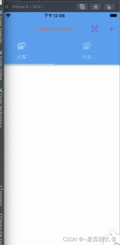
}8.bottom
出现在应用栏底部的控件,一般是
TabBar
import 'package:flutter/material.dart';

class AppBarExample extends StatefulWidget {
  @override
  _AppBarExampleState createState() => _AppBarExampleState();
}

class _AppBarExampleState extends State<AppBarExample> with SingleTickerProviderStateMixin{

  TabController _tabController;

  @override
  void initState() {
    // TODO: implement initState
    super.initState();
    _tabController = TabController(length: 2, vsync: this);
  }

  @override
  Widget build(BuildContext context) {
    return Scaffold(
      appBar: AppBar(
        bottom: TabBar(
          controller: _tabController,
          tabs: [
            Tab(text: "火车", icon: Icon(Icons.bus_alert),),
            Tab(text: "汽车", icon: Icon(Icons.bus_alert),)
          ],
        ),
      ),
    );
  }
}
9.elevation
控制应用栏下方阴影的大小,这个值不能是一个负值
@override
Widget build(BuildContext context) {
  return Scaffold(
    appBar: AppBar(
      elevation: 10,
    ),
  );
}
10.shadowColor
控制导航栏下方阴影的颜色
@override
Widget build(BuildContext context) {
  return Scaffold(
    appBar: AppBar(
      elevation: 10,
      shadowColor: Colors.green,
    ),
  );
}
11.shape
导航栏的形状以及阴影
@override
Widget build(BuildContext context) {
  return Scaffold(
    appBar: AppBar(
      elevation: 10,
      shadowColor: Colors.green,
      shape: RoundedRectangleBorder(
        side: BorderSide(
          color: Colors.red,
          width: 5
        )
      )
    ),
  );
}
12.backgroundColor
导航栏的背景颜色
@override
Widget build(BuildContext context) {
  return Scaffold(
    appBar: AppBar(
      backgroundColor: Colors.orange,
    ),
  );
}
13.foregroundColor
导航栏中文本和图标的颜色
@override
Widget build(BuildContext context) {
  return Scaffold(
    appBar: AppBar(
      foregroundColor: Colors.black,
    ),
  );
}
14.backwardsCompatibility
与foregroundColor配合使用
@override
Widget build(BuildContext context) {
  return Scaffold(
    appBar: AppBar(
      foregroundColor: Colors.black,
      backwardsCompatibility: true,
    ),
  );
}
15.iconTheme
导航栏图标的颜色、透明度、大小的配置
@override
Widget build(BuildContext context) {
  return Scaffold(
    appBar: AppBar(
      leading: IconButton(
        onPressed: (){
          Navigator.pop(context);
        },
        icon: Icon(Icons.arrow_back_sharp, color: Colors.white,)
      ),
      iconTheme: IconThemeData(
        color: Colors.orange,
        opacity: 1,
        size: 50
      ),
    ),
  );
}
16.actionsIconTheme
导航栏右侧图标的颜色、透明度、大小的配置
@override
Widget build(BuildContext context) {
  return Scaffold(
    appBar: AppBar(
      actions: [
        IconButton(
          onPressed: (){

          },
          tooltip: "扫一扫",
          icon: Icon(Icons.qr_code_scanner),
        ),
        IconButton(
          onPressed: (){

          },
          tooltip: "添加",
          icon: Icon(Icons.add),
        )
      ],
      actionsIconTheme: IconThemeData(
        color: Colors.purple,
      ),
    ),
  );
}
17.textTheme
导航栏文本的排版样式,默认使用
ThemeData.primaryTextTheme
18.primary
导航栏是否显示在屏幕顶部
@override
Widget build(BuildContext context) {
  return Scaffold(
    appBar: AppBar(
      backrogoundColor: Colors.black,
      primary: true,
    ),
  );
}
19.excludeHeaderSemantics
标题是否应该用 [Semantics] 包裹,默认false
@override
Widget build(BuildContext context) {
  return Scaffold(
    appBar: AppBar(
      backrogoundColor: Colors.black,
      primary: true,
      excludeHeaderSemantics: true,
    ),
  );
}
20.titleSpacing
标题内容的间距,如果为0,将占用全部空间
@override
Widget build(BuildContext context) {
  return Scaffold(
    appBar: AppBar(
      title: Text("AppBarExample"),
      centerTitle: true,
      titleSpacing: 0,
    ),
  );
}
21.toolbarOpacity
导航栏的透明度
@override
Widget build(BuildContext context) {
  return Scaffold(
    appBar: AppBar(
      backrogoundColor: Colors.black,
      toolbarOpacity: 0.5,
    ),
  );
}
22.bottomOpacity
导航栏底部的透明度
import 'package:flutter/material.dart';

class AppBarExample extends StatefulWidget {
  @override
  _AppBarExampleState createState() => _AppBarExampleState();
}

class _AppBarExampleState extends State<AppBarExample> with SingleTickerProviderStateMixin{

  TabController _tabController;

  @override
  void initState() {
    // TODO: implement initState
    super.initState();
    _tabController = TabController(length: 2, vsync: this);
  }

  @override
  Widget build(BuildContext context) {
    return Scaffold(
      appBar: AppBar(
        bottom: TabBar(
          controller: _tabController,
          tabs: [
            Tab(text: "火车", icon: Icon(Icons.bus_alert),),
            Tab(text: "汽车", icon: Icon(Icons.bus_alert),)
          ],
        ),
				bottomOpacity: 0.5,
      ),
    );
  }
}
23.toolbarHeight
导航栏的高度,默认kToolbarHeight
@override
Widget build(BuildContext context) {
  return Scaffold(
    appBar: AppBar(
      backrogoundColor: Colors.black,
      toolbarHeight: 200,
    ),
  );
}
24.toolbarTextStyle
导航栏图标的颜色
@override
Widget build(BuildContext context) {
  return Scaffold(
    appBar: AppBar(
      leading: IconButton(
        onPressed: (){
          Navigator.pop(context);
        },
        icon: Icon(Icons.arrow_back_sharp, color: Colors.white,)
      ),
      toolbarTextStyle: TextStyle(
        color: Colors.black
      ),
    ),
  );
}
25.titleTextStyle
导航栏标题的默认颜色
@override
Widget build(BuildContext context) {
  return Scaffold(
    appBar: AppBar(
      title: Text("AppBarExample"),
      centerTitle: true,
      titleSpacing: 0,
      titleTextStyle: TextStyle(
        color: Colors.red
      ),
    ),
  );
}
26.flexibleSpace,systemOverlayStyle,brightness
flexibleSpace以及systemOverlayStyle一般都是在配合SliverAppBar使用的,这里不做过多的描述。而brightness已经废弃,用systemOverlayStyle代替
总结
以上是针对 AppBar 的所有使用方法,最常用的属有leading、title、actions、centerTitle、bottom、backgroundColor,其他属性都是在特定的情况才会使用。


![[附源码]java毕业设计校园飞毛腿系统](https://img-blog.csdnimg.cn/0a4d5bde10cc4b3c90800691bd375d82.png)
![[附源码]计算机毕业设计JAVA基于web的球类体育馆预定系统](https://img-blog.csdnimg.cn/7799420366594499855e6579801a7aea.png)