- 1. Panuon环境配置
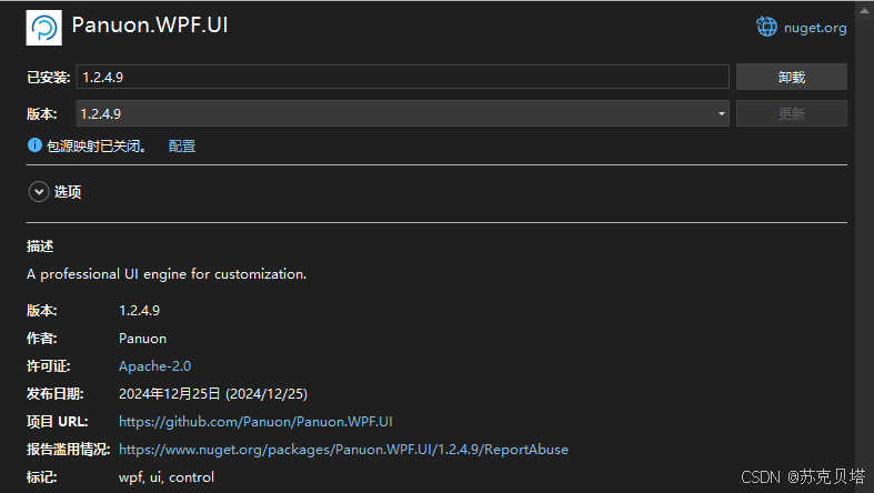
- 1.1. 通过Nuget 安装 Panuon.WPF.UI
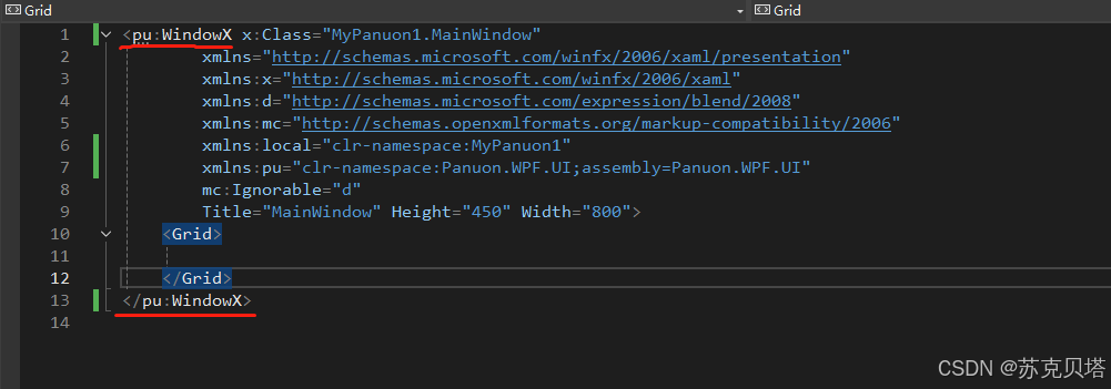
- 1.2. xaml引用命名空间
- 1.3. using Panuon.WPF.UI;
- 2. VS2019 view
- 2.1. 设置窗体尺寸和title
- 2.2. 添加静态资源
- 2.2.1. 什么是静态资源
- 2.3. 主Grid
- 2.3.1. 盒子模型
- 2.3.2. 嵌套布局
- 3. 总结
1. Panuon环境配置
1.1. 通过Nuget 安装 Panuon.WPF.UI
现在最新的是1.2.4.9,点击安装即可
1.2. xaml引用命名空间
修改MainWindow.xaml,引用命名空间xmlns:pu="clr-namespace:Panuon.WPF.UI;assembly=Panuon.WPF.UI"
然后把Window标签改为pu:WindowX
1.3. using Panuon.WPF.UI;
在MainWindow.cs中引用命名空间using Panuon.WPF.UI;
同样,需要把基类Window 改为 WindowX, 这样窗体变成了Panuon 窗体了,很简单。
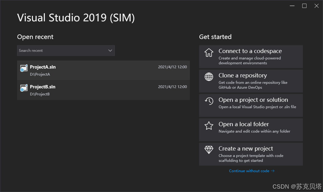
2. VS2019 view
下面我们用panuon开发一个高仿VS2019启动界面,最终成品如下:
2.1. 设置窗体尺寸和title
新建WPF工程,按第1节配置panuon环境,然后在pu:WindowX继续添加属性
Title="Visual Studio (SIM)"
Height="630"
Width="1058"
MinHeight="630"
MinWidth="1058"
Background="#252526"
BorderBrush="#3E3E45"
BorderThickness="1"
Foreground="#F1F1F1"
2.2. 添加静态资源
2.2.1. 什么是静态资源
资源可以分为静态资源或动态资源进行引用。
分别是通过使用 StaticResource 标记扩展或 DynamicResource 标记扩展完成的。
StaticResource的用法:
通过替换已定义资源的值(x:Key)来为 XAML 属性提供值。
这里添加静态资源就是可以对单个控件的样式单独控制,定制化。为后面的控件样式所用。
<pu:WindowX.Resources>

    <Style x:Key="SearchComboBoxStyle"
       TargetType="ComboBox"
       BasedOn="{StaticResource {x:Type ComboBox}}">
        <Setter Property="pu:ComboBoxHelper.HoverBorderBrush"
            Value="#007ACC" />
        <Setter Property="pu:ComboBoxHelper.FocusedBorderBrush"
            Value="#007ACC" />
        <Setter Property="Height"
            Value="35" />
        <Setter Property="Width"
            Value="320" />
        <Setter Property="Background"
            Value="#333337" />
        <Setter Property="BorderBrush"
            Value="#3F3F46" />
        <Setter Property="Foreground"
            Value="#F1F1F1" />
    </Style>


    <Style x:Key="CardButtonStyle"
       TargetType="Button"
       BasedOn="{StaticResource {x:Type Button}}">
        <Setter Property="pu:IconHelper.FontFamily"
            Value="{StaticResource PanuonIconFont}" />
        <Setter Property="pu:IconHelper.FontSize"
            Value="30" />
        <Setter Property="pu:IconHelper.VerticalAlignment"
            Value="Top" />
        <Setter Property="pu:IconHelper.Margin"
            Value="7,2,17,0" />
        <Setter Property="pu:ButtonHelper.HoverBackground"
            Value="#3F3F40" />
        <Setter Property="pu:ButtonHelper.ClickBackground"
            Value="{x:Null}" />
        <Setter Property="Foreground"
            Value="#F1F1F1" />
        <Setter Property="Background"
            Value="#333337" />
        <Setter Property="Padding"
            Value="10,7,10,10" />
        <Setter Property="Height"
            Value="75" />
        <Setter Property="VerticalContentAlignment"
            Value="Stretch" />
        <Setter Property="HorizontalContentAlignment"
            Value="Stretch" />
    </Style>


    <Style x:Key="LinkButtonStyle"
       TargetType="Button"
       BasedOn="{StaticResource {x:Type Button}}">
        <Setter Property="pu:IconHelper.FontFamily"
            Value="{StaticResource PanuonIconFont}" />
        <Setter Property="pu:ButtonHelper.HoverBackground"
            Value="{x:Null}" />
        <Setter Property="pu:ButtonHelper.ClickBackground"
            Value="{x:Null}" />
        <Setter Property="Foreground"
            Value="#0097FB" />
        <Setter Property="Background"
            Value="{x:Null}" />
        <Setter Property="Cursor"
            Value="Hand" />
        <Setter Property="VerticalContentAlignment"
            Value="Stretch" />
        <Setter Property="HorizontalContentAlignment"
            Value="Stretch" />
        <Style.Triggers>
            <Trigger Property="IsMouseOver"
                 Value="True">
                <Setter Property="ContentTemplate">
                    <Setter.Value>
                        <DataTemplate>
                            <TextBlock Text="{Binding}"
                                   TextDecorations="Underline"/>
                        </DataTemplate>
                    </Setter.Value>
                </Setter>
            </Trigger>
        </Style.Triggers>
    </Style>


    <Style x:Key="ProjectListBoxStyle"
       TargetType="ListBox"
       BasedOn="{StaticResource {x:Type ListBox}}">
        <Setter Property="pu:IconHelper.FontFamily"
            Value="{StaticResource PanuonIconFont}" />
        <Setter Property="pu:IconHelper.Width"
            Value="25" />
        <Setter Property="pu:IconHelper.Height"
            Value="25" />
        <Setter Property="pu:IconHelper.VerticalAlignment"
            Value="Top" />
        <Setter Property="pu:IconHelper.Margin"
            Value="0,-15,7,0" />
        <Setter Property="pu:ListBoxHelper.ItemsHeight"
            Value="65" />
        <Setter Property="pu:ListBoxHelper.ItemsPadding"
            Value="10,0,10,0" />
        <Setter Property="pu:ListBoxHelper.ItemsHoverBackground"
            Value="#3F3F40" />
        <Setter Property="pu:ListBoxHelper.ItemsSelectedBackground"
            Value="{x:Null}" />
        <Setter Property="Foreground"
            Value="#F1F1F1" />
        <Setter Property="Background"
            Value="Transparent" />
        <Setter Property="BorderThickness"
            Value="0" />
        <Setter Property="VerticalContentAlignment"
            Value="Center" />
        <Setter Property="HorizontalContentAlignment"
            Value="Stretch" />
    </Style>


</pu:WindowX.Resources>
2.3. 主Grid
2.3.1. 盒子模型
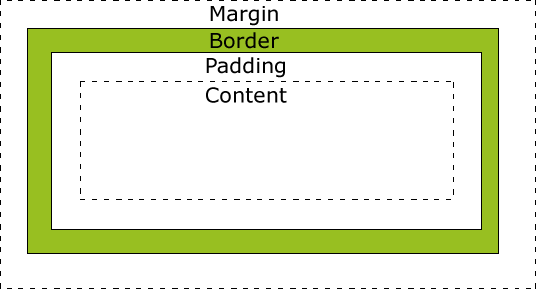
主Grid里面的布局需要手写,手写需要有一定布局的基础。如果不是很清楚需要先了解下盒子模型。
盒子模型最开始是应用于网页布局,将页面中所有元素都看作是一个盒子,盒子都包含以下几个属性:
width 宽度
height 高度
border 边框——围绕在内边距和内容外的边框
padding 内边距——清除内容周围的区域,内边距是透明的
margin 外边距——清除边框外的区域,外边距是透明的
content 内容——盒子的内容,显示文本和图像
2.3.2. 嵌套布局
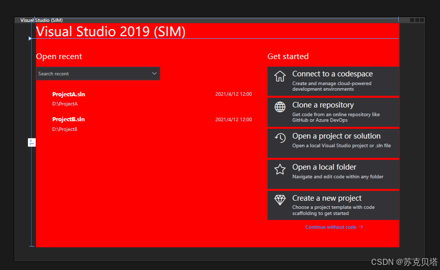
用xaml写布局,当层级嵌套比较深,比较复杂的时候自己都会很晕,这里有个小技巧我经常用,就是给背景/边框标红,这样能直观看到当前的嵌套到哪里了。等找到自己的定位后,在把红色标记去掉。
<Grid Margin="55,0,65,35" Background="Red">
完整的Grid布局代码:
<Grid Margin="55,0,65,35">
<Grid.RowDefinitions>
<RowDefinition Height="Auto"/>
<RowDefinition />
</Grid.RowDefinitions>
<TextBlock Text="Visual Studio 2019 (SIM)"
FontSize="33"/>
<Grid Grid.Row="1">
<Grid.ColumnDefinitions>
<ColumnDefinition />
<ColumnDefinition Width="30"/>
<ColumnDefinition Width="0.6*" />
</Grid.ColumnDefinitions>
<Grid.RowDefinitions>
<RowDefinition Height="Auto"/>
<RowDefinition />
</Grid.RowDefinitions>
<TextBlock Margin="0,30,0,0"
Text="Open recent"
FontSize="20" />
<Grid Grid.Row="1">
<Grid.RowDefinitions>
<RowDefinition Height="Auto" />
<RowDefinition />
</Grid.RowDefinitions>
<ComboBox Margin="0,15,0,0"
HorizontalAlignment="Left"
IsEditable="True"
Style="{StaticResource SearchComboBoxStyle}"
pu:ComboBoxHelper.Watermark="Search recent" />
<ListBox Grid.Row="1"
Margin="0,15,0,0"
Style="{StaticResource ProjectListBoxStyle}">
<ListBoxItem pu:ListBoxItemHelper.Icon="/Samples;component/Resources/WebForms.png">
<Grid>
<Grid.RowDefinitions>
<RowDefinition Height="Auto"/>
<RowDefinition Height="Auto"/>
</Grid.RowDefinitions>
<TextBlock FontSize="14"
FontWeight="Bold"
Text="ProjectA.sln" />
<TextBlock VerticalAlignment="Center"
HorizontalAlignment="Right"
Foreground="#C6C8D2"
Text="2021/4/12 12:00" />
<TextBlock Grid.Row="1"
Margin="0,8,0,0"
Text="D:\ProjectA"
TextTrimming="CharacterEllipsis"
Foreground="#C6C8D2" />
</Grid>
</ListBoxItem>
<ListBoxItem pu:ListBoxItemHelper.Icon="/Samples;component/Resources/WebForms.png">
<Grid>
<Grid.RowDefinitions>
<RowDefinition Height="Auto" />
<RowDefinition Height="Auto" />
</Grid.RowDefinitions>
<TextBlock FontSize="14"
FontWeight="Bold"
Text="ProjectB.sln" />
<TextBlock VerticalAlignment="Center"
HorizontalAlignment="Right"
Foreground="#C6C8D2"
Text="2021/4/12 12:00" />
<TextBlock Grid.Row="1"
Margin="0,8,0,0"
Text="D:\ProjectB"
TextTrimming="CharacterEllipsis"
Foreground="#C6C8D2" />
</Grid>
</ListBoxItem>
</ListBox>
</Grid>
<TextBlock Grid.Column="2"
Margin="0,30,0,0"
Text="Get started"
FontSize="20" />
<StackPanel Grid.Column="2"
Grid.Row="1"
Margin="0,15,0,0">
<Button Style="{StaticResource CardButtonStyle}"
pu:ButtonHelper.Icon="">
<StackPanel>
<TextBlock FontSize="18"
Text="Connect to a codespace"/>
<TextBlock Margin="0,5,0,0"
Text="Create and manage cloud-powered development environments"
TextWrapping="Wrap"
Foreground="#C6C8D2"/>
</StackPanel>
</Button>
<Button Margin="0,5,0,0"
Style="{StaticResource CardButtonStyle}"
pu:ButtonHelper.Icon="">
<StackPanel>
<TextBlock FontSize="18"
Text="Clone a repository" />
<TextBlock Margin="0,5,0,0"
Text="Get code from an online repository like GitHub or Azure DevOps"
TextWrapping="Wrap"
Foreground="#C6C8D2" />
</StackPanel>
</Button>
<Button Margin="0,5,0,0"
Style="{StaticResource CardButtonStyle}"
pu:ButtonHelper.Icon="">
<StackPanel>
<TextBlock FontSize="18"
Text="Open a project or solution" />
<TextBlock Margin="0,5,0,0"
Text="Open a local Visual Studio project or .sln file"
TextWrapping="Wrap"
Foreground="#C6C8D2" />
</StackPanel>
</Button>
<Button Margin="0,5,0,0"
Style="{StaticResource CardButtonStyle}"
pu:ButtonHelper.Icon="">
<StackPanel>
<TextBlock FontSize="18"
Text="Open a local folder" />
<TextBlock Margin="0,5,0,0"
Text="Navigate and edit code within any folder"
TextWrapping="Wrap"
Foreground="#C6C8D2" />
</StackPanel>
</Button>
<Button Margin="0,5,0,0"
Style="{StaticResource CardButtonStyle}"
pu:ButtonHelper.Icon="">
<StackPanel>
<TextBlock FontSize="18"
Text="Create a new project" />
<TextBlock Margin="0,5,0,0"
Text="Choose a project template with code scaffolding to get started"
TextWrapping="Wrap"
Foreground="#C6C8D2" />
</StackPanel>
</Button>
<StackPanel Margin="0,10,0,0"
HorizontalAlignment="Center"
Orientation="Horizontal">
<Button Style="{StaticResource LinkButtonStyle}"
Content="Continue without code" />
<TextBlock Text=""
VerticalAlignment="Center"
Foreground="#0097FB"
FontFamily="{StaticResource PanuonIconFont}"/>
</StackPanel>
</StackPanel>
</Grid>
</Grid>
3. 总结
Panuon.WPF.UI 是一个适用于定制个性化UI界面的组件库。它能帮助你快速完成样式和控件的UI设计,而不必深入了解WPF的 ControlTemplate 、 Storyboard 等知识。
例如,在原生WPF中下,如果你想要修改 Button 按钮 控件的悬浮背景色,你需要修改按钮的 Style 属性,并编写 Trigger 和 Storyboard 来实现悬浮渐变效果。如果你想要更复杂的效果,你可能还需要编写内部的ControlTemplate模板。但现在, Panuon.WPF.UI 为你提供了一个更简单的方式。你只需要在 Button 按钮 控件上添加一条 pu:ButtonHelper.HoverBackground="#FF0000" 属性,即可实现背景色悬浮渐变到红色的效果。Panuon.WPF.UI为每一种控件都提供了大量的属性,使你能够方便地修改WPF中没有直接提供,但在UI设计中非常常用的效果,这有助于你快速地完成UI设计(尤其是在你有设计图的情况下)。