1. 初识Matplotlib
matplotlib是 Python 最流行的绘图工具之一,广泛用于数据可视化。
1.1基本图表绘制:
| 图表名称 | 表示函数 |
|---|---|
| 散点图 | plt.scatter(x, y) |
| 柱状图 | plt.bar(x, height) |
| 折线图 | plt.plot(x, y) |
| 直方图 | plt.hist(x, bins) |
| 箱线图 | plt.boxplot(x) |
| 热力图 | plt.imshow(x) |
| 填色图 | plt.fill_between(x, y1, y2) |
1.2 图表元素:
| 元素名称 | 引用函数 |
|---|---|
| 标题: | plt.title('Title') |
| X轴标签: | plt.xlabel('X label') |
| Y轴标签: | plt.ylabel('Y label') |
| 图例: | plt.legend() |
| 网格线: | plt.grid() |
| 子图: | plt.subplot(nrows, ncols, index) |
1.3 定制图表:
| 装饰元素 | 引用函数 |
|---|---|
| 线型、标记和颜色: | plt.plot(x, y, linestyle, marker, color) |
| 轴的范围: | plt.xlim([start, end]) 和 plt.ylim([start, end]) |
| 轴的刻度: | plt.xticks(ticks) 和 plt.yticks(ticks) |
| 图例位置: | plt.legend(loc='upper right') |
1.4 数据可视化工具:
numpy 和 pandas 集成:plt.plot(dataframe['column'])
2.认识Matplotlib基本函数
2.1 引用matplotlib
plt.rcParams 是一个字典,用于全局配置 matplotlib 的参数。
['font.family']='Fangsong':确保绘图时,所有出现的字体都为“仿宋”;
['axes.unicode_minus'] = False:确保在大多数情况下负号能够正确显示;
注:字体可在'设置-编辑器-字体'路径查看,找到系统中正确的字体名。
import matplotlib.pyplot as plt
import numpy as np
plt.rcParams['font.family']='Fangsong'
plt.rcParams['axes.unicode_minus'] = False
2.2 创建绘图子集
2.2.1 设置图表画布
参数1:行数、参数2:列数;
返回值fig,表示当前画布;
返回值axs,表示设置数据引用。
fig,axs = plt.subplots(2,1)2.2.2 分别在下标值为0或1的窗口中绘制柱形图:
[0]是指第一个格子
hist() 函数用于绘制数据的直方图;
plot() 函数用于绘制线图。
axs[0].hist(data,bins=50,color='blue')
axs[1].plot(data,color='red')
2.2.3 参数设置-设置标题
axs[0].set_title('数据分布')
axs[1].set_title('随机样本')
axs[0].set_xlabel('值')
axs[0].set_ylabel('频率')
2.2.4 布局输出
fig.tight_layout()#自动布局
plt.show()
3.关联图
3.1 随机绘制一个散点图
#散点图
x=np.random.randn(100)
y=np.random.randn(100)
#绘制散点图函数
#参数marker='*',设置窗口中图像样式
plt.scatter(x=x,y=y,color='red',marker='*')
#设置xy轴范围
plt.xlim(0,2)
plt.ylim(0.5,2)
#显示网络
plt.grid()
3.2 导入数据绘制散点图
3.2.1 导入文件
data = pd.read_excel('order2019.xlsx')
# print(data.head())
# print(data.describe())
#获得商品
types = data['goodsID'].unique().tolist()
# print(types)
#存放商品均价的列表
prices = []
#存放商品数量的列表
amounts = []
for t in types:
    #依次获得每一个商品的均价
    price = data[data['goodsID']==t]['orderAmount'].mean()
    prices.append(price)
    #依次获得每一个商品的数量
    amount = len(data[data['goodsID']==t])
    amounts.append(amount)
print(prices)
print(amounts)
3.2.2 绘制散点图
plt.scatter(x=prices, y=amounts,color='green',marker='*')
plt.title('goods prices vs amounts')
plt.xlabel('price')
plt.ylabel('amount')
plt.xlim(600,1500)
plt.ylim(50,150)
plt.grid()
plt.show()
3.2.3 利用散点图对三个商品进行分析
import matplotlib.pyplot as plt
import numpy as np
import pandas as pd
#导入文件a
data = pd.read_excel('order2019.xlsx')
#获得商品
types = data['goodsID'].unique().tolist()
prices = []
amounts = []
for t in ['PR000064','PR000582','PR000302']:
    price = data[data['goodsID']==t]['orderAmount'].mean()
    prices.append(price)
    amount = len(data[data['goodsID']==t])
    amounts.append(amount)
plt.scatter(x=prices[0], y=amounts[0], color='red', marker='*')
plt.scatter(x=prices[1], y=amounts[1], color='blue', marker='*')
plt.scatter(x=prices[2], y=amounts[2], color='green', marker='*')
plt.title('goods prices vs amounts')
plt.xlabel('price')
plt.ylabel('amount')
plt.grid()
plt.show()
3.3 热力图绘制
import matplotlib.pyplot as plt
import numpy as np
import pandas as pd
plt.rcParams['font.family']='Fangsong'
plt.rcParams['axes.unicode_minus'] = False
data = pd.read_excel('order2019.xlsx')

factories = ['fac1','fac2','fac3','fac4','fac5']
quanlity = ['bad','poor','general','good','great']
result = np.round(np.random.random(25).reshape(5,5),1)
print(result)
fig,ax = plt.subplots(1,1)#chuangkou:jiegou/zhi
plt.imshow(result)

#循环 为每一个格子赋值
for i in np.arange(len(factories)):
    for j in np.arange(len(quanlity)):
        plt.text(j, i, result[i][j], color='w', va='center', ha='center')

#设置坐标轴的类别
ax.set_yticks(np.arange(len(quanlity)))#设置x轴取值范围
ax.set_xticks(np.arange(len(factories)))#设置y轴取值范围
ax.set_yticklabels(quanlity)#设置x轴文本
ax.set_xticklabels(factories)#设置y轴文本
ax.set_title('goods quanlity or factories')

fig.tight_layout()
plt.show()
4.变化图
4.1 绘制折线图
samplel = np.random.random(100)
plt.plot(samplel)
4.2 绘制面积图
plt.fill_between(np.arange(100),y1=samplel,y2=0,alpha=0.5)5.分组图
1.散点分布图
以a_x为例:
- 生成一个包含100个随机浮点数的数组,这些浮点数在[0, 1)区间内均匀分布。
- 加上1后,这些值被平移至[1, 2)区间。
import matplotlib.pyplot as plt
import numpy as np
import pandas as pd

a_x = np.random.random(100)+1
a_y = np.random.random(100)+1.5
b_x = np.random.random(200)+2.1
b_y = np.random.random(200)+1.7

plt.scatter(a_x, a_y)
plt.scatter(b_x, b_y)
plt.show()
输出结果:

2.条形分布图
x1 = [1,2,3,4]
x2 = [1.5,2.5,3.5,4.5]
y1 = [1,2,3,4]
y2 = [2,3,4,1]
plt.bar(x1,y1,width=0.2)
plt.bar(x2,y2,width=0.2)
plt.show()
3.应用范例
#获取源数据渠道列'ChanelID'的数据,取唯一值,转换成列表,获取前三个数据
chanel = data['chanelID'].unique().tolist()[:3]
#根据渠道的ID值获取对应的数据
df2 = data[(data['chanelID']==chanel[0])|(data['chanelID']==chanel[1])|(data['chanelID']==chanel[2])]
# print(df2)
#检索列
df2 = df2[['chanelID', 'platfromType', 'payment']]
#对数据进行分组
#根据渠道ID进行分组后,再根据支付方式分组
res = df2.groupby(['chanelID', 'platfromType']).sum()
print(res)
# print(df2)

fig,ax = plt.subplots()
labels1 = res.loc[chanel[0],:].index.tolist()
labels2 = res.loc[chanel[1],:].index.tolist()
labels3 = res.loc[chanel[2],:].index.tolist()
print(labels1)
#绘制分组柱状图,参数1起始位置;参数2:值;参数3:间距
plt.bar(np.arange(len(labels1))+1,res.loc[chanel[0],'payment'].tolist(),width=0.2)

print(np.arange(len(labels1))+1)
print(res.loc[chanel[0],'payment'].tolist())
# plt.show()
#x轴的类别显示
ax.set_xticks(np.arange(len(labels1)))
ax.set_xticklabels(labels=labels1,rotation=45)
plt.show()
6.偏差图
1.引用渠道、支付金额
res = data[['chanelID','payment']].groupby('chanelID').sum()2.发散型条形图
交易额进行排序
plt.hlines(y=['a','b','c'],
           xmin=0,xmax=[-1,2,0.5],
           colors=['r','g','b'])
plt.show()
3.列表条形图
res = res.sort_values('payment',ascending=True)#降序
res['colors'] = ['red' if x>10000000 else 'green' for x in res['payment']]
plt.hlines(y=res.index,
           xmin=0,xmax=res['payment'],
           colors=res['colors'])
plt.grid(linestyle='--',alpha=0.5)
plt.show()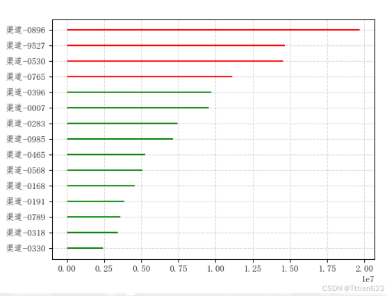
4.面积图
交易额的差值:
where=res['error'>0]条件匹配
facecolor='green'满足条件赋予色值
interpolate=True支持在参数列表中使用where表达式
alpha=0.5透明度0.5,不透明即为1
res['error']=res['payment'] - res['payment'].mean()
res = res.sort_values('chanelID')
plt.plot(res['error'])
plt.fill_between(res.index,res['error'],0,
                 where=res['error']>0,facecolor='green',
                 interpolate=True,alpha=0.5)
plt.fill_between(res.index,res['error'],0,
                 where=res['error']<0,facecolor='red',
                 interpolate=True,alpha=0.5)
plt.xticks(rotation=45)
plt.show()


![【题解】【动态规划01背包问题】—— [NOIP2012 普及组] 摆花](https://i-blog.csdnimg.cn/direct/e4eda0123a0c4ef6a368cf6bb3f44a25.jpeg#pic_center)


