注意:博主有个鸿蒙专栏,里面从上到下有关于鸿蒙next的教学文档,大家感兴趣可以学习下
如果大家觉得博主文章写的好的话,可以点下关注,博主会一直更新鸿蒙next相关知识
专栏地址: https://blog.csdn.net/qq_56760790/category_12794123.html
目录
1. 属性动画
1.1 基本介绍
1.2 用法
1.3 代码示例
2. 显式动画
2.1 基本介绍
2.2 用法
2.3 代码示例
3. 转场动画
3.1 基本介绍
3.2 出现/消失专场
3.2.1 用法
3.2.2 代码示例
3.3 共享元素转场
3.3.1 用法
3.3.2 代码示例
3.4 组件内转场
3.4.1 用法
3.4.2 代码示例
4. 学习地址
1. 属性动画
1.1 基本介绍
组件的某些通用属性变化时,可以通过属性动画实现渐变过渡效果,提升用户体验。支持的属性包括width、height、backgroundColor、opacity、scale、rotate、translate等。布局类改变宽高的动画,内容都是直接到终点状态,例如文字、Canvas的内容等,如果要内容跟随宽高变化,可以使用renderFit属性配置。
1.2 用法
animation(value:AnimateParam) 设置动画效果相关参数
参考地址
文档中心
1.3 代码示例
@Entry
  @Component
  struct Index {
    @State
    widthSize: number = 100
    @State
    heightSize: number = 50
    build() {
      Column({space:20}){
        Button('元素动画')
          .width(this.widthSize)
          .height(this.heightSize)

          .animation({
            // 动画时间
            duration: 300,
            // 执行次数
            iterations: -1,
            // 动画曲线
            curve: Curve.Ease,
            // 延时时间
            delay: 1000,
            // 播放模式
            playMode: PlayMode.Alternate
          })
        Button("开始动画")
          .onClick(() => {
            this.widthSize = 200
            this.heightSize = 100
          })
      }
    }
  }
2. 显式动画
2.1 基本介绍
提供全局animateTo显式动画接口来指定由于闭包代码导致的状态变化插入过渡动效。同属性动画,布局类改变宽高的动画,内容都是直接到终点状态,例如文字、Canvas的内容等,如果要内容跟随宽高变化,可以使用renderFit属性配置。
2.2 用法
animateTo(value: AnimateParam, event: () => void): void
参考地址
文档中心
2.3 代码示例
@Entry
  @Component
  struct Index {
    @State widthSize: number = 250
    @State heightSize: number = 100
    @State rotateAngle: number = 0
    private flag: boolean = true

    build() {
      Column() {
        Button('change size')
          .width(this.widthSize)
          .height(this.heightSize)
          .margin(30)
          .onClick(() => {
            if (this.flag) {
              animateTo({
                duration: 2000,
                curve: Curve.EaseOut,
                iterations: 3,
                playMode: PlayMode.Normal,
                onFinish: () => {
                  console.info('play end')
                }
              }, () => {
                this.widthSize = 150
                this.heightSize = 60
              })
            } else {
              animateTo({}, () => {
                this.widthSize = 250
                this.heightSize = 100
              })
            }
            this.flag = !this.flag
          })
        Button('change rotate angle')
          .margin(50)
          .rotate({ x: 0, y: 0, z: 1, angle: this.rotateAngle })
          .onClick(() => {
            animateTo({
              duration: 1200,
              curve: Curve.Friction,
              delay: 500,
              iterations: -1, // 设置-1表示动画无限循环
              playMode: PlayMode.Alternate,
              onFinish: () => {
                console.info('play end')
              },
              expectedFrameRateRange: {
                min: 10,
                max: 120,
                expected: 60,
              }
            }, () => {
              this.rotateAngle = 90
            })
          })
      }.width('100%').margin({ top: 5 })
    }
  }
3. 转场动画
3.1 基本介绍
- 出现/消失转场
- 共享元素转场
- 组件内转场 transition属性
3.2 出现/消失专场
3.2.1 用法
直接使用animateTo闭包函数即可
3.2.2 代码示例
@Entry
  @Component
  struct Index {
    @State message: string = 'Hello World';
    @State
    showMessage: boolean = false
    build() {
      Row() {
        Column() {
          Column() {
            if(this.showMessage) {
              Text(this.message)
                .fontSize(50)
                .fontWeight(FontWeight.Bold)
            }
          }
          .height(50)

          Button("显示/隐藏")
            .onClick(() => {
              animateTo({ duration: 1000 },  () => {
                this.showMessage = !this.showMessage
              })
            })

        }
        .width('100%')
      }
      .height('100%')
    }
  }
3.3 共享元素转场
3.3.1 用法
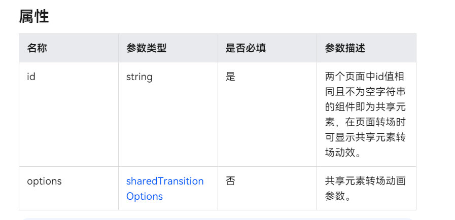
当路由进行切换时,可以通过设置组件的 sharedTransition 属性将该元素标记为共享元素并设置对应的共享元素转场动效。
3.3.2 代码示例
import { router } from '@kit.ArkUI'

@Entry
  @Component
  struct Index {
    build() {
      Column(){
        Image($r('app.media.dog1'))
          .height(50)
          .width(50)
          .sharedTransition('dog',{duration:500})
          .onClick(()=>{
            router.pushUrl({
              url:'pages/Detail'
            })
          })
      }
    }
  }
@Entry
  @Component
  struct Detail {
    @State message: string = 'Hello World';

    build() {
      Column() {
        Image($r('app.media.dog1'))
          .height(100)
          .width(200)
          .sharedTransition('dog',{duration:500})

      }
      .height('100%')
        .width('100%')
    }
  }
3.4 组件内转场
3.4.1 用法
组件内转场主要通过transition属性配置转场参数,在组件插入和删除时显示过渡动效,主要用于容器组件中的子组件插入和删除时,提升用户体验。
3.4.2 代码示例
@Entry
  @Component
  struct Index {
    @State flag: boolean = true;
    @State show: string = 'show';

    build() {
      Column() {
        Button(this.show).width(80).height(30).margin(30)
          .onClick(() => {
            // 点击Button控制Image的显示和消失
            if (this.flag) {
              this.show = 'hide';
            } else {
              this.show = 'show';
            }
            this.flag = !this.flag;
          })
        if (this.flag) {
          // Image的显示和消失配置为相同的过渡效果(出现和消失互为逆过程)
          // 出现时从指定的透明度为0、绕z轴旋转180°的状态,变为默认的透明度为1、旋转角为0的状态,透明度与旋转动画时长都为2000ms
          // 消失时从默认的透明度为1、旋转角为0的状态,变为指定的透明度为0、绕z轴旋转180°的状态,透明度与旋转动画时长都为2000ms
          Image($r('app.media.dog1')).width(200).height(200)
            .transition(TransitionEffect.OPACITY.animation({ duration: 2000, curve: Curve.Ease }).combine(
              TransitionEffect.rotate({ z: 1, angle: 180 })
            ))
        }
      }.width('100%')
    }
  }
4. 学习地址
全网首发鸿蒙NEXT星河版零基础入门到实战,2024年最新版,企业级开发!视频陆续更新中!_哔哩哔哩_bilibili