系列文章目录
【鸿蒙】HarmonyOS NEXT开发快速入门教程之ArkTS语法装饰器(上)
【鸿蒙】HarmonyOS NEXT开发快速入门教程之ArkTS语法装饰器(下)
【鸿蒙】HarmonyOS NEXT应用开发快速入门教程之布局篇(上)
文章目录
- 系列文章目录
- 前言
- 一、ArkTs布局代码位置和写法规则
- 二、ArkTS 常见布局介绍
- 三、ArkTS 组件通用信息
- (1)通用事件:
- (2)通用属性
- (3)手势处理
- 四、常见布局详细使用
- (1)线性布局(Row、Column)
- 1.1、Row\Column 入参:
- 1.2、Row\Column自带属性
- 示例1:
- 示例2:
- 示例3:
- 示例4:
- 示例5:
- (2)层叠布局(Stack)
- 1、 通过如下示例理解层叠布局效果:
- 2、Stack 入参
- 3、改变示例里面显示位置看看所有枚举值渲染情况
- (1)TopStart
- (2)Top
- (3)TopEnd
- (4)Start
- (5)Center
- (6)End
- (7)BottomStart
- (8)Bottom
- (9)BottomEnd
- 4、搭配通用属性position和translate实现css绝对布局效果
- 示例1:
- 示例2:
- (3)弹性布局(Flex)
- 入参:
- 示例1:
- 示例2:
- 示例3:
- 总结
- Flex布局和线性布局(Row、Column)区别和优劣选择:
- 四、总结
- 五、未完待更
前言
HarmonyOS NEXT(鸿蒙应用)开发快速入门教程之布局篇,基于HarmonyOS NEXT Beta1版本(api 12)讲解。
本文将从前端开发者角度来学习鸿蒙的布局语法,通过类比鸿蒙布局和web css布局相似之处,帮助大家快速掌握鸿蒙布局开发。鸿蒙的布局方式跟css非常相似,主要还是以flex布局为基调,搭配相对、绝对、层叠布局实现大部分场景。鸿蒙自带的系统组件更为丰富,扩展的属性很多,功能更强大,像衍生出的布局类组件有Swiper(轮播)、Tabs(选项卡)、List(列表)、Grid(网格)有着丰富的配置来满足各种定制化需求。
一、ArkTs布局代码位置和写法规则

从HarmonyOS NEXT开发快速入门教程之ArkTS语法装饰器(上)这篇博文知道布局主要在build函数里面写入,父子组件标签嵌套的方式写布局,跟html一样。组件的属性和事件跟jq一样通过链式调用。build函数内只能有一个根组件,跟vue2 template一样。
二、ArkTS 常见布局介绍
声明式UI提供了以下9种常见布局:
1、线性布局(Row、Column):
线性布局就是子元素按照水平或者垂直2种方向按顺序排列,其中Row为水平方向容器,Column为垂直方向容器,最常用布局方式,没有之一。
2、层叠布局(Stack)
层叠布局类似css绝对布局或Fixed布局,在Stack容器内子元素依次入栈,后一个子元素覆盖前一个子元素上面,子元素可以叠加,也可以设置相对父容器位置。不会占用或影响同容器内其子组件的布局空间。
3、弹性布局(Flex)
相当于css flex布局,用法几乎一样,也和线性布局类似,区别在于弹性布局默认能够使子组件压缩或拉伸。在子组件需要计算拉伸或压缩比例时优先使用此布局,可使得多个容器内子组件能有更好的视觉上的填充容器效果。
4、相对布局(RelativeContainer)
跟安卓相对布局类似,设置兄弟组件或父组件为锚点,基于锚点做相对位置布局。相对布局面对复杂的界面可以减少多层次组件嵌套,有效的提升性能,减少时间开销。
5、栅格布局(GridRow、GridCol)
跟elementUI el-row el-col相似,将空间分割为有规律的栅格。栅格不同于网格布局固定的空间划分,它可以实现不同设备下不同的布局
6、媒体查询(@ohos.mediaquery)
跟css媒体查询类似,可根据不同设备类型或同设备不同状态修改应用的样式。
7、列表(List)
官方归为布局之一,实际上就是一个 列表组件
8、网格(Grid)
网格组件,类似css网格布局
9、轮播(Swiper)
官方归为布局之一,实际上就是一个轮播组件
三、ArkTS 组件通用信息
组件通用信息指的是所有组件(或大部分组件)都共有的一些信息特性,包括通用事件、通用属性、手势处理三种类型。
(1)通用事件:
比如点击事件、触摸事件,所有组件都能触发,都可以绑定监听事件
例如:
  build() {
    Column() {
    }
    .onClick((event: ClickEvent) => {
      console.log('点击事件')
    })
    .onTouch((event: TouchEvent) => {
       console.log('触摸事件')
    })

  }
所有通用事件如下:

详细介绍可查阅官方文档:通用事件
(2)通用属性
组件通用属性跟组件布局关系比较大,通用属性大部分类似css属性,可以对组件布局进行控制,例如组件宽高、边框、背景等设置。
例如:
  build() {
    Column() {
    }
    .width(500) //宽
    .height(200) //高
    .backgroundColor(Color.Black) //背景色
    .border({ width: 1, color: Color.Red }) //边框
    .borderRadius(10) //圆角
    .opacity(0.5) //透明度
    .visibility(Visibility.Visible) //是否可见
  }
所有通用属性:


详细介绍可查阅官方文档:通用属性
(3)手势处理
一些手势操作监听处理,比如长按、双击、拖拽、捏合等,具体可看:手势处理官方文档
四、常见布局详细使用
(1)线性布局(Row、Column)
线性布局是日常开发最常用的一种布局方式。可以看成简化版flex布局,支持设置子组件在主轴方向上的对齐方式. justifyContent()和垂直轴方向上的对齐方式.alignItems(),且性能优于flex布局,所以也是最优先选择的布局方式。
Row:主轴为水平方向,子元素从左到右或从右向左依次排列的容器,相当于html 中设置了 display: flex; flex-direction: row 的div
Column :主轴为垂直方向,子元素从上到下或从下向上依次排列的容器,相当于html 中设置了 display: flex; flex-direction: column的div
1.1、Row\Column 入参:
Row\Column(value?:{space?: number | string }):设置主轴方向上子元素之间的间距
例如:
  build() {
    Column({ space: 10 }) {
      Button('按钮1')
      Button('按钮2')
      Button('按钮3')
    }
  }

注意:
justifyContent设置为FlexAlign.SpaceBetween、FlexAlign.SpaceAround、FlexAlign.SpaceEvenly时不生效,默认值:0,单位vp
1.2、Row\Column自带属性
-
alignItems(value: VerticalAlign) 设置子组件在相对主轴垂直方向上的对齐方式。
-
value值支持如下枚举值:

默认值VerticalAlign.Center -
justifyContent(value: FlexAlign) 设置子组件在主轴方向上的对齐方式。
-
value值支持如下枚举值:

默认值FlexAlign.Start -
reverse(isReversed: Optional) 设置子组件在主轴上的排列是否反转.(相当于css flex-direction: row-reverse(column-reverse);)
配合上通用属性——flexBasis、flexGrow、flexShrink、alignSelf就是个简化版的flex
通过上面表格可以看出justifyContent可选值跟css flex justifyContent一样而alignItems可选值就有区别只有3个而且名称由start变成top end变成bottom。
示例1:
justifyContent(FlexAlign.SpaceBetween)
@Entry
@Component
struct Demo {
  build() {
    Column() {
      Row() {
        Image($r('app.media.arrow_left')).width(28)
        Text('商品详情')
        Image($r('app.media.icon_share3')).width(28)
      }
      .width('100%')
      .height(50)
      .justifyContent(FlexAlign.SpaceBetween)
      .padding({top:0,bottom:0,left:15,right:15})
    }
  }
}
运行效果:

说明:上述示例三段式常见的布局方式
示例2:
.alignItems(HorizontalAlign.Center) 、 .justifyContent(FlexAlign.Center)、.alignSelf(ItemAlign.Start) 、.alignSelf(ItemAlign.End)
/**
 * 自定义Row通用样式
 */
@Extend(Row)
function customRow() {
  .width(300)
  .height(100)
  .justifyContent(FlexAlign.Center)
  .backgroundColor(Color.Orange)
  .borderRadius(20)
}

@Entry
@Component
struct Demo {
  build() {
    Column({ space: 20 }) {
      Row({space:30}) {
        Text('A')
        Text('B')
      }.customRow()

      Row({space:30}) {
        Text('A')
        Text('B')
      }.customRow()

      Row({space:30}) {
        Text('A')
        Text('B')
      }.customRow().alignSelf(ItemAlign.Start)

      Row({space:30}) {
        Text('A')
        Text('B')
      }.customRow().alignSelf(ItemAlign.End)
    }
    .width('100%')
    .alignItems(HorizontalAlign.Center)
    .padding(20)
  }
}
运行效果:

说明:上图示例中父组件设置了 .alignItems(HorizontalAlign.Center),子组件默认在水平方向上居中对齐,通过设置alignSelf(),可以单独设置某个子组件对齐方式,如示例所示第三、第四个Item就分别单独设置了居左(ItemAlign.Start)和居右(ItemAlign.End)显示。
示例3:
.flexGrow(1)、justifyContent(FlexAlign.SpaceBetween)
@Entry
@Component
struct Demo {
  build() {
    Column() {
      Row({space:10}) {
        Text('地址:').fontSize(14).fontWeight(600)
        Text('福建省厦门市思明区')
          .height('100%')
          .fontSize(14)
          .fontColor('#666')
          .flexGrow(1)
          .textAlign(TextAlign.End)
          .backgroundColor('#F0F0F0')

        Image($r('app.media.arrow_right')).width(22)
      }
      .width('100%')
      .height(50)
      .justifyContent(FlexAlign.SpaceBetween)

      .border({
        width: {
          bottom: 1
        }, color: '#dedede'
      })
    }.padding({top:10,left:18,right:18})
  }
}
运行效果:

说明:上述示例中省市区文字的组件Text通过设置flexGrow(1)拉伸占满父容器剩余水平方向上所有空间。
示例4:
.justifyContent(FlexAlign.SpaceEvenly)、.justifyContent(FlexAlign.SpaceAround)、.justifyContent(FlexAlign.SpaceBetween)
@Entry
@Component
struct Demo {
//自定义item
  @Builder customItem(icon:Resource,label:string){
       Column({space:5}){
           Image(icon).width(40)
           Text(label)
       }
  }

  build() {
    Column({space:30}) {
      Row(){
        this.customItem($r('app.media.tabbar11'),'首页')
        this.customItem($r('app.media.tabbar11'),'首页')
        this.customItem($r('app.media.tabbar11'),'首页')
        this.customItem($r('app.media.tabbar11'),'首页')
      }.width('100%').justifyContent(FlexAlign.SpaceEvenly)

      Row(){
        this.customItem($r('app.media.tabbar11'),'首页')
        this.customItem($r('app.media.tabbar11'),'首页')
        this.customItem($r('app.media.tabbar11'),'首页')
        this.customItem($r('app.media.tabbar11'),'首页')
      }.width('100%').justifyContent(FlexAlign.SpaceAround)

      Row(){
        this.customItem($r('app.media.tabbar11'),'首页')
        this.customItem($r('app.media.tabbar11'),'首页')
        this.customItem($r('app.media.tabbar11'),'首页')
        this.customItem($r('app.media.tabbar11'),'首页')
      }.width('100%').justifyContent(FlexAlign.SpaceBetween)
    }.padding({top:20})
  }
}
运行效果:

说明:.justifyContent(FlexAlign.SpaceEvenly)、.justifyContent(FlexAlign.SpaceAround)、.justifyContent(FlexAlign.SpaceBetween)每种值呈现的效果对比,item之间的间距依次变大。
三者区别:
FlexAlign.SpaceEvenly:item之间的间距相等,且第一个item与最后一个item与父容器间距等于item之间的间距
FlexAlign.SpaceAround:item之间的间距相等,且第一个item与最后一个item与父容器间距等于item之间的间距的一半
FlexAlign.SpaceBetween:item之间的间距相等,且第一个item与最后一个item与父容器间距为0
示例5:
css和ArkTS写法对照
css:
 .div{
    display: flex;
    flex-direction: column;
    justify-content: center;
    align-items: center;
    align-self: center;
    flex-grow: 1;
    flex-shrink: 0;
    flex-basis: 100px;
 }
等价于
ArkTs:
   Column() {
    }
    .justifyContent(FlexAlign.Center)
    .alignItems(HorizontalAlign.Center)
    .alignSelf(ItemAlign.Center)
    .flexGrow(1)
    .flexShrink(0)
    .flexBasis('100px')
  }
说明:从上述示例可以看出ArkTs的线性布局跟css中flex设计机制、属性作用几乎一样,甚至连命名都一样,只不过换了种调用形式。
ps:友情提示属性入参都是系统定义好的枚举值例如FlexAlign.Center,这些枚举值无须去记忆,只要把鼠标放置属性上有语法提示
线性布局更多示例说明可以查阅官方文档
(2)层叠布局(Stack)
Stack容器内的子元素会脱离文档流,默认只相对于父容器(上下左右中)某个方向对齐显示而无关兄弟元素影响。后置元素层级越高,就叠在最上面所以也称层叠布局,配合通用属性position、translate使用跟css绝对布局或Fixed布局有异曲同工之妙。
1、 通过如下示例理解层叠布局效果:
示例1:
@Entry
@Component
struct Demo {
  build() {
    Stack(){
      Column(){}.width(200).height(200).backgroundColor(Color.Red)
      Column(){}.width(100).height(100).backgroundColor(Color.Orange)
      Column(){}.width(50).height(50).backgroundColor(Color.Blue)
    }.width(300)
    .height(400)
    .border({
      width:1,
      color:Color.Black
    })
    .margin({top:30,left:30})

  }
}
运行效果:

说明:默认居中显示
示例2:
@Entry
@Component
struct Demo {
  build() {
    Stack({alignContent:Alignment.TopStart}){
      Column(){}.width(200).height(200).backgroundColor(Color.Red)
      Column(){}.width(100).height(100).backgroundColor(Color.Orange)
      Column(){}.width(50).height(50).backgroundColor(Color.Blue)
    }.width(300)
    .height(400)
    .border({
      width:1,
      color:Color.Black
    })
    .margin({top:30,left:30})

  }
}
运行效果:

说明:可通过入参alignContent设置显示位置
示例3:
通过zIndex属性调整层叠顺序
@Entry
@Component
struct Demo {
  build() {
    Stack(){
      Column(){}.width(200).height(200).backgroundColor(Color.Red)
      Column(){}.width(100).height(100).backgroundColor(Color.Orange).zIndex(9)
      Column(){}.width(50).height(50).backgroundColor(Color.Blue)
    }.width(300)
      .height(400)
      .border({
        width:1,
        color:Color.Black
      })
      .margin({top:30,left:30})

  }
}

说明:可通过zIndex控制层叠显示顺序,数值越大越上面(离眼睛越近),不设置默认为0
2、Stack 入参
Stack(value?: { alignContent?: Alignment })

可设置有如下9种位置枚举值,不传默认横向纵向居中

3、改变示例里面显示位置看看所有枚举值渲染情况
(1)TopStart

(2)Top

(3)TopEnd

(4)Start

(5)Center

(6)End

(7)BottomStart

(8)Bottom

(9)BottomEnd

4、搭配通用属性position和translate实现css绝对布局效果
通用属性position和translate跟css position和translate使用类似,具体使用可查阅官方文档,这里不过多介绍
示例1:
html\css写法:
<template>
   <div class="parent">
      <div class="child-left">child-left</div>
      <div class="child-right">child-righ</div>
   </div>
</template>

<style >
 .parent{
    height: 300px;
    width: 300px;
    position: relative;
    border: 1px solid #000;
 }
 .child-left{
    height: 100px;
    width: 100px;
    background-color: red;
    position: absolute;
    left:0;
    top:50%;
    transform: translateY(-50%);
 }

 .child-right{
    height: 100px;
    width: 100px;
    background-color: red;
    position: absolute;
    right:0;
    top:50%;
    transform: translateY(-50%);
 }
</style>
等价于ArkTs写法:
@Entry
@Component
struct Demo {
  build() {
    Stack({alignContent:Alignment.Start}){
      Column(){
        Text('child-left')
      }.width(100).height(100).backgroundColor(Color.Red)
      Column(){
        Text('child-right')
      }.width(100).height(100).backgroundColor(Color.Red)
      .position({
        right:0,
        top:'50%'
      })
      .translate({
        x:0,
        y:'-50%'
      })
    }.width(300)
    .height(400)
    .border({
      width:1,
      color:Color.Black
    })
    .margin({top:10,left:10})

  }
}
运行效果:

说明:由于Stace入参只能设置一个方向,默认所有子组件对齐方式是固定的,而在css绝对布局中我们可以灵活设置子元素任意位置,想实现css这种效果,需要配合position属性单独设置某个子组件对齐方向和距离并通过translate平移到居中位置。
示例2:
实现一个悬浮按钮场景:
@Entry
@Component
struct Demo {
  @State list:number[]=[]
  aboutToAppear(): void {
   this.list=new Array(20).fill('')
  }
  build() {
    Stack({ alignContent: Alignment.BottomEnd }) {
      //页面内容
      Column() {
         List(){
           ForEach(this.list,(item:string,index:number)=>{
             ListItem(){
               Text(`${index}`)
             }.width('100%').height(60).border({
               width:1,
               color:'#eee'
             })
           },(index:number)=>index.toString())
         }
      }

      //悬浮按钮
      Column() {
        Image($r('app.media.top')).width(20)
      }
      .width(50)
      .height(50)
      .borderRadius(25)
      .backgroundColor('#eee')
      .justifyContent(FlexAlign.Center)
      .position({
        right: 20,
        bottom: 50
      })

    }.width('100%')
    .height('100%')
  }
}
运行效果:

更多的Stack示例和介绍请查看官方文档
(3)弹性布局(Flex)
弹性布局(Flex)跟css flex使用和命名上几乎完全一样,最大不同于线性布局在于写法上,Flex的设置全部是入参形式,而Row/Column通过属性。
入参:
Flex(value?: { direction?: FlexDirection, wrap?: FlexWrap, justifyContent?: FlexAlign, alignItems?: ItemAlign, alignContent?: FlexAlign })

示例1:
@Entry
@Component
struct Demo {
  build() {
    Flex({
      alignItems: ItemAlign.Center
    }) {
      //头像
      Image($r('app.media.app_icon')).width(50).borderRadius(25)

      //昵称+手机号
      Flex({
        direction: FlexDirection.Column,
        justifyContent: FlexAlign.Center
      }) {
        Text('昵称')
        Text('1555555555555').margin({ top: 4 })
      }
      .margin({ left: 10 })
      .flexGrow(1)

      //箭头图标
      Image($r('app.media.arrow_right')).width(25)

    }
    .width('100%')
    .height(100)
    .padding(20)
    .backgroundColor('#f2f2f2')

  }
}
运行效果:

示例2:
通过wrap: FlexWrap.Wrap实现网格布局效果
@Entry
@Component
struct Demo {
  @State list: number[] = []

  aboutToAppear(): void {
    this.list = new Array(7).fill(0)
  }

  //自定义item
  @Builder
  customItem(index: number) {
    Flex({
      direction: FlexDirection.Column,
      alignItems: ItemAlign.Center,
      justifyContent: FlexAlign.Center

    }) {
      Image($r('app.media.sport')).width(40)
      Text(`标签${index}`).fontSize(13).margin({ top: 4 })
    }
    .height(75)
    .constraintSize({
      minWidth: '25%'
    })
  }

  build() {
    Column() {

      Flex({
        direction: FlexDirection.Row,
        wrap: FlexWrap.Wrap,
        justifyContent: FlexAlign.Start
      }) {
        ForEach(this.list, (item: number, index: number) => {
          //item
          this.customItem(index)
        }, (index: number) => index.toString())

      }.padding(10).backgroundColor('#ffffff').borderRadius(10)

    }.height('100%').width('100%').backgroundColor('#f2f2f2').padding(20)
  }
}
运行效果:

ps:当Flex容器主轴为垂直方向时需要设置具体高度值,不然Flex会继承父元素100%高度无法自动高度
示例3:
css有个缩写属性
flex:1
它是
flex-grow: 1;
flex-shrink: 1;
flex-basis: 0%;
或
flex-grow: 1;
flex-shrink: 1;
flex-basis: 0;
的缩写,作用是使得所有子元素平均分配父元素空间
css效果:

换成ArkTs写法试试效果:
ArkTs没有flex:1缩写形式只能3个分开写
@Entry
@Component
struct Demo {
build() {
Column({ space: 50 }) {
Flex() {
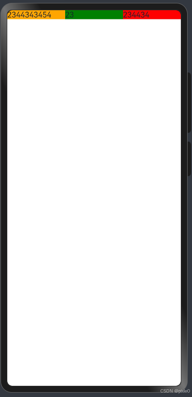
Text('2344343454').flexGrow(1).flexBasis(0).flexShrink(1).backgroundColor(Color.Orange)
Text('23').flexGrow(1).flexBasis(0).flexShrink(1).backgroundColor(Color.Green)
Text('234434').flexGrow(1).flexBasis(0).flexShrink(1).backgroundColor(Color.Red)
}.width('100%')
}
}
}
运行效果:

通过运行效果看,没有达到预期效果,子元素没有平均分配父元素空间,而是平均分配剩余空间。
猜想可能是flexBasis(0)没有生效,flexBasis是设置元素基准宽度, 只有所有子元素基准宽度相同通过扩大或缩小相同比例所有子元素才能均等分。
与css 不一样的是flexBasis不支持百分比
我们改成flexBasis(1)试试
@Entry
@Component
struct Demo {
  build() {
    Column({ space: 50 }) {
      Flex() {
        Text('2344343454').flexGrow(1).flexBasis(0).flexShrink(1).backgroundColor(Color.Orange)
        Text('23').flexGrow(1).flexBasis(0).flexShrink(1).backgroundColor(Color.Green)
        Text('234434').flexGrow(1).flexBasis(0).flexShrink(1).backgroundColor(Color.Red)
      }.width('100%')
    }
  }
}
运行效果:
是我们想要的效果,结果也验证了flexBasis(0)无效。
总结
Flex布局或者线性布局(Row\Column)想要让子元素均等分父元素空间可以使用如下写法:
子组件().flexGrow(1).flexShrink(1).flexBasis(1)
Flex布局和线性布局(Row、Column)区别和优劣选择:
1、写法上一个入参形式、一个属性形式,从代码美观和可读性看线性布局写法比较优雅。
2、Flex配置更丰富,alignItems支持Baseline、Stretch等6种类型值,并且包含direction、wrap、alignContent等入参设置更加靠近css 的flex使用习惯,能实现更多复杂的布局需求。
3、Flex组件主轴默认不设置时撑满父容器,Column、Row组件主轴不设置时默认是跟随子节点大小,这点Flex使用比较麻烦必须时刻注意设置主轴方向的宽或高。
4、Flex组件在渲染时存在二次布局过程,因此在对性能有严格要求的场景下建议使用Column、Row代替
更多Flex布局示例说明请看官方文档
四、总结
从上述讲解中我们能发现ArkTS布局几乎是借鉴css,相似度很高,该有的东西基本都有只是写法不一样罢了,这对于前端开发人员来说几乎没难度可以快速衔接上手,当然ArkTS有着更丰富的系统组件,属性、入参和事件也非常多,对于系统组件需要多花点时间学习。