目录
- 前言
- 1. 基本知识
- 2. Demo
- 2.1 基本
- 2.2 自定义分页
- 2.3 自定义动画
- 3. 扩展
前言
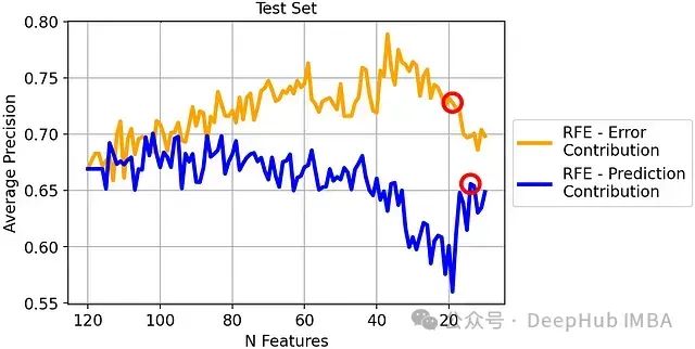
先看代码示例:
实现了一个带有分页指示器的轮播图组件
<template>
  <view class="work-container">
    <!-- 轮播图 -->
    <uni-swiper-dot class="uni-swiper-dot-box" :info="data" :current="current" field="content">
      <swiper class="swiper-box" :current="current" @change="changeSwiper" autoplay interval="3000">
        <swiper-item v-for="(item, index) in data" :key="index">
          <view class="swiper-item" @click="clickBannerItem(item)">
            <image :src="item.image" mode="aspectFill" :draggable="false" />
          </view>
        </swiper-item>
      </swiper>
    </uni-swiper-dot>
  </view>
</template>

<script>
export default {
  data() {
    return {
      current: 0,
      data: [
        { image: '/static/images/banner/banner01.jpg' },
        { image: '/static/images/banner/banner02.jpg' },
        { image: '/static/images/banner/banner03.jpg' }
      ]
    };
  },
  methods: {
    clickBannerItem(item) {
      console.info('Banner item clicked:', item);
    },
    changeSwiper(e) {
      this.current = e.detail.current;
    }
  }
};
</script>

<style lang="scss">
  .swiper-box {
    height: 150px;
  }

  .swiper-item {
    display: flex;
    justify-content: center;
    align-items: center;
    color: #fff;
    height: 300rpx;
    line-height: 300rpx;
  }

  @media screen and (min-width: 500px) {
    .uni-swiper-dot-box {
      width: 400px;
      margin: 0 auto;
      margin-top: 8px;
    }
  }
</style>
截图如下:

1. 基本知识
在 uni-app 中,<swiper> 组件是一个用于轮播图的基础组件,类似于其他前端框架中的 carousel
配合 <swiper-item>,可以实现多个页面、图片或内容的循环切换
uni-swiper-dot 组件用于为轮播图提供分页指示器(即小点)
<swiper> 组件:用于创建轮播图的组件
主要有以下几个常用属性:
current:当前显示的 swiper-item 的索引autoplay:是否自动切换,布尔值interval:自动切换的时间间隔,单位为毫秒duration:滑动动画的时长,单位为毫秒circular:是否采用衔接滑动,即是否循环播放indicator-dots:是否显示面板指示点
事件
change:轮播图滑动时触发,返回当前页的索引
<swiper-item> 组件:是 swiper 的子组件,用于定义每个可滑动的内容块
有一个 key 属性,用于唯一标识每一个 swiper-item
<uni-swiper-dot> 组件:一个为 swiper 提供分页指示器(小圆点)的组件,是 uni-app 的扩展组件
通过将分页指示器与 swiper 组件结合,可以为用户提供视觉提示,了解当前处于第几页
2. Demo
2.1 基本
简单的轮播图,包含 3 个图片项,开启了自动播放和指示点,间隔为 3 秒,动画时长为 500 毫秒
<template>
  <swiper
    indicator-dots
    autoplay
    interval="3000"
    duration="500"
  >
    <swiper-item>
      <view class="swiper-item">
        <image src="https://example.com/image1.jpg" mode="aspectFill"></image>
      </view>
    </swiper-item>
    <swiper-item>
      <view class="swiper-item">
        <image src="https://example.com/image2.jpg" mode="aspectFill"></image>
      </view>
    </swiper-item>
    <swiper-item>
      <view class="swiper-item">
        <image src="https://example.com/image3.jpg" mode="aspectFill"></image>
      </view>
    </swiper-item>
  </swiper>
</template>

<style scoped>
.swiper-item {
  width: 100%;
  height: 300px;
}
</style>
2.2 自定义分页
结合 uni-swiper-dot 实现自定义分页指示器
使用了 uni-swiper-dot 组件,自定义了轮播图的分页指示器。这里通过 @change 监听 swiper 的切换事件,动态更新当前页索引
<template>
  <uni-swiper-dot class="uni-swiper-dot-box" :info="data" :current="currentIndex" field="content">
    <swiper class="swiper-box" :current="currentIndex" @change="changeSwiper" autoplay interval="3000">
      <swiper-item v-for="(item, index) in data" :key="index">
        <view class="swiper-item" @click="clickBannerItem(item)">
          <image :src="item.image" mode="aspectFill" />
        </view>
      </swiper-item>
    </swiper>
  </uni-swiper-dot>
</template>

<script>
export default {
  data() {
    return {
      currentIndex: 0,
      data: [
        { image: 'https://example.com/image1.jpg', content: 'Image 1' },
        { image: 'https://example.com/image2.jpg', content: 'Image 2' },
        { image: 'https://example.com/image3.jpg', content: 'Image 3' },
      ],
    };
  },
  methods: {
    changeSwiper(e) {
      this.currentIndex = e.detail.current;
    },
    clickBannerItem(item) {
      console.log('Banner item clicked:', item);
    },
  },
};
</script>

<style scoped>
.swiper-box {
  height: 300px;
}
.swiper-item {
  display: flex;
  justify-content: center;
  align-items: center;
  height: 100%;
}
</style>
2.3 自定义动画
自定义了指示点的颜色,包括默认颜色和当前页的激活颜色,并且开启了 circular 选项实现循环播放
<template>
  <swiper
    autoplay
    interval="4000"
    duration="600"
    indicator-dots
    indicator-color="rgba(255,255,255,0.6)"
    indicator-active-color="rgba(255,0,0,1)"
    circular
  >
    <swiper-item v-for="(item, index) in images" :key="index">
      <view class="swiper-item">
        <image :src="item" mode="aspectFill"></image>
      </view>
    </swiper-item>
  </swiper>
</template>

<script>
export default {
  data() {
    return {
      images: [
        'https://example.com/image1.jpg',
        'https://example.com/image2.jpg',
        'https://example.com/image3.jpg',
      ],
    };
  },
};
</script>

<style scoped>
.swiper-item {
  height: 250px;
  background-color: #ccc;
}
</style>
3. 扩展
常见的功能扩展如下:
手动切换到指定页面,修改 current 变量可以手动切换到某一页
<template>
  <swiper :current="current" @change="changeSwiper">
    <!-- swiper-item content here -->
  </swiper>
  <button @click="current = 1">切换到第二页</button>
</template>

<script>
export default {
  data() {
    return {
      current: 0,
    };
  },
  methods: {
    changeSwiper(e) {
      this.current = e.detail.current;
    },
  },
};
</script>
自定义指示器样式,通过 indicator-color 和 indicator-active-color 可以修改指示器颜色
<swiper :indicator-dots="true" indicator-color="rgba(0,0,0,.3)" indicator-active-color="#007aff">
  <!-- swiper-item content here -->
</swiper>


![[SAP ABAP] 修改内表数据](https://i-blog.csdnimg.cn/direct/88f35c63227741359ab6509838d61265.png)