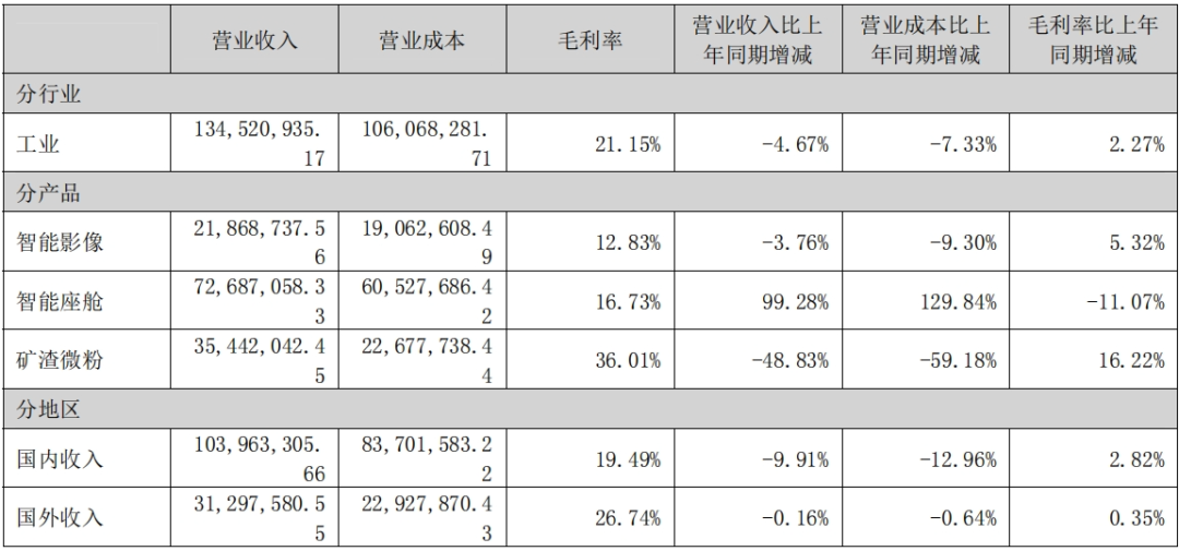
前期我们已经学习过2D和3D的直方图绘制:
二维常规直方图绘制:python画图|水平直方图绘制_绘制水平直方图-CSDN博客
二维极坐标直方图绘制:python画图|极坐标中画直方图_ax1.plot()怎么画直方图-CSDN博客
三维直方图绘制:python画图|3D直方图基础教程-CSDN博客
三维直方图绘制进阶:python画图|3D bar进阶探索-CSDN博客
现在我们尝试在三维空间上画二维的直方图。
【1】官网教程
打开官网教程,看到漂亮的2D直方图位于不同的平面上:
Create 2D bar graphs in different planes — Matplotlib 3.9.2 documentation
代码非常简洁,因此尝试做一下解读。
【2】代码解读
首先是numpy计算模块和matplot画图模块的引入:
import matplotlib.pyplot as plt  #引入matplotlib模块画图
import numpy as np #引入numpy模块做数学计算
然后定义了随机数种子和要画图:
# Fixing random state for reproducibility
np.random.seed(19680801) #定义随机数种子


fig = plt.figure() #定义要画图
ax = fig.add_subplot(projection='3d') #定义要画3D图
之后设定了color、yticks矩阵,并使用for循环对其输出以画图:
colors = ['r', 'g', 'b', 'y'] #定义颜色矩阵
yticks = [3, 2, 1, 0] #定义Y轴显示的坐标值
for c, k in zip(colors, yticks): #定义for循环
    # Generate the random data for the y=k 'layer'.
    xs = np.arange(20) #xs取值0,1,2...20
    ys = np.random.rand(20) #ys为1行20列随机矩阵

    # You can provide either a single color or an array with the same length as
    # xs and ys. To demonstrate this, we color the first bar of each set cyan.
    cs = [c] * len(xs) #因变量定义
    cs[0] = 'c' #定义cs[0]

    # Plot the bar graph given by xs and ys on the plane y=k with 80% opacity.
      ax.bar(xs, ys, zs=k, zdir='y', color=cs, alpha=0.8) #输出直方图,zs表示画图平面
上述代码中:
【a】xs = np.arange(20) 表示xs取值0,1,2..,19;
【b】ys = np.random.rand(20) 表示ys为1行20列随机矩阵,这个随机矩阵已经提前用np.random.seed(19680801)定义了随机数种子。
【c】cs = [c] * len(xs) 表达的意思是:有多少个[c],[c]代表颜色,xs数组的长度是20,所以就是有20个[c],表明一共有20个直方图用了同一种颜色。
【d】cs[0] = 'c',约定了第一个直方图的颜色是cyan青绿色。
【e】zs=k, zdir='y'是指画图平面的位置,Z平面位于y=k轴。
最后设置了坐标,并输出图形:
ax.set_xlabel('X') #定义X轴
ax.set_ylabel('Y') #定义Y轴
ax.set_zlabel('Z') #定义Z轴

# On the y-axis let's only label the discrete values that we have data for.
ax.set_yticks(yticks) #将yticks输出

plt.show() #输出图形

图1
由图1可见,所有平面上的直方图,第一个图形总是青绿色。
至此带注释的完整代码为:
import matplotlib.pyplot as plt  #引入matplotlib模块画图
import numpy as np #引入numpy模块做数学计算

# Fixing random state for reproducibility
np.random.seed(19680801) #定义随机数种子


fig = plt.figure() #定义要画图
ax = fig.add_subplot(projection='3d') #定义要画3D图

colors = ['r', 'g', 'b', 'y'] #定义颜色矩阵
yticks = [3, 2, 1, 0] #定义Y轴显示的坐标值
for c, k in zip(colors, yticks): #定义for循环
    # Generate the random data for the y=k 'layer'.
    xs = np.arange(20) #xs取值0,1,2...20
    ys = np.random.rand(20) #ys取值随机,范围[0,20)

    # You can provide either a single color or an array with the same length as
    # xs and ys. To demonstrate this, we color the first bar of each set cyan.
    cs = [c] * len(xs) #因变量定义
    cs[0] = 'c' #定义cs[0]

    # Plot the bar graph given by xs and ys on the plane y=k with 80% opacity.
    ax.bar(xs, ys, zs=k, zdir='y', color=cs, alpha=0.8) #输出直方图,zs表示画图平面

ax.set_xlabel('X') #定义X轴
ax.set_ylabel('Y') #定义Y轴
ax.set_zlabel('Z') #定义Z轴

# On the y-axis let's only label the discrete values that we have data for.
ax.set_yticks(yticks) #将yticks输出

plt.show() #输出图形
【3】代码修改
【3.1】直方图颜色设置
尝试不执行cs[0] = 'c',也就是不限定第一个矩形的值。将其改为注释:
#cs[0] = 'c' #定义cs[0]
输出图形为:

图2
由图2可见,所有平面上的第一个直方图已经不再是青绿色,而是和同平面其他方块一致。
【3.2】直方图平面设置
在前述加注释过程中,已经发现直方图平面设置在Y轴,现在尝试将其转移到X轴:
ax.bar(xs, ys, zs=k, zdir='x', color=cs, alpha=0.8)
此时的输出结果为:

图3
转移到Z轴:
ax.bar(xs, ys, zs=k, zdir='z', color=cs, alpha=0.8)

图4
【4】代码优化
图形虽然展示了坐标轴,但是没有图名,因此尝试增加图名。
ax.set_title('3D plot which has 2D bar graphs')
为了让坐标轴等突出,设置坐标轴的颜色:
ax.set_xlabel('X',color="g") #定义X轴
ax.set_ylabel('Y',color="g") #定义Y轴
ax.set_zlabel('Z',color="g") #定义Z轴
对比不同形式的图形,增加散点图绘制:
# Plot the bar graph given by xs and ys on the plane y=k with 80% opacity.
ax.bar(xs, ys, zs=k, zdir='y', color=cs, alpha=0.8)  # 输出直方图,zs表示画图平面
ax.scatter(xs, ys, zs=k, zdir='y', color=cs1, alpha=0.8) #输出直方图,zs表示画图平面
在散点图中出现color1,需要往前追溯,增加cs1定义和输出:
colors = ['r', 'g', 'b', 'y'] #定义颜色矩阵
colors1 = ['b', 'y', 'r', 'g'] #定义颜色矩阵
yticks = [3, 2, 1, 0] #定义Y轴显示的坐标值
for c, k ,c1 in zip(colors, yticks,colors1): #定义for循环
    # Generate the random data for the y=k 'layer'.
    xs = np.arange(20) #xs取值0,1,2...20
    ys = np.random.rand(20) #ys取值随机,范围[0,20)

    # You can provide either a single color or an array with the same length as
    # xs and ys. To demonstrate this, we color the first bar of each set cyan.
    cs = [c] * len(xs) #因变量定义
    cs1= [c1] * len(xs) #因变量定义
输出图形为:

图5
输出结果如图5所示,同时绘制了散点图和直方图,且散点图位于直方图的顶端。
至此的完整代码为:
import matplotlib.pyplot as plt  #引入matplotlib模块画图
import numpy as np #引入numpy模块做数学计算

# Fixing random state for reproducibility
np.random.seed(19680801) #定义随机数种子


fig = plt.figure() #定义要画图
ax = fig.add_subplot(projection='3d') #定义要画3D图

colors = ['r', 'g', 'b', 'y'] #定义颜色矩阵
colors1 = ['b', 'y', 'r', 'g'] #定义颜色矩阵
yticks = [3, 2, 1, 0] #定义Y轴显示的坐标值
for c, k ,c1 in zip(colors, yticks,colors1): #定义for循环
    # Generate the random data for the y=k 'layer'.
    xs = np.arange(20) #xs取值0,1,2...20
    ys = np.random.rand(20) #ys取值随机,范围[0,20)

    # You can provide either a single color or an array with the same length as
    # xs and ys. To demonstrate this, we color the first bar of each set cyan.
    cs = [c] * len(xs) #因变量定义
    cs1= [c1] * len(xs) #因变量定义
    #cs[0] = 'c' #定义cs[0]

    # Plot the bar graph given by xs and ys on the plane y=k with 80% opacity.
    ax.bar(xs, ys, zs=k, zdir='y', color=cs, alpha=0.8)  # 输出直方图,zs表示画图平面
    ax.scatter(xs, ys, zs=k, zdir='y', color=cs1, alpha=0.8) #输出直方图,zs表示画图平面

ax.set_xlabel('X',color="g") #定义X轴
ax.set_ylabel('Y',color="g") #定义Y轴
ax.set_zlabel('Z',color="g") #定义Z轴
ax.set_title('3D plot which has 2D bar graphs')
# On the y-axis let's only label the discrete values that we have data for.
ax.set_yticks(yticks) #将yticks输出
ax.set_zlim(-0.1, 1.5) #设置Z轴
plt.show() #输出图形
【5】总结
学习了在三维坐标上绘制二维直方图,设置了坐标,修改了第一个直方图的颜色,并尝试了散点图和直方图的同时输出。


![[数据集][目标检测]文本表格检测数据集VOC+YOLO格式6688张5类别](https://i-blog.csdnimg.cn/direct/b51f88fe85364c2185dde74d1ba04f25.png)