原始教程链接:https://github.com/iMetaScience/iMetaPlot/tree/main/221017multi-pieplot
写在前面
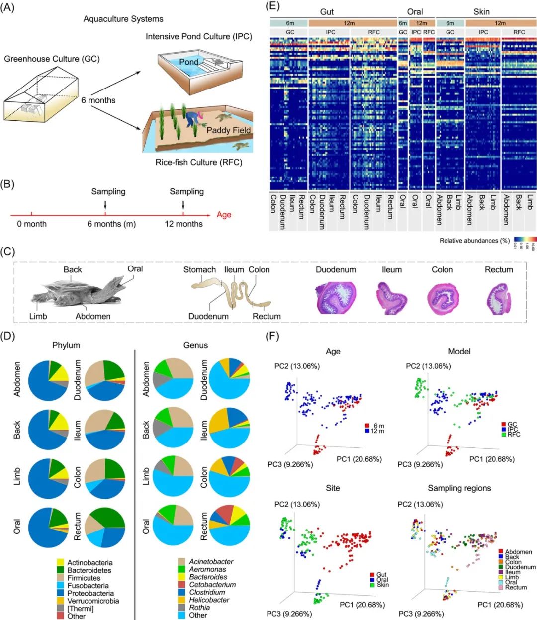
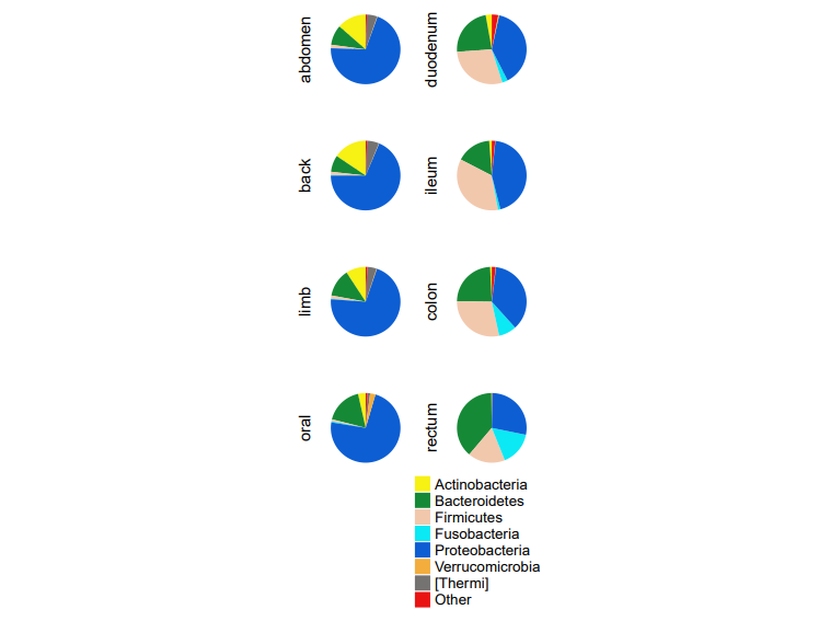
饼图 (Pie Plot) 在微生物组研究中可以用来展示菌群物种组成,可以起到与堆叠柱状图相同的展示效果。本期我们挑选2022年4月5日刊登在iMeta上的The impact of aquaculture system on the microbiome and gut metabolome of juvenile Chinese softshell turtle (Pelodiscus sinensis)- iMeta | 南昌大学丁霞等-水产养殖模式对水产动物皮肤、口腔和肠道微生物群落组装及宿主适应性的影响,选择文章的Figure 1D进行复现,讲解和探讨简单饼图以及同一图片中呈现多个饼图的方法,先上原图:

代码编写及注释:农心生信工作室
R包检测和安装
01
安装核心R包ggplot2以及一些功能辅助性R包,并载入所有R包
if (!require("ggplot2"))install.packages('ggplot2')if (!require("dplyr"))install.packages('dplyr')if (!require("ComplexHeatmap"))BiocManager::install('ComplexHeatmap')#>#> 有二进制版本的,但源代码版本是后来的:#> binary source needs_compilation#> clue 0.3-61 0.3-62 TRUE#>#>#> 下载的二进制程序包在#> /var/folders/15/ywvz065n3jl4qm8jygpq5bz80000gn/T//RtmpLnQspz/downloaded_packages里# 加载包library(ggplot2)library(dplyr)library(ComplexHeatmap)library(grid)
读取或生成数据
02
设该图数据来自文章的补充文件supplementary table3,大家可以根据链接自行下载。在这里,我们下载它的补充文件后,导出为test.CSV进行读取。
#读取数据df<-read.csv("test.CSV",header = T)#创建一个向量,包含了图中将要展示的丰度最高的7个科top_phylum=c("Actinobacteria","Bacteroidetes","Firmicutes","Fusobacteria","Proteobacteria","Verrucomicrobia","[Thermi]")#将其他低丰度的科统一命名为Otherdf[!(df$Taxonomyt %in% top_phylum),]$Taxonomyt = "Other"
饼图预览
03
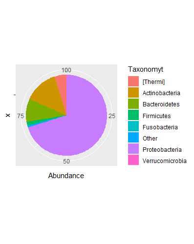
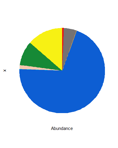
选择样本abdomen,使用ggplot2包绘制一个最简单的饼图,方法与绘制柱状图一样,只是将直角坐标系转化为了极坐标系:
#选择样本abdomenper_df<-df[df$Sample=="abdomen",]#使用aggregate函数,根据Taxonomyt的分组,将科名称相同的丰度求和,即最终得到Other的丰度的和per_df<-aggregate(per_df$Abundance,by=list(Taxonomyt=per_df$Taxonomyt),sum) %>% rename(Abundance=x)p<-ggplot(per_df,aes("",Abundance,fill=Taxonomyt))+geom_bar(stat = "identity")+coord_polar(theta = "y")
04
根据原图,我们固定图例中科名显示的顺序,并美化图片,设置颜色,去除背景,坐标轴,图例:
mycol<-c("#F7F114","#168936","#F2C8AD","#0BE9F4","#0D5ED3","#F2AD3D","#757272","#EA1313")#设置颜色per_df<-df[df$Sample=="abdomen",]per_df<-aggregate(per_df$Abundance,by=list(Taxonomyt=per_df$Taxonomyt),sum) %>% rename(Abundance=x)per_df$Taxonomyt<-factor(per_df$Taxonomyt,levels =c("Actinobacteria","Bacteroidetes","Firmicutes","Fusobacteria","Proteobacteria","Verrucomicrobia","[Thermi]","Other"))#固定图例顺序p<-ggplot(per_df,aes("",Abundance,fill=Taxonomyt))+geom_bar(stat = "identity")+coord_polar(theta = "y")+scale_fill_manual(values = mycol)+guides(fill="none")+theme(axis.text.y = element_blank(),panel.background = element_blank(),line = element_blank(),axis.ticks.y = element_blank(),axis.text.x = element_blank())
05
接下来是全文的重点,如何在一张画布上绘制多个饼图,并将它们有序排列。这里,我们要用assign函数,使每个样本对应一副饼图:
#首先生成一个向量,包含全部八个样本名sample_name<-unique(df$Sample)#unique()函数去除重复数据#设置颜色mycol<-c("#F7F114","#168936","#F2C8AD","#0BE9F4","#0D5ED3","#F2AD3D","#757272","#EA1313")#编写函数getPieplot(),该函数包含两个参数,第一个参数为数据框df,第二个参数为样本名称,最终返回饼图getPieplot<-function(dfname,Samplename){per_df<-dfname[dfname$Sample==Samplename,]per_df<-aggregate(per_df$Abundance,by=list(Taxonomyt=per_df$Taxonomyt),sum) %>% rename(Abundance=x)per_df$Taxonomyt<-factor(per_df$Taxonomyt,levels =c("Actinobacteria","Bacteroidetes","Firmicutes","Fusobacteria","Proteobacteria","Verrucomicrobia","[Thermi]","Other"))p<-ggplot(per_df,aes("",Abundance,fill=Taxonomyt))+geom_bar(stat = "identity")+coord_polar(theta = "y")+scale_fill_manual(values = mycol)+labs(x=Samplename,y="")+guides(fill="none")+theme(axis.text.y = element_blank(),panel.background = element_blank(),line = element_blank(),axis.ticks.y = element_blank(),axis.text.x = element_blank())return(p)}#for循环遍历八个样本名,利用assign函数,以样本名作变量名,将饼图分别赋给对应的变量for (i in sample_name){assign(i,getPieplot(df,i))}
06
使用底层绘图包grid,按顺序将饼图一一排列:
#创建新一个新的画布grid.newpage()#创建一个4行2列的布局pushViewport(viewport(layout = grid.layout(nrow = 4, ncol = 2),width = 0.3))#编写一个函数,方便定义每一个饼图在画布布局中的具体位置vp_value <- function(row, col){viewport(layout.pos.row = row, layout.pos.col = col)}#print将每个图形输出到布局的不同区域中print(abdomen,vp = vp_value(row = 1, col = 1))print(duodenum,vp = vp_value(row = 1, col = 2))print(back,vp = vp_value(row = 2, col = 1))print(ileum,vp = vp_value(row = 2, col = 2))print(limb,vp = vp_value(row = 3, col = 1))print(colon,vp = vp_value(row = 3, col = 2))print(oral,vp = vp_value(row = 4, col = 1))print(rectum,vp = vp_value(row = 4, col = 2))
07
最后,我们利用顾祖光博士开发的ComplexHeatmap包(关于ComplexHeatmap包的使用,可以参考往期推文跟着iMeta学做图|ComplexHeatmap绘制多样的热图),绘制一个单独的图例,并置于画布的最下方:
pdf("Figure1D.pdf",width = 8, height = 6)grid.newpage()#重新创建一个5行2列的布局,最后一行用于放置图例pushViewport(viewport(layout = grid.layout(nrow = 5, ncol = 2),width = 0.3))vp_value <- function(row, col){viewport(layout.pos.row = row, layout.pos.col = col)}print(abdomen,vp = vp_value(row = 1, col = 1))print(duodenum,vp = vp_value(row = 1, col = 2))print(back,vp = vp_value(row = 2, col = 1))print(ileum,vp = vp_value(row = 2, col = 2))print(limb,vp = vp_value(row = 3, col = 1))print(colon,vp = vp_value(row = 3, col = 2))print(oral,vp = vp_value(row = 4, col = 1))print(rectum,vp = vp_value(row = 4, col = 2))#创建图例lgd_points = Legend(at = c("Actinobacteria","Bacteroidetes","Firmicutes","Fusobacteria","Proteobacteria","Verrucomicrobia","[Thermi]","Other"), type = "points", pch = 15,legend_gp = gpar(col = mycol),title = "",background = mycol)#将图例与饼图合并draw(lgd_points, x = unit(45, "mm"), y = unit(5, "mm"), just = c( "bottom"))dev.off()#> quartz_off_screen#> 2
完整代码
if (!require("ggplot2"))install.packages('ggplot2')if (!require("dplyr"))install.packages('dplyr')if (!require("ComplexHeatmap"))BiocManager::install('ComplexHeatmap')#>#> 有二进制版本的,但源代码版本是后来的:#> binary source needs_compilation#> clue 0.3-61 0.3-62 TRUE#>#>#> 下载的二进制程序包在#> /var/folders/15/ywvz065n3jl4qm8jygpq5bz80000gn/T//RtmpLnQspz/downloaded_packages里# 加载包library(ggplot2)library(dplyr)library(ComplexHeatmap)library(grid)#读取数据df<-read.csv("test.CSV",header = T)#创建一个向量,包含了图中将要展示的丰度最高的7个科top_phylum=c("Actinobacteria","Bacteroidetes","Firmicutes","Fusobacteria","Proteobacteria","Verrucomicrobia","[Thermi]")#将其他低丰度的科统一命名为Otherdf[!(df$Taxonomyt %in% top_phylum),]$Taxonomyt = "Other"#选择样本abdomenper_df<-df[df$Sample=="abdomen",]#使用aggregate函数,根据Taxonomyt的分组,将科名称相同的丰度求和,即最终得到Other的丰度的和per_df<-aggregate(per_df$Abundance,by=list(Taxonomyt=per_df$Taxonomyt),sum) %>% rename(Abundance=x)p<-ggplot(per_df,aes("",Abundance,fill=Taxonomyt))+geom_bar(stat = "identity")+coord_polar(theta = "y")mycol<-c("#F7F114","#168936","#F2C8AD","#0BE9F4","#0D5ED3","#F2AD3D","#757272","#EA1313")#设置颜色per_df<-df[df$Sample=="abdomen",]per_df<-aggregate(per_df$Abundance,by=list(Taxonomyt=per_df$Taxonomyt),sum) %>% rename(Abundance=x)per_df$Taxonomyt<-factor(per_df$Taxonomyt,levels =c("Actinobacteria","Bacteroidetes","Firmicutes","Fusobacteria","Proteobacteria","Verrucomicrobia","[Thermi]","Other"))#固定图例顺序p<-ggplot(per_df,aes("",Abundance,fill=Taxonomyt))+geom_bar(stat = "identity")+coord_polar(theta = "y")+scale_fill_manual(values = mycol)+guides(fill="none")+theme(axis.text.y = element_blank(),panel.background = element_blank(),line = element_blank(),axis.ticks.y = element_blank(),axis.text.x = element_blank())p#首先生成一个向量,包含全部八个样本名sample_name<-unique(df$Sample)#unique()函数去除重复数据#设置颜色mycol<-c("#F7F114","#168936","#F2C8AD","#0BE9F4","#0D5ED3","#F2AD3D","#757272","#EA1313")#编写函数getPieplot(),该函数包含两个参数,第一个参数为数据框df,第二个参数为样本名称,最终返回饼图getPieplot<-function(dfname,Samplename){per_df<-dfname[dfname$Sample==Samplename,]per_df<-aggregate(per_df$Abundance,by=list(Taxonomyt=per_df$Taxonomyt),sum) %>% rename(Abundance=x)per_df$Taxonomyt<-factor(per_df$Taxonomyt,levels =c("Actinobacteria","Bacteroidetes","Firmicutes","Fusobacteria","Proteobacteria","Verrucomicrobia","[Thermi]","Other"))p<-ggplot(per_df,aes("",Abundance,fill=Taxonomyt))+geom_bar(stat = "identity")+coord_polar(theta = "y")+scale_fill_manual(values = mycol)+labs(x=Samplename,y="")+guides(fill="none")+theme(axis.text.y = element_blank(),panel.background = element_blank(),line = element_blank(),axis.ticks.y = element_blank(),axis.text.x = element_blank())return(p)}#for循环遍历八个样本名,利用assign函数,以样本名作变量名,将饼图分别赋给对应的变量for (i in sample_name){assign(i,getPieplot(df,i))}#创建新一个新的画布grid.newpage()#创建一个4行2列的布局pushViewport(viewport(layout = grid.layout(nrow = 4, ncol = 2),width = 0.3))#编写一个函数,方便定义每一个饼图在画布布局中的具体位置vp_value <- function(row, col){viewport(layout.pos.row = row, layout.pos.col = col)}#print将每个图形输出到布局的不同区域中print(abdomen,vp = vp_value(row = 1, col = 1))print(duodenum,vp = vp_value(row = 1, col = 2))print(back,vp = vp_value(row = 2, col = 1))print(ileum,vp = vp_value(row = 2, col = 2))print(limb,vp = vp_value(row = 3, col = 1))print(colon,vp = vp_value(row = 3, col = 2))print(oral,vp = vp_value(row = 4, col = 1))print(rectum,vp = vp_value(row = 4, col = 2))pdf("Figure1D.pdf",width = 8, height = 6)grid.newpage()#重新创建一个5行2列的布局,最后一行用于放置图例pushViewport(viewport(layout = grid.layout(nrow = 5, ncol = 2),width = 0.3))vp_value <- function(row, col){viewport(layout.pos.row = row, layout.pos.col = col)}print(abdomen,vp = vp_value(row = 1, col = 1))print(duodenum,vp = vp_value(row = 1, col = 2))print(back,vp = vp_value(row = 2, col = 1))print(ileum,vp = vp_value(row = 2, col = 2))print(limb,vp = vp_value(row = 3, col = 1))print(colon,vp = vp_value(row = 3, col = 2))print(oral,vp = vp_value(row = 4, col = 1))print(rectum,vp = vp_value(row = 4, col = 2))#创建图例lgd_points = Legend(at = c("Actinobacteria","Bacteroidetes","Firmicutes","Fusobacteria","Proteobacteria","Verrucomicrobia","[Thermi]","Other"), type = "points", pch = 15,legend_gp = gpar(col = mycol),title = "",background = mycol)#将图例与饼图合并draw(lgd_points, x = unit(45, "mm"), y = unit(5, "mm"), just = c( "bottom"))dev.off()#> quartz_off_screen#> 2
以上数据和代码仅供大家参考,如有不完善之处,欢迎大家指正!