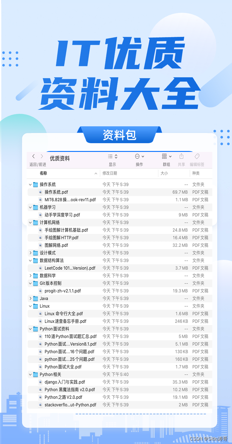
前言:哈喽,大家好,今天给大家分享html+css 绚丽效果!并提供具体代码帮助大家深入理解,彻底掌握!创作不易,如果能帮助到大家或者给大家一些灵感和启发,欢迎收藏+关注哦 💕
文章目录
- 效果
- 原理解析
- 1.通过a标签的hover,实现变成3d分层悬停按钮。按钮的组成如下。
- 2.具体的变换参数,直接==看代码==,可以一键复制,查看效果
- 上代码,可以直接复制使用
- 目录
- html
- css
效果

原理解析
1.通过a标签的hover,实现变成3d分层悬停按钮。按钮的组成如下。

2.具体的变换参数,直接看代码,可以一键复制,查看效果
上代码,可以直接复制使用
目录

html
<!DOCTYPE html>
<html>

<head>
    <meta http-equiv="content-type" content="text/html; charset=utf-8">
    <meta name="viewport" content="width=device-width,initial-scale=1,maximum-scale=1,user-scalable=no">

    <title>html+css 3D分层悬停按钮</title>
    <link href="https://cdn.bootcdn.net/ajax/libs/font-awesome/4.7.0/css/font-awesome.min.css" rel="stylesheet">
    <link rel="stylesheet" href="./style.css">
</head>

<body>
<div class="container">
    <h1 style="text-align: center;color:#fff;margin-bottom: 50px;padding-top: 50px">html+css 3D分层悬停按钮</h1>

    <div class="icon-box">
        <a href="#">
            <div class="layer">
                <i></i>
                <i></i>
                <i></i>
                <i></i>
                <i class="fa fa-qq" aria-hidden="true"></i>
            </div>
            <div class="text">QQ</div>
        </a>
        <a href="#">
            <div class="layer">
                <i></i>
                <i></i>
                <i></i>
                <i></i>
                <i class="fa fa-weixin" aria-hidden="true"></i>
            </div>
            <div class="text">微信</div>
        </a>
        <a href="#">
            <div class="layer">
                <i></i>
                <i></i>
                <i></i>
                <i></i>
                <i class="fa fa-weibo" aria-hidden="true"></i>
            </div>
            <div class="text">微博</div>
        </a>
        <a href="#">
            <div class="layer">
                <i></i>
                <i></i>
                <i></i>
                <i></i>
                <i class="fa fa-renren" aria-hidden="true"></i>
            </div>
            <div class="text">人人网</div>
        </a>
        <a href="#">
            <div class="layer">
                <i></i>
                <i></i>
                <i></i>
                <i></i>
                <i class="fa fa-twitter" aria-hidden="true"></i>
            </div>
            <div class="text">推特</div>
        </a>
    </div>

</div>

</body>

</html>
css
*{
    /* 初始化 取消内外边距 */
    margin: 0;
    padding: 0;
    /* 设置的边框和内边距的值是包含在总宽高内的 */
    box-sizing: border-box;
}


.container{
    /* 100%窗口高度 */
    height: 100vh;
    /* 渐变背景 */
    background: linear-gradient(200deg,#29323c,#485563);
}
.icon-box{
    /* 弹性布局 水平排列 */
    display: flex;
    flex-direction: row;
    width: 650px;
    margin:0 auto;
}
.icon-box a{
    color: #fff;
    margin: 0 30px;
    text-decoration: none;
    display: block;
    /* 相对定位 */
    position: relative;
}
.icon-box a .layer{
    width: 70px;
    height: 70px;
    /* 动画过渡 */
    transition: 0.3s;
}
.icon-box a .layer i{
    position: absolute;
    top: 0;
    left: 0;
    width: 100%;
    height: 100%;
    /* 通过var函数调用自定义属性--c */
    border: 1px solid var(--c);
    border-radius: 6px;
    transition: 0.3s;
}
.icon-box a .layer i.fa{
    font-size: 35px;
    text-align: center;
    line-height: 70px;
    color: var(--c);
}
.icon-box a .text{
    /* 绝对定位 */
    position: absolute;
    bottom: 0;
    opacity: 0;
    width: 100%;
    text-align: center;
    color: var(--c);
    /* 动画过渡 */
    transition: 0.3s;
}
.icon-box a:hover .text{
    /* 鼠标移入文本出现 */
    bottom: -35px;
    opacity: 1;
}
.icon-box a:hover .layer{
    /* 鼠标移入,该元素旋转-35度并倾斜20度 */
    transform: rotate(-35deg) skew(20deg);
}
/* 鼠标移入,设置图标外的每一层边框的样式(不透明度+位置偏移) */
.icon-box a:hover .layer i:nth-child(1){
    opacity: 0.2;
    transform: translate(0,0);
}
.icon-box a:hover .layer i:nth-child(2){
    opacity: 0.4;
    transform: translate(5px,-5px);
}
.icon-box a:hover .layer i:nth-child(3){
    opacity: 0.6;
    transform: translate(10px,-10px);
}
.icon-box a:hover .layer i:nth-child(4){
    opacity: 0.8;
    transform: translate(15px,-15px);
}
.icon-box a:hover .layer i:nth-child(5){
    opacity: 1;
    transform: translate(20px,-20px);
}
/* 鼠标移入,设置每一层边框的阴影样式 */
.icon-box a:hover .layer i{
    box-shadow: -1px 1px 3px var(--c);
}
/* 接下来为每一个按钮设置不同颜色 */
.icon-box a:nth-child(1) .layer i,
.icon-box a:nth-child(1) .text{
    /* --c是自定义属性,这里为颜色值,可通过var函数进行调用 */
    --c: #12b7f5;
}
.icon-box a:nth-child(2) .layer i,
.icon-box a:nth-child(2) .text{
    --c: #2aae67;
}
.icon-box a:nth-child(3) .layer i,
.icon-box a:nth-child(3) .text{
    --c: #e79115;
}
.icon-box a:nth-child(4) .layer i,
.icon-box a:nth-child(4) .text{
    --c: #2075fd;
}
.icon-box a:nth-child(5) .layer i,
.icon-box a:nth-child(5) .text{
    --c: #2d8dc5;
}
到此这篇文章就介绍到这了,更多精彩内容请关注本人以前的文章或继续浏览下面的文章,创作不易,如果能帮助到大家,希望大家多多支持宝码香车~💕
更多专栏订阅推荐:
👍 html+css+js 绚丽效果
💕 vue
✈️ Electron
⭐️ js
📝 字符串
✍️ 时间对象(Date())操作


