简单方法通过css 绕过同源策略 以获取资源
<!DOCTYPE html>
<html lang="en">
<head>
<meta charset="UTF-8">
<meta name="viewport" content="width=device-width, initial-scale=1.0">
<title>水面倒影</title>
</head>
<style>
* {
margin: 0;
padding: 0;
background-color: black;
overflow: hidden;
}
:root {
--url1: url('https://p1.ssl.qhimgs1.com/sdr/400__/t01ad51c404cedd035b.jpg');
--url2: url('https://p1.ssl.qhimgs1.com/sdr/400__/t01c1a45e5e8cd59ed1.jpg');
--url4: url('https://p1.ssl.qhimgs1.com/sdr/400__/t0476de4a34f088a8a7.jpg');
--url5: url('https://p1.ssl.qhimgs1.com/sdr/400__/t04a17109704054cb5b.jpg');
--url6: url('https://p2.ssl.qhimgs1.com/sdr/400__/t03e8c2d4c1fba3f1c2.jpg');
--url7: url('https://p0.ssl.qhimgs1.com/sdr/400__/t01801242cf98b4c440.jpg');
--url8: url('https://p2.ssl.qhimgs1.com/sdr/400__/t0439d69c47c0d7c0e8.jpg');
}
body {
box-sizing: border-box;
position: relative;
overflow: hidden;
z-index: -1;
}
.boxa {
position: relative;
margin: 0;
padding: 0;
width: 100vw;
height: 500px;
display: flex;
justify-content: center;
align-items: center;
background-color: transparent;
z-index: 1;
}
div:not(.boxa):not(.void):hover {
transform: translateZ(200px) translateY(10px) rotateY(20deg);
perspective: 1000px;
-webkit-box-reflect: below 0px -webkit-linear-gradient(top, rgba(255, 255, 255, 0), rgba(255, 255, 255, 0.5));
box-shadow: 0 0 20px 0 rgba(225, 136, 41, 0.5),
0 0 25px 0 rgba(7, 229, 29, 0.5),
0 0 30px 0 rgba(214, 46, 184, 0.5);
}
#t1:active {
transform: translateX(600px) scale(2);
box-shadow: 0 0 20px 10px rgba(134, 198, 237, 1),
0 0 25px 15px rgba(3, 250, 213, 1),
0 0 30px 20px rgba(244, 3, 39, 1);
}
#t2:active {
transform: translateX(400px) scale(2);
box-shadow: 0 0 20px 10px rgba(255, 165, 0, 1),
0 0 25px 15px rgba(255, 0, 255, 1),
0 0 30px 20px rgba(0, 255, 0, 1);
}
#t3:active {
transform: translateX(200px) scale(2);
box-shadow: 0 0 20px 10px rgba(0, 0, 255, 1),
0 0 25px 15px rgba(255, 0, 0, 1),
0 0 30px 20px rgba(0, 255, 255, 1);
}
#t4:active {
transform: scale(2);
box-shadow: 0 0 20px 10px rgba(128, 0, 128, 1),
0 0 25px 15px rgba(255, 255, 0, 1),
0 0 30px 20px rgba(0, 128, 128, 1);
}
#t5:active {
transform: translateX(-200px) scale(2);
box-shadow: 0 0 20px 10px rgba(128, 128, 0, 1),
0 0 25px 15px rgba(128, 0, 0, 1),
0 0 30px 20px rgba(0, 128, 0, 1);
}
#t6:active {
transform: translateX(-400px) scale(2);
box-shadow: 0 0 20px 10px rgba(0, 0, 0, 1),
0 0 25px 15px rgba(255, 255, 255, 1),
0 0 30px 20px rgba(128, 128, 128, 1);
}
#t7:active {
transform: translateX(-600px) scale(2);
box-shadow: 0 0 20px 10px rgba(255, 255, 128, 1),
0 0 25px 15px rgba(128, 255, 255, 1),
0 0 30px 20px rgba(255, 128, 128, 1);
}
.test1 {
overflow: hidden;
width: 200px;
height: 300px;
background-image: var(--url1);
background-repeat: no-repeat;
background-position: center;
background-size: cover;
border: 2px solid rgb(255, 255, 255);
}
.test2 {
overflow: hidden;
width: 200px;
height: 300px;
background-image: var(--url2);
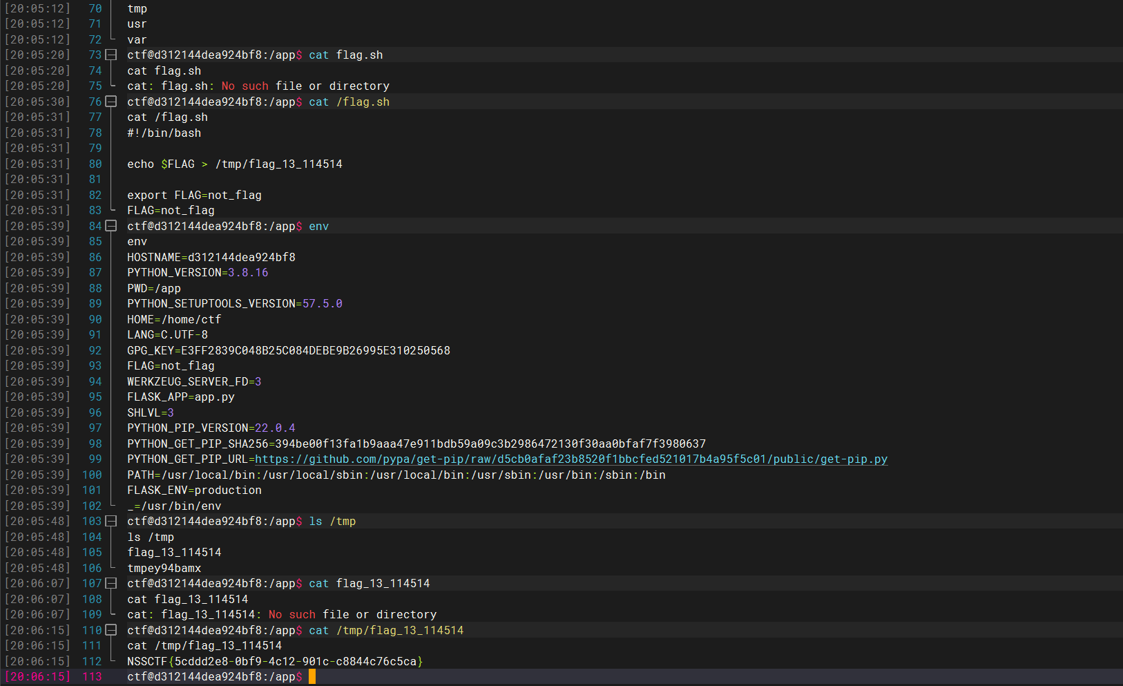
background-repeat: no-repeat;
background-position: center;
background-size: cover;
border: 2px solid rgb(255, 255, 255);
}
.test3 {
overflow: hidden;
width: 200px;
height: 300px;
background-image: var(--url4);
background-repeat: no-repeat;
background-position: center;
background-size: cover;
border: 2px solid rgb(255, 255, 255);
}
.test4 {
overflow: hidden;
width: 200px;
height: 300px;
background-image: var(--url5);
background-repeat: no-repeat;
background-position: center;
background-size: cover;
border: 2px solid rgb(255, 255, 255);
}
.test5 {
overflow: hidden;
width: 200px;
height: 300px;
background-image: var(--url6);
background-repeat: no-repeat;
background-position: center;
background-size: cover;
border: 2px solid rgb(255, 255, 255);
}
.test6 {
overflow: hidden;
width: 200px;
height: 300px;
background-image: var(--url7);
background-repeat: no-repeat;
background-position: center;
background-size: cover;
border: 2px solid rgb(255, 255, 255);
}
.test7 {
overflow: hidden;
width: 200px;
height: 300px;
background-image: var(--url8);
background-repeat: no-repeat;
background-position: center;
background-size: cover;
border: 2px solid rgb(255, 255, 255);
}
.void {
top: -16vh;
z-index: 0;
position: relative;
width: 100vw;
height: 500px;
background-image: url("https://p3.ssl.qhimgs1.com/sdr/400__/t011d51db67bfe62a1d.gif");
background-repeat: no-repeat;
background-position: center;
background-size: cover;
opacity: 0.5;
}
</style>
<body>
<div id="box" class="boxa">
<div id="t1" class="test1"></div>
<div id="t2" class="test2"></div>
<div id="t3" class="test3"></div>
<div id="t4" class="test4"></div>
<div id="t5" class="test5"></div>
<div id="t6" class="test6"></div>
<div id="t7" class="test7"></div>
</div>
<div class="void">显示图片</div>
</body>
</html>
效果展示