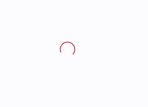
效果
仅使用html+css,效果如下所示
代码
<!DOCTYPE html>
<html lang="en">
  <head>
    <meta charset="UTF-8" />
    <title>加载中</title>
    <style>
      .el-loading-spinner .circular {
        height: 42px;
        width: 42px;
        animation: loading-rotate 2s linear infinite;
      }
      @keyframes loading-rotate {
        100% {
          transform: rotate(1turn);
        }
      }
      .el-loading-spinner .path {
        animation: loading-dash 1.5s ease-in-out infinite;
        stroke-dasharray: 90,150;
        stroke-dashoffset: 0;
        stroke-width: 2;
        stroke: #C00019;
        stroke-linecap: round;
      }
      @keyframes loading-dash {
        0% {
          stroke-dasharray: 1,200;
          stroke-dashoffset: 0;
        }
        50% {
          stroke-dasharray: 90,150;
          stroke-dashoffset: -40px;
        }
        100% {
          stroke-dasharray: 90,150;
          stroke-dashoffset: -120px;
        }
      }
    </style>
  </head>
  <body>
    <div class="loading">
      <div class="el-loading-spinner">
        <svg viewBox="25 25 50 50" class="circular">
          <circle cx="50" cy="50" r="20" fill="none" class="path"></circle>
        </svg>
      </div>
    </div>

  </body>
</html>

![【PYG】Planetoid中边存储的格式,为什么打印前十条边用edge_index[:, :10]](https://img-blog.csdnimg.cn/direct/1909b053a7d7489eb61ccb86baec98e0.png)