HTML+CSS+JavaScript
结构+表现+交互
学习内容:
- CSS是什么
- CSS怎么用(快速入门)
- CSS选择器(重点+难点)
- 美化网页(文字,阴影,超链接,列表,渐变…)
- 盒子模型
- 浮动
- 定位
- 网页动画(特效效果)
1. 是什么
Cascading Style Sheet 层叠级联样式表
CSS:表现(美化网页)
字体、颜色、边距、高度、宽度、背景图片、网页定位、网页浮动…
发展史
CSS 1.0
CSS 2.0 DIV(块)+CSS,HTML与CSS结构分离的思想,网页变得简单、SEO
CSS 2.1 浮动、定位
CSS 3.0 圆角、阴影、动画… 、浏览器兼容性~
2. 快速入门
方法一:
规范:在head标签中使用<style>标签可以编写CSS代码;每一个声明,最好使用分号结尾。
语法:
选择器{
	声明1;
	声明2;
	声明3;
}
例如:
<style>
	h1{
		color:red;
	}
</style>
方法二:分离
- 建立一个style.css文件
- 将声明的代码写在其中(CSS代码)
- 然后在HTML代码中使用
<link rel="stylesheet" href="..../style.css">
引入CSS代码,实现html与css分离
CSS优势:
- 内容和表现分离
- 内容结构表现统一,可以实现复用(网站中其他网页可以使用这个CSS)
- 样式十分的丰富
- 建立使用独立于HTML的CSS文件
- 利用SEO,容易被搜索引擎收录!
CSS的三种导入方式:
1、行内样式:在标签元素中,编写一个style属性,编写样式即可
2、内部样式:在<head>标签内编写一个style属性,编写样式即可
3、外部样式:建立一个CSS文件,在里面编写样式,在<head>标签内使用<link> 标签调用CSS文件即可
文件结构:
		项目名:
				CSS:
					style.css
				index.html
优先级:就近原则,离代码近的优先被使用
拓展:外部样式的两种导入写法:
- 链接式:
<link> - 导入式:(CSS 2.1特有的)
<style>
	@import url("css/style.css");
</style>
<!DOCTYPE html>
<html lang="en">
<head>
    <meta charset="UTF-8">
    <title>Title</title>

    <!--内部样式-->
    <style>
        h1{
            color: green;
        }
    </style>

    <!--外部样式-->
    <!--连接式-->
    <link rel="stylesheet" href="css/style.css">
    <!--导入式-->
    <style>
        @import url("css/style.css");
    </style>
</head>
<body>

<!--优先级:就近原则-->

<!--行内样式:在标签元素中,编写一个style属性,编写样式即可-->
<h1 style="color:red;">我是标题</h1>

</body>
</html>
3. 选择器
作用:选择页面上的某一个元素或者某一类元素
基本选择器
- 标签选择器:会选择到页面上所有的这个标签的元素,格式:
标签{ } - 类选择器:可以多个标签归类,是同一个class,可以复用,格式:
.class的名称{ }
例如:
<head>
	<style>
		.qtf1{
			color:....;
		}
		.qtf2{
			color:....;
		}
	</style>
</head>
<body>
	<h1 class="qtf1">标题1</h1>
	<h1 class="qtf2">标题2</h1>
	<p class="qtf1">P标签</p>
</body>
- id选择器:id必须保证全局唯一!格式:
#id名称{ }
<head>
	<style>
		#qtf1{
			color:....;
		}
	</style>
</head>
<body>
	<h1 id="qtf1">标题1</h1>
</body>
标签选择器、类选择器、id选择器优先级是固定的:id选择器>类选择器>标签选择器
层次选择器
- 后代选择器:在某个元素的后面
例如:
	body p{
		background : red;
	}
效果:body后面所有P标签背景颜色都改变
- 子选择器:后面一代(儿子)
例如:
	body>p{
		background : red;
	}
效果:body后面下一个层次的P标签背景颜色改变
- 相邻兄弟选择器:只有一个,同层次相邻(向下)
例如:
<head>
	<style>
		.active+p{
			background : red;
		}
	</style>
</head>
<body>
	<p>P0</p>
	<p class="active">P1</p>
	<p>P2</p>
	<p>P3</p>
</body>
效果:只有P2会变颜色,因为相邻向下一个P标签兄弟style改变
- 通用兄弟选择器:当前选中元素的向下的所有兄弟元素
例如:
<head>
	<style>
		.active~p{
			background : red;
		}
	</style>
</head>
<body>
	<p>P0</p>
	<p class="active">P1</p>
	<p>P2</p>
	<p>P3</p>
	<p>P4</p>
</body>
效果:P2、P3、P4背景颜色全部改变,同层向下P标签兄弟变色
| 写法 | 效果 |
|---|---|
| body p{} | 后代所有p标签 |
| body>p{} | 后一代所有p标签 |
| body+p{} | 兄弟下一个p标签 |
| body~p{} | 兄弟后面所有p标签 |
结构伪类选择器
使用 : 叫做伪类选择器
<body>
	<h1>H1</h1>
	<p>P1</p>
	<p>P2</p>
	<p>P3</p>
	<ul>
		<li>L1</li>
		<li>L2</li>
		<li>L3</li>
	</ul>
</body>
更换ul的第一个子元素背景颜色:
	ul li:first-child{
			background:....;
	}
更换ul的最后一个子元素背景颜色:
	ul li:last-child{
			background:....;
	}
选中并更改P1元素:首先需要定位到P元素的父元素,然后再定位到P1元素,必须是P元素才生效!
法1:选中P元素父亲body下的全部元素的第二个元素P1
		p:nth-child(2){
            color: #ff0051;
        }
法二:选中P元素父亲body下的P元素的第一个元素P1
        p:nth-of-type(1){
            background: yellow;
        }
属性选择器(常用)
id+class结合~
格式:名称[属性名=属性值]{} 名称可以是各种选择器的标签,属性值是正则表达式
基础正则表达式
| 符号 | 含义 |
|---|---|
| = | 绝对等于 |
| *= | 包含这个元素 |
| ^= | 以这个元素开头 |
| $= | 以这个元素结尾 |
例如:
存在id属性的a标签元素:
a[id]{
	background:....;
}
id=first的a标签元素:
a[id=first]{
	background:....;
}
class中有links的a标签元素:
a[class*="links"]{
	background:....;
}
选中href中以http开头的a标签元素:
a[href^=http]{
	background:....;
}
4. 美化网页元素
为什么要美化网页?
- 有效的传递页面信息
- 美化网页,页面漂亮,才能吸引用户
- 凸显页面主题
- 提高用户的体验
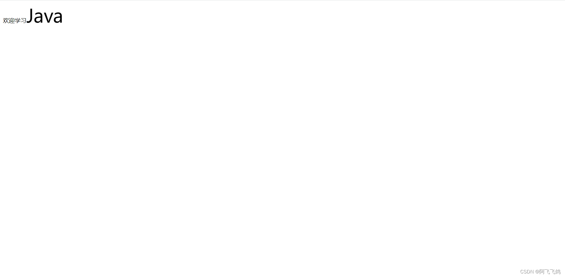
span标签:重点要突出的字,使用span套起来
<!DOCTYPE html>
<html lang="en">
<head>
    <meta charset="UTF-8">
    <title>Title</title>

    <style>
        #title1{
            font-size: 50px;
        }
    </style>

</head>
<body>


欢迎学习<span id="title1">Java</span>

</body>
</html>
字体样式:
font-family字体
font-size 字体大小
font-weight 字体粗细
color 字体颜色
颜色:
#RGB(红绿蓝) 0~F
#RGBA(红绿蓝透明度) A:0~1
例:
color:rgb(0,255,0);(绿色)
color:rgba(0,255,0,0.5);(绿色)
可以合在一起写:font: oblique bolder 16px "楷体";依次是斜体、粗体、大小、字体;
<!DOCTYPE html>
<html lang="en">
<head>
<meta charset="UTF-8">
<title>Title</title>
<!--
font-family:字体
font-size:字体大小 px像素
font-weight:字体粗细
color:字体颜色
-->
<style>
body{
font-family: "Arial Black" , 楷体 ;
color: #a13d30;
}
h1{
font-size: 50px;
}
.p1{
font-weight: bold;
}
</style>
</head>
<body>
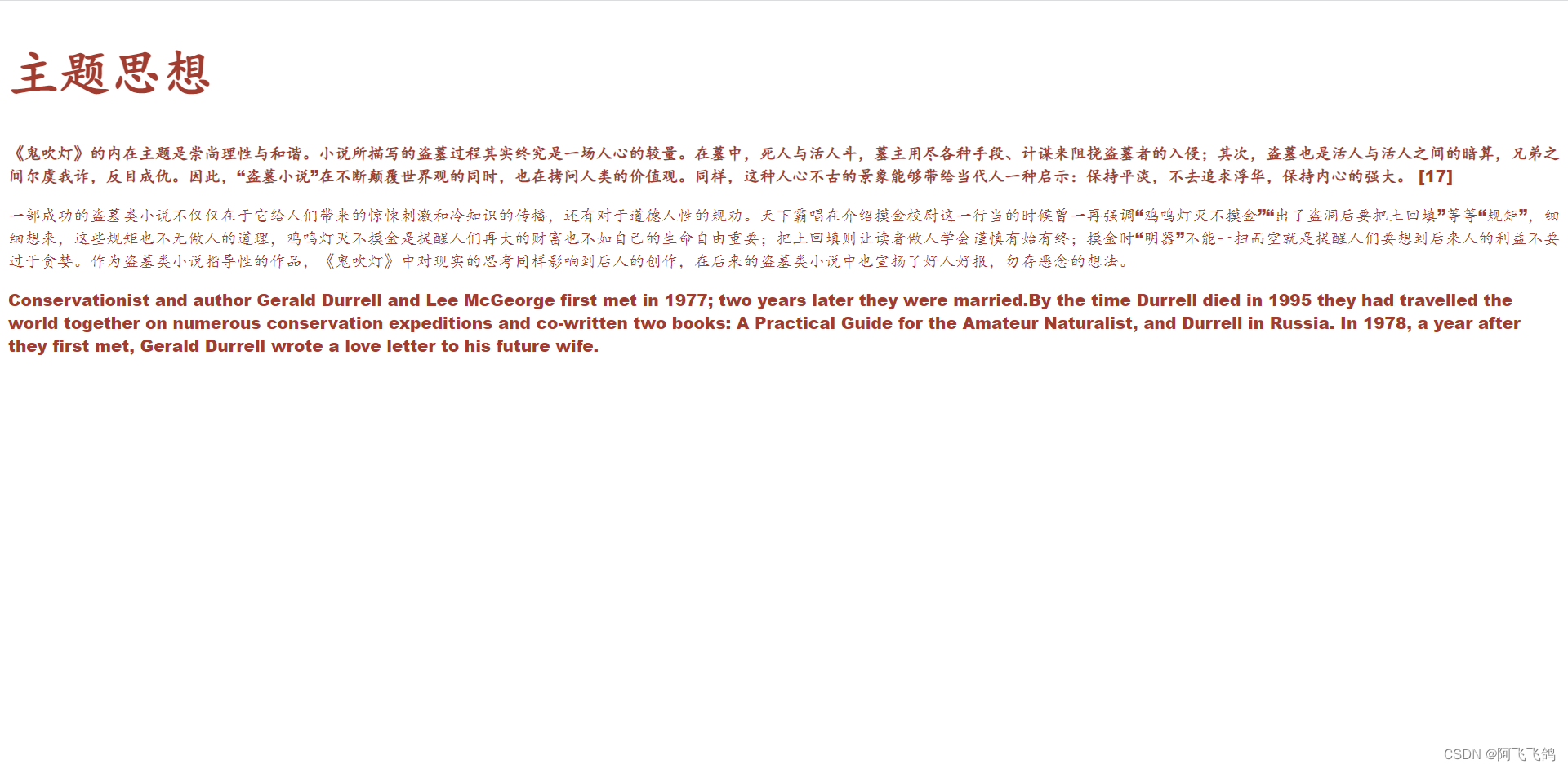
<h1>主题思想</h1>
<p class="p1">
《鬼吹灯》的内在主题是崇尚理性与和谐。小说所描写的盗墓过程其实终究是一场人心的较量。在墓中,死人与活人斗,墓主用尽各种手段、计谋来阻挠盗墓者的入侵;其次,盗墓也是活人与活人之间的暗算,兄弟之间尔虞我诈,反目成仇。因此,“盗墓小说”在不断颠覆世界观的同时,也在拷问人类的价值观。同样,这种人心不古的景象能够带给当代人一种启示:保持平淡,不去追求浮华,保持内心的强大。 [17]
</p>
<p>
一部成功的盗墓类小说不仅仅在于它给人们带来的惊悚刺激和冷知识的传播,还有对于道德人性的规劝。天下霸唱在介绍摸金校尉这一行当的时候曾一再强调“鸡鸣灯灭不摸金”“出了盗洞后要把土回填”等等“规矩”,细细想来,这些规矩也不无做人的道理,鸡鸣灯灭不摸金是提醒人们再大的财富也不如自己的生命自由重要;把土回填则让读者做人学会谨慎有始有终;摸金时“明器”不能一扫而空就是提醒人们要想到后来人的利益不要过于贪婪。作为盗墓类小说指导性的作品,《鬼吹灯》中对现实的思考同样影响到后人的创作,在后来的盗墓类小说中也宣扬了好人好报,勿存恶念的想法。
</p>
<p>
Conservationist and author Gerald Durrell and Lee McGeorge first met in 1977; two years later they were married.By the time Durrell died in 1995 they had travelled the world together on numerous conservation expeditions and co-written two books: A Practical Guide for the Amateur Naturalist, and Durrell in Russia. In 1978, a year after they first met, Gerald Durrell wrote a love letter to his future wife.
</p>
</body>
</html>
文本样式:
text-align:center排版水平居中
text-indent:2em段落首行缩进2字符
height:300px
line-height:300px
行高和块的高度一致,就可以上下居中
text-decoration:underline下划线
text-decoration:line-through中划线
text-decoration:overline上划线
text-decoration:nonea标签去掉下划线
rertical-align:middle文本图片水平对齐
<!DOCTYPE html>
<html lang="en">
<head>
<meta charset="UTF-8">
<title>Title</title>
<!--
颜色:
单词
RGB 0~F
RGBA A:0~1
text-align:排版,居中
text-indent: 2em;段落首行缩进
height: 300px;
line-height: 300px;
行高, 和 块的高度一致,就可以上下居中
text-decoration 上中下划线,链接标签去下划线
-->
<style>
h1{
color: rgba(0,255,255,0.9);
text-align: center;
}
.p1{
text-indent: 2em;
}
.p3{
background: #134efc;
height: 300px;
line-height: 300px;
}
.l1{
text-decoration: underline;
}
.l2{
text-decoration: line-through;
}
.l3{
text-decoration: overline;
}
a{
text-decoration: none;
}
</style>
</head>
<body>
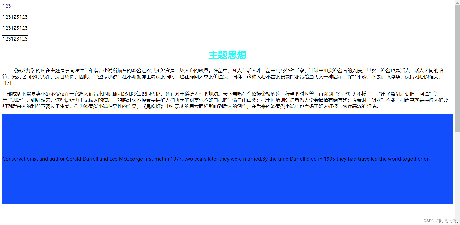
<a href="">123</a>
<p class="l1">123123123</p>
<p class="l2">123123123</p>
<p class="l3">123123123</p>
<h1>主题思想</h1>
<p class="p1">
《鬼吹灯》的内在主题是崇尚理性与和谐。小说所描写的盗墓过程其实终究是一场人心的较量。在墓中,死人与活人斗,墓主用尽各种手段、计谋来阻挠盗墓者的入侵;其次,盗墓也是活人与活人之间的暗算,兄弟之间尔虞我诈,反目成仇。因此,“盗墓小说”在不断颠覆世界观的同时,也在拷问人类的价值观。同样,这种人心不古的景象能够带给当代人一种启示:保持平淡,不去追求浮华,保持内心的强大。 [17]
</p>
<p>
一部成功的盗墓类小说不仅仅在于它给人们带来的惊悚刺激和冷知识的传播,还有对于道德人性的规劝。天下霸唱在介绍摸金校尉这一行当的时候曾一再强调“鸡鸣灯灭不摸金”“出了盗洞后要把土回填”等等“规矩”,细细想来,这些规矩也不无做人的道理,鸡鸣灯灭不摸金是提醒人们再大的财富也不如自己的生命自由重要;把土回填则让读者做人学会谨慎有始有终;摸金时“明器”不能一扫而空就是提醒人们要想到后来人的利益不要过于贪婪。作为盗墓类小说指导性的作品,《鬼吹灯》中对现实的思考同样影响到后人的创作,在后来的盗墓类小说中也宣扬了好人好报,勿存恶念的想法。
</p>
<p class="p3">
Conservationist and author Gerald Durrell and Lee McGeorge first met in 1977; two years later they were married.By the time Durrell died in 1995 they had travelled the world together on numerous conservation expeditions and co-written two books: A Practical Guide for the Amateur Naturalist, and Durrell in Russia. In 1978, a year after they first met, Gerald Durrell wrote a love letter to his future wife.
</p>
</body>
</html>
<!DOCTYPE html>
<html lang="en">
<head>
<meta charset="UTF-8">
<title>Title</title>
<!--
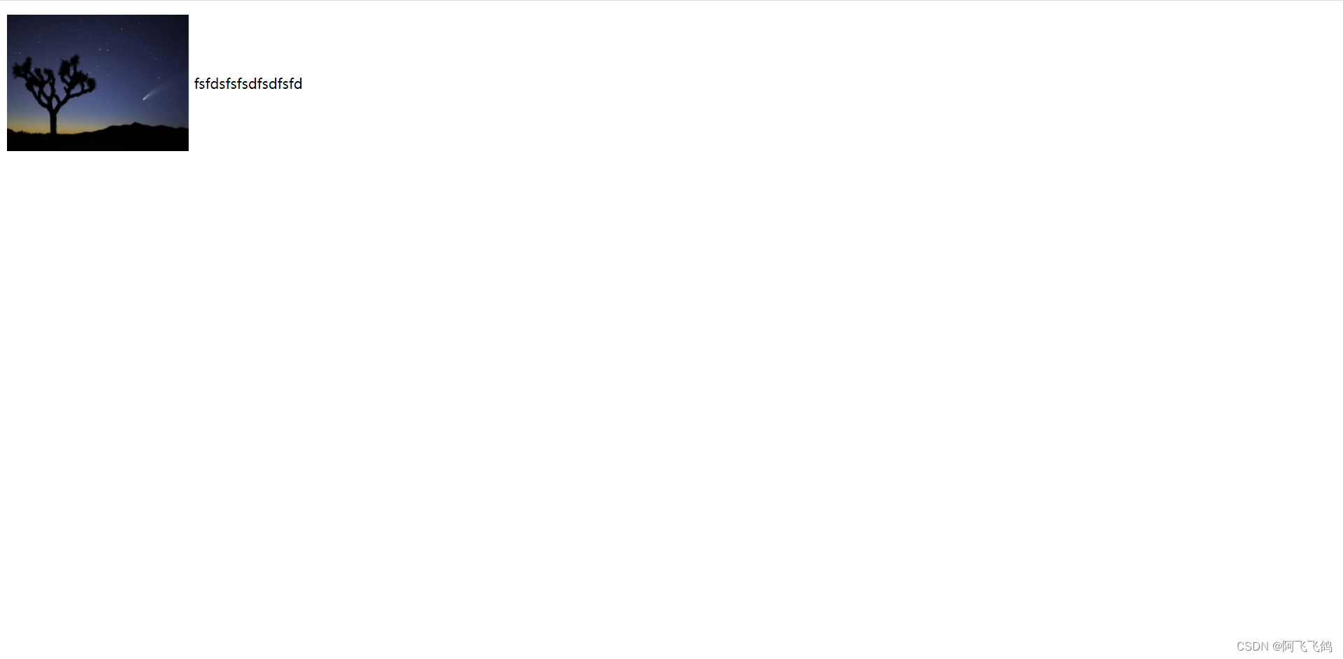
水平对齐 参照物 a,b
文本图片水平对齐 vertical-align: middle;
-->
<style>
img,span{
vertical-align: middle;
}
</style>
</head>
<body>
<p>
<img src="images/a.PNG" alt="">
<span>fsfdsfsfsdfsdfsfd</span>
</p>
</body>
</html>
阴影
text-shadow:阴影颜色 水平偏移 垂直偏移 阴影半径;
例如:
#price{
	text-shadow:#3cc7f5 10px -10px 2px;
}
超链接伪类:
a:link{color:....;}未访问的链接状态
a:visited{color:....;}已访问的链接状态
a:hover{color:....;}鼠标悬浮的链接状态
a:active{color:....;}鼠标按住未释放的链接状态
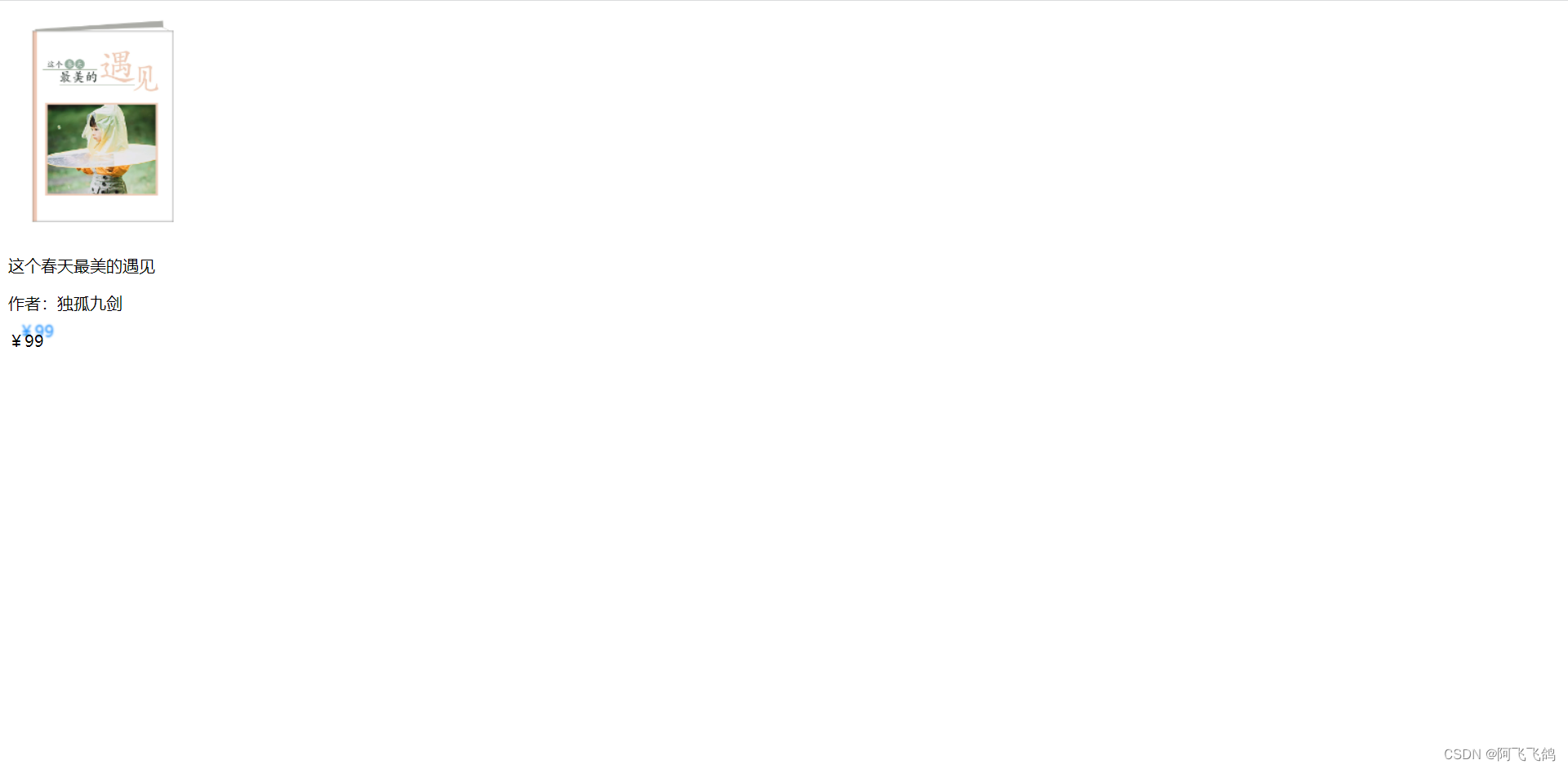
<!DOCTYPE html>
<html lang="en">
<head>
    <meta charset="UTF-8">
    <title>Title</title>

    <style>
        /*默认的颜色*/
        a{
            text-decoration: none;
            color: black;
        }
        /*鼠标悬浮的状态(只需要记住)*/
        a:hover{
            color: orange;
            font-size: 50px;
        }
        /*鼠标按住未释放的状态*/
        a:active{
            color: green;
        }
        /*text-shadow:阴影颜色,水平偏移,垂直偏移,阴影半径*/
        #price{
            text-shadow: dodgerblue 10px -10px 2px;
        }
    </style>
</head>
<body>

<a href="#">
    <img src="images/书.PNG" alt="">
</a>
<p>
    <a href="#">这个春天最美的遇见</a>
</p>
<p>
    <a href="">作者:独孤九剑</a>
</p>
<p id="price">
    ¥99
</p>

</body>
</html>
列表样式 ul li
list-style:
none 去掉圆点
circle 空心圆
decimal 数字
square 正方形
例如:
ul li{
	height:30px;
	list-style:none;
	text-indent:1em;
}
<!DOCTYPE html>
<html lang="en">
<head>
    <meta charset="UTF-8">
    <title>Title</title>
    <link rel="stylesheet" href="css/style.css">
</head>
<body>

<div id="nav">
    <h2 class="title">全部商品分类</h2>
    <ul>
        <li>
            <a href="#">图书</a>
            <a href="#">音像</a>
            <a href="#">数字商品</a>

        </li>
        <li>
            <a href="#">家用电器</a>
            <a href="#">手机</a>
            <a href="#">数码</a>
        </li>
        <li>
            <a href="#">电脑</a>
            <a href="#">办公</a>
        </li>
        <li>
            <a href="#">家居</a>
            <a href="#">家装</a>
            <a href="#">厨具</a>

        </li>
        <li>
            <a href="#">服饰鞋帽</a>
            <a href="#">个性化妆</a>

        </li>
        <li>
            <a href="#">礼品箱包</a>
            <a href="#">钟表</a>
            <a href="#">珠宝</a>
        </li>
        <li>
            <a href="#">食品饮料</a>
            <a href="#">保健食品</a>
        </li>
        <li>
            <a href="#">彩票</a>
            <a href="#">旅行</a>
            <a href="#">充值</a>
            <a href="#">票务</a>
        </li>
    </ul>
</div>

</body>
</html>
#nav{
    width: 300px;
    background: #a0a0a0;
}

.title{
    font-size: 18px;
    font-weight: bold;
    text-indent: 1em;
    line-height: 35px;
    /*颜色,图片,图片位置,平铺方式*/
    background: red url("../images/下.PNG") 260px 7px no-repeat;
}
/*ul li*/
/*
list-style:
    none 去掉圆点
    circle 空心圆
    decimal 数字
    square 正方形
*/
/*ul{
    background: #a0a0a0;
}*/

ul li{
    height: 30px;
    list-style: none;
    text-indent: 1em;
    background-image: url("../images/右.PNG");
    background-repeat: no-repeat;
    background-position: 220px 0px;
}

a{
    text-decoration: none;
    font-size: 14px;
    color: #000;
}
a:hover{
    color: orange;
    text-decoration: underline;
}
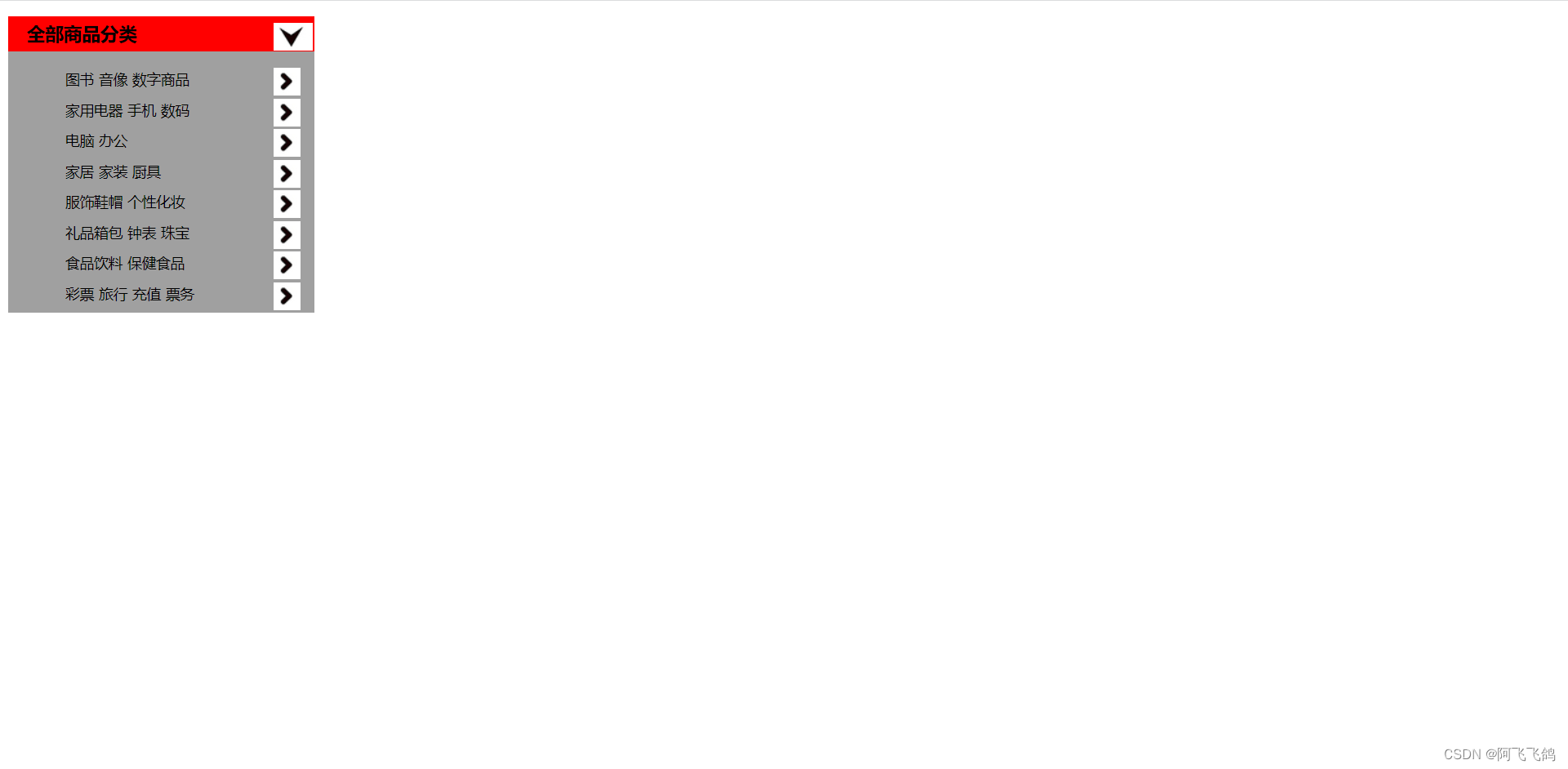
背景(背景颜色、背景图片)
例如:
<style>
	div{
		width:1000px;
		height:700px;
		border:1px solid red;/*边框:粗细 实线 颜色*/
		background-image:url("....");/*背景图片,默认全部平铺*/
	}
	.div1{
		background-repeat:repeat-x;/*x轴平铺*/
	}
	.div2{
		background-repeat:repeat-y;/*y轴平铺*/
	}
	.div3{
		background-repeat:no-repeat;/*不平铺*/
	}
</style>
background:red url("....") 260px 7px no-repeat;颜色、图片、图片位置、平铺方式
background-image:url("....");
background-repeat:no-repeat;
background-position:220px 0px;
渐变:https://www.grabient.com
<!DOCTYPE html>
<html lang="en">
<head>
    <meta charset="UTF-8">
    <title>Title</title>

    <!--径向渐变,圆形渐变-->
    <style>
        body{
            background-color: #85FFBD;
            background-image: linear-gradient(45deg, #85FFBD 0%, #FFFB7D 100%);
        }
    </style>
</head>
<body>

</body>
</html>
5.盒子模型
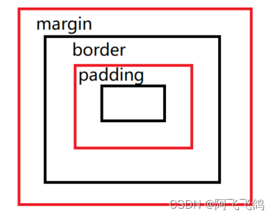
margin:外边距
border:边框
padding:内边距
<!DOCTYPE html>
<html lang="en">
<head>
    <meta charset="UTF-8">
    <title>Title</title>

    <style>
        /*body总有一个默认的外边距,需要改margin: 0*/
        /*h1,ul,li,a,body{
            margin: 0;
            padding: 0;
            text-decoration: none;
        }*/
        /*border:粗细,样式,颜色*/
        #box{
            width: 300px;
            border: 1px solid red;
        }

        h2{
            font-size: 16px;
            background: #3cbda6;
            line-height: 30px;
            color: white;
        }

        form{
            background: #3cbda6;
        }
        div:nth-of-type(1) input{
            border: 3px solid black;
        }
        div:nth-of-type(2) input{
            border: 3px dashed #4d0b8c;
        }
        div:nth-of-type(3) input{
            border: 2px dashed #008c27;
        }
    </style>

</head>
<body>

<div id="box">
    <h2>会员登录</h2>
    <form action="#">
        <div>
            <span>用户名:</span>
            <input type="text">
        </div>
        <div>
            <span>密码:</span>
            <input type="text">
        </div>
        <div>
            <span>邮箱:</span>
            <input type="text">
        </div>
    </form>
</div>

</body>
</html>
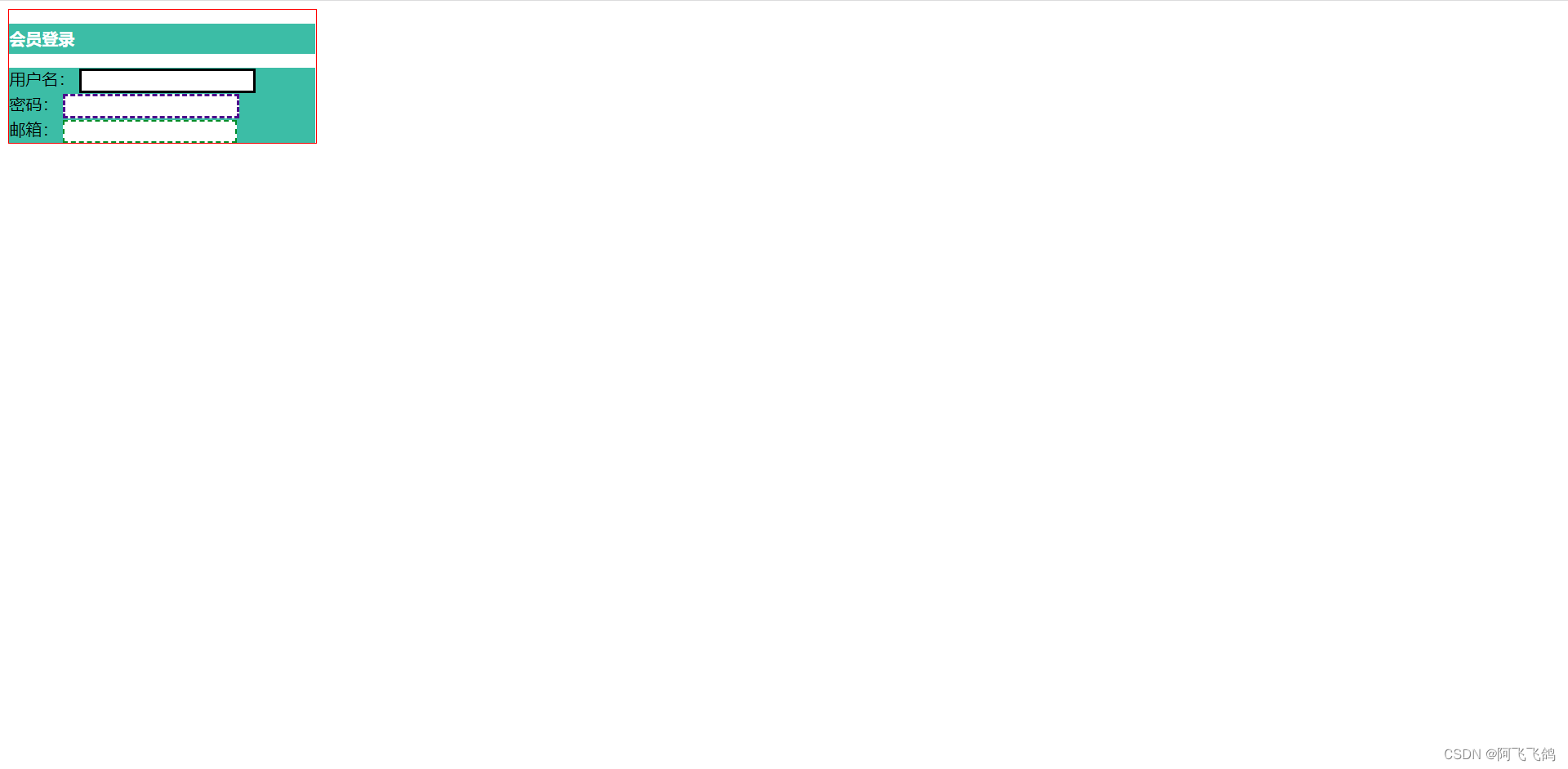
边框:border:1px solid red;/*边框:粗细 实线 颜色*/
- 边框的粗细
- 边框的样式 solid:实线 dashed:虚线
- 边框的颜色
内外边距
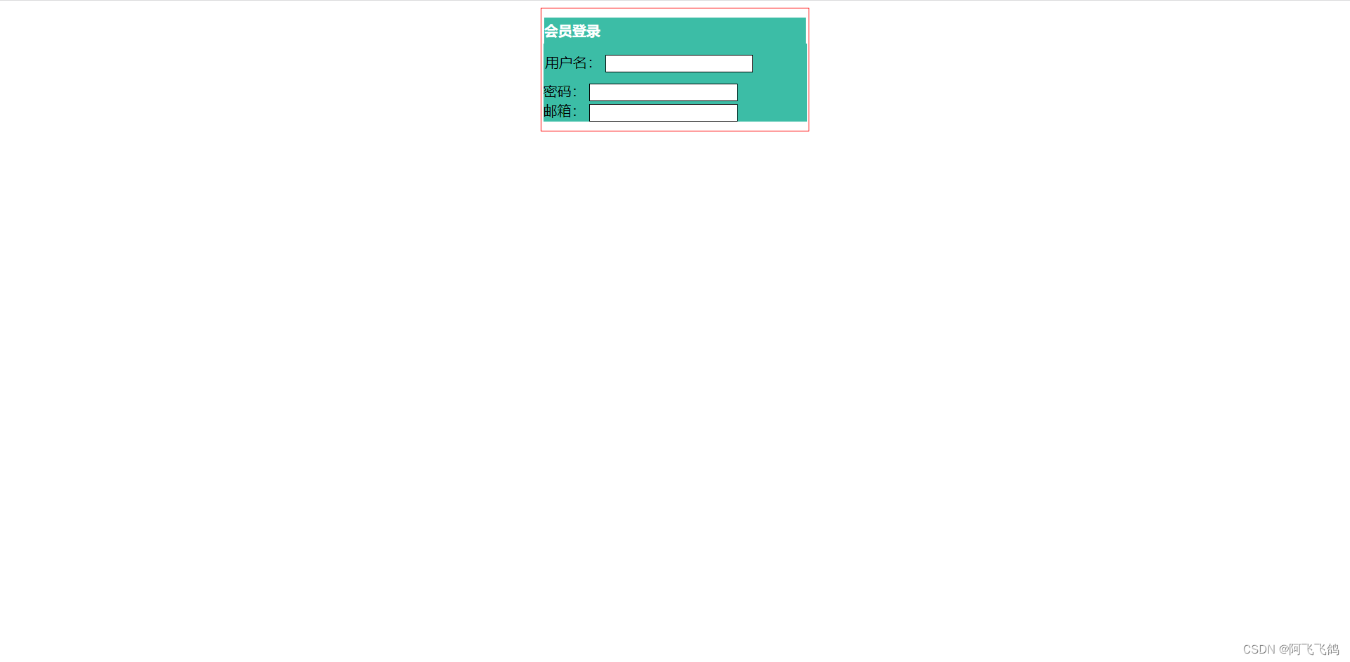
外边距的妙用:居中元素
margin:0上下左右都为0
margin:0 1px上下为0 左右为1个像素
margin:0 1px 2px 3px上 右 下 左 顺时针旋转
盒子的计算方式:margin+border+padding+内容宽度(四部分)
<!DOCTYPE html>
<html lang="en">
<head>
    <meta charset="UTF-8">
    <title>Title</title>

    <!--外边距的妙用:居中元素
    margin: 0 auto;
    -->
    <style>
        #box{
            width: 300px;
            border: 1px solid red;
            margin: 0 auto;
        }
        /*
        顺时针旋转
        margin:0 上下左右
        margin: 0 1px 上下 左右
        margin: 0 1px 2px 3px 上 右 下 左
        */
        h2{
            font-size: 16px;
            background: #3cbda6;
            line-height: 30px;
            color: white;
            margin: 0 1px;
        }

        form{
            background: #3cbda6;
        }
        input{
            border: 1px solid black;
        }
        div:nth-of-type(1){
            padding: 10px 2px;
        }
    </style>

</head>
<body>

<div id="box">
    <h2>会员登录</h2>
    <form action="#">
        <div>
            <span>用户名:</span>
            <input type="text">
        </div>
        <div>
            <span>密码:</span>
            <input type="text">
        </div>
        <div>
            <span>邮箱:</span>
            <input type="text">
        </div>
    </form>
</div>

</body>
</html>
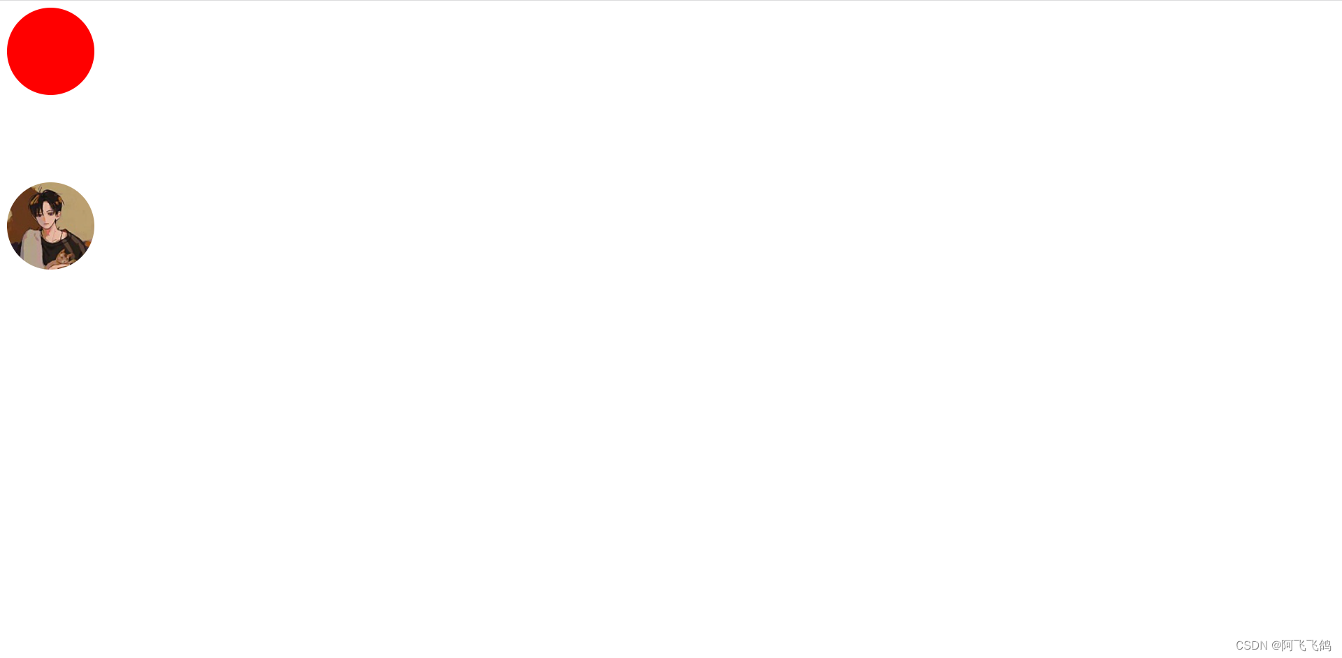
圆角边框
border-radius:10px 10px 10px 10px;/*左上 右上 右下 左下*/
圆圈:圆角≥宽度一半(半径 width:\height:)
例如:
div{
	/*红色的圆圈*/
	width:100px;
	height:100px;
	background:red;
	border-radius:50px;
}
/*圆形头像*/
img{
	width:100px;
	height:100px;
	border-radius:50px;
}
margin:0 auto;居中的前提条件
要求:块元素;<div></div>
块元素有固定的宽度width height
<!DOCTYPE html>
<html lang="en">
<head>
    <meta charset="UTF-8">
    <title>Title</title>


    <!--
    左上 右上 右下 左下, 顺时针方向
    -->
    <!--
    圆圈: 圆角 > 宽度一半(半径) 会变成圆圈
    -->
    <style>
        div{
            width: 100px;
            height: 100px;
            background: red;
            border-radius: 50px 50px 50px 50px;
        }
        img{
            margin-top: 100px;
            width: 100px;
            height: 100px;
            border-radius: 50px;

        }
    </style>

</head>
<body>

<div>
</div>

<img src="images/111.jpg" alt="">

</body>
</html>
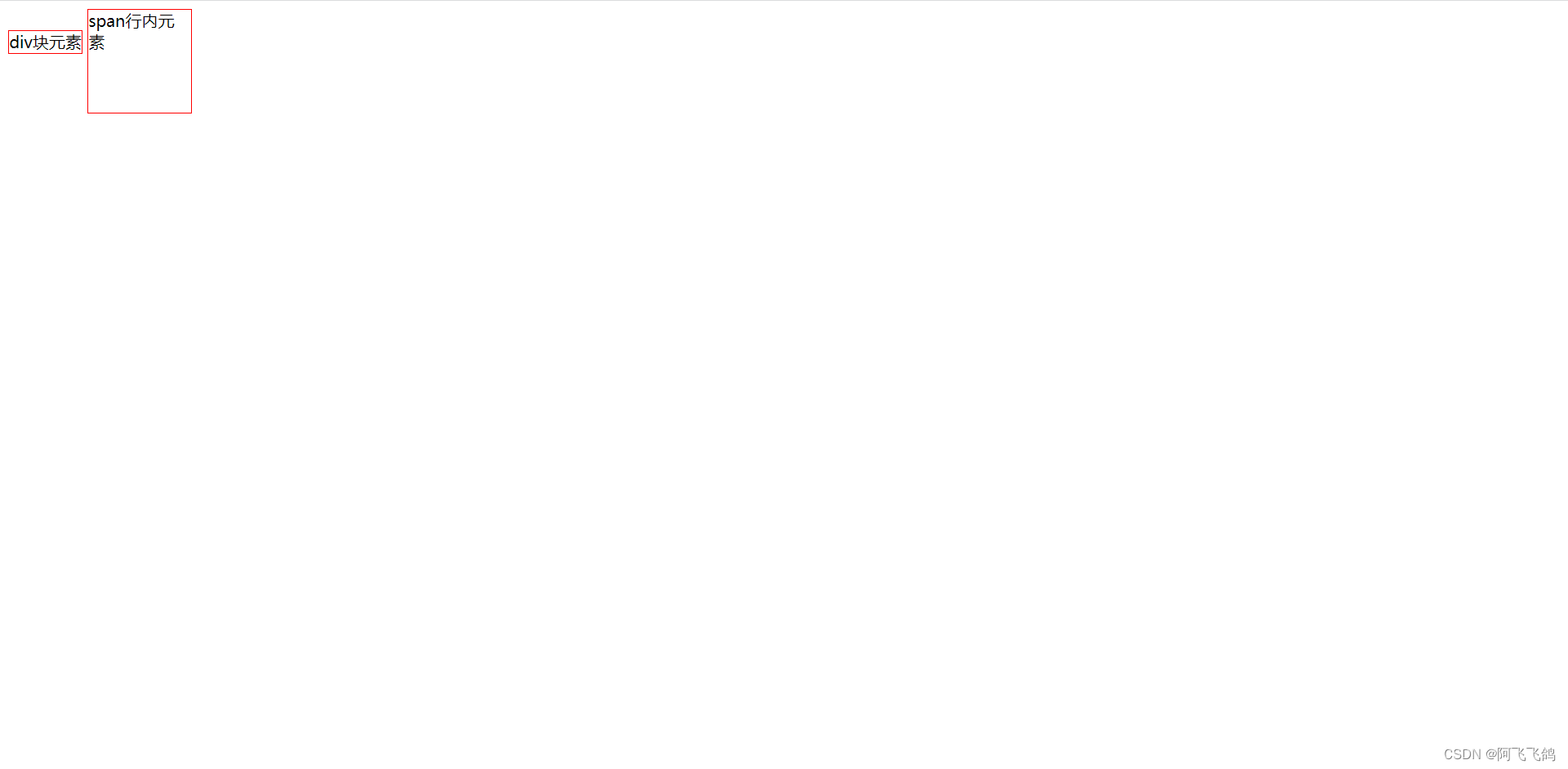
6. 浮动
块级元素:独占一行
h1~h6 p div 列表…
行内元素:不独占一行
span a img strong…
行内元素可以被包含在块级元素中,反之,则不可以~
display
display:inline-block;
block,块元素
inline,行内元素
inline-block,是块元素,但是可以内联,在一行!
none,消失
作用:将 块元素->行内元素 或 将 行内元素->块元素
这个也是一种实现行内元素排列的方式,但是我们很多情况都是用float(浮动)
diplay练习:
<!DOCTYPE html>
<html lang="en">
<head>
    <meta charset="UTF-8">
    <title>Title</title>

    <!--
    display
    block,块元素
    inline,行内元素
    inline-block,是块元素,但是可以内联,在一行!
    none,消失
    -->
    <style>
        div{
            width: 100px;
            height: 100px;
            border:1px solid red;
            display: inline;
        }
        span{
            width: 100px;
            height: 100px;
            border:1px solid red;
            display: inline-block;
        }
    </style>

</head>
<body>

<div>div块元素</div>
<span>span行内元素</span>

</body>
</html>
结果:
float:左右浮动
例:float:right 或 float:left
clear
clear: right;右侧不允许有浮动元素,如果有就自动排列到右侧浮动元素的下一行
clear: left;左侧不允许有浮动元素
clear: both;两侧都不允许有浮动元素
clear: none;
父级边框塌陷的问题
解决方案:
- 增加父级元素的高度(不建议使用)
原理:将浮动的元素包含起来,无论怎么浮动,元素都包含在父级边框中。 - 增加一个空的div标签,清除浮动
在父级元素里的所有元素后面增加!
<div class="clear"></div>
.clear{clear:both;margin:0;padding:0;} - overflow
在父级元素中增加一个overflow:hidden; - 父类添加一个伪类:after (最正规)
#father:after{
	content:'';
	display:block;
	clear:both;
}
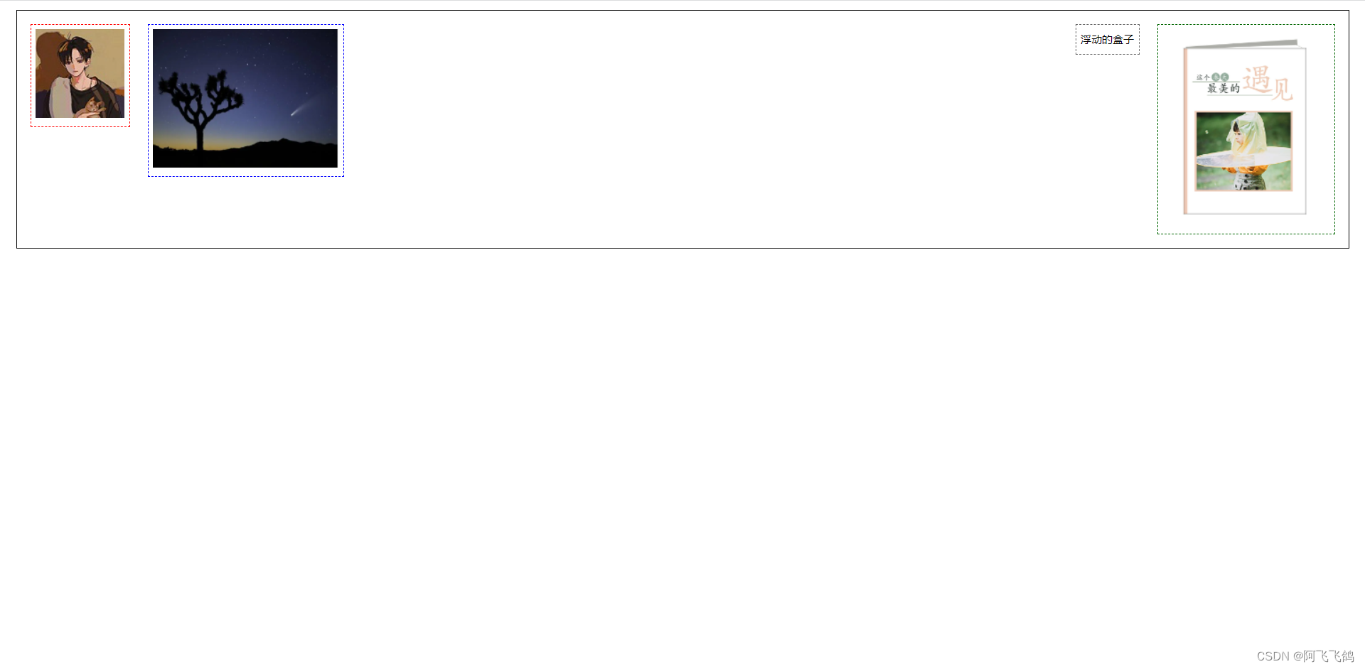
练习:
<!DOCTYPE html>
<html lang="en">
<head>
    <meta charset="UTF-8">
    <title>浮动</title>
    <link rel="stylesheet" href="css/style.css">
</head>
<body>
<div id="father">
    <div class="layer01"><img src="images/111.jpg" alt=""></div>
    <div class="layer02"><img src="images/a.PNG" alt=""></div>
    <div class="layer03"><img src="images/书.PNG" alt=""></div>
    <div class="layer04">
        浮动的盒子
    </div>
    <!--<div class="clear"></div>-->
</div>
</body>
</html>
div{
    margin: 10px;
    padding: 5px;
}
#father{
    border: 1px #000 solid;
    /*overflow: hidden;*/
}
#father:after{
    content: '';
    display: block;
    clear: both;
}
.layer01{
    border: 1px #F00 dashed;
    display: inline-block;
    float: left;
}
.layer02{
    border: 1px #00F dashed;
    display: inline-block;
    float: left;
}
.layer03{
    border: 1px #060 dashed;
    display: inline-block;
    float: right;
}
/*
clear: right;右侧不允许有浮动元素,如果有就自动排列到右侧浮动元素的下一行
clear: left;左侧不允许有浮动元素
clear: both;两侧都不允许有浮动元素
clear: none;
*/
.layer04{
    border: 1px #666 dashed;
    font-size: 12px;
    line-height: 23px;
    display: inline-block;
    float: right;
}
.clear{
    clear: both;
    margin: 0;
    padding: 0;
}
结果:
小结:
- 浮动元素后面增加空div,简单,代码中尽量避免空div
- 设置父元素的高度,简单,元素假设没有了固定的高度,就会被限制
- overflow:hidden(隐藏)/ scroll(滚动条),简单,下拉的一些场景避免使用
- 父类添加一个伪类:after(推荐),写法稍微复杂一点,但是没有副作用,推荐使用。
对比:
- display 方向不可以控制
- float 浮动起来的话会脱离标准文档流,所以要解决父级边框塌陷的问题~
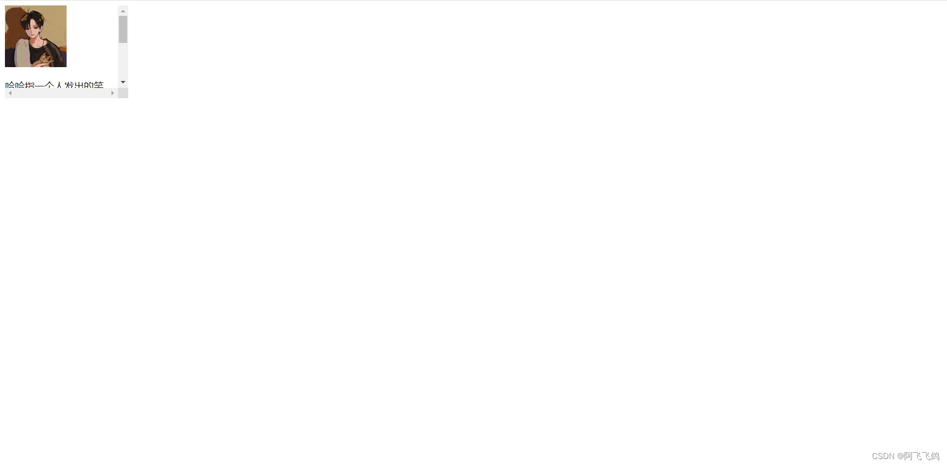
scroll练习
<!DOCTYPE html>
<html lang="en">
<head>
    <meta charset="UTF-8">
    <title>Title</title>
    <style>
        #content{
            width: 200px;
            height: 150px;
            overflow: scroll;
        }
    </style>
</head>
<body>

<div id="content">
    <img src="images/111.jpg" alt="">
    <p>
        哈哈指一个人发出的笑声,高兴开心欢乐时的状态,抒发快乐的心情,表现一个人很开心快乐的状态。也指人通常用来开玩笑。人的一种笑声,表示高兴、开心、愉悦,也表示兴奋。
    </p>
</div>

</body>
</html>
结果:
7. 定位
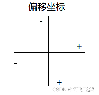
- 相对定位
例如:
#first{
	border: 1px dashed #325436;
    background-color: #325436;
    position: relative;/*相对定位:上下左右*/
    top:-20px;
    left:20px;
}
position: relative;
top:
left:
bottom:
right:
相对于原来的位置,进行指定的偏移。
相对定位的话,它仍然在标准文档流中,原来的位置会被保留。
默认情况
<!DOCTYPE html>
<html lang="en">
<head>
<meta charset="UTF-8">
<title>Title</title>
<style>
div{
margin: 10px;
padding: 15px;
font-size: 12px;
line-height: 25px;
}
#father{
border: 1px solid #666;
padding: 0;
}
#first{
border: 1px dashed #325436;
background-color: #325436;
}
#second{
border: 1px dashed #47527a;
background-color: #47527a;
}
#third{
border: 1px dashed #5a3546;
background-color: #5a3546;
}
</style>
</head>
<body>
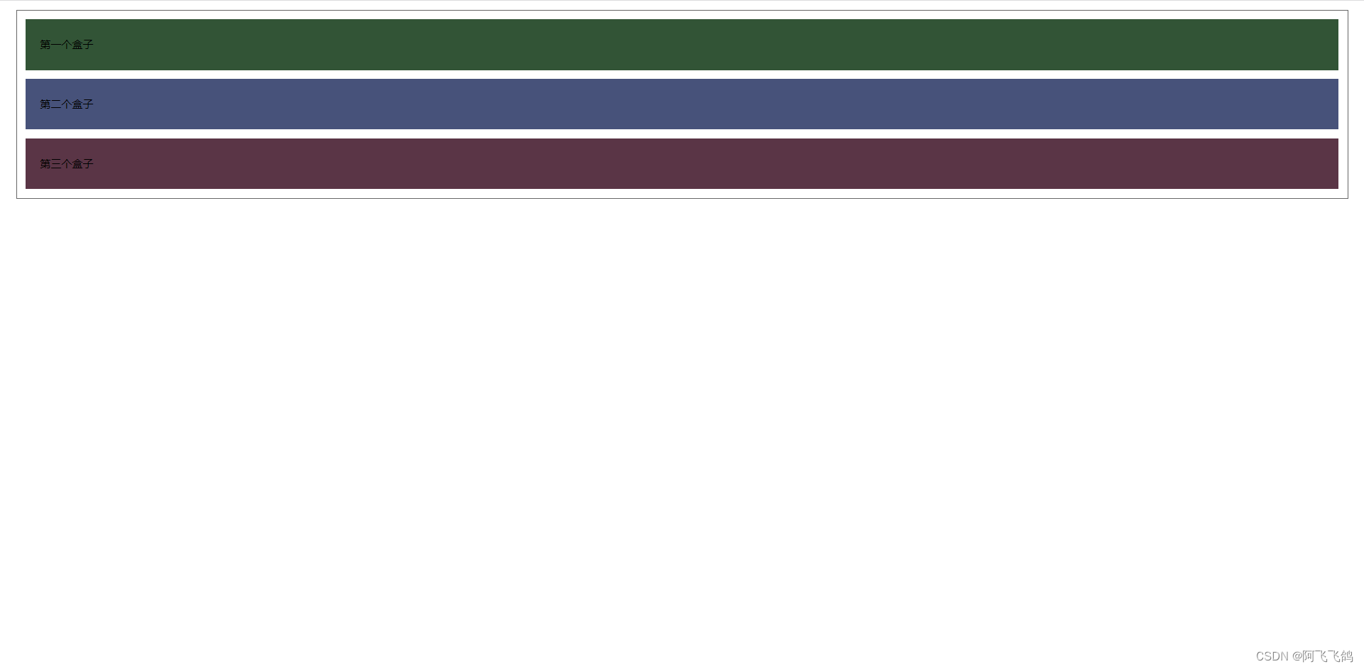
<div id="father">
<div id="first">第一个盒子</div>
<div id="second">第二个盒子</div>
<div id="third">第三个盒子</div>
</div>
</body>
</html>
效果:
练习:
<!DOCTYPE html>
<html lang="en">
<head>
<meta charset="UTF-8">
<title>Title</title>
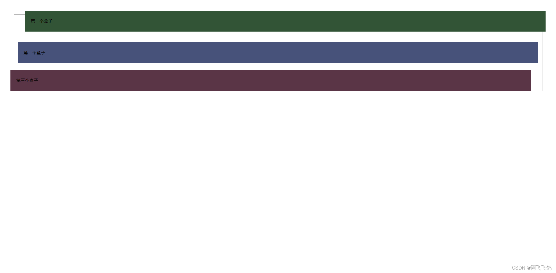
<!--相对定位
相对于自己原来的位置进行偏移
-->
<style>
body{
padding: 20px;
}
div{
margin: 10px;
padding: 15px;
font-size: 12px;
line-height: 25px;
}
#father{
border: 1px solid #666;
padding: 0;
}
#first{
border: 1px dashed #325436;
background-color: #325436;
position: relative;/*相对定位:上下左右*/
top:-20px;
left:20px;
}
#second{
border: 1px dashed #47527a;
background-color: #47527a;
}
#third{
border: 1px dashed #5a3546;
background-color: #5a3546;
position: relative;
bottom: -10px;
right: 20px;
}
</style>
</head>
<body>
<div id="father">
<div id="first">第一个盒子</div>
<div id="second">第二个盒子</div>
<div id="third">第三个盒子</div>
</div>
</body>
</html>
结果:
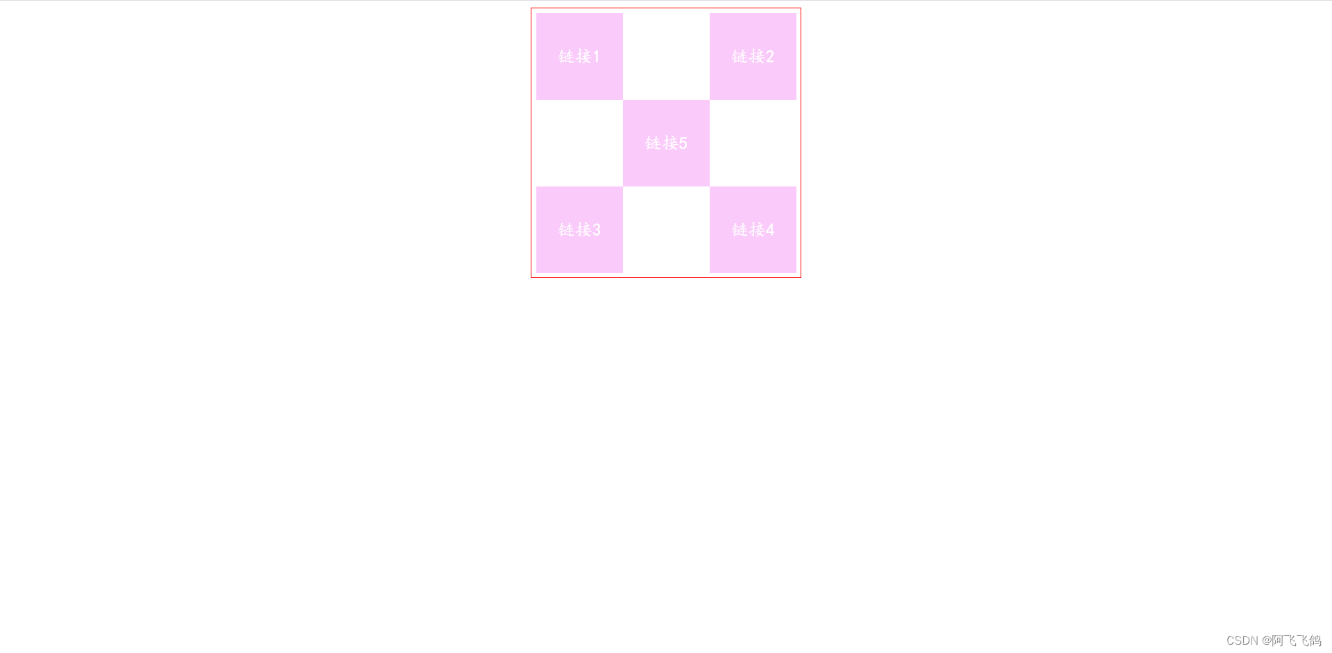
相对定位练习:
<!DOCTYPE html>
<html lang="en">
<head>
    <meta charset="UTF-8">
    <title>Title</title>
</head>

<style>
    a{
        font-size: 20px;
        font-family: 楷体;
        text-align: center;
        color: white;
        line-height: 100px;
        width: 100px;
        height: 100px;
        text-decoration: none;
        background-color: #facafa;
        display: block;/*变成块元素*/
    }
    a:hover{
        background-color: #134efc;
    }
    #father{
        border: 1px solid red;
        margin: 0 auto;
        padding: 5px;
        width: 300px;
        height: 300px;
    }
    .d2{
        position: relative;
        top:-100px;
        left: 200px;
    }
    .d4{
        position: relative;
        bottom: 100px;
        left: 200px;
    }
    .d5{
        position: relative;
        bottom: 300px;
        left: 100px;
    }
</style>

<body>

<div id="father">
    <a class="d1" href="#">链接1</a>
    <a class="d2" href="#">链接2</a>
    <a class="d3" href="#">链接3</a>
    <a class="d4" href="#">链接4</a>
    <a class="d5" href="#">链接5</a>
</div>

</body>
</html>
效果:
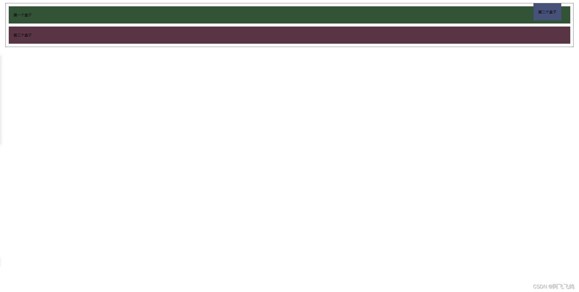
- 绝对定位
position:absolute;
- 没有父级元素定位的前提下,相对于浏览器定位
- 假设父级元素存在定位,我们通常会相对于父级元素进行偏移
- 在父级元素范围内移动
相对于父级或浏览器的位置,进行指定的偏移,绝对定位的话,它不在标准文档流中,原来的位置不会被保留。
练习
<!DOCTYPE html>
<html lang="en">
<head>
    <meta charset="UTF-8">
    <title>Title</title>

    <style>
        div{
            margin: 10px;
            padding: 15px;
            font-size: 12px;
            line-height: 25px;
        }
        #father{
            border: 1px solid #666;
            padding: 0;
            position: relative;
        }
        #first{
            border: 1px dashed #325436;
            background-color: #325436;
        }
        #second{
            border: 1px dashed #47527a;
            background-color: #47527a;
            position: absolute;
            right: 30px;
            top: -10px;
        }
        #third{
            border: 1px dashed #5a3546;
            background-color: #5a3546;
        }
    </style>

</head>
<body>

<div id="father">
    <div id="first">第一个盒子</div>
    <div id="second">第二个盒子</div>
    <div id="third">第三个盒子</div>
</div>

</body>
</html>
结果:
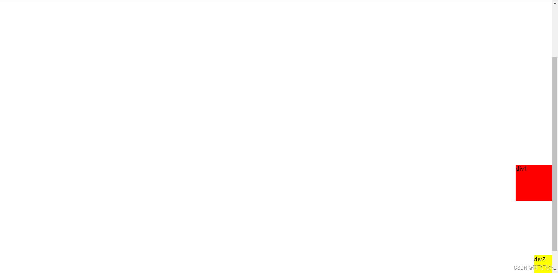
- 固定定位
position:fixed;
固定在某一个位置,例如:网页中的“返回顶部”;
练习:
<!DOCTYPE html>
<html lang="en">
<head>
    <meta charset="UTF-8">
    <title>Title</title>

    <style>
        body{
            height: 1000px;
        }
        div:nth-of-type(1){/*绝对定位:相对于浏览器*/
            width: 100px;
            height: 100px;
            background: red;
            position: absolute;
            right: 0;
            bottom: 0;
        }
        div:nth-of-type(2){/*fixed,固定定位*/
            width: 50px;
            height: 50px;
            background: yellow;
            position: fixed;
            right: 0;
            bottom: 0;
        }
    </style>

</head>
<body>

<div>div1</div>
<div>div2</div>

</body>
</html>
结果:
- z-index 层次
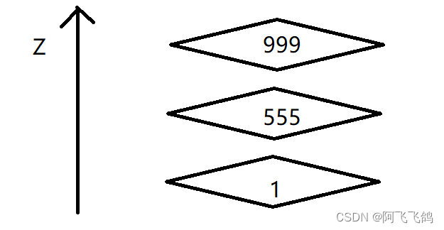
一层一层的结构,上层可以将下层覆盖
z-index:默认是0,最高无限~(999)
z-index:999;
z-index:1;
999的层次比1的高,因而显示在上面。
opacity:0.5;背景透明度
练习:
<!DOCTYPE html>
<html lang="en">
<head>
<meta charset="UTF-8">
<title>Title</title>
<link rel="stylesheet" href="css/style.css">
</head>
<body>
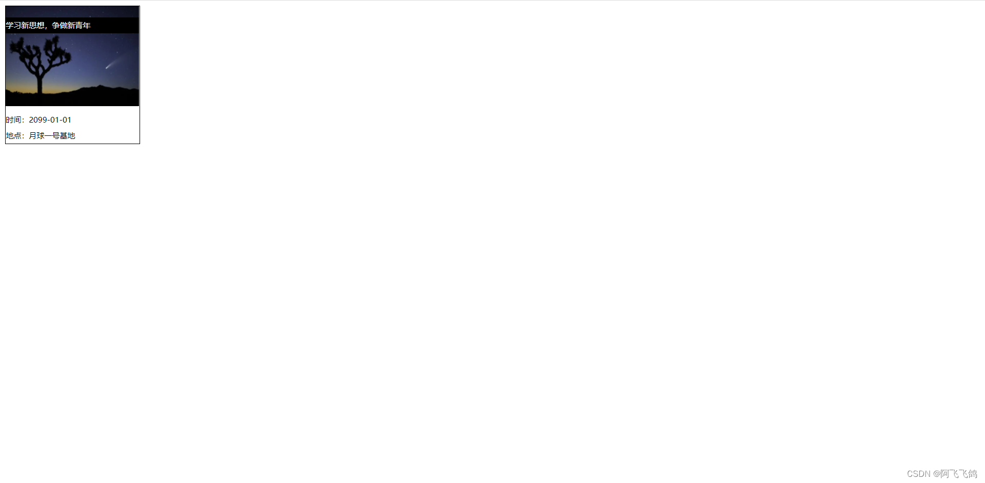
<div id="content">
<ul>
<li><img src="images/bg.PNG" alt=""></li>
<li class="tipText">学习新思想,争做新青年</li>
<li class="tipBg"></li>
<li>时间:2099-01-01</li>
<li>地点:月球一号基地</li>
</ul>
</div>
</body>
</html>
#content{
    width: 208px;
    padding: 0;
    margin: 0;
    overflow: hidden;
    font-size: 12px;
    line-height: 25px;
    border: 1px black solid;
}
ul,li{
    padding: 0;
    margin: 0;
    list-style: none;
}
/*父级元素相对定位*/
#content ul{
    position: relative;
}
.tipText,.tipBg{
    position: absolute;
    width: 208px;
    height: 25px;
    top:17px;
}
.tipBg{
    background: black;
    /*opacity: 0.5;!*背景透明度*!*/
}
.tipText{
    z-index: 999;
    color: white;
}
运行结果:


![10. 好客租房-RocketMQ快速入门[非项目必需]](https://img-blog.csdnimg.cn/img_convert/60a443a43b94b89494c5dddbb4512f6f.png)