移动web 空间转换 3D
- 空间转换 3D
- 3D位移
- 透视
- 3D旋
- rotateX
- rotateY
- 左手法则
- 立体呈现
空间转换 3D
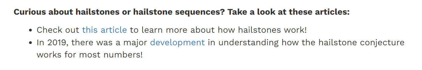
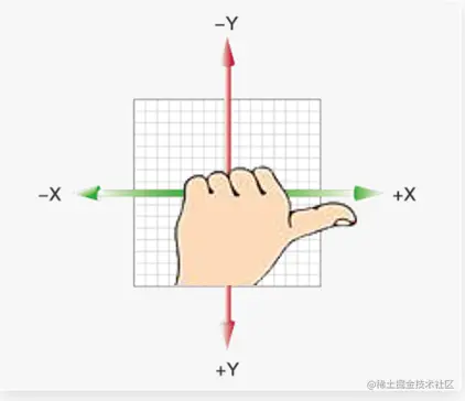
3D坐标系
3D 坐标系比2D 多了一个Z轴。
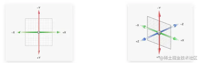
一定要记住3个坐标轴取值的正反:
- X 轴 往右越大,是正值, 否则反之
- Y 轴 往下越大,是正值,否则反之
- Z轴 (指向我们)越大,是正值,否则反之
3D位移
完整写法:
transform: translate3d(x, y, z);
不过在很多情况下,经常喜欢分开写:
transform: translateX(100px);
transform: translateY(100px);
transform: translateZ(100px);
    <style>
        .box {
            width: 200px;
            height: 200px;
            background-color: pink;
            /* 3d位移的写法 */
            /* x y z之间用逗号隔开 */
            /* transform: translate3d(x,y,z); */
            transform: translate3d(100px, 100px, 200px);
            transform: translate3d(100px, 0, 0);
        }
    </style>
<body>
    <div class="box"></div>
</body>
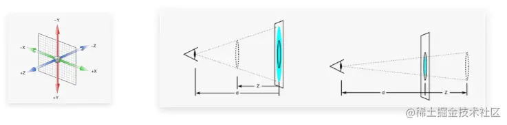
透视
透视的作用: 空间转换时,为元素添加近大远小、近实远虚的视觉效果
语法:
perspective: 800px;
透视注意事项:
-
取值范围经常在 800px ~ 1200px 之间。
-
一定给父亲添加
-
透视距离也称为视距,所谓的视距就是人的眼睛到屏幕的距离。
- 其中 d 为透视的距离
- z 是
translateZ的距离, 这个距离靠近我们,盒子越大
3D旋
有了透视的加持,我们3d旋转效果会比较明显。
rotateX
类似单杠旋转。
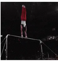
注意:默认的旋转中心在盒子的中心位置。
 body {
     /* 父级添加透视 */
     perspective: 400px;
}

img {
    transition: all 1s;
}

img:hover {
    transform: rotateX(360deg);
}
rotateY
类似钢管舞。
body {
    perspective: 400px;
}

img {
    transition: all 1s;
}

img:hover {
    transform: rotateY(360deg);
}
左手法则
一定要搞清楚X轴和Y轴如何旋转的,旋转的度数是正值还是负值。
左手法则:
判断旋转方向: 左手握住旋转轴, 拇指指向正值方向, 手指弯曲方向为旋转正值方向
规则:
- 大拇指指向X轴正向方(右), 则四指指向的方向是旋转的方向
- 大拇指指向Y轴正向方(下), 则四指指向的方向是旋转的方向
立体呈现
让子盒子在父盒子内有空间的展示,此时可以给父亲添加
transform-style: preserve-3d;
    <style>
        .cube {
            position: relative;
            width: 200px;
            height: 200px;
            margin: 100px auto;
            transition: all .5s;
            background-color: pink;
            /* 3d呈现 */
            transform-style: preserve-3d;
        }

        .cube div {
            /* 1.1 添加定位 让2个盒子叠加在一起 */
            position: absolute;
            left: 0;
            top: 0;
            width: 200px;
            height: 200px;
        }

        .front {
            /* 向我们面前拉(移动) */
            background-color: orange;
            /* transform: translateZ(200px); */
            transform: translateZ(100px);

        }

        .back {
            background-color: green;
            transform: translateZ(-100px);
        }

        .cube:hover {
            transform: rotateY(65deg);
        }
    </style>
</head>

<body>
    <div class="cube">
        <div class="front">前面</div>
        <div class="back">后面</div>
    </div>
</body>