在iOS中,popover是出现在现有内容顶部的UI元素,通常用于在上下文中向用户呈现新视图。与其他占用整个屏幕的视图控制器不同,popover出现在一个较小的、集中的区域,从而使用户能够在必要时与popover外的应用程序的其他部分进行交互。这是一种有效的方式来显示额外的信息或选项,而不会扰乱用户在应用程序中的当前流程。
基本使用
想要弹出一个popover还是比较简单的,我们只需要在对应的视图上添加.popover修饰符,并传入参数即可。
func popover<Content>(
    isPresented: Binding<Bool>,
    attachmentAnchor: PopoverAttachmentAnchor = .rect(.bounds),
    arrowEdge: Edge = .top,
    @ViewBuilder content: @escaping () -> Content
) -> some View where Content : View
isPresented: 绑定到一个布尔值,该值决定是否显示修饰符内容闭包返回的内容视图。
attachmentAnchor:定义popover附着点的定位锚。默认值是bounds。
arrowEdge: 箭头方向,iOS上这个参数不起作用。
content:返回popover要显示的内容视图。
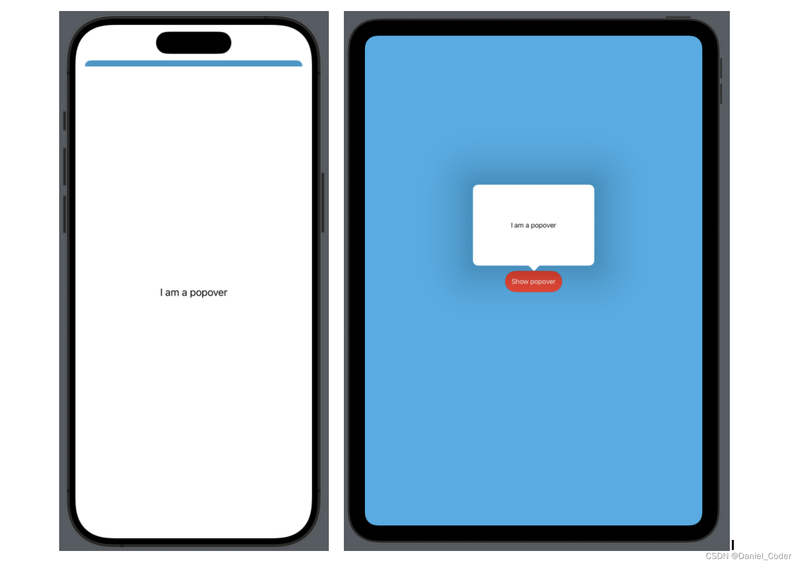
struct PopoverDemo: View {
  @State private var showPopover: Bool = false

  var body: some View {
    ZStack {
      Color.cyan
        .ignoresSafeArea()

      Button {
        showPopover.toggle()
      } label: {
        Text("Show popover")
          .foregroundColor(.white)
          .padding()
          .background(
            Color.red
              .clipShape(Capsule())
          )
      }
      .popover(isPresented: $showPopover, content: {
        Text("I am a popover")
      })

    }
  }
}
iPhone:

iPad:

上面代码中,iPhone弹出了一个类似sheet的视图,而iPad确实popover弹框。
我们也可以在popover修饰符的闭包中给内部的视图添加frame,如下:
.popover(isPresented: $showPopover, content: {
  Text("I am a popover")
    .frame(width: 300, height: 200)
})
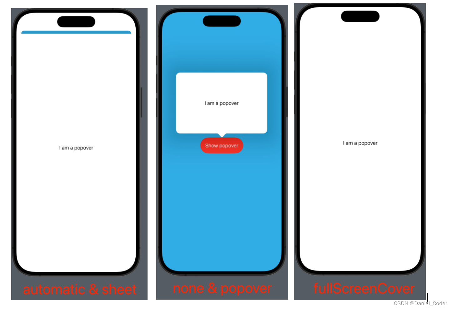
但是得到的效果是iPhone还是类似sheet的视图,而iPad却改变了弹框的尺寸。
popover弹出方式
如果想改变iPhone上的弹出方式,可以使用下面的修饰符,括号内传入想要的类型。
.presentationCompactAdaptation()
主要是针对Compact size class采取的弹出策略。
func presentationCompactAdaptation(_ adaptation: PresentationAdaptation) -> some View
PresentationAdaptation的类型主要有:
automatic: 默认弹出方式。none: 不针对size class使用任何弹出方式,自适应视图尺寸。popover: 悬浮弹框方式,自适应视图尺寸。sheet: 类似sheet的弹出方式,从下往上,基本上要占满整个屏幕了,iPhone上默认的方式。fullScreenCover: 全屏方式弹出。
popover的大小由所使用的视图的大小决定,如果尺寸较小,可以通过添加padding修饰符或者frame修饰符更改大小。视图的位置取决于我们将popover视图修饰符附加到哪个视图上,比如上面示例就是加到了Button上,所以popover在Button周围弹出。
箭头位置
使用.popover()修饰符的时候还可以传递一个参数attachmentAnchor,意思就是我们的popover的箭头指向哪个位置。
public enum PopoverAttachmentAnchor {
    /// The anchor point for the popover relative to the source's frame.
    case rect(Anchor<CGRect>.Source)

    /// The anchor point for the popover expressed as a unit point  that
    /// describes possible alignments relative to a SwiftUI view.
    case point(UnitPoint)
}
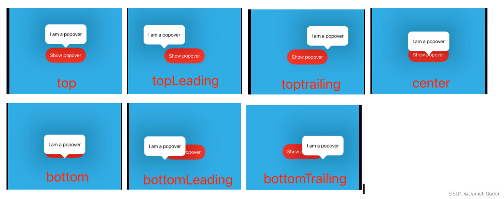
以上这些位置都是基于Button的位置,如果将.popover()修饰符添加到上面代码中的ZStack上,那么除了center这种能在中间显示,其他的都要出屏幕了。
在iOS上,arrowEdge参数被忽略了,系统会选择合适的值。arrowEdge值仅在macOS上使用。
退出popover
退出也很简单,要显示的时候将绑定的Bool值设置为true,需要dismiss的时候再设置为false即可。

或者将绑定的值再绑定到下一个界面,通过下一个界面改变该值,然后dismiss界面。
struct PopoverDemo: View {
  @State private var showPopover: Bool = false

  var body: some View {
    ZStack {
      Color.cyan
        .ignoresSafeArea()

      Button {
        showPopover = true
      } label: {
        Text("Show popover")
          .foregroundColor(.white)
          .padding()
          .background(
            Color.red
              .clipShape(Capsule())
          )
      }
      .popover(isPresented: $showPopover, content: {
        ActionView(showPopover: $showPopover)
          .presentationCompactAdaptation(.fullScreenCover)
      })
    }
  }
}

struct ActionView: View {
  @Binding var showPopover: Bool
  var body: some View {
    List(0..<10, id: \.self) { index in
      Button("Action \(index)") {
        showPopover = false
      }
    }
  }
}

写在最后
总之,SwiftUI中的popover将额外的内容覆盖到现有的视图上,提供上下文信息或选项,而不会干扰用户当前的工作流程。这与sheet不同,sheet占据了屏幕的较大部分,通常用于需要用户输入的更复杂的任务。popover和sheet都是SwiftUI中必不可少的工具,允许更动态、直观和用户友好的应用程序设计。了解何时以及如何有效地使用这些功能可以大大提高iOS应用程序的整体用户体验。
最后,希望能够帮助到有需要的朋友,如果您觉得有帮助,还望点个赞,添加个关注,笔者也会不断地努力,写出更多更好用的文章。


