1.0准备工作
1.1 数据框
数据框是变量(列)和观测(行)的矩形集合。
下文经常使用mpg 包含了由美国环境保护协会收集的 38 种车型的观测数据。
1.2 创建 ggplot 图形
1.3 绘图模板
ggplot(data = <DATA>) +
<GEOM_FUNCTION>(mapping = aes(<MAPPINGS>))
#<GEOM_FUNCTION>
geom_point散点图
#<MAPPINGS>
x=<变量名>,y=<变量名>,color=<变量名>,shape,size,alpha(透明度)
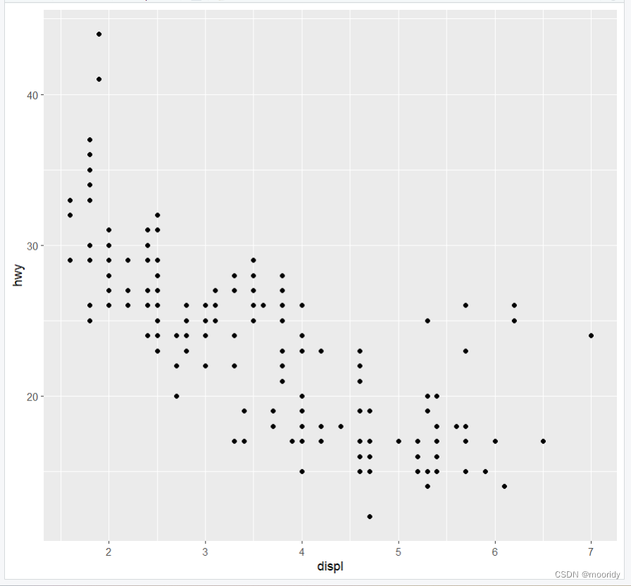
eg.ggplot(data = diamonds) + geom_point(mapping = aes(x=carat,y=price))
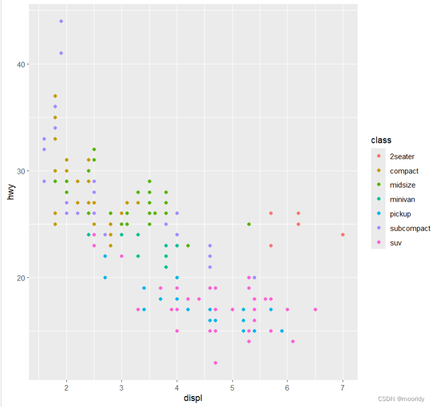
1.4 图形属性映射
eg.ggplot(data = mpg) +
geom_point(mapping = aes(x = displ, y = hwy, color = class))
可以将点的颜色映射为变量class ^^^^^^^^^^^^^
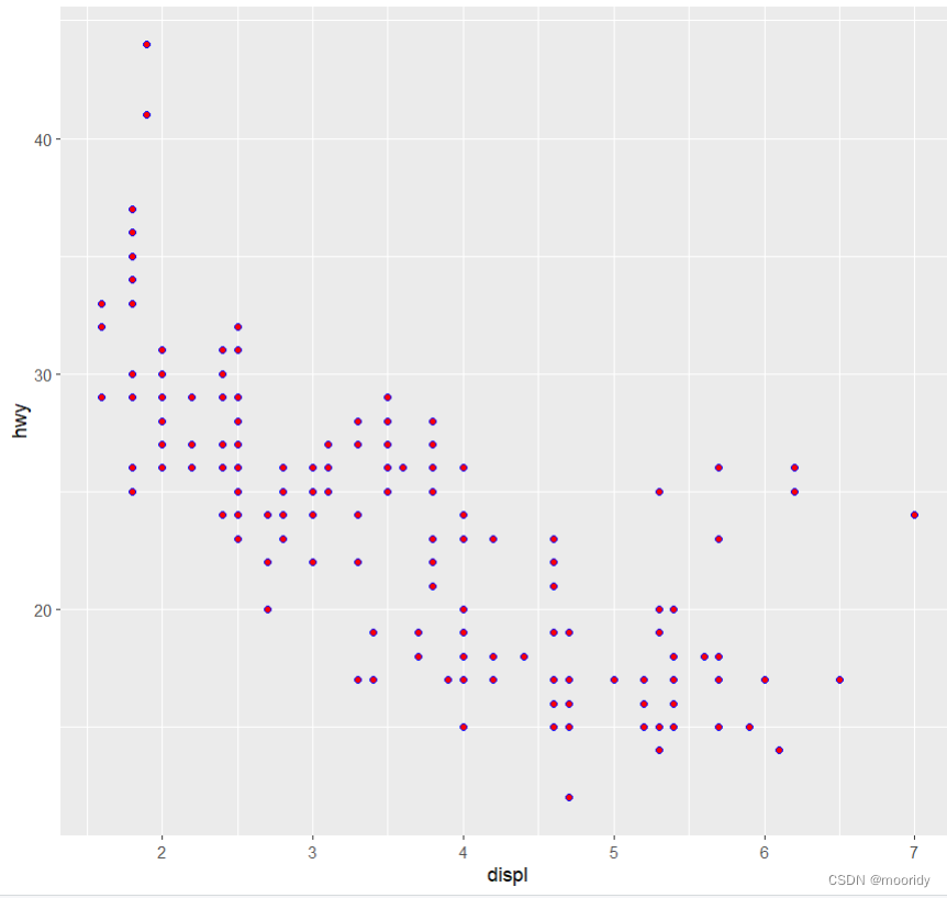
区分:
#以手动为几何对象设置图形属性(常量)
ggplot(data = mpg) +
geom_point(mapping = aes(x = displ, y = hwy), color = "blue",shape=21,fill="red")
^^^^^^^^^^^^^^^^^^^^^^^写在aes外面
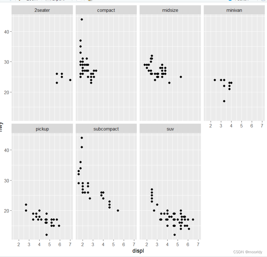
1.5 分面
1.5.1 facet_wrap()
eg. ggplot(data = mpg) +
geom_point(mapping = aes(x = displ, y = hwy)) +
facet_wrap(~ class, nrow = 2)
以class来分组,排成2行
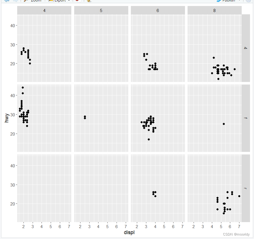
1.5.2 facet_grid()
(多一个分类)
eg.ggplot(data = mpg) +
geom_point(mapping = aes(x = displ, y = hwy)) +
facet_grid(drv ~ cyl)
1.6 几何对象
几何对象是图中用来表示数据的几何图形对象。我们经常根据图中使用的几何对象类型来
描述相应的图。例如,条形图使用了条形几何对象,折线图使用了直线几何对象,箱线图
使用了矩形和直线几何对象。
#geom_point散点图
#geom_smooth平滑曲线图
#geom_bar条形图
#可以叠加使用
eg.ggplot(data = mpg) +
+ geom_smooth(mapping = aes(x = displ, y = hwy)) +
+ geom_point(mapping = aes(x = displ, y = hwy))
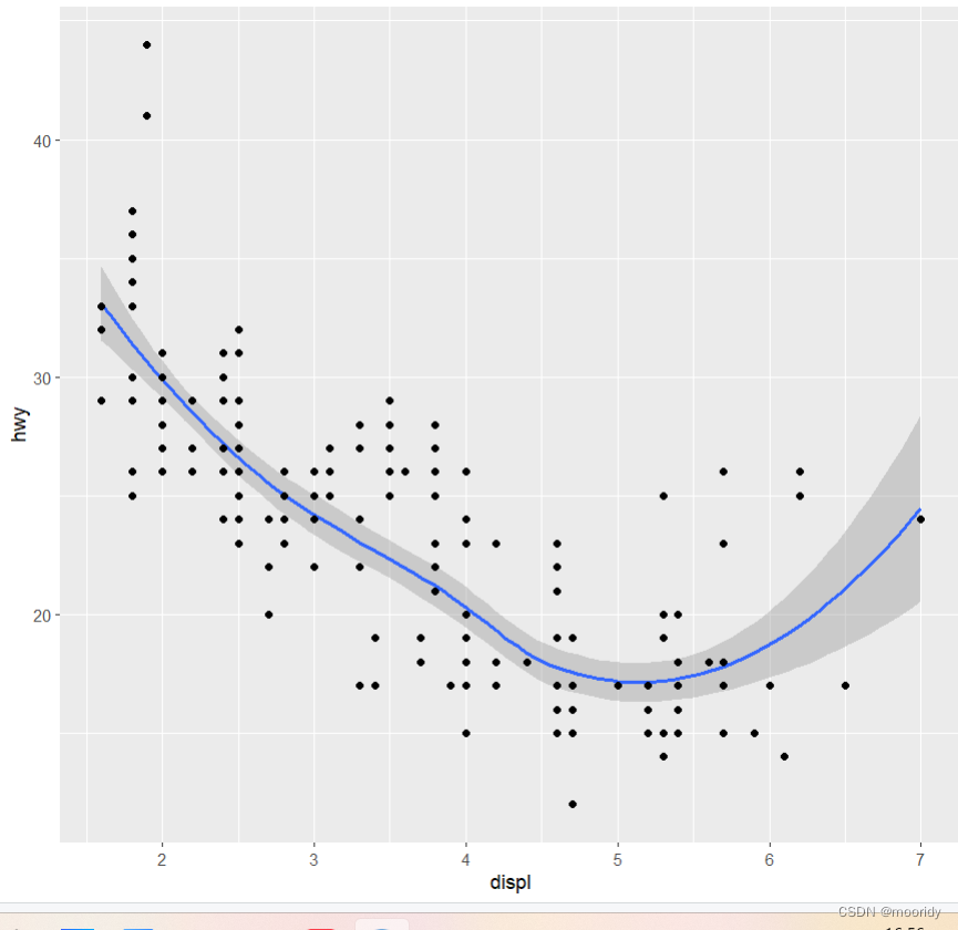
#在geom_smooth平滑曲线图中,可以按照不同的线型绘制出不同的曲线,每条曲线对应映射到线型的
变量的一个唯一值:
ggplot(data = mpg) +
geom_smooth(mapping = aes(x = displ, y = hwy, linetype = drv))
linetype线性
group
color
#不想要示例图
show.legend=FALSE 位置:和mapping并列
#不想要质性区间
se=FALSE 位置:和mapping并列
1.7 统计变换
1.8 位置调整
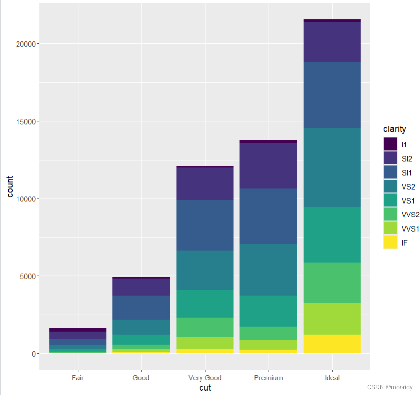
ggplot(data = diamonds) +
geom_bar(
mapping = aes(x = cut, fill = clarity),
position = "dodge"
)
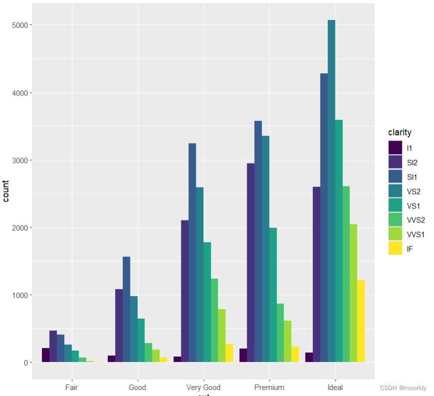
position参数
dodge分开排
identity叠着排,实际高度
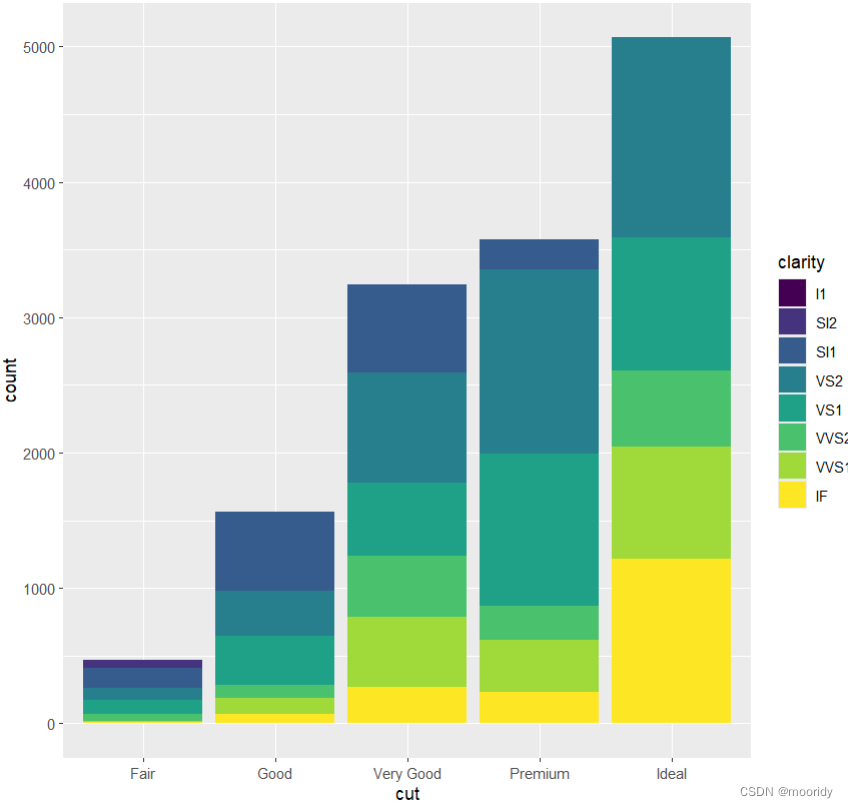
默认 堆叠着排
jitter(适用范围:散点图)
position = "jitter"为每个数据点添加一个很小的随机扰动,这样就可以将重叠的点分散开:
ggplot(data = mpg) +
geom_point(
mapping = aes(x = displ, y = hwy),
position = "jitter"
)
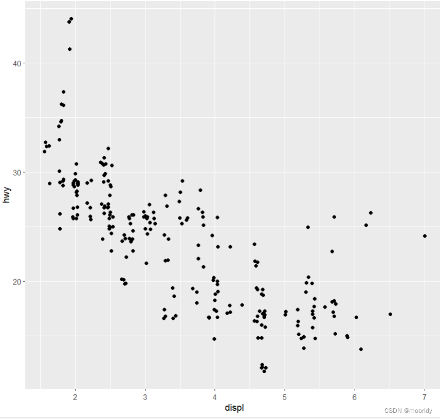
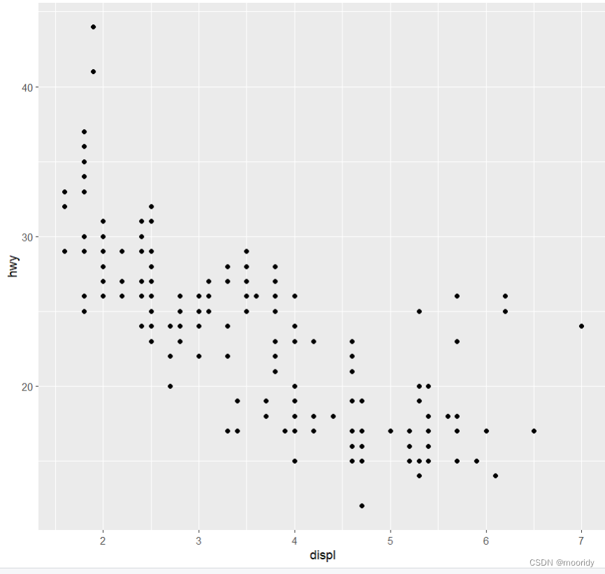
对比没有使用jitter的:
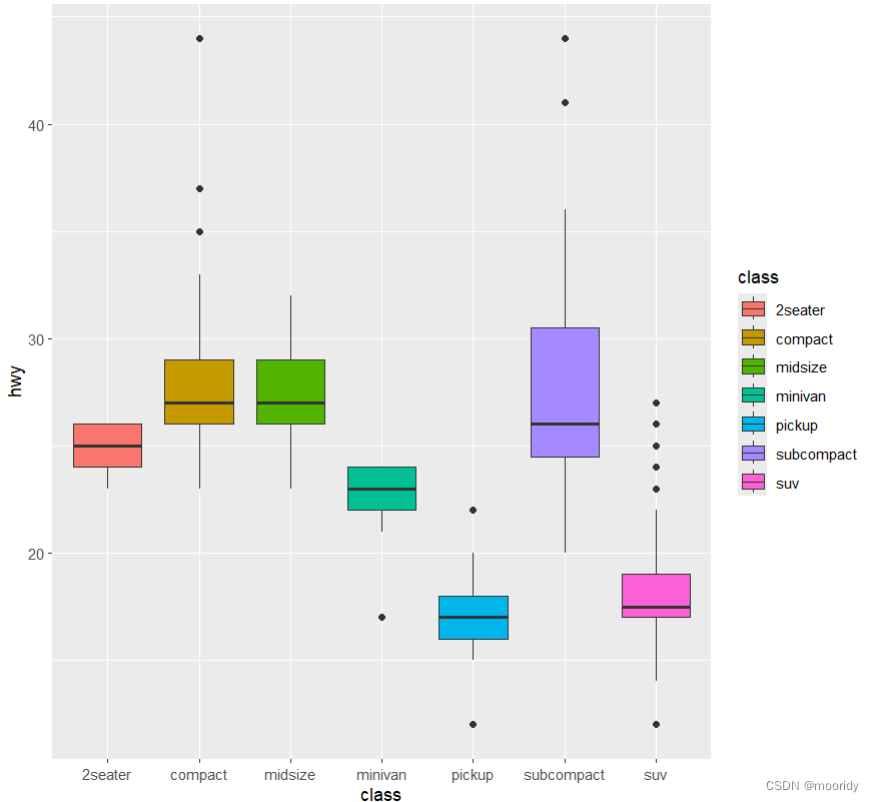
画盒图
ggplot(data = mpg,mapping = aes(x = class, y = hwy)) +
geom_boxplot( aes(fill=class))
1.9 坐标系
1.10 图形分层语法
#图形属性映射
#分面
#几何对象
几何对象是图中用来表示数据的几何图形对象。我们经常根据图中使用的几何对象类型来
描述相应的图。例如,条形图使用了条形几何对象,折线图使用了直线几何对象,箱线图
使用了矩形和直线几何对象。
#geom_point散点图
#geom_smooth平滑曲线图
#geom_bar条形图
#可以叠加使用
eg.ggplot(data = mpg) +
+ geom_smooth(mapping = aes(x = displ, y = hwy)) +
+ geom_point(mapping = aes(x = displ, y = hwy))
#在geom_smooth平滑曲线图中,可以按照不同的线型绘制出不同的曲线,每条曲线对应映射到线型的
变量的一个唯一值:
ggplot(data = mpg) +
geom_smooth(mapping = aes(x = displ, y = hwy, linetype = drv))
linetype线性
group
color
#不想要示例图
show.legend=FALSE 位置:和mapping并列
#不想要质性区间
se=FALSE 位置:和mapping并列
#简化
全局映射
ggplot是全局函数
而geom_point等是局部函数
ggplot(data = mpg, mapping = aes(x = displ, y = hwy)) +
geom_point(mapping = aes(color = class)) +
geom_smooth()
#筛选
data = filter(数据集, class == 变量名)
eg.
ggplot(data = mpg, mapping = aes(x = displ, y = hwy)) +
geom_point(mapping = aes(color = class)) +
geom_smooth(
data = filter(mpg, class == "subcompact"),
se
= FALSE
)
#条形图
geom_bar
ggplot(data = diamonds) +
geom_bar(mapping = aes(x = cut)) 不用写y轴
#统计变换函数
stat_count(可替换geom_bar)
ggplot(data = diamonds) +
stat_count(mapping = aes(x = cut))
#如果是统计过的数据
ggplot(data = demo) +
geom_bar(
mapping = aes(x = a, y = b), stat = "identity"
)
#显示一张表示比例(而不是计数)的条形图:
ggplot(data = diamonds) +
geom_bar(
mapping = aes(x = cut, y = ..prop.., group = 1) )
#强调统计变换用stat_summary()
ggplot(data = diamonds) +
stat_summary(
mapping = aes(x = cut, y = depth),
fun.ymin = min,
fun.ymax = max,
fun.y = median >>>>>中位数,这里也可以改成mean,看均值
)
#为条形图上色
ggplot(data = diamonds) +
geom_bar(mapping = aes(x = cut, color = cut))
ggplot(data = diamonds) +
geom_bar(mapping = aes(x = cut, fill = cut)) //fill明显更常用
#映射
ggplot(data = diamonds) +
+ geom_bar(mapping = aes(x = cut, fill = color))
#位置调整
ggplot(data = diamonds) +
geom_bar(
mapping = aes(x = cut, fill = clarity),
position = "dodge"
)
position参数
dodge分开排
identity叠着排,实际高度
默认 堆叠着排
jitter(散点图用)
position = "jitter"为每个数据点添加一个很小的随机扰动,这样就可以将重叠的点分散开:
ggplot(data = mpg) +
geom_point(
mapping = aes(x = displ, y = hwy),
position = "jitter"
)
#画盒图
ggplot(data = mpg,mapping = aes(x = class, y = hwy)) +
geom_boxplot(
aes(fill=class))
#旋转坐标系 coord_flip()
ggplot(data = mpg, mapping = aes(x = class, y = hwy)) +
geom_boxplot() +
coord_flip()
#绘制空间数据 geom_polygon()
nz <- map_data("nz") //取出新西兰地图
ggplot(nz, aes(long, lat, group = group)) +
geom_polygon(fill = "white", color = "black") +
coord_quickmap coord_quickmap函数可以为地图设置合适的纵横比
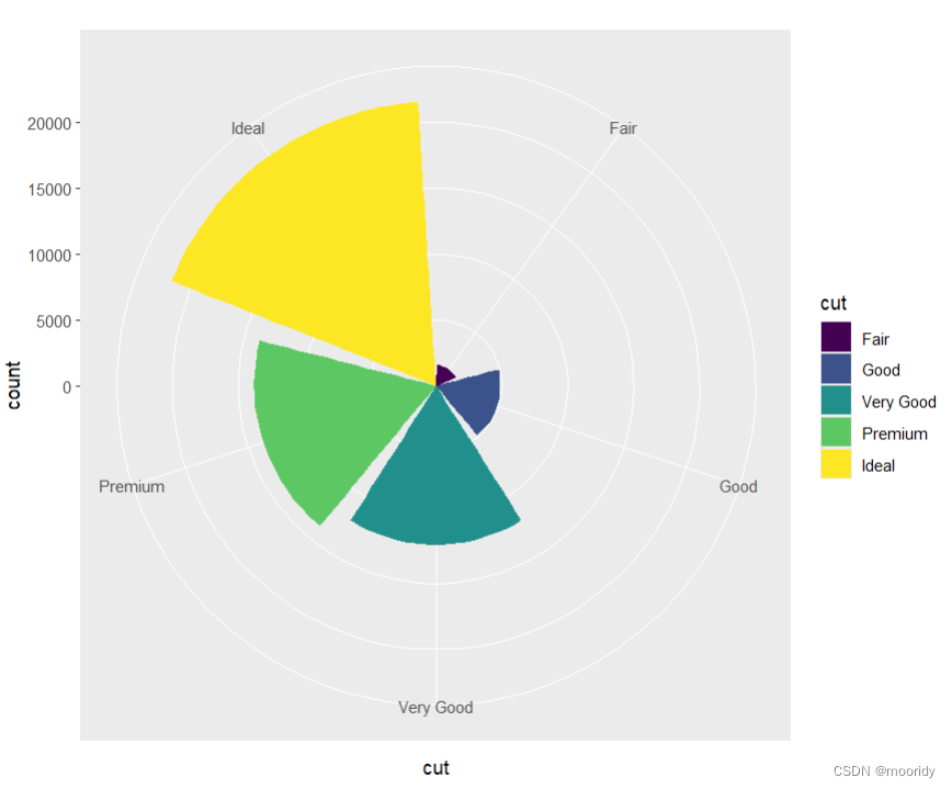
#画鸡冠图
coord_polar()画极坐标
1.coord_polar(theta="x")
p<-ggplot(data = diamonds) + geom_bar(mapping = aes(x = cut, fill = cut))+coord_polar()
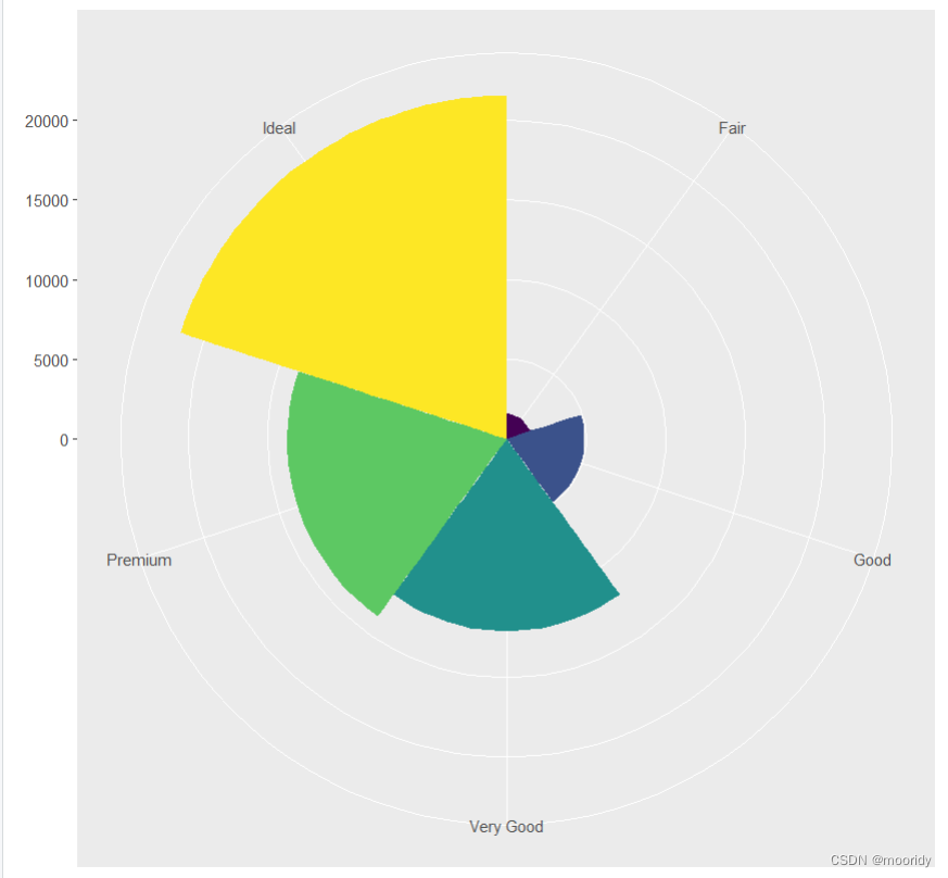
2.coord_polar(theta="y")
p<-ggplot(data = diamonds) + geom_bar(mapping = aes(x = cut, fill = cut,width=1))+coord_polar(theta="y")
#分布进行,把命令储存到变量,可进行叠加
eg.
bar <- ggplot(data = diamonds) +
geom_bar(
mapping = aes(x = cut, fill = cut),
show.legend = FALSE,
width = 1
) +
theme(aspect.ratio = 1) +
labs(x = NULL, y = NULL)
bar + coord_flip()
show.legend = FALSE:删除图例
width=1:width越大,图挨得越近,等于1时,挨在一起
theme(aspect.ratio = 1):宽高比为1,更圆
labs(x = NULL, y = NULL):去除标签注释
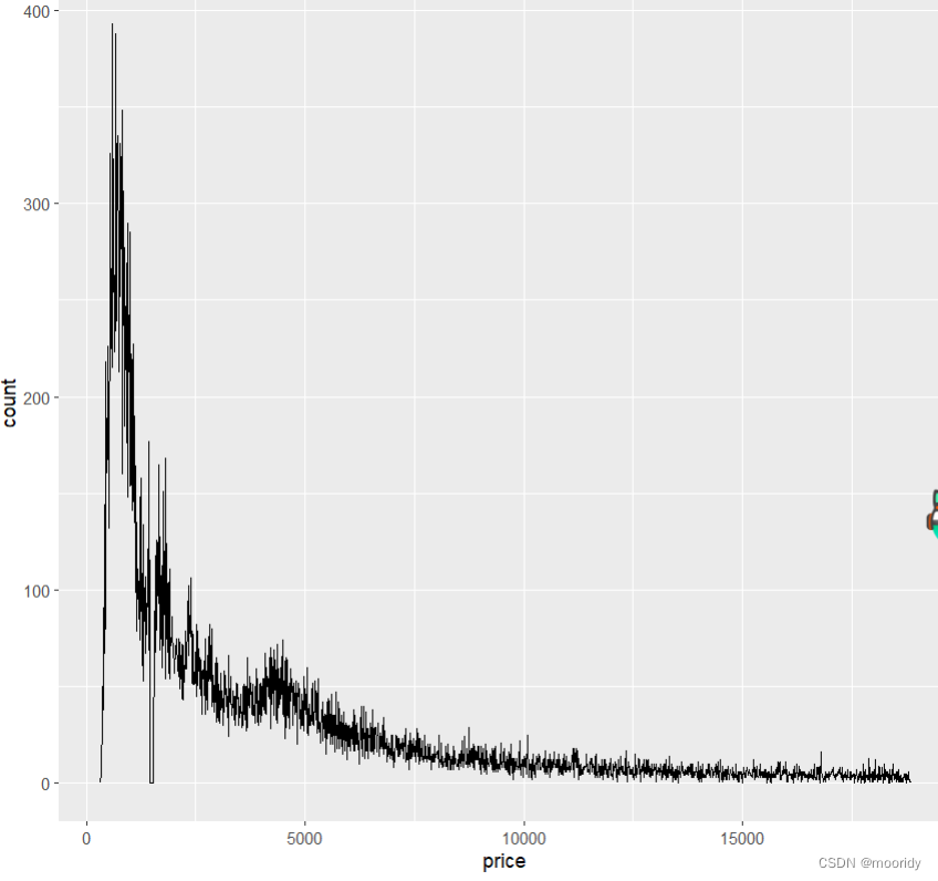
频率分布图geom_freqpoly()
 ggplot(data = diamonds, mapping = aes(x = price)) +
+     geom_freqpoly(binwidth = 10)