参考网址https://driverjs.com/docs/installation
安装
npm install driver.js以下是1.3.1版本的基本使用方法
import { driver } from 'driver.js'
import 'driver.js/dist/driver.css'
mounted() {
// 实例化driver对象
const driverObj = driver({
showProgress: true,
steps: [
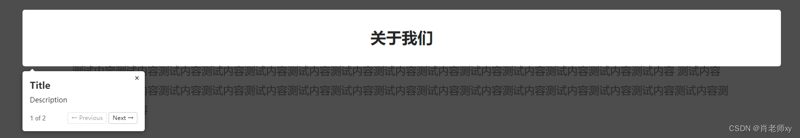
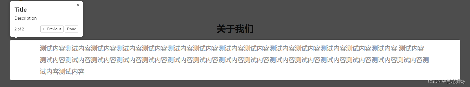
{ element: '.title', popover: { title: 'Title', description: 'Description' } },
{ element: '.desc', popover: { title: 'Title', description: 'Description' } }
]
})
driverObj.drive()
}展示效果
常用属性及方法:
overlayColor: 'red', //遮罩颜色显示哪个按钮,不要哪个就去掉,全不显示赋值为['']
showButtons: [
    'next',
    'previous',
    'close'
 ],
改变按钮文字
nextBtnText: '下一步',
prevBtnText: '上一步',
doneBtnText: '完成',
改变样式
//js部分
popoverClass: 'customer-popover',

//css部分
.customer-popover {
  .driver-popover-next-btn {
    color: #1583f8;
  }
}
onNextClick (点击下一步按钮触发)
注意:调用此方法,点击下一步按钮不会自动执行,需要手动调用driverObj.moveNext();
onNextClick: () => {
    console.log('Next Button Clicked')
    // Implement your own functionality here
    driverObj.moveNext()
},
onPrevClick(点击上一步按钮触发)
注意:调用此方法,点击上一步按钮不会自动执行,需要手动调用driverObj.movePrevious();
onPrevClick: () => {
    console.log('Previous Button Clicked')
    // Implement your own functionality here
    driverObj.movePrevious()
},
onCloseClick(点击关闭按钮触发)
注意:调用此方法,点击关闭按钮不会自动关闭,需要手动调用driverObj.destroy();
onCloseClick: () => {
    console.log('Close Button Clicked')
    // Implement your own functionality here
    driverObj.destroy()
},
onDestroyStarted(退出引导时触发)
注意:调用此方法,点击其他区域不会自动关闭,需要手动调用driverObj.destroy();
 onDestroyStarted: () => {
    if (!driverObj.hasNextStep() || confirm("Are you sure?")) {
      driverObj.destroy();
    }
  },
自定义按钮
onPopoverRender: (popover, { config, state }) => {
        const firstButton = document.createElement('button')
        firstButton.innerText = 'Go to First'
        popover.footerButtons.appendChild(firstButton)

        firstButton.addEventListener('click', () => {
          driverObj.drive(0)
        })
},
完整配置
const driverObj = driver({
showProgress: true,
overlayColor: 'red', //遮罩颜色
steps: [
{
element: '.title',
popover: {
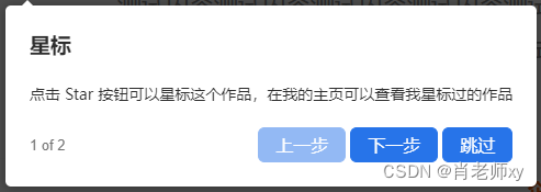
title: '星标',
description: '点击 Star 按钮可以星标这个作品,在我的主页可以查看我星标过的作品'
}
},
{
element: '.desc',
popover: { title: '运行', description: '点击 Run 按钮可以运行这个作品' }
}
],
showButtons: ['next', 'previous'],
nextBtnText: '下一步',
prevBtnText: '上一步',
doneBtnText: '完成',
popoverClass: 'customer-popover',
onPopoverRender: (popover, { config, state }) => {
const firstButton = document.createElement('button')
firstButton.classList.add('pass-btn')
firstButton.innerText = '跳过'
popover.footerButtons.appendChild(firstButton)
firstButton.addEventListener('click', () => {
console.log(666)
driverObj.destroy()
})
},
onNextClick: () => {
console.log('Next Button Clicked')
// Implement your own functionality here
driverObj.moveNext()
},
onPrevClick: () => {
console.log('Previous Button Clicked')
// Implement your own functionality here
driverObj.movePrevious()
},
onCloseClick: () => {
console.log('Close Button Clicked')
// Implement your own functionality here
driverObj.destroy()
},
onDestroyStarted: () => {
console.log('onDestroyStarted is called when the user tries to exit the tour')
driverObj.destroy()
}
})
driverObj.drive()
<style>
.customer-popover {
min-width: 360px;
max-width: 500px;
padding: 22px;
.driver-popover-next-btn,
.driver-popover-prev-btn,
.pass-btn {
color: #fff;
background-color: #2774e9;
border-color: #2774e9;
height: 32px;
padding: 0 15px;
font-size: 16px;
border-radius: 6px;
text-shadow: inherit;
&:hover,
&:focus {
background-color: #2774e9;
}
}
.driver-popover-description {
margin-bottom: 20px;
margin-top: 20px !important;
}
}
</style>修改样式后展示效果