Navigation
官方文献
Navigation 组件一般作为页面布局的根容器,它提供了一系列属性方法来设置页面的标题栏、工具栏以及菜单栏的各种展示样式。 Navigation 除了提供了默认的展示样式属性外,它还提供了 CustomBuilder 模式来自定义展示样式
说明
该组件从API Version 8开始支持。后续版本如有新增内容,则采用上角标单独标记该内容的起始版本。
子组件
可以包含子组件。从API Version 9开始,推荐与NavRouter组件搭配使用。
接口
Navigation()
属性
除支持通用属性外,还支持以下属性:
| 名称 | 参数类型 | 描述 |
|---|---|---|
| title | string | CustomBuilder8+ | NavigationCommonTitle9+ | NavigationCustomTitle9+ | 页面标题。 |
| subTitledeprecated | string | 页面副标题。从API Version 9开始废弃,建议使用title代替。 |
| menus | Array<NavigationMenuItem> | CustomBuilder8+ | 页面右上角菜单。使用Array<NavigationMenuItem> 写法时,竖屏最多支持显示3个图标,横屏最多支持显示5个图标,多余的图标会被放入自动生成的更多图标。 |
| titleMode | NavigationTitleMode | 页面标题栏显示模式。 默认值:NavigationTitleMode.Free |
| toolBar | object | CustomBuilder8+ | 设置工具栏内容。 items: 工具栏所有项。 说明: items均分底部工具栏,在每个均分内容区布局文本和图标,文本超长时,逐级缩小,缩小之后换行,最后...截断。 |
| hideToolBar | boolean | 隐藏工具栏。 默认值:false true: 隐藏工具栏。 false: 显示工具栏。 |
| hideTitleBar | boolean | 隐藏标题栏。 默认值:false true: 隐藏标题栏。 false: 显示标题栏。 |
| hideBackButton | boolean | 隐藏返回键。不支持隐藏NavDestination组件标题栏中的返回图标。 默认值:false true: 隐藏返回键。 false: 显示返回键。 说明: 返回键仅针对titleMode为NavigationTitleMode.Mini时才生效。 |
| navBarWidth9+ | Length | 导航栏宽度。 默认值:200vp 单位:vp 说明: 仅在Navigation组件分栏时生效。 |
| navBarPosition9+ | NavBarPosition | 导航栏位置。 默认值:NavBarPosition.Start 说明: 仅在Navigation组件分栏时生效。 |
| mode9+ | NavigationMode | 导航栏的显示模式。 默认值:NavigationMode.Auto 自适应:基于组件宽度自适应单栏和双栏。 |
| backButtonIcon9+ | string | PixelMap | Resource | 设置导航栏返回图标。不支持隐藏NavDestination组件标题栏中的返回图标。 |
| hideNavBar9+ | boolean | 是否显示导航栏(仅在mode为NavigationMode.Split时生效)。 |
NavigationMenuItem类型说明
| 名称 | 类型 | 必填 | 描述 |
|---|---|---|---|
| value | string | 是 | 菜单栏单个选项的显示文本。 |
| icon | string | 否 | 菜单栏单个选项的图标资源路径。 |
| action | () => void | 否 | 当前选项被选中的事件回调。 |
object类型说明
| 名称 | 类型 | 必填 | 描述 |
|---|---|---|---|
| value | string | 是 | 工具栏单个选项的显示文本。 |
| icon | string | 否 | 工具栏单个选项的图标资源路径。 |
| action | () => void | 否 | 当前选项被选中的事件回调。 |
NavigationTitleMode枚举说明
| 名称 | 描述 |
|---|---|
| Free | 当内容为可滚动组件时,标题随着内容向上滚动而缩小(子标题的大小不变、淡出)。向下滚动内容到顶时则恢复原样。 |
| Mini | 固定为小标题模式。 |
| Full | 固定为大标题模式。 |
NavigationCommonTitle类型说明
| 名称 | 类型 | 必填 | 描述 |
|---|---|---|---|
| main | string | 是 | 设置主标题。 |
| sub | string | 是 | 设置副标题。 |
NavigationCustomTitle类型说明
| 名称 | 类型 | 必填 | 描述 |
|---|---|---|---|
| builder | CustomBuilder | 是 | 设置标题栏内容。 |
| height | TitleHeight | Length | 是 | 设置标题栏高度。 |
NavBarPosition枚举说明
| 名称 | 描述 |
|---|---|
| Start | 双栏显示时,主列在主轴方向首部。 |
| End | 双栏显示时,主列在主轴方向尾部。 |
NavigationMode枚举说明
| 名称 | 描述 |
|---|---|
| Stack | 导航栏与内容区独立显示,相当于两个页面。 |
| Split | 导航栏与内容区分两栏显示。 |
| Auto | 窗口宽度>=520vp时,采用Split模式显示;窗口宽度<520vp时,采用Stack模式显示。 |
TitleHeight枚举说明
| 名称 | 描述 |
|---|---|
| MainOnly | 只有主标题时标题栏的推荐高度(56vp)。 |
| MainWithSub | 同时有主标题和副标题时标题栏的推荐高度(82vp)。 |
说明
目前可滚动组件只支持List。
事件
| 名称 | 功能描述 |
|---|---|
| onTitleModeChange(callback: (titleMode: NavigationTitleMode) => void) | 当titleMode为NavigationTitleMode.Free时,随着可滚动组件的滑动标题栏模式发生变化时触发此回调。 |
| onNavBarStateChange(callback: (isVisible: boolean) => void) | 导航栏显示状态切换时触发该回调。返回值isVisible为true时表示显示,为false时表示隐藏。 |
内容比较多我将用简单易懂的话来进行说明,并且精炼其中内容。
Navigation定义介绍
interface NavigationInterface {
  (): NavigationAttribute;
}
Navigation 两种标题样式:
Mini模式
普通型标题栏,用于一级页面不需要突出标题的场景。
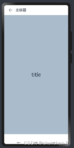
Navigation 的定义不需要传递相关参数,我们先看下 Navigation 的最简单样例:
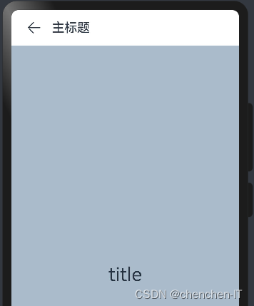
代码示例:
@Entry
@Component
struct Index {

  build() {
    Navigation() {              // Navigation只能包含一个子组件
      Text('title')
        .textAlign(TextAlign.Center)
        .fontSize(30)
        .width('100%')
        .height('100%')
        .backgroundColor('#aabbcc')
    }
    .size({width: '100%', height: '100%'}) // Navigation只设置了size,没有设置任何其它属性
    .titleMode(NavigationTitleMode.Mini)   //设置标题模式
    .title('主标题')
  }
}
Full模式
强调型标题栏,用于一级页面需要突出标题的场景
代码示例:
@Entry
@Component
struct Index {

  build() {
    Navigation() {              // Navigation只能包含一个子组件
      Text('title')
        .textAlign(TextAlign.Center)
        .fontSize(30)
        .width('100%')
        .height('100%')
        .backgroundColor('#aabbcc')
    }
    .size({width: '100%', height: '100%'}) // Navigation只设置了size,没有设置任何其它属性
    .titleMode(NavigationTitleMode.Full)   //设置标题模式
    .title('主标题')
  }
}
Navigation属性介绍
declare class NavigationAttribute extends CommonMethod<NavigationAttribute> {
  title(value: string | CustomBuilder): NavigationAttribute;
  subTitle(value: string): NavigationAttribute;
  hideTitleBar(value: boolean): NavigationAttribute;
  hideBackButton(value: boolean): NavigationAttribute;
  titleMode(value: NavigationTitleMode): NavigationAttribute;
  menus(value: Array<NavigationMenuItem> | CustomBuilder): NavigationAttribute;
  toolBar(value: object | CustomBuilder): NavigationAttribute;
  hideToolBar(value: boolean): NavigationAttribute;
  onTitleModeChange(callback: (titleMode: NavigationTitleMode) => void): NavigationAttribute;
}
title:设置导航栏的标题
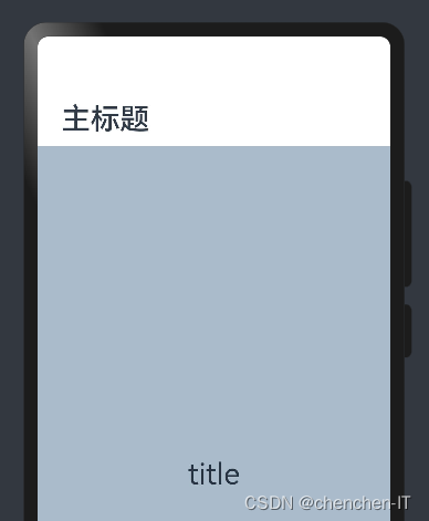
当参数类型为 string 时,可以直接设置标题,但样式不支修改;当参数为 CustomBuilder 时,可以自定义标题样式。
-
参数类型为
string,简单样例如下所示:@Entry @Component struct Index { build() { Navigation() { // Navigation只能包含一个子组件 Text('title') .textAlign(TextAlign.Center) .fontSize(30) .width('100%') .height('100%') .backgroundColor('#aabbcc') } .size({width: '100%', height: '100%'}) // Navigation只设置了size,没有设置任何其它属性 .titleMode(NavigationTitleMode.Full)//设置标题模式 .title('主标题') //标题栏内容 } }样例运行结果如下图所示:
-
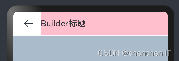
参数类型为
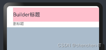
CustomBuilder,简单样例如下所示:@Entry @Component struct ComponentTest { @Builder title() { // 通过Builder自定义标题栏,可以灵活的设置标题样式 Row() { Text('Builder标题') .fontSize(20) } .width('100%') .height(55) .backgroundColor(Color.Pink) } build() { Navigation() { Text('title') .textAlign(TextAlign.Center) .fontSize(30) .size({ width: '100%', height: '100%' }) .backgroundColor('#aabbcc') } .size({ width: '100%', height: '100%' }) .title(this.title()) // 使用自定义的标题栏 .titleMode(NavigationTitleMode.Mini)//设置标题模式 } }样例运行结果如下图所示:
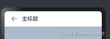
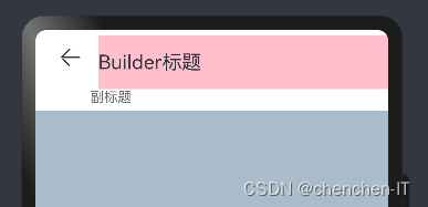
subTitle:设置页面的副标题
-
简单样例如下所示:
@Entry
@Component
struct ComponentTest {
  @Builder title() { // 通过Builder自定义标题栏,可以灵活的设置标题样式
    Row() {
      Text('Builder标题')
        .fontSize(20)
    }
    .width('100%')
    .height(55)
    .backgroundColor(Color.Pink)
  }

  build() {
    Navigation() {
      Text('title')
        .textAlign(TextAlign.Center)
        .fontSize(30)
        .size({ width: '100%', height: '100%' })
        .backgroundColor('#aabbcc')
    }
    .size({ width: '100%', height: '100%' })
    .title(this.title()) // 使用自定义的标题栏
    .subTitle("副标题")
    .titleMode(NavigationTitleMode.Mini)//设置标题模式
  }
}
样例运行结果如下图所示:
hideBackButton:是否隐藏返回按钮
-
默认情况下不隐藏,简单样例如下所示:
@Entry
@Component
struct ComponentTest {
  @Builder title() { // 通过Builder自定义标题栏,可以灵活的设置标题样式
    Row() {
      Text('Builder标题')
        .fontSize(20)
    }
    .width('100%')
    .height(55)
    .backgroundColor(Color.Pink)
  }

  build() {
    Navigation() {
      Text('title')
        .textAlign(TextAlign.Center)
        .fontSize(30)
        .size({ width: '100%', height: '100%' })
        .backgroundColor('#aabbcc')
    }
    .size({ width: '100%', height: '100%' })
    .title(this.title()) // 使用自定义的标题栏
    .subTitle("副标题")
    .titleMode(NavigationTitleMode.Mini)//设置标题模式
    .hideBackButton(true)
  }
}
样例运行结果如下图所示:
toolBar:设置工具栏
-
当参数类型为
object时,可以直接设置工具栏选项,但样式不支修改;当参数为CustomBuilder时,可以自定义标题栏。-
当参数为
object类型时,参数需要按照如下格式定义:- value:工具栏单个选项的显示文本。
- icon:工具栏单个选项的图标资源路径。
- action:当前选项被选中时的事件回调。
-
@Entry
@Component
struct Index {
  build() {
    Navigation() {              // Navigation只能包含一个子组件
      Text('title')
        .textAlign(TextAlign.Center)
        .fontSize(30)
        .width('100%')
        .height('100%')
        .backgroundColor('#aabbcc')
    }
    .size({width: '100%', height: '100%'}) // Navigation只设置了size,没有设置任何其它属性
    .titleMode(NavigationTitleMode.Mini)//设置标题模式
    .title('主标题')     //标题栏内容
    .toolBar({items:[
      {value: "func", icon: "./icon/ic_public_community_messages.png", action: ()=>{}},
      {value: "func", icon: "../../resources/base/media/icon.png", action: ()=>{}},
      {value: "func", icon: $r("app.media.icon"), action: ()=>{}}]})
  }
}
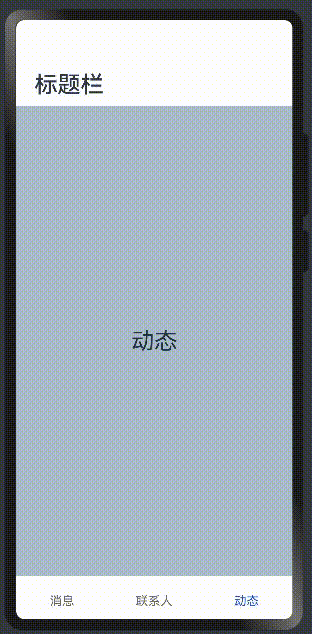
当参数为 CustomBuilder 类型
可以自定义样式,简单样例如下所示
@Entry
@Component
struct ComponentTest {
  @State index: number = 0; // 选项卡下标,默认为第一个

  @Builder toolbar() { // 通过builder自定义toolbar
    Row() {
      Column() {
        Image(this.index == 0 ? 'pages/icon_message_selected.png' : 'pages/icon_message_normal.png')
          .size({ width: 25, height: 25 })
        Text('消息')
          .fontSize(16)
          .fontColor(this.index == 0 ? "#2a58d0" : "#6b6b6b")
      }
      .alignItems(HorizontalAlign.Center)
      .height('100%')
      .layoutWeight(1)
      .onClick(() => {
        this.index = 0;
      })

      Column() {
        Image(this.index == 1 ? 'pages/icon_contract_selected.png' : 'pages/icon_contract_normal.png')
          .size({ width: 25, height: 25 })
        Text('联系人')
          .fontSize(16)
          .fontColor(this.index == 1 ? "#2a58d0" : "#6b6b6b")
      }
      .alignItems(HorizontalAlign.Center)
      .height('100%')
      .layoutWeight(1)
      .onClick(() => {
        this.index = 1;
      })

      Column() {
        Image(this.index == 2 ? 'pages/icon_dynamic_selected.png' : 'pages/icon_dynamic_normal.png')
          .size({ width: 25, height: 25 })
        Text('动态')
          .fontSize(16)
          .fontColor(this.index == 2 ? "#2a58d0" : "#6b6b6b")
      }
      .alignItems(HorizontalAlign.Center)
      .height('100%')
      .layoutWeight(1)
      .onClick(() => {
        this.index = 2;
      })
    }
    .width('100%')
    .height(60)
  }

  build() {
    Navigation() {
      Text(this.index == 0 ? "消息" : this.index == 1 ? "联系人" : "动态")
        .textAlign(TextAlign.Center)
        .fontSize(30)
        .size({ width: '100%', height: '100%' })
        .backgroundColor('#aabbcc')
    }
    .size({ width: '100%', height: '100%' })
    .title("标题栏")
    .toolBar(this.toolbar())
  }
}
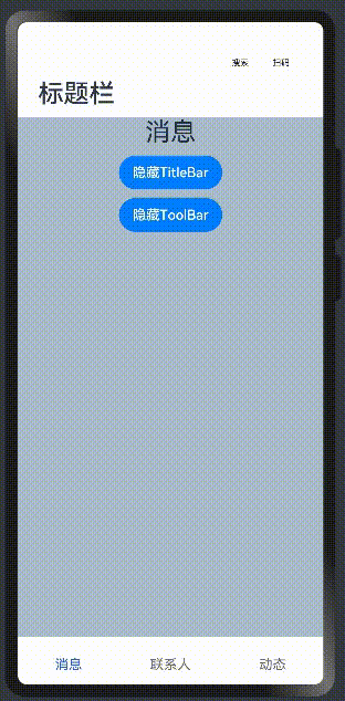
hideTitleBar、hideToolBar
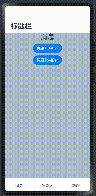
设置是否显示或者隐藏标题栏、工具栏,简单样例如下所示:
@Entry
@Component
struct ComponentTest {
  @State index: number = 0;
  @State hideToolBar: boolean = false;
  @State hideTitleBar: boolean = false;

  @Builder toolbar() {
    Row() {
      Column() {
        Image(this.index == 0 ? 'pages/icon_message_selected.png' : 'pages/icon_message_normal.png')
          .size({ width: 25, height: 25 })
        Text('消息')
          .fontSize(16)
          .fontColor(this.index == 0 ? "#2a58d0" : "#6b6b6b")
      }
      .alignItems(HorizontalAlign.Center)
      .height('100%')
      .layoutWeight(1)
      .onClick(() => {
        this.index = 0;
      })

      Column() {
        Image(this.index == 1 ? 'pages/icon_contract_selected.png' : 'pages/icon_contract_normal.png')
          .size({ width: 25, height: 25 })
        Text('联系人')
          .fontSize(16)
          .fontColor(this.index == 1 ? "#2a58d0" : "#6b6b6b")
      }
      .alignItems(HorizontalAlign.Center)
      .height('100%')
      .layoutWeight(1)
      .onClick(() => {
        this.index = 1;
      })

      Column() {
        Image(this.index == 2 ? 'pages/icon_dynamic_selected.png' : 'pages/icon_dynamic_normal.png')
          .size({ width: 25, height: 25 })
        Text('动态')
          .fontSize(16)
          .fontColor(this.index == 2 ? "#2a58d0" : "#6b6b6b")
      }
      .alignItems(HorizontalAlign.Center)
      .height('100%')
      .layoutWeight(1)
      .onClick(() => {
        this.index = 2;
      })
    }
    .width('100%')
    .height(60)
  }

  build() {
    Navigation() {
      Column({ space: 10 }) {
        Text(this.index == 0 ? "消息" : this.index == 1 ? "联系人" : "动态")
          .textAlign(TextAlign.Center)
          .fontSize(30)

        Button(this.hideTitleBar ? "显示TitleBar" : "隐藏TitleBar")
          .onClick(() => {
            this.hideTitleBar = !this.hideTitleBar;
          })


        Button(this.hideToolBar ? "显示ToolBar" : "隐藏ToolBar")
          .onClick(() => {
            this.hideToolBar = !this.hideToolBar;
          })
      }
      .backgroundColor('#aabbcc')
      .size({ width: '100%', height: '100%' })
    }
    .size({ width: '100%', height: '100%' })
    .title("标题栏")
    .toolBar(this.toolbar())
    .hideToolBar(this.hideToolBar)
    .hideTitleBar(this.hideTitleBar)
  }
} 
设置菜单栏
菜单栏位于Navigation组件的右上角,开发者可以通过menus属性进行设置。menus支持Array<NavigationMenuItem>和CustomBuilder两种参数类型。使用Array<NavigationMenuItem>类型时,竖屏最多支持显示3个图标,横屏最多支持显示5个图标,多余的图标会被放入自动生成的更多图标。
menus:设置标题栏右上角的菜单项,当参数为 CustomBuilder 时可以自定义菜单项。
-
当参数为
NavigationMenuItem数组时,参数说明如下:- value:菜单项的显示文本。
- icon:菜单项的显示图标路径。
- action:点击菜单项的事件回调。
简单样例如下所示:
@Entry
@Component
struct ComponentTest {
  @State index: number = 0;
  @State hideToolBar: boolean = false;
  @State hideTitleBar: boolean = false;

  @Builder toolbar() {
    Row() {
      Column() {
        Image(this.index == 0 ? 'pages/icon_message_selected.png' : 'pages/icon_message_normal.png')
          .size({ width: 25, height: 25 })
        Text('消息')
          .fontSize(16)
          .fontColor(this.index == 0 ? "#2a58d0" : "#6b6b6b")
      }
      .alignItems(HorizontalAlign.Center)
      .height('100%')
      .layoutWeight(1)
      .onClick(() => {
        this.index = 0;
      })

      Column() {
        Image(this.index == 1 ? 'pages/icon_contract_selected.png' : 'pages/icon_contract_normal.png')
          .size({ width: 25, height: 25 })
        Text('联系人')
          .fontSize(16)
          .fontColor(this.index == 1 ? "#2a58d0" : "#6b6b6b")
      }
      .alignItems(HorizontalAlign.Center)
      .height('100%')
      .layoutWeight(1)
      .onClick(() => {
        this.index = 1;
      })

      Column() {
        Image(this.index == 2 ? 'pages/icon_dynamic_selected.png' : 'pages/icon_dynamic_normal.png')
          .size({ width: 25, height: 25 })
        Text('动态')
          .fontSize(16)
          .fontColor(this.index == 2 ? "#2a58d0" : "#6b6b6b")
      }
      .alignItems(HorizontalAlign.Center)
      .height('100%')
      .layoutWeight(1)
      .onClick(() => {
        this.index = 2;
      })
    }
    .width('100%')
    .height(60)
  }

  build() {
    Navigation() {
      Column({ space: 10 }) {
        Text(this.index == 0 ? "消息" : this.index == 1 ? "联系人" : "动态")
          .textAlign(TextAlign.Center)
          .fontSize(30)

        Button(this.hideTitleBar ? "显示TitleBar" : "隐藏TitleBar")
          .onClick(() => {
            this.hideTitleBar = !this.hideTitleBar;
          })


        Button(this.hideToolBar ? "显示ToolBar" : "隐藏ToolBar")
          .onClick(() => {
            this.hideToolBar = !this.hideToolBar;
          })
      }
      .backgroundColor('#aabbcc')
      .size({ width: '100%', height: '100%' })
    }
    .size({ width: '100%', height: '100%' })
    .title("标题栏")
    .toolBar(this.toolbar())
    .hideToolBar(this.hideToolBar)
    .hideTitleBar(this.hideTitleBar)
    .menus([
      {
        value: "搜索",
        icon: "pages/icon_search.png",
        action: () => {
          Prompt.showToast({ message: "搜索" })
        }
      },
      {
        value: "扫码",
        icon: "pages/icon_scan.png",
        action: () => {
          Prompt.showToast({ message: "扫码" })
        }
      }
    ])
  }
}
Navigation事件介绍
declare class NavigationAttribute extends CommonMethod<NavigationAttribute> {
  onTitleModeChange(callback: (titleMode: NavigationTitleMode) => void): NavigationAttribute;
}
- onTitleModeChange:当
titleMode为 NavigationTitleMode.Free 时,随着可滚动组件的滑动标题栏模式发生变化时触发此回调
NavRouter
分享
添加收藏
导航组件,默认提供点击响应处理,不需要开发者自定义点击事件逻辑。
说明
该组件从API Version 9开始支持。后续版本如有新增内容,则采用上角标单独标记该内容的起始版本。
子组件
必须包含两个子组件,其中第二个子组件必须为NavDestination。
说明
子组件个数异常时:
- 有且仅有1个时,触发路由到NavDestination的能力失效。
- 有且仅有1个时,且使用NavDestination场景下,不进行路由。
- 大于2个时,后续的子组件不显示。
- 第二个子组件不为NavDestination时,触发路由功能失效。
接口
NavRouter()
事件
| 名称 | 功能描述 |
|---|---|
| onStateChange(callback: (isActivated: boolean) => void) | 组件激活状态切换时触发该回调。返回值isActivated为true时表示激活,为false时表示未激活。 说明: 开发者点击激活NavRouter,加载对应的NavDestination子组件时,回调onStateChange(true)。NavRouter对应的NavDestination子组件不再显示时,回调onStateChange(false)。 |
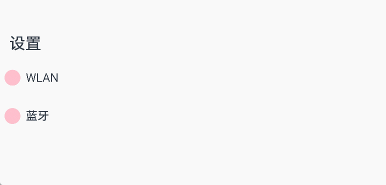
示例
// xxx.ets
@Entry
@Component
struct NavRouterExample {
  @State isActiveWLAN: boolean = false
  @State isActiveBluetooth: boolean = false

  build() {
    Column() {
      Navigation() {
        NavRouter() {
          Row() {
            Row().width(30).height(30).borderRadius(30).margin({ left: 3, right: 10 }).backgroundColor(Color.Pink)
            Text(`WLAN`)
              .fontSize(22)
              .fontWeight(500)
              .textAlign(TextAlign.Center)
          }
          .width('90%')
          .height(72)
          NavDestination() {
            Flex({ direction: FlexDirection.Row }) {
              Text('未找到可用WLAN').fontSize(30).padding({ left: 15 })
            }
          }.hideTitleBar(false).backgroundColor('#0c182431')
        }.backgroundColor(this.isActiveWLAN ? '#ccc' : '#fff')
        .borderRadius(24)
        .onStateChange((isActivated: boolean) => {
          this.isActiveWLAN = isActivated
        })

        NavRouter() {
          Row() {
            Row().width(30).height(30).borderRadius(30).margin({ left: 3, right: 10 }).backgroundColor(Color.Pink)
            Text(`蓝牙`)
              .fontSize(22)
              .fontWeight(500)
              .textAlign(TextAlign.Center)
          }
          .width('90%')
          .height(72)

          NavDestination() {
            Flex({ direction: FlexDirection.Row }) {
              Text('未找到可用蓝牙').fontSize(30).padding({ left: 15 })
            }
          }.hideTitleBar(false).backgroundColor('#0c182431')
        }.backgroundColor(this.isActiveBluetooth ? '#ccc' : '#fff')
        .borderRadius(24)
        .onStateChange((isActivated: boolean) => {
          this.isActiveBluetooth = isActivated
        })
      }
      .title('设置')
      .titleMode(NavigationTitleMode.Free)
      .mode(NavigationMode.Auto)
      .hideTitleBar(false)
      .hideToolBar(true)
    }.height('100%')
  }
}