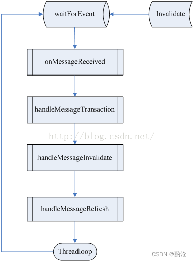
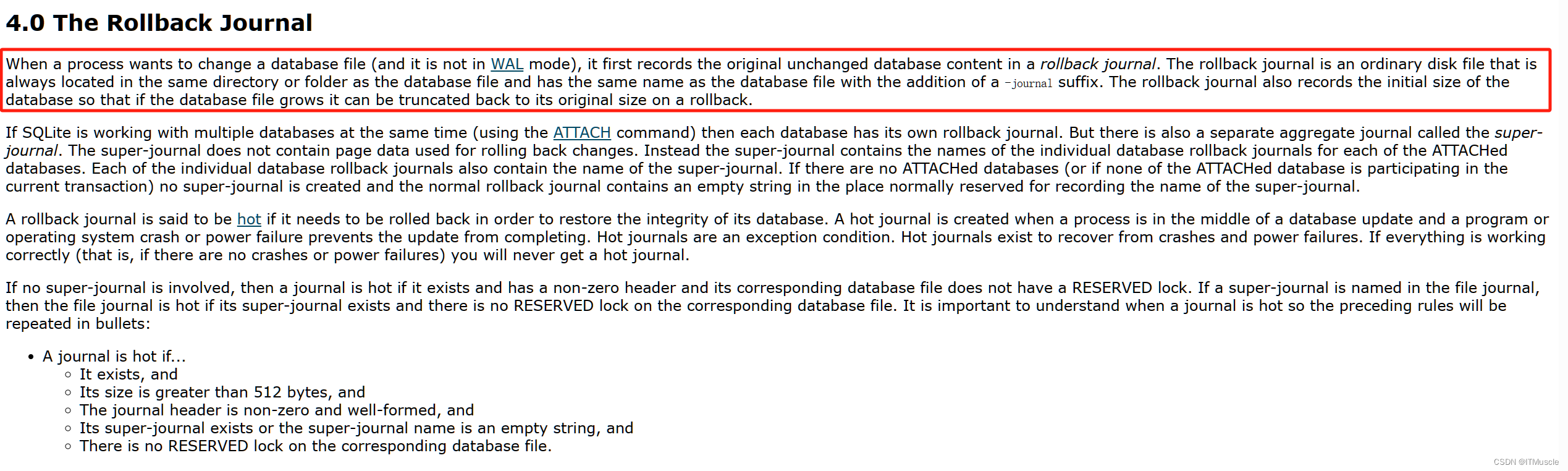
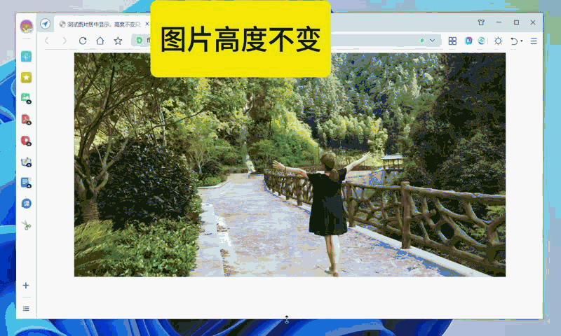
改变浏览器大小,图片(img)内容居中显示,img标签,不是背景图
效果直接上图:

上代码:
<!DOCTYPE html>
<html>
<head>
    <title>测试图片居中显示,高度不变只变宽度</title>
    <meta content="测试图片居中显示,高度不变只变宽度" name="description"/>
    <meta content="测试图片居中显示,高度不变只变宽度" name="keywords"/>
    <meta http-equiv="Content-Type" content="text/html; charset=utf-8"/>
    <meta name="viewport"
          content="width=device-width, user-scalable=no, initial-scale=1.0, maximum-scale=1.0, minimum-scale=1.0"/>
    <meta http-equiv="Cache-Control" content="no-cache, no-store, must-revalidate"/>
    <meta http-equiv="Pragma" content="no-cache"/>
    <meta http-equiv="Expires" content="0"/>
    <meta name="viewport" content="width=1280">
    <meta name="format-detection" content="telephone=no">
    <meta http-equiv="X-UA-Compatible" content="IE=edge"/>
    <meta http-equiv="cache-control" content="no-cache">
    <meta name="robots" content="all"/>
    <style>

        /*测试图片居中显示,高度不变只变宽度*/
        .bannerWrap{
            overflow-x: hidden;
            display: flex;
            flex-direction: column;
            align-items: center;
        }
        .banner{
            width:1000px;
            height:500px;
        }
        .banner img{
            display: block;
            width: 100%;
            height: 100%;
        }

    </style>
</head>
<body>

    <!-- banner -->
    <div class="bannerWrap">
        <div class="banner">
            <img src="./images/test1000-5000.jpg" alt="">
        </div>
    </div>

    <!-- banner end -->


</body>
</html>
此代码浏览器高度改变,图片不变上效果
测试完整demo:
https://download.csdn.net/download/qq_33650655/89299911