文章目录
- 前言
- 一、Button是什么?
- 二、开始使用button
- 1.ElevatedButton
- 1.无style 的ElevatedButton
- 2.基础功能的处理之后的button
- 3.利用buttonstyle 来美化下button
- 2.IconButton,TextButton基础功能都是一样的
- 三、做几个好看点的按键
- 总结
前言
一、Button是什么?
按键,在flutter 中,有很多已经内置的button,合理的利用可以快速的开发,
但是ElevatedButton中,有一个Buttonstyle,配合起来可以创建自己需要的按钮样式,但是其实个人感觉运用起来有些复杂。
二、开始使用button
在一个app 中,肯定会出现按键widget的,这个也是运用很多的情况。
1.ElevatedButton
| 参数 | 说明 |
|---|---|
| super.key | key |
| required super.onPressed | 点击函数 |
| super.onLongPress | 长按的处理 |
| super.onHover | 鼠标悬停的时候处理的时间 |
| super.onFocusChange | 焦点改变 |
| super.style | buttonstyle |
| super.focusNode | – |
| super.autofocus = false, | – |
| super.clipBehavior = Clip.none | 抗锯齿功能 |
| super.statesController | 可以监听和控制按钮的状态改变,然后做处理 |
| required super.child | widget |
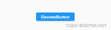
1.无style 的ElevatedButton
代码如下(示例):
 ElevatedButton(
   onPressed: () {},
   child: const Text('ElevatedButton'),
2.基础功能的处理之后的button
鼠标悬停在按钮上面就改变颜色
      ElevatedButton(
              onPressed: () {
                debugPrint("I AM CLICK HERE");
              },
              onLongPress: () {
                debugPrint('I AM LONGPRESS');
              },
              //按钮的状态控制器,少用到
              // statesController: ,
              //抗锯齿功能
              clipBehavior: Clip.antiAlias,
              //焦点处理,使用不多
              focusNode: FocusNode(),
              //鼠标悬停的处理,一般在win 和mac的软件的时候处理
              onHover: (inhover) {
                if (inhover) {
                  _color = Colors.green;
                } else {
                  _color = Colors.red;
                }
                setState(() {});
              },
              child: Text(
                'ElevatedButton',
                style: TextStyle(color: _color),
              ),
            )

3.利用buttonstyle 来美化下button
| 参数 | 说明 |
|---|---|
| this.textStyle | 文本样式 |
| this.backgroundColor | 背景颜色 |
| this.foregroundColor | |
| this.overlayColor | |
| this.shadowColor | |
| this.surfaceTintColor | |
| this.elevation | |
| this.padding | |
| this.minimumSize | |
| this.fixedSize | |
| this.maximumSize | |
| this.side | |
| this.shape | |
| this.mouseCursor | |
| this.visualDensity | |
| this.tapTargetSize | |
| this.animationDuration | |
| this.enableFeedback | |
| this.alignment | |
| this.splashFactory |
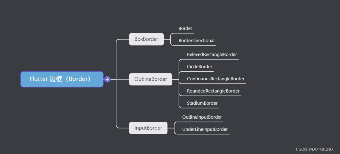
【Flutter】shape 属性 ShapeBorder,形状
    ElevatedButton(
              onPressed: () {
                debugPrint("I AM CLICK HERE");
              },
              onLongPress: () {
                debugPrint('I AM LONGPRESS');
              },
              //按钮的状态控制器,少用到
              // statesController: ,
              //抗锯齿功能
              clipBehavior: Clip.antiAlias,

              //焦点处理,使用不多
              focusNode: FocusNode(),
              style: ButtonStyle(
                  //背景颜色
                  backgroundColor: MaterialStateProperty.all(Colors.indigo),
                  //字体颜色
                  foregroundColor: MaterialStateProperty.all(Colors.white),
                  // 鼠标悬停的时候背景颜色
                  overlayColor: MaterialStateProperty.all(Colors.red),
                  //影音的颜色
                  shadowColor: MaterialStateProperty.all(Colors.yellow),
                  //表面颜色
                  surfaceTintColor: MaterialStateProperty.all(Colors.pink),
                  // 阴影值
                  elevation: MaterialStateProperty.all(10),
                  //内边距,文本同按钮边框的距离
                  // padding: MaterialStateProperty.all(const EdgeInsets.all(5)),
                  //最小值,尺寸不能再小于这个了
                  // minimumSize: MaterialStateProperty.all(const Size(10, 10)),
                  //边框的颜色和厚度
                  side: MaterialStateProperty.all(
                      const BorderSide(color: Colors.pink, width: 1.0)),
                  //形状
                  shape: MaterialStateProperty.all(
                    const BeveledRectangleBorder(
                        borderRadius: BorderRadius.all(Radius.circular(15)),
                        side: BorderSide(color: Colors.green, width: 1)),
                  ),
                  //鼠标的样式,当悬停的时候,鼠标要显示为什么样的样式,比如下面的鼠标就会显示为等待加载的样式
                  mouseCursor:
                      MaterialStateProperty.all(SystemMouseCursors.wait),
                  //视觉密度,就是按钮的紧凑性
                  visualDensity: VisualDensity.compact,
                  //触控区域,少用
                  tapTargetSize: MaterialTapTargetSize.padded,
                  //shap,eleation 改变的动画时间
                  animationDuration: const Duration(seconds: 1),
                  //检测到的手势是否应提供声学和/或触觉反馈。例如,在Android上,当启用反馈时,轻敲会产生咔哒声,长按会产生短暂的振动。
                  enableFeedback: true,
                  //child的位置,
                  alignment: Alignment.center,
                  //水波纹
                  splashFactory: InkRipple.splashFactory,
                  //字体样式
                  textStyle: MaterialStateProperty.all(
                      const TextStyle(fontWeight: FontWeight.bold))),

              child: const Text(
                'ElevatedButton',
              ),
            )

2.IconButton,TextButton基础功能都是一样的
带图标的按键:buttonstyle 同上面的说明是一样的;
isSelected: isSelect,//需要在themedata 里面设置useMaterial3: true
         IconButton(
              icon: const Icon(Icons.arrow_drop_down),
              isSelected: isSelect,//需要在themedata 里面设置useMaterial3: true
              selectedIcon: const Icon(Icons.arrow_drop_up),
              onPressed: () {
                isSelect = !isSelect;
                setState(() {});
              },
            ),
            IconButton(
                onPressed: () {
                  print("Pressed");

                  setState(() {});
                },

                // splashRadius: 0.2,
                splashColor: Colors.red,
                focusColor: Colors.indigo,
                hoverColor: Colors.yellow,
                highlightColor: Colors.purple,
                disabledColor: Colors.teal,
                // mouseCursor: SystemMouseCursors.allScroll,
                //尺寸限制
                // constraints:BoxConstraints() ,
                tooltip: 'this is a iconbutton',
                isSelected: true,
                selectedIcon: Icon(Icons.favorite),
                icon: Icon(Icons.adb_sharp))

三、做几个好看点的按键
     ElevatedButton(
                onPressed: () {},
                style: ButtonStyle(
                    backgroundColor: MaterialStateProperty.all(Colors.teal),
                    shadowColor: MaterialStateProperty.all(Colors.yellowAccent),
                    elevation: MaterialStateProperty.all(10)),
                child: const Text(
                  '开始',
                  style: TextStyle(color: Colors.white),
                )),
            ElevatedButton(
                onPressed: () {},
                clipBehavior: Clip.antiAlias,
                style: ButtonStyle(
                    shape: MaterialStateProperty.all(const CircleBorder(
                        side: BorderSide(width: 1, color: Colors.pink))),
                    padding:
                        MaterialStateProperty.all(const EdgeInsets.all(10)),
                    overlayColor: MaterialStateProperty.all(Colors.white),
                    foregroundColor: MaterialStateProperty.all(Colors.black),
                    backgroundColor:
                        MaterialStateProperty.all(Colors.indigoAccent),
                    shadowColor: MaterialStateProperty.all(Colors.blueAccent),
                    elevation: MaterialStateProperty.all(10)),
                child: const Text(
                  '登陆',
                )),

            ElevatedButton(
                onPressed: () {},
                style: ButtonStyle(
                    minimumSize: MaterialStateProperty.all(
                        Size(MediaQuery.of(context).size.width, 40)),
                    foregroundColor: MaterialStateProperty.all(Colors.black),
                    backgroundColor: MaterialStateProperty.all(Colors.purple),
                    shadowColor: MaterialStateProperty.all(Colors.blueAccent),
                    elevation: MaterialStateProperty.all(10)),
                child: const Text(
                  '登陆',
                )),
            ElevatedButton(
                onPressed: () {},
                style: ButtonStyle(
                    shape: MaterialStateProperty.all(
                        const BeveledRectangleBorder(
                            borderRadius: BorderRadius.all(Radius.circular(15)),
                            side: BorderSide(color: Colors.green, width: 1))),
                    minimumSize: MaterialStateProperty.all(
                        Size(MediaQuery.of(context).size.width, 40)),
                    foregroundColor: MaterialStateProperty.all(Colors.black),
                    backgroundColor: MaterialStateProperty.all(Colors.pink),
                    shadowColor: MaterialStateProperty.all(Colors.blueAccent),
                    elevation: MaterialStateProperty.all(10)),
                child: const Text(
                  '登陆',
                )),

总结
欢迎关注,留言,咨询,交流!