摘要:
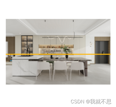
需求中需要模拟扫描的效果来实现户型的生成!由于接口ai生成的图片户型时间比较长,所以需要模拟特效!
<!DOCTYPE html>
<html>
	<head>
		<mate charset="UTF-8" />
		<title>扫描</title>
		<style type="text/css">
			html,body{
				margin: 0;
				padding: 0;
			}

			.production-img {
				background: #fff;
				width: 90%;
				height: 550px;
				margin: 0 5%;
				position: absolute;
				top: 50%;
				transform: translateY(-88%);
				border-radius: 15px;
			}

			.scanImage {
				width: 100%;
				height: 550px;
			}

			.loadingscon {
				position: absolute;
				top: 0;
				left: 0;
				right: 0;
				bottom: 0;
				background: linear-gradient(#ffb80d, #ffb80d),
					linear-gradient(90deg, #ffffff33 1px, transparent 0),
					linear-gradient(#ffffff33 1px, transparent 0),
					linear-gradient(transparent, #ffb80d);
				background-size: 100% 1.5%, 0% 100%, 100% 0%, 100% 0%;
				background-repeat: no-repeat, repeat, repeat, no-repeat;
				background-position: 0 0, 0 0, 0 0, 0 0;
				clip-path: polygon(0% 0%, 100% 0%, 100% 1.5%, 0% 1.5%);
				animation: move 3s infinite linear;
			}

			@keyframes move {
				to {
					background-position: 0 100%, 0 0, 0 0, 0 0;
					clip-path: polygon(0% 0%, 100% 0%, 100% 100%, 0% 100%);
				}
			}
		</style>
	</head>
	<body>
		<div style="display:flex;">
			<div class="production-img global_df_c">
				<img class="scanImage" src="https://qhrenderpicoss.kujiale.com/r/2023/11/30/L3D593S21ENDPB33D6QUWLCMELUFX73ESRI8_8000x6000.jpg" />
				<div class="loadingscon"></div>
			</div>
		</div>
	</body>
</html>
上面是实现从上到下的扫描的过程!如果需要从左到右扫描的过程:
.loadingscon {
	position: absolute;
	top: 0;
	left: 0;
	right: 0;
	bottom: 0;
	background: linear-gradient(#ffb80d, #ffb80d),
				linear-gradient(90deg, #ffffff33 1px, transparent 0),
				linear-gradient(#ffffff33 1px, transparent 0),
				linear-gradient(transparent, #ffb80d);
	background-size: 100% 100%, 0% 100%, 100% 0%, 100% 0%;
	background-repeat: no-repeat, repeat, repeat, no-repeat;
	background-position: 0 0, 0 0, 0 0, 0 0;
	clip-path: polygon(0% 0%, 1% 0%, 1% 100%, 0% 100%);
	animation: move 3s infinite linear;
}

@keyframes move {
	to {
		background-position: 0 100%, 0 0, 0 0, 0 0;
		clip-path: polygon(99% 0%, 100% 0%, 100% 100%, 99% 100%);
	}
}