学习笔记:
1. DataGrid 笔记1中已经记录;
2. ItemsControl
属性:
ItemsSource:数据源
ItemsControl.ItemTemplate:单项数据模板,内部使用<DataTemplate>
示例:
<ItemsControl Grid.Row="4" ItemsSource="{Binding ItemModels}" >
    <ItemsControl.ItemTemplate>
        <DataTemplate>
            <Grid>
                <Grid.RowDefinitions >
                    <RowDefinition/>
                    <RowDefinition/>
                    <RowDefinition/>
                </Grid.RowDefinitions>
                <TextBlock Text="{Binding LastName}"></TextBlock>
                <TextBlock Text="{Binding FirstName}"></TextBlock>

            </Grid>
        </DataTemplate>
    </ItemsControl.ItemTemplate>
</ItemsControl>
public List<Person> ItemModels { get; set; } = new List<Person>();
public MainWindowViewModel()
{
ItemModels.Add(new Person("eew", "dsjuoj"));
ItemModels.Add(new Person("Ne22323ids", "dsjuoj"));
ItemModels.Add(new Person("rrrr", "dsjuoj"));
}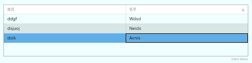
水平方向可以根据父元素尺寸自动调整,但垂直方向不可以。
3. ItemsRepeater 具有数据模板和布局模板
需要引用nuget包
<PackageReference Include="Avalonia.Controls.ItemsRepeater" Version="11.0.9" />
属性:
ItemsSource
ItemsRepeater.ItemTemplate
ItemsRepeater.Layout:设置布局的方向,默认垂直
// 该标签内必须设置StackLayout
<ItemsRepeater.Layout>
    <StackLayout Spacing="40" Orientation="Horizontal" />
</ItemsRepeater.Layout>
该标签内必须设置StackLayout。
<ItemsRepeater Grid.Row="5" Grid.RowSpan="3" ItemsSource="{Binding ItemModels}">
    <ItemsRepeater.Layout>
        <StackLayout Orientation="Horizontal"></StackLayout>
    </ItemsRepeater.Layout>
    <ItemsRepeater.ItemTemplate>
        <DataTemplate>
            <Border Margin="0,10,0,0" CornerRadius="5" BorderBrush="Blue" BorderThickness="1" Padding="5">
                <StackPanel Orientation="Horizontal">
                    <TextBlock Text="{Binding FirstName}"></TextBlock>
                    <TextBlock Margin="5 0" Text="{Binding LastName}"></TextBlock>
                </StackPanel>
            </Border>
        </DataTemplate>
    </ItemsRepeater.ItemTemplate>
</ItemsRepeater>

4. ListBox
属性:
Items:数据项集合。只有get属性
SelectedIndex:下标
SelectedItem:单选
SelectedItems: 多选
Selection:一个ISelectionModel对象,具有各种方法来跟踪多个选定项目
SelectionMode:选择模式,值为:Single(单选模式)、Multiple(多选模式)、Toggle(所选项目可以切换,若不启用,则需要用“shift/ctrl”切换)、AlwaysSelected(始终被选择)
ScrollViewer.Horizontal:水平滚动条的可见性,值:Disabled(默认)、Auto、Hidden、Visible。
ScrollViewer.Vertical:垂直滚动条的可见性,值:Disabled(默认)、Auto、Hidden、Visible。
示例:
<ListBox Grid.Row="5" x:Name="animals"> animals.ItemsSource = new string[] { "cat", "dog", "bird", "tiger", "duck", "chicken" }.OrderBy(x=>x);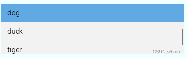
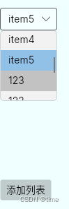
5. ComboBox 下拉框
属性:
Items:数据项集合,只读
SelectedIndex
SelectedItem
SelectedItems
AutoScrollToSelectedItem:是否自动滚动到所选择的项
IsDropDownOpen:是否打开下拉
MaxDropDownHeight:下拉最大高度,这是列表部分的实际高度,而不是显示的项目数。
示例:
<ComboBox Grid.Row="5" SelectedIndex="0" MaxDropDownHeight="100" x:Name="ComboBox1" ItemsSource="{Binding ComboxArr}"/>
<Button Grid.Row="6" Content="添加列表" Command="{Binding AddCom}" CommandParameter="123"></Button>
public List<string> ComboBoxList = new List<string>();
public ObservableCollection<string> ComboxArr { get; set; }
public MainWindowViewModel()
{
ComboBoxList.Add("item1");
ComboBoxList.Add("item2");
ComboBoxList.Add("item3");
ComboBoxList.Add("item4");
ComboBoxList.Add("item5");
ComboxArr = new ObservableCollection<string>(ComboBoxList.ToArray());
}
public void AddCom(string args)
{
ComboBoxList.Add(args);
ComboxArr = new ObservableCollection<string>(ComboBoxList.ToArray());
this.RaisePropertyChanged(nameof(ComboxArr));
}