目录
1.介绍
2.使用
1. 安装:
2.创建简单图表
3.图表类型
1.一共分为7类
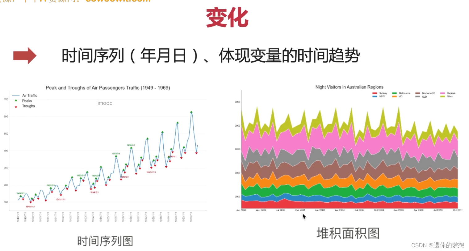
2.变化
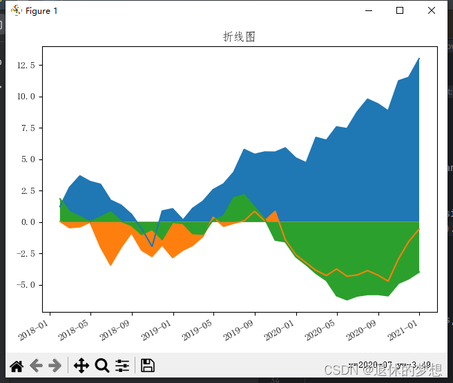
1.折线图
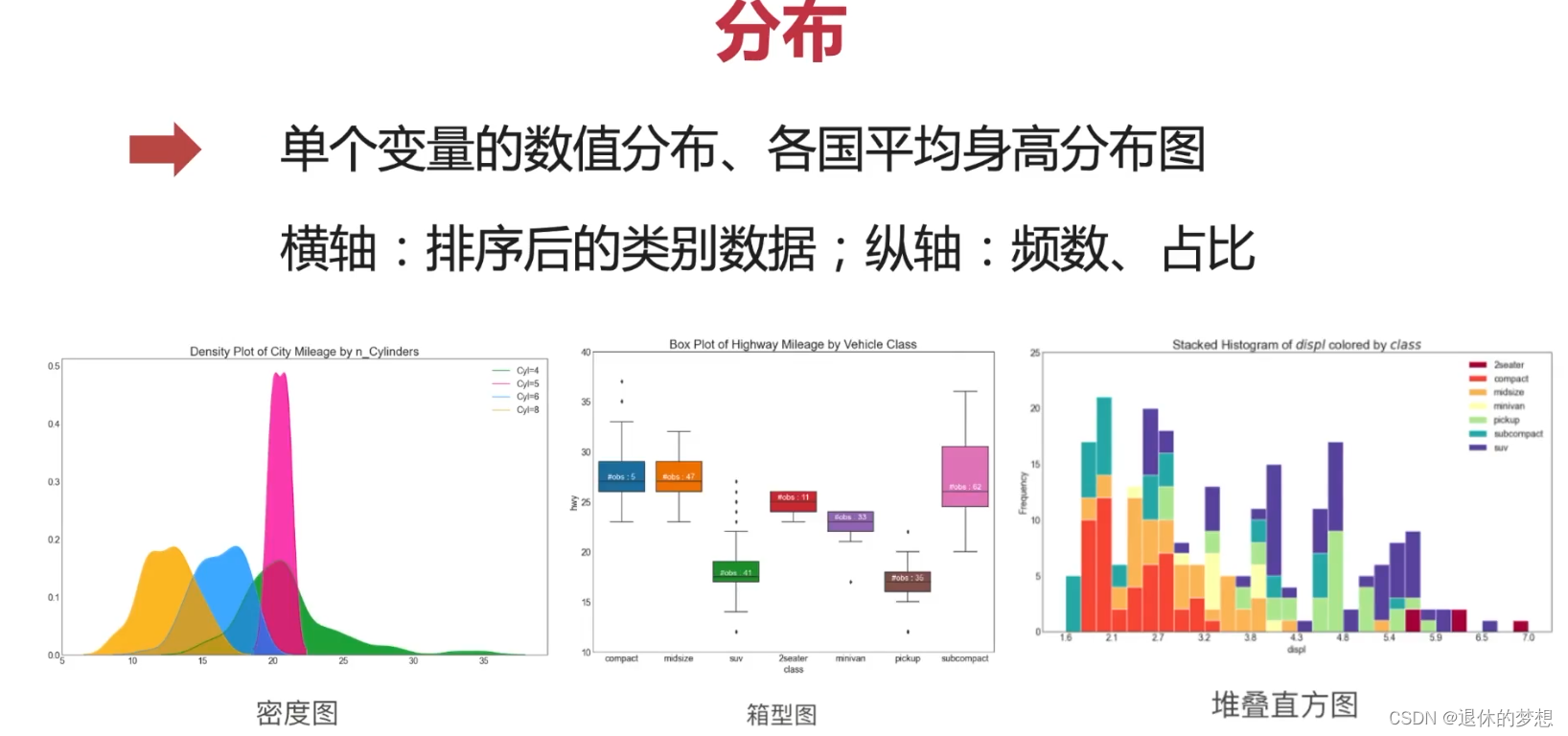
3.分布
编辑
1.直方图
2.箱型图
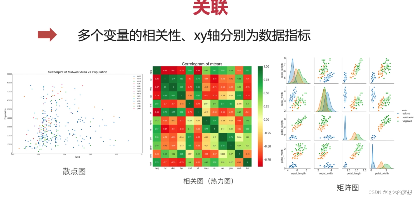
4.关联
1. 散点图:
2.热力图:
5.组成
1.饼图
2.条形图
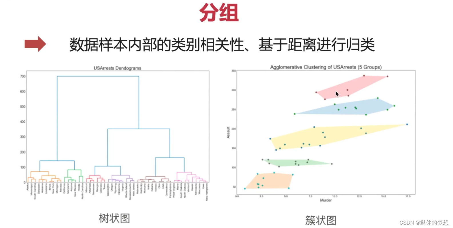
6.分组
1.簇型散点图
2.分组条形图
3.分组条形图不覆盖
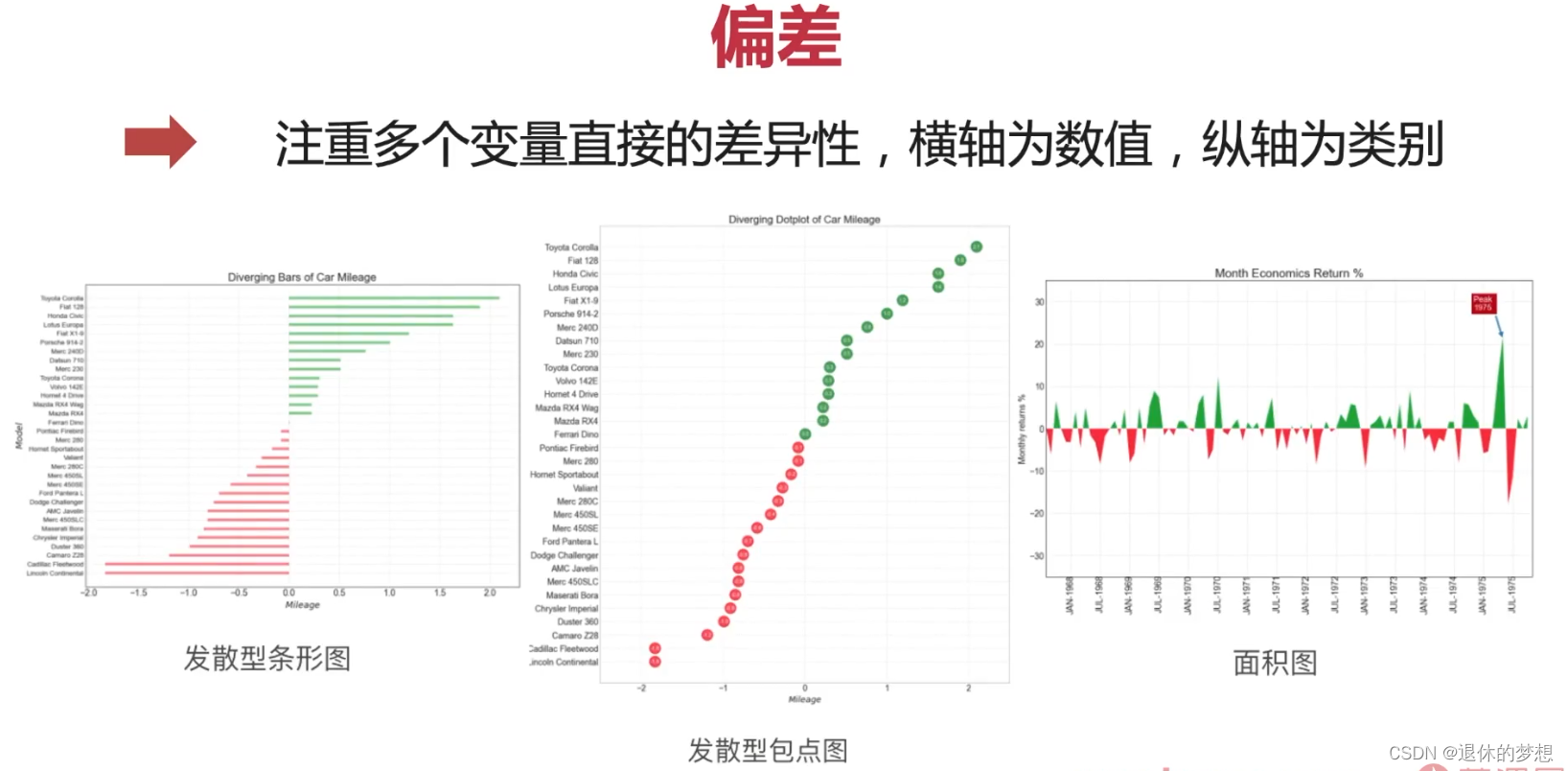
7.偏差
1.发散条形图
2.面积图
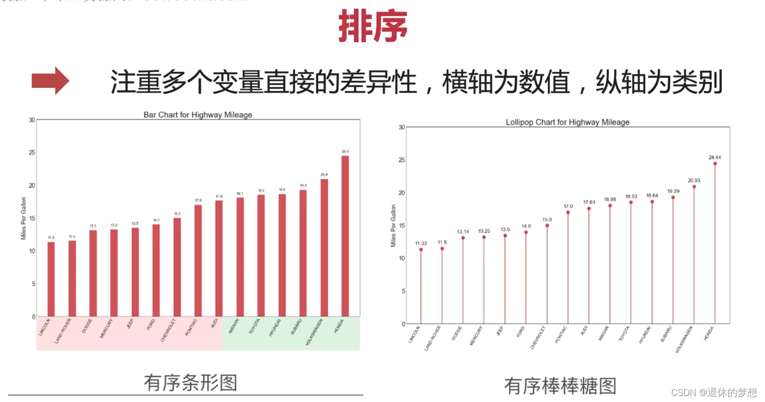
8.排序
1.介绍
1. 数据可视化相关库

2.Matplotlib
1. 官网:http://matplotlib.org
2.中文网:http://matplotlib.org.cn
2.使用
1. 安装:
pip install matplotlib
import matplotlib.pyplot as plt
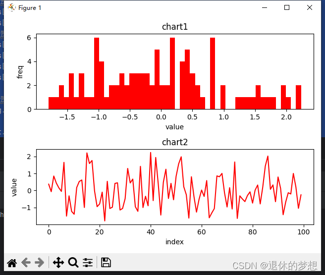
2.创建简单图表
# 创建画板, 2行1列的图表 sharex:共享x轴,sharey:共享y轴
fig, axs = plt.subplots(2, 1)

# 生成数据
data = np.random.randn(100)

# 选取第一个画布,填充数据
axs[0].hist(data, bins=50, color="red")
axs[1].plot(data, color="red")


#参数设置
#设置标题
axs[0].set_title("chart1")
axs[1].set_title("chart2")
#设置x轴y轴名称
axs[0].set_xlabel("value")
axs[0].set_ylabel("freq")
axs[1].set_xlabel("index")
axs[1].set_ylabel("value")

#设置间距,避免名称重叠
fig.tight_layout()

plt.show()
3.图表类型
1.一共分为7类

2.变化
1.折线图
# coding:utf-8

import matplotlib.pyplot as plt
import matplotlib as mpl
import numpy as np
import pandas as pd

# 设置显示中文

mpl.rcParams["font.family"] = "FangSong"  # 设置字体
mpl.rcParams["axes.unicode_minus"] = False  # 正常显示负号

fig, ax = plt.subplots(1, 1)

# 模拟数据
datas = pd.date_range("2018-01-01", "2021-01-01", freq="M")


def get_price(size):
    return np.cumsum(np.random.randn(size))


price = [get_price(datas.size), get_price(datas.size), get_price(datas.size)]
data = pd.DataFrame(price).T

data.index = datas

#填充顔色,设置面积图
for p in price:
    plt.fill_between(datas, y1=p)

# 折线图
plt.plot(data)

# 设置x轴lable为斜线
fig.autofmt_xdate()

# 设置x,y轴坐标标签
ax.set_title("折线图")
fig.tight_layout()

plt.show()
3.分布
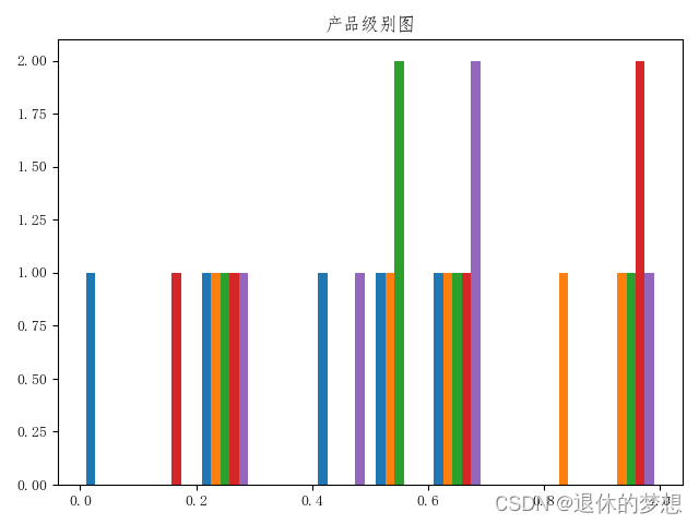
1.直方图
import matplotlib.pyplot as plt
import matplotlib as mpl
import numpy as np

mpl.rcParams["font.family"] = "FangSong"  # 设置字体
mpl.rcParams["axes.unicode_minus"] = False  # 正常显示负号

fig,ax=plt.subplots(1,1)

#模拟数据,5行5列数据
data=np.round(np.random.random(25).reshape(5,5),1)
#直方图
plt.hist(data)

#设置x,y轴坐标标签
ax.set_title("产品级别图")
#明确设置x,y轴数量

fig.tight_layout()


plt.show()
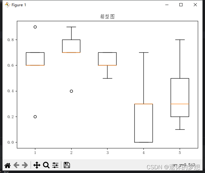
2.箱型图
import matplotlib.pyplot as plt
import matplotlib as mpl
import numpy as np

mpl.rcParams["font.family"] = "FangSong"  # 设置字体
mpl.rcParams["axes.unicode_minus"] = False  # 正常显示负号

fig,ax=plt.subplots(1,1)

#模拟数据,5行5列数据
data=np.round(np.random.random(25).reshape(5,5),1)
#直方图
plt.boxplot(data)

#设置x,y轴坐标标签
ax.set_title("箱型图")
#明确设置x,y轴数量

fig.tight_layout()


plt.show()
4.关联
使用:
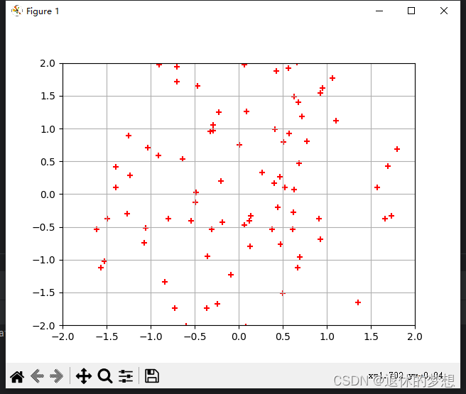
1. 散点图:
坐标轴为数值型数据
import matplotlib.pyplot as plt
import numpy as np
#绘制散点图 x = np.random.randn(100) y = np.random.randn(100)*1.5 plt.scatter(x=x,y=y,color="red",marker="+") #限制x、y轴显示范围 plt.xlim(-2,2) plt.ylim(-2,2) #显示网格 plt.grid() plt.show()
2.热力图:
类别型数据,体现的是2组变量的关联性
import matplotlib.pyplot as plt
import matplotlib as mpl
import numpy as np

mpl.rcParams["font.family"] = "FangSong"  # 设置字体
mpl.rcParams["axes.unicode_minus"] = False  # 正常显示负号

fig,ax=plt.subplots(1,1)
# 绘制热力图
# 定义x轴,y轴内容
# x轴为 等级
x_lable = ["1级", "2级", "3级", "4级", "5级"]
# y轴为 产品
y_lable = ["产品1", "产品2", "产品3", "产品4", "产品5"]
#模拟数据,5行5列数据
data=np.round(np.random.random(25).reshape(5,5),1)
#热点图
plt.imshow(data)

#轮流锁定单元格,设置单元格文字
for i in  np.arange(len(x_lable)):
    for j in np.arange(len(y_lable)):
        plt.text(i,j,data[i][j],color="w",ha="center",va="center")

#设置x,y轴坐标标签
ax.set_title("产品级别图")
#明确设置x,y轴数量
ax.set_xticks(np.arange(len(x_lable)))
ax.set_yticks(np.arange(len(y_lable)))
ax.set_xticklabels(x_lable)
ax.set_yticklabels(y_lable)

fig.tight_layout()


plt.show()

5.组成

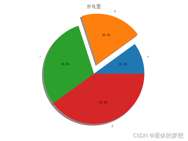
1.饼图
# coding:utf-8

import matplotlib.pyplot as plt
import matplotlib as mpl
import numpy as np
import pandas as pd

# 设置显示中文

mpl.rcParams["font.family"] = "FangSong"  # 设置字体
mpl.rcParams["axes.unicode_minus"] = False  # 正常显示负号

fig, ax = plt.subplots(1, 1)

# 模拟数据
data = [0.1, 0.2, 0.3, 0.4]

#绘制饼图,labels为每一项的名称 explode:突出值 autopct:格式化百分比, textprops字体格式
plt.pie(data,labels=["a","b","c","d"],explode=[0,0.2,0,0],autopct="%.1f%%",shadow=True,textprops={"size":"small"})

# 设置x轴lable为斜线
fig.autofmt_xdate()

# 设置x,y轴坐标标签
ax.set_title("折线图")
fig.tight_layout()

plt.show()
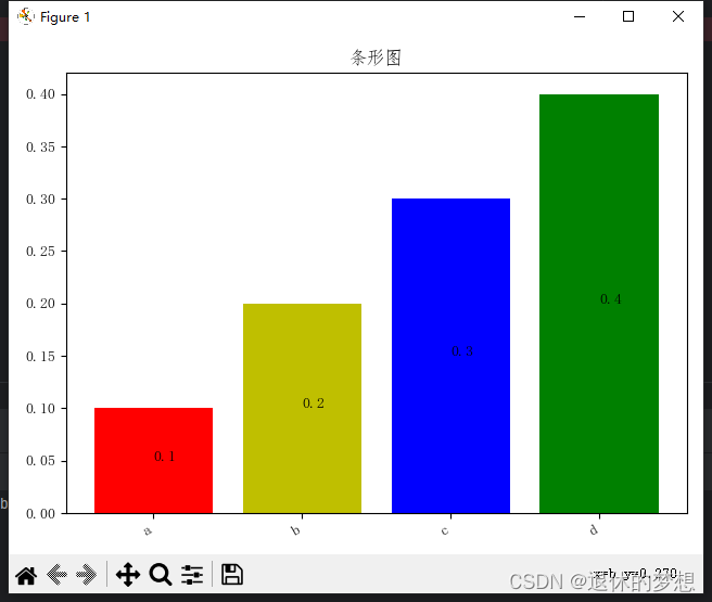
2.条形图
import matplotlib.pyplot as plt
import matplotlib as mpl
import numpy as np
import pandas as pd

# 设置显示中文

mpl.rcParams["font.family"] = "FangSong"  # 设置字体
mpl.rcParams["axes.unicode_minus"] = False  # 正常显示负号

fig, ax = plt.subplots(1, 1)

# 模拟数据
data = [0.1, 0.2, 0.3, 0.4]
labels = ["a", "b", "c", "d"]
# 绘制条形图  color:设置条形颜色
plt.bar(labels, data, color=["r", "y", "b", "g"])

# 显示条形上的文字
for x, y in zip(labels, data):
    plt.text(x, (y / 2), y)
# 设置x轴lable为斜线
fig.autofmt_xdate()

# 设置x,y轴坐标标签
ax.set_title("条形图")
fig.tight_layout()

plt.show()
6.分组
1.簇型散点图
import matplotlib.pyplot as plt
import matplotlib as mpl
import numpy as np
import pandas as pd

# 设置显示中文

mpl.rcParams["font.family"] = "FangSong"  # 设置字体
mpl.rcParams["axes.unicode_minus"] = False  # 正常显示负号

fig, ax = plt.subplots(1, 1)

# 模拟数据
a_x=np.random.random(100)+1
a_y=np.random.random(100)+1.5
a_x1=np.random.random(200)+2.1
a_y1=np.random.random(200)+1.7

#绘制散点图分组
plt.scatter(a_x,a_y)
plt.scatter(a_x1,a_y1)
# 设置x轴lable为斜线
fig.autofmt_xdate()

fig.tight_layout()

plt.show()
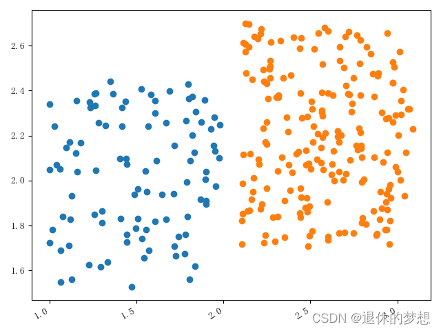
2.分组条形图
import matplotlib.pyplot as plt
import matplotlib as mpl
import numpy as np
import pandas as pd

# 设置显示中文

mpl.rcParams["font.family"] = "FangSong"  # 设置字体
mpl.rcParams["axes.unicode_minus"] = False  # 正常显示负号

fig, ax = plt.subplots(1, 1)

# 模拟数据
x=["a","b","c","d"]
y1=[1,2,3,4]
y2=[4,3,2,1]
#绘制图形
plt.bar(x,y1)
plt.bar(x,y2)

fig.autofmt_xdate()

fig.tight_layout()

plt.show()
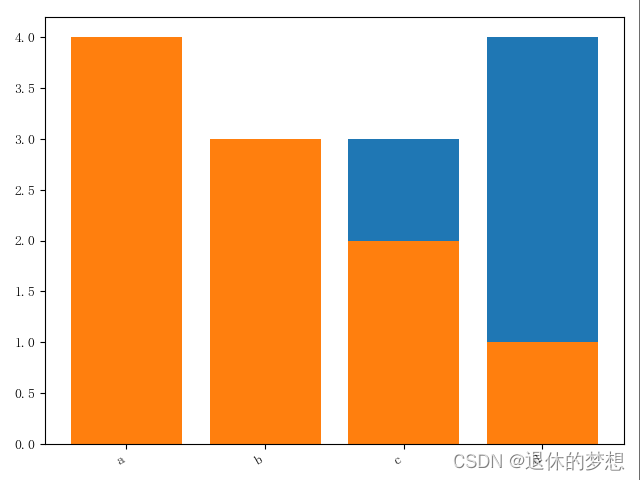
3.分组条形图不覆盖
import matplotlib.pyplot as plt
import matplotlib as mpl
import numpy as np
import pandas as pd

# 设置显示中文

mpl.rcParams["font.family"] = "FangSong"  # 设置字体
mpl.rcParams["axes.unicode_minus"] = False  # 正常显示负号

fig, ax = plt.subplots(1, 1)

# 模拟数据

axis1=[1,2,3,4]
axis2=[1.2,2.2,3.2,4.2]

y1=[1,2,3,4]

y2=[4,3,2,1]
#绘制图形
plt.bar(axis1,y1,width=0.2)
plt.bar(axis2,y2,width=0.2)

fig.autofmt_xdate()

fig.tight_layout()

plt.show()
7.偏差
1.发散条形图
# coding:utf-8

import matplotlib.pyplot as plt
import matplotlib as mpl
import numpy as np
import pandas as pd

# 设置显示中文

mpl.rcParams["font.family"] = "FangSong"  # 设置字体
mpl.rcParams["axes.unicode_minus"] = False  # 正常显示负号

fig, ax = plt.subplots(1, 1)

# 模拟数据
#绘制
y=["a","b","c","d"]
data=[-1,2,0.5,4]
data.sort()
plt.hlines(y=y,xmin=0,xmax=data,colors=["r","b","y","g"])
#设置网格 plt.grid(linestyle="--",alpha=0.5)# 设置x轴lable为斜线 fig.autofmt_xdate() fig.tight_layout() plt.show()

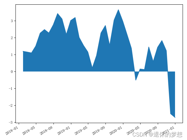
2.面积图
mpl.rcParams["font.family"] = "FangSong"  # 设置字体
mpl.rcParams["axes.unicode_minus"] = False  # 正常显示负号

fig, ax = plt.subplots(1, 1)

# 模拟数据
#绘制
datas = pd.date_range("2018-01-01", "2021-01-01", freq="M")

def get_price(size):
    return np.cumsum(np.random.randn(size))

price ={"price":get_price(datas.size)}

pd=pd.DataFrame(index=datas,data=price)

plt.plot(pd["price"])
#填充面积颜色
plt.fill_between(pd.index,pd["price"],0)

# 设置x轴lable为斜线
fig.autofmt_xdate()

fig.tight_layout()
8.排序