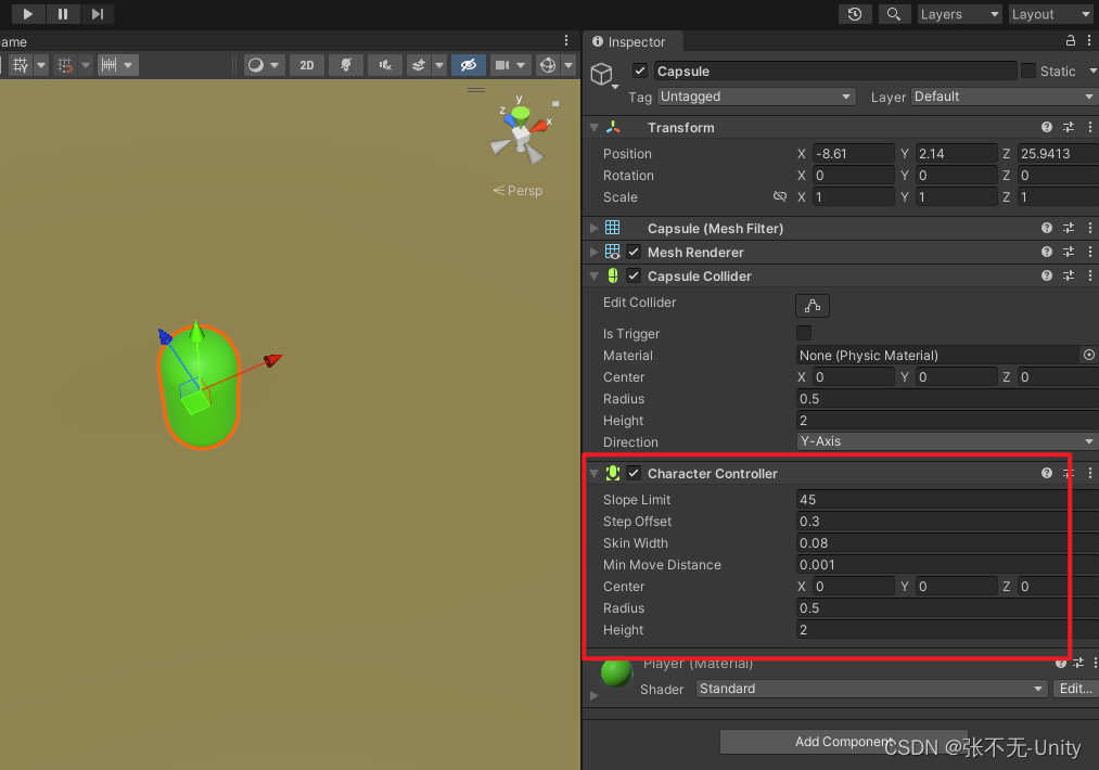
根据指定的选择范围创建文本选择器,展示在弹窗上。
该组件从API Version 8开始支持
TextPickerDialog.show
show(options?: TextPickerDialogOptions)
定义文本滑动选择器弹窗并弹出。
TextPickerDialogOptions参数:
| 参数名 | 参数类型 | 必填 | 参数描述 |
|---|---|---|---|
| range | string[] | Resource | 是 | 设置文本选择器的选择范围。 |
| selected | number | 否 | 设置选中项的索引值。 默认值:0 |
| value | string | 否 | 设置选中项的文本内容。当设置了selected参数时,该参数不生效。如果设置的value值不在range范围内,则默认取range第一个元素。 |
| defaultPickerItemHeight | number | string | 否 | 设置选择器中选项的高度。 |
| onAccept | (value: TextPickerResult) => void | 否 | 点击弹窗中的“确定”按钮时触发该回调。 |
| onCancel | () => void | 否 | 点击弹窗中的“取消”按钮时触发该回调。 |
| onChange | (value: TextPickerResult) => void | 否 | 滑动弹窗中的选择器使当前选中项改变时触发该回调。 |
TextPickerResult对象说明
| 名称 | 类型 | 描述 |
|---|---|---|
| value | string | 选中项的文本内容。 |
| index | number | 选中项在选择范围数组中的索引值。 |
// xxx.ets
@Entry
@Component
struct TextPickerDialogExample {
  private select: number | number[] = 2
  private fruits: string[] = ['apple1', 'orange2', 'peach3', 'grape4', 'banana5']

  build() {
    Row() {
      Column() {
        Button("TextPickerDialog")
          .margin(20)
          .onClick(() => {
            TextPickerDialog.show({
              range: this.fruits,
              selected: this.select,
              onAccept: (value: TextPickerResult) => {
                // 设置select为按下确定按钮时候的选中项index,这样当弹窗再次弹出时显示选中的是上一次确定的选项
                this.select = value.index
                console.info("TextPickerDialog:onAccept()" + JSON.stringify(value))
              },
              onCancel: () => {
                console.info("TextPickerDialog:onCancel()")
              },
              onChange: (value: TextPickerResult) => {
                console.info("TextPickerDialog:onChange()" + JSON.stringify(value))
              }
            })
          })
      }.width('100%')
    }.height('100%')
  }
}