什么是组件
组件允许我们将 UI 划分为独立的、可重用的部分,并且可以对每个部分进行处理。在实际应用中,组件常常被组织成层层嵌套的树状结构。
定义一个组件
我们一般会将 Vue 组件定义在一个单独的 .vue 文件中,这被叫做单文件组件 (简称 SFC):
<script lang="ts" setup>
import { ref } from 'vue'
const count = ref(0)
</script>
<template>
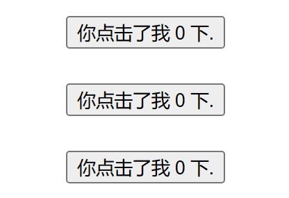
<div class="container">
<button @click="count++">你点击了我 {{ count }} 下.</button>
</div>
</template>
<style lang="scss" scoped>
.container {
}
</style>
效果:

使用组件
要使用一个子组件,我们需要在父组件中导入它。
组件可以被重用任意多次
<script lang="ts" setup>
import { ref } from 'vue'
import ButtonCount from '@/components/ButtonCount.vue'
</script>

<template>
  <div class="container">
    <ButtonCount />
    <br />
    <ButtonCount></ButtonCount>
    <br />
    <button-count></button-count>
  </div>
</template>

<style lang="scss" scoped>
.container {
}
</style>
效果:
-
每当你使用一个组件,就创建了一个新的实例
-
在单文件组件中,推荐为子组件使用 PascalCase 的标签名,以此来和原生的 HTML 元素作区分。
<ButtonCount /> 或者
<ButtonCount></ButtonCount>
-
如果你是直接在 DOM 中书写模板 (例如原生 <template> 元素的内容),模板的编译需要遵从浏览器中 HTML 的解析行为。
<!-- 如果是在 DOM 中书写该模板 -->
<button-count></button-count>
父组件向子组件传值 props
定义一个帖子的组件 通过 title 向子组件传标题的值
<script lang="ts" setup>
import { ref } from 'vue'
import Post from '@/components/Post.vue'

const posts = ref([
  { id: 1, title: '文章1标题' },
  { id: 2, title: '文章2标题' },
  { id: 3, title: '文章3标题' }
])
</script>

<template>
  <div class="container">
    <Post v-for="post in posts" :key="post.id" :title="post.title"></Post>
  </div>
</template>

<style lang="scss" scoped>
.container {
}
</style>
效果:

监听事件子组件事件 emits
通过点击标题后面的按钮放大标题
<script lang="ts" setup>
import { ref } from 'vue'
import Post from '@/components/Post.vue'

const posts = ref([
  { id: 1, title: '文章1标题', font: 1 },
  { id: 2, title: '文章2标题', font: 1 },
  { id: 3, title: '文章3标题', font: 1 }
])
</script>

<template>
  <div class="container">
    <Post
      :style="{ fontSize: post.font + 'em' }"
      v-for="post in posts"
      :key="post.id"
      :title="post.title"
      @changeFont="post.font += 0.1"
    ></Post>
  </div>
</template>

<style lang="scss" scoped>
.container {
}
</style>
效果

通过插槽来分配内容
可以向组件中传递内容
子组件
<script lang="ts" setup>
import { ref } from 'vue'
</script>

<template>
  <div class="container">
    <div class="alert-box">
      <strong>Error!</strong>
      <br />
      <slot />
    </div>
  </div>
</template>

<style lang="scss" scoped>
.container {
  .alert-box {
    color: #666;
    border: 1px solid red;
    border-radius: 4px;
    padding: 20px;
    background-color: #f8f8f8;
  }

  strong {
    color: red;
  }
}
</style>
父组件
<script lang="ts" setup>
import { ref } from 'vue'
import DangerBox from '@/components/DangerBox.vue'
</script>

<template>
  <div class="container">
    <DangerBox> 可以传入自定义的内容 替换 slot </DangerBox>
  </div>
</template>

<style lang="scss" scoped>
.container {
}
</style>
效果:

如上所示,我们使用 <slot> 作为一个占位符,父组件传递进来的内容就会渲染在这里。
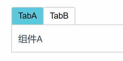
动态组件
有些场景会需要在两个组件间来回切换,比如 Tab 界面
通过 :is 属性实现组件切换 :is 的值可以是以下几种
-
被注册的组件名
-
导入的组件对象
当使用 <component :is="..."> 来在多个组件间作切换时,被切换掉的组件会被卸载。 我们可以通过 <KeepAlive> 组件强制被切换掉的组件仍然保持“存活”的状态。
  <script lang="ts" setup>
import { ref } from 'vue'
import TabA from '@/components/TabA.vue'
import TabB from '@/components/TabB.vue'

const currentTab = ref('TabA')
const tabs = ref({ TabA, TabB })
</script>

<template>
  <div class="container">
    <button
      v-for="(_, tab) in tabs"
      :key="tab"
      :class="['tab-button', { active: currentTab === tab }]"
      @click="currentTab = tab"
    >
      {{ tab }}
    </button>
    <component :is="tabs[currentTab]" class="tab"></component>
  </div>
</template>

<style lang="scss" scoped>
.container {
  .demo {
    font-family: sans-serif;
    border: 1px solid #eee;
    border-radius: 2px;
    padding: 20px 30px;
    margin-top: 1em;
    margin-bottom: 40px;
    user-select: none;
    overflow-x: auto;
  }

  .tab-button {
    padding: 6px 10px;
    border-top-left-radius: 3px;
    border-top-right-radius: 3px;
    border: 1px solid #ccc;
    cursor: pointer;
    background: #f0f0f0;
    margin-bottom: -1px;
    margin-right: -1px;
  }
  .tab-button:hover {
    background: #757070;
  }
  .tab-button.active {
    background: #ea7a7a;
  }
  .tab {
    border: 1px solid #ccc;
    padding: 10px;
  }
}
</style>
效果:
至此 vue基础告一段落,恭喜能坚持看到现在的小伙伴,你们都很棒哟!可以多看几遍打牢基础。