黑马程序员JS学习时的一个案例,CSS有点不懂,单拎出来分析。
具体出处是某站视频中的数组篇讲解,(点击链接跳转)
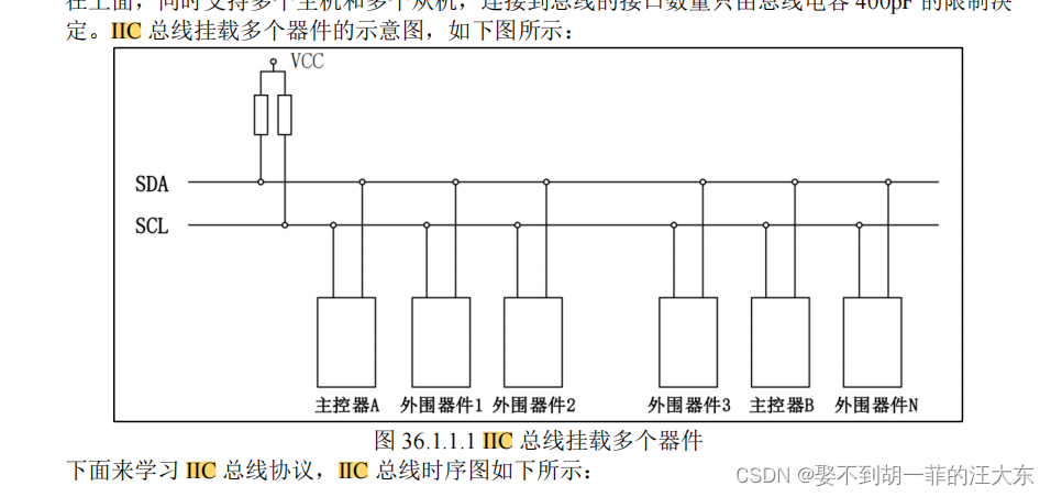
CSS案例
- 效果&代码
- 1. 先分析最大的box
- flex布局
- justify-content
- align-items
- 以 flex-end 为例
- 2. box中的dix分析
- 步骤1
- flex-direction
- 步骤2
- 步骤3
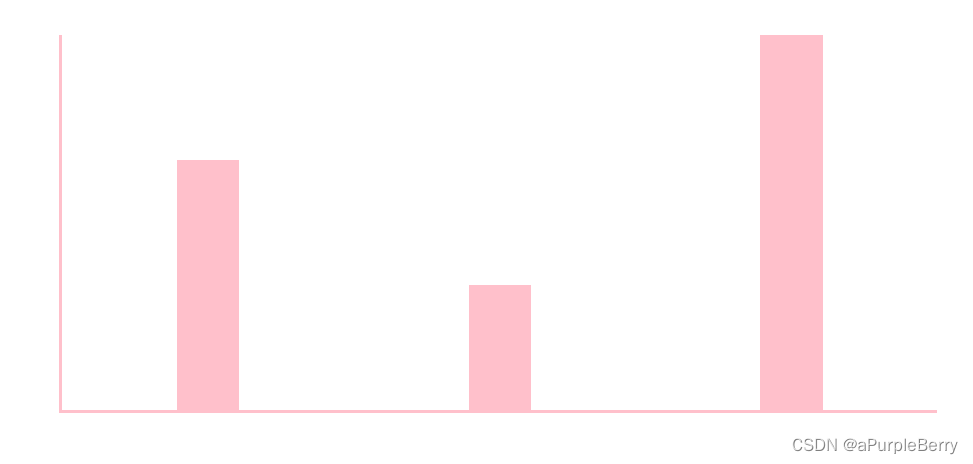
效果&代码

<!DOCTYPE html>
<html lang="en">

<head>
    <meta charset="UTF-8">
    <meta http-equiv="X-UA-Compatible" content="IE=edge">
    <meta name="viewport" content="width=device-width, initial-scale=1.0">
    <title>Document</title>
    <style>
        * {
            margin: 0;
            padding: 0;
        }

        .box {
            display: flex; /*flex*/
            width: 700px;
            height: 300px;
            border-left: 1px solid pink;
            border-bottom: 1px solid pink;
            margin: 50px auto; /*上下50px 左右auto居中*/
            justify-content: space-around;
            align-items: flex-end;
            text-align: center;
        }

        .box>div {
            display: flex;
            width: 50px;
            background-color: pink;
            flex-direction: column;
            justify-content: space-between;
        }

        .box div span {

            margin-top: -20px;
        }

        .box div h4 {
            margin-bottom: -35px;
            width: 70px;
            margin-left: -10px;
        }
    </style>
</head>

<body>
    <div class="box">
        <div style="height: 123px;">
            <span>123</span>
            <h4>第1季度</h4>
        </div>
        <div style="height: 156px;">
            <span>156</span>
            <h4>第2季度</h4>
        </div>
        <div style="height: 120px;">
            <span>120</span>
            <h4>第3季度</h4>
        </div>
        <div style="height: 210px;">
            <span>210</span>
            <h4>第4季度</h4>
        </div>

    </div>
    <script>

    </script>
</body>

</html>
1. 先分析最大的box
flex布局
这些都是flex布局中的 display: flex; 为了能够更好区别,先设置主轴(x轴)justify-content,再设置侧轴(y轴)align-items
justify-content
| 属性值 | 说明 |
|---|---|
| flex-start | 默认值,项目向水平方向的起点对其 |
| flex-end | 水平方向的终点对齐 |
| center | 项目在水平方向上居中 |
| space-between | 最左最右靠边,中间间距相等 |
| space-evenly | 水平方向的终点对齐 |
| space-around | 每个项目的左右撑开距离相等 |
跳转链接查看
align-items
该属性用于控制子元素在侧轴(默认为y轴)上的排列方式,在子元素为单项时使用
| 属性值 | 说明 |
|---|---|
| flex-start | 从上到下;默认值 |
| flex-end | 从下到上 |
| center | 垂直居中 |
| stretch | 注意:子元素不设置高度,否则没有效果 |
以 flex-end 为例
<!DOCTYPE html>
<html lang="en">

<head>
    <meta charset="UTF-8">
    <meta http-equiv="X-UA-Compatible" content="IE=edge">
    <meta name="viewport" content="width=device-width, initial-scale=1.0">
    <title>Document</title>
    <body>
	    <div class="box">
	        <div style="height: 200px;">
	        </div>
	        <div style="height: 100px;">
	        </div>
	        <div style="height: 300px;">
	        </div>
	    </div>
	</body>
    <style>
        * {
            margin: 0;
            padding: 0;
        }

        .box {
            width: 700px;
            height: 300px;
            border-left: 3px solid pink;
            border-bottom: 3px solid pink;
            margin: 50px auto;


            display: flex;
            justify-content: space-around;
            align-items: flex-end;
        }

        .box>div {
            width: 50px;
            background-color: pink;
        }
    </style>
</head>
</html>
2. box中的dix分析
一个div中有2个元素
<div style="height: 120px;">
    <span>120</span>
    <h4>第3季度</h4>
</div>
这里以一个柱状图为例。
步骤1

<!DOCTYPE html>
<html lang="en">

<head>
    <meta charset="UTF-8">
    <meta http-equiv="X-UA-Compatible" content="IE=edge">
    <meta name="viewport" content="width=device-width, initial-scale=1.0">
    <title>Document</title>
    <body>
      <div class="box">
        <span>xxxx</span>
      	<h4>第x季度</h4>
      </div>
    </body>

    <style>
        * {
            margin: 0;
            padding: 0;
        }

        .box {
            width: 300px;
            height: 700px;
            background-color: pink;
	        margin: 50px auto;
        }
    </style>
</head>
</html>
flex-direction
flex-direction: 决定主轴的方向(即项目的排列方向)
flex-direction :column 主轴为垂直方向,起点在上沿
这篇文章写的好,点击跳转链接
此时我们的div中有两个元素,span和h4,想让他一个在上,一个在下,就先设置主轴方向为垂直方向。然后 justify-content: space-between;最左最右靠边,中间间距相等
步骤2

<!DOCTYPE html>
<html lang="en">

<head>
    <meta charset="UTF-8">
    <meta http-equiv="X-UA-Compatible" content="IE=edge">
    <meta name="viewport" content="width=device-width, initial-scale=1.0">
    <title>Document</title>
    <body>
      <div class="box">
        <span>xxxx</span>
      	<h4>第x季度</h4>
      </div>
    </body>

    <style>
        * {
            margin: 0;
            padding: 0;
        }

        .box {
            width: 300px;
            height: 700px;
            background-color: pink;
	        margin: 50px auto;

	  		display: flex;
            flex-direction: column;
	        justify-content: space-between;
        }


    </style>
</head>
</html>
步骤3
添加了text-align: center;等
这里设置了黄色是为了更好看清楚。

<!DOCTYPE html>
<html lang="en">

<head>
    <meta charset="UTF-8">
    <meta http-equiv="X-UA-Compatible" content="IE=edge">
    <meta name="viewport" content="width=device-width, initial-scale=1.0">
    <title>Document</title>
    <body>
      <div class="box">
        <span>xxxx</span>
      	<h4>第x季度</h4>
      </div>
    </body>

    <style>
        * {
            margin: 0;
            padding: 0;
        }

        .box {
            width: 300px;
            height: 700px;
            background-color: pink;
	        margin: 50px auto;


	        display: flex;
            flex-direction: column;
	        justify-content: space-between;

            text-align: center;
        }


        .box span {
            margin-top: -20px;
	        background-color: yellow;
        }

        .box h4 {
            margin-bottom: -35px;
            width: 300px;
            background-color: yellow;
        }

    </style>
</head>


</html>