vue3 ant design vue项目实战——单选框(Radio)的使用以及Form表单的双向绑定
- 知识调用(form表单的源代码附在文章最后)
- 场景复现
- 实现需求
- form表单整体架构的搭建
- input输入框文本域的嵌套
- 单选组合Radio的嵌套
- button按钮组合的嵌套
- form表单源代码
本文依旧沿用ant design vue组件库和ts语言🔥🔥更多内容见Ant Design Vue官方文档
知识调用(form表单的源代码附在文章最后)
| 🔥🔥 vue3+ant design vue+ts实战【ant-design-vue组件库引入】 |
|---|
| 🔥 Ant Design Vue组件库——在vue项目中使用单选框 Radio |
场景复现
一个功能齐全的后台管理系统,一定离不开Form表单的使用,form表单有很多学问,从本期文章开始会详细介绍如何在项目中使用form表单、完成数据的双向绑定、各种组件的嵌套,最后形成封装好了的form表单,可以实现复用。
具体UI需求如下:(本期文章详细介绍)
- 1.表单需要有输入框,限制输入字数,样式为文本域
- 2.表单需要有单选组合,样式为垂直平铺
- 3.表单需要有按钮组合,包括取消按钮和确认按钮
功能需求:(下期文章详细介绍)
- 1.表单的值需要动态绑定
- 2.点击确认按钮,控制台能够正确打印表单提交的值
- 3.点击取消按钮,表单内容能够重置
- 4.点击确认按钮时,检查表单输入是否有为空的部分,给出相应提示
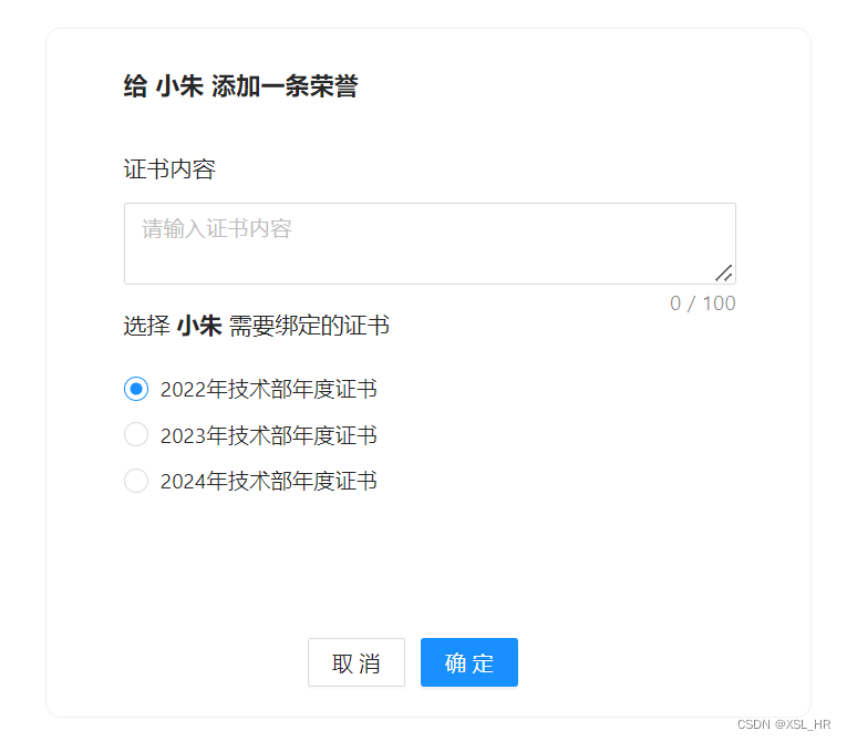
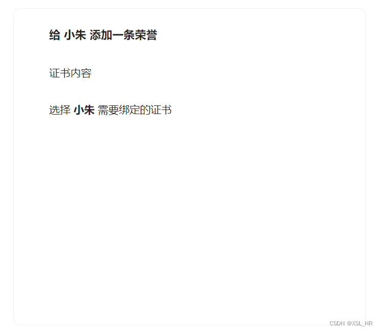
UI界面最终实现效果:
实现需求
一定别忘了,任何时候使用组件,都需要在main.ts文件中注册,才能在页面中使用。
组件的注册在《知识调用》文章中都能找到,这里就不多介绍了。
form表单整体架构的搭建
form表单整体架构可以分为三个部分,也就是三个form-item,分别用于嵌套input输入框文本域、radiogroup垂直单选框组合、button按钮组合
html部分:
<a-form
   class="form"
   name="basic"
   :model="contentFormState"
   autocomplete="off"
   >
   <p style="font-size:16px;margin-top:24px;">
     <b>给 小朱 添加一条荣誉</b>
     <!-- input输入框文本域-->
   </p>
   <a-form-item name="promotionContent">
      <p>证书内容</p>
   </a-form-item>
   <a-form-item>
      <p style="margin-top:-10px">选择 <b>小朱</b> 需要绑定的证书</p>
      <!-- radiogroup单选框组合-->
   </a-form-item>
   <a-form-item class="button-box">
      <!-- 按钮组合-->
   </a-form-item>
</a-form>
css部分:(可以根据需求进行调整)
.form {
    margin:0 auto;
    width: 500px;
    height: 450px;
    margin-top: 15px;
    background-color: #FFFFFF;
    border: 1px solid rgba(172, 171, 171, 0.16);
    border-radius: 10px;
    position: relative;
    p {
        margin-left: 50px;
        margin-top: 20px;
        font-size: 15px;
        margin-bottom: 10px;
        font-family: "微软雅黑";
    }
    .button-box {
        position: absolute;
        bottom: -5px;
        left: 170px;
    }
}
实现效果如下:
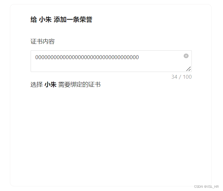
input输入框文本域的嵌套
我们需要在第一个form-item中添加input输入框文本域,这里推荐使用textarea
<a-textarea
style="width:400px;margin-left:50px"
placeholder="请输入证书内容"
show-count
allow-clear
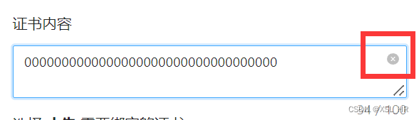
:maxlength="100"
/>
标签中属性的解释:
- 1.
placeholder——文本域中的初始提示字句
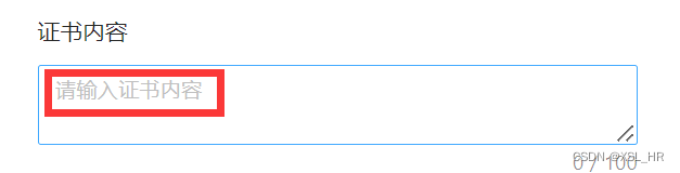
- 2.
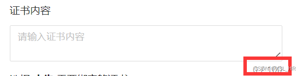
show-count——显示输入字数
- 3.
:maxLength——绑定最大长度 - 4.
allow-clear——清除按钮、点击即可清除所有输入内容
css样式添加:(在form样式中添加input输入框的样式)
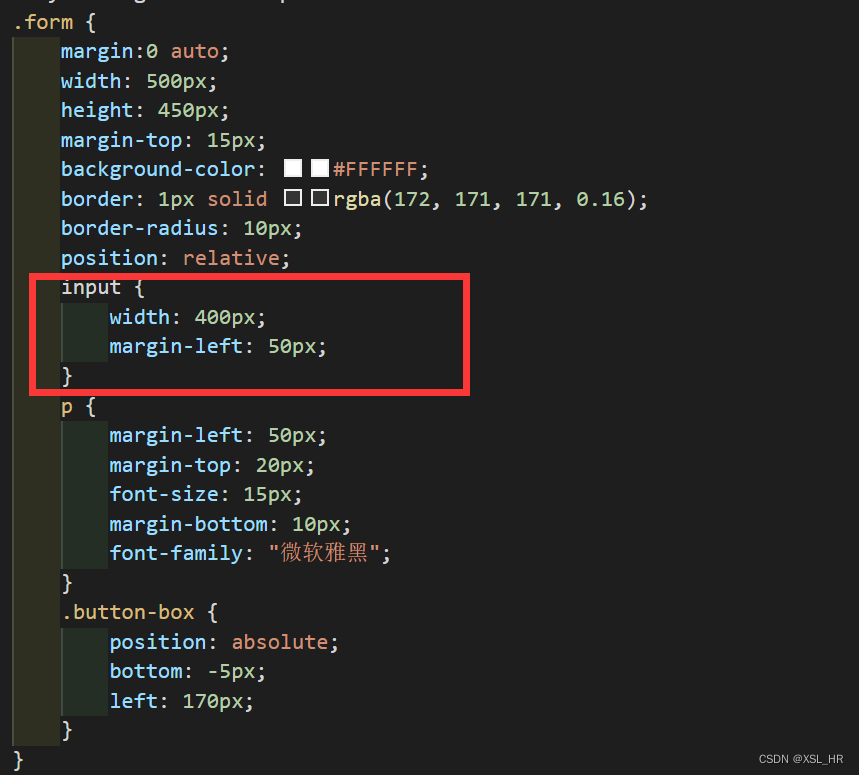
代码如下:
    input {
        width: 400px;
        margin-left: 50px;
    }
实现效果:
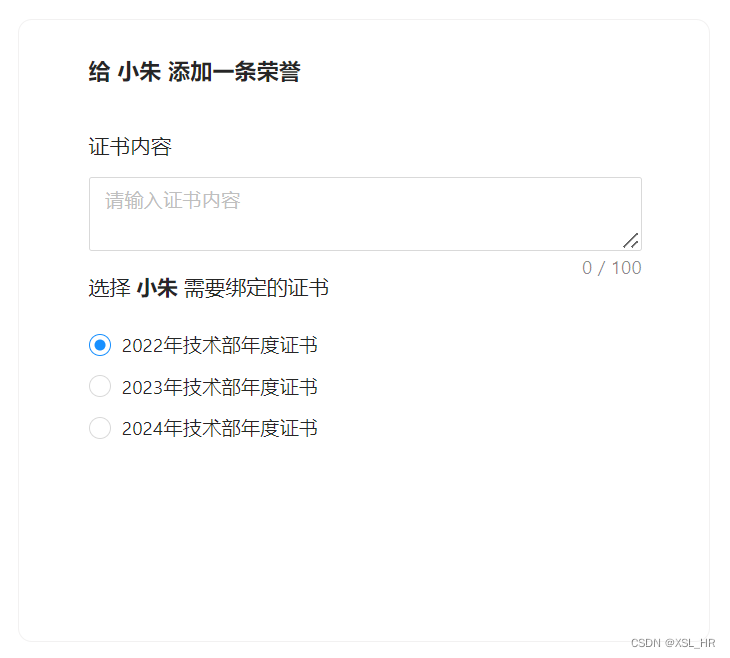
单选组合Radio的嵌套
html部分:(在第二个form-item中添加以下内容,嵌套单选组合)
<a-radio-group
      name="certificatesRadioGroup"
      style="margin-top:5px"
      >
     <a-radio
           :style="radioStyle"
           v-for="item of certificatesOptionsValue"
           v-model:value="item.options"
           :key="item.id"
           >{{ item.options }}
      </a-radio>
</a-radio-group>
标签中属性的解释:
1.:style——绑定自定义的选项样式
// 样式数据类型
interface radioStyleType {
    display:string,
    lineHeight:string,
    marginLeft:string,
    height:string,
}
// 单选框样式
const radioStyle = reactive<radioStyleType>({
    display: 'flex',
    height: '30px',
    lineHeight: '30px',
    marginLeft:'50px',
});
2.v-for——选项采用循环的方式输出
// 选择项数据类型
interface optionsType {
    id:number,
    options:string
}
// 证书选择框选择项
const certificatesOptionsValue = ref<optionsType[]>([
    {"id":1,"options":"2022年技术部年度证书"},
    {"id":2,"options":"2023年技术部年度证书"},
    {"id":3,"options":"2024年技术部年度证书"},
])
现在我们来看一下实现效果:
button按钮组合的嵌套
html部分:(在第三个form-item中添加以下代码,样式之前已经写好,这里只需要设置两个按钮之前的间隔即可)
<a-button>取消</a-button>
<a-button
   type="primary"
   style="margin-left:10px"
   >确定
</a-button>
此时我们来看看最终的实现效果:
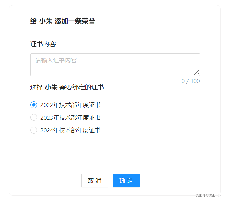
和给出的UI需求已经一模一样,到目前为止,页面的渲染工作已经完成。
form表单源代码
html部分:
<a-form
   class="form"
   name="basic"
   :model="contentFormState"
   autocomplete="off"
   >
   <p style="font-size:16px;margin-top:24px;">
     <b>给 小朱 添加一条荣誉</b>
   </p>
   <a-form-item
      name="promotionContent"
      >
      <p>证书内容</p>
      <a-textarea
         v-model:value="contentFormState.certificates_content"
         style="width:400px;margin-left:50px"
         placeholder="请输入证书内容"
         show-count
         allow-clear
         :maxlength="100"
         />
    </a-form-item>
    <a-form-item>
       <p style="margin-top:-10px">选择 <b>小朱</b> 需要绑定的证书</p>
       <a-radio-group
          v-model:value="contentFormState.certificates_select"
          name="certificatesRadioGroup"
          style="margin-top:5px"
          >
          <a-radio
             :style="radioStyle"
             v-for="item of certificatesOptionsValue"
             v-model:value="item.options"
             :key="item.id"
             >{{ item.options }}
          </a-radio>
       </a-radio-group>
    </a-form-item>
    <a-form-item class="button-box">
       <a-button @click="cancelContent()">取消</a-button>
       <a-button
          type="primary"
          style="margin-left:10px"
          @click="confirmContent()"
          :disabled="contentFormState.confirm == 0 ? true : false"
          >确定
       </a-button>
    </a-form-item>
</a-form>
css部分:
.form {
    margin:0 auto;
    width: 500px;
    height: 450px;
    margin-top: 15px;
    background-color: #FFFFFF;
    border: 1px solid rgba(172, 171, 171, 0.16);
    border-radius: 10px;
    position: relative;
    input {
        width: 400px;
        margin-left: 50px;
    }
    p {
        margin-left: 50px;
        margin-top: 20px;
        font-size: 15px;
        margin-bottom: 10px;
        font-family: "微软雅黑";
    }
    .button-box {
        position: absolute;
        bottom: -5px;
        left: 170px;
    }
}
ts部分:
import { ref, reactive } from "vue"
import { Router, useRouter } from "vue-router";

const router : Router = useRouter();
// 样式数据类型
interface radioStyleType {
    display:string,
    lineHeight:string,
    marginLeft:string,
    height:string,
}
// 单选框样式
const radioStyle = reactive<radioStyleType>({
    display: 'flex',
    height: '30px',
    lineHeight: '30px',
    marginLeft:'50px',
});

// 选择项数据类型
interface optionsType {
    id:number,
    options:string
}
// 证书选择框选择项
const certificatesOptionsValue = ref<optionsType[]>([
    {"id":1,"options":"2022年技术部年度证书"},
    {"id":2,"options":"2023年技术部年度证书"},
    {"id":3,"options":"2024年技术部年度证书"},
])
当然,现在实现的只是UI界面,真正核心的是数据的动态绑定,让表单每个部分的值能够存储在变量当中,从而进一步实现后续的提交与重置功能。