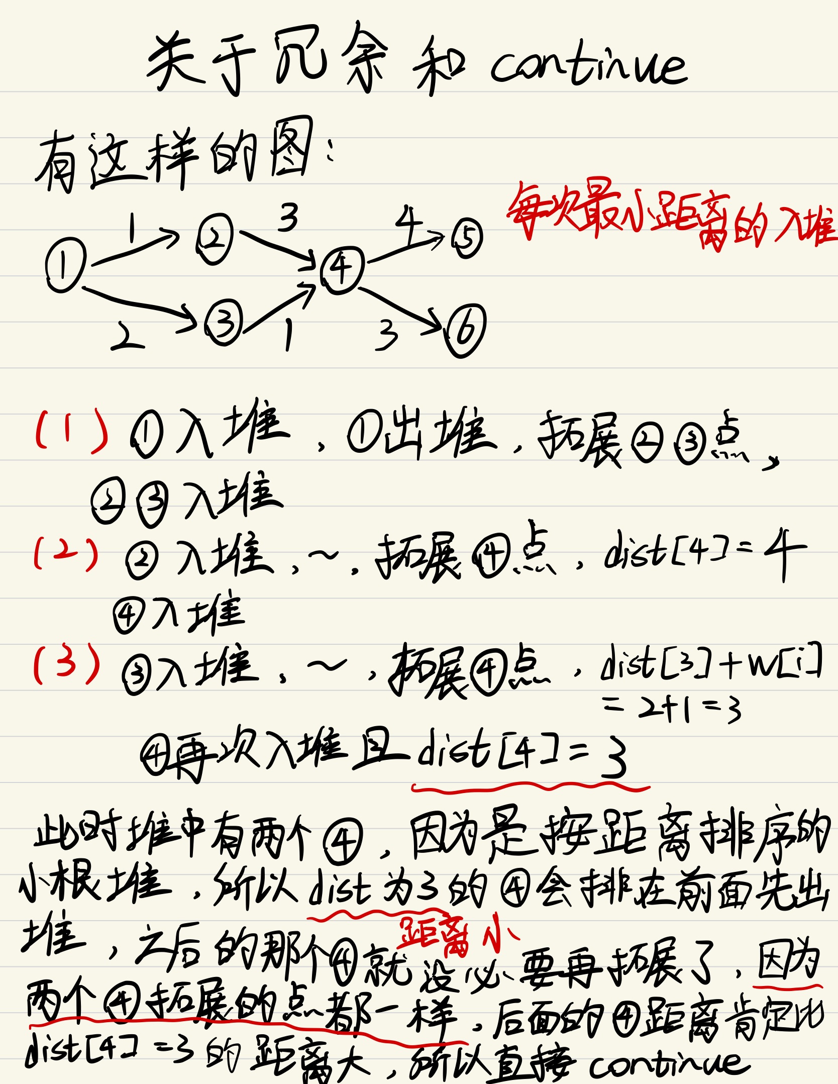
上图
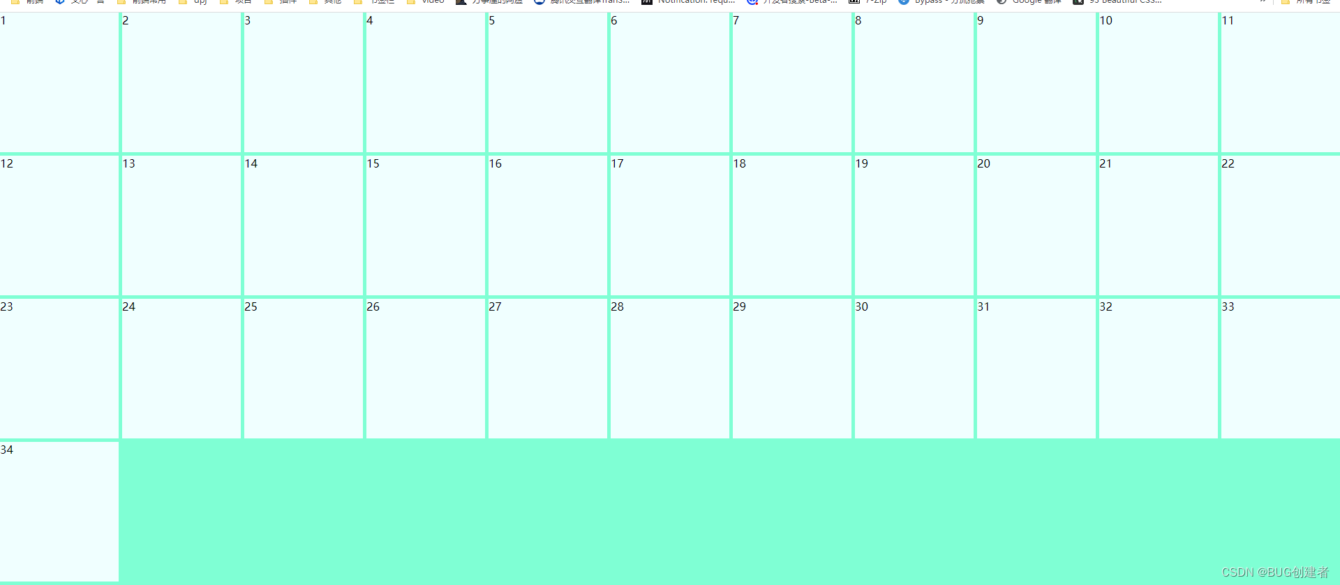
缩小后
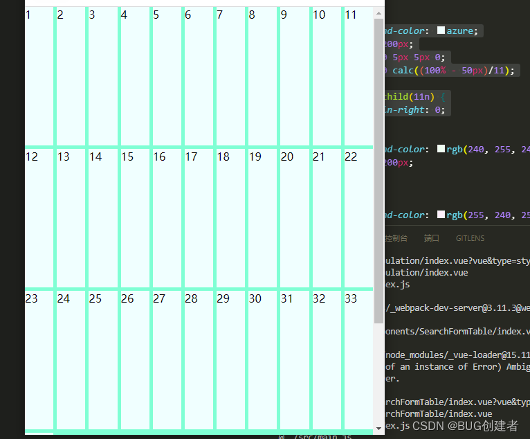
主要用了 flex-basis flex-grow flex-shrink flex的三个属性 有兴趣的可以看看
深入理解CSS之flex精要之 flex-basis flex-grow flex-shrink 实战讲解
 .bg{
      background-color: aquamarine;
      width: 100%;
      height: 100%;
      display: flex;
      flex-wrap: wrap;
    }
    .box1{
      background-color: azure;
      height: 200px;
      /* 11   就是n   注意margin 右 5px   所以就是(n-1)*5   这里n=11  所以计算出来就是50     */
      margin: 0 5px 5px 0;
      flex: 0 0 calc((100% - 50px)/11);
    }
    .box1:nth-child(11n) {
          margin-right: 0;
      }


![[Linux] yum安装分布式LNMP架构](https://img-blog.csdnimg.cn/direct/d7a9033b44054a30b2c7135e97ab1147.png)