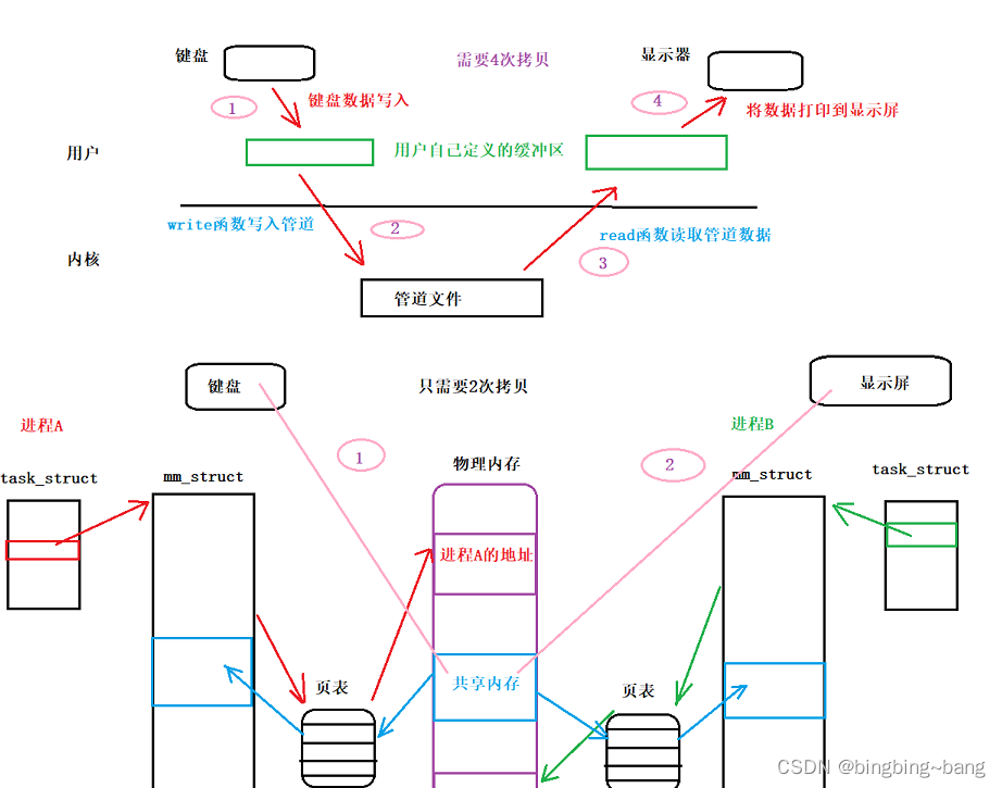
文章目录
- CSS 颜色
- 关键字 & 十六进制 & RGB
- opacity 透明度
- RGBA 颜色
- CSS3 渐变
- 线性渐变
- 径向渐变
CSS 颜色
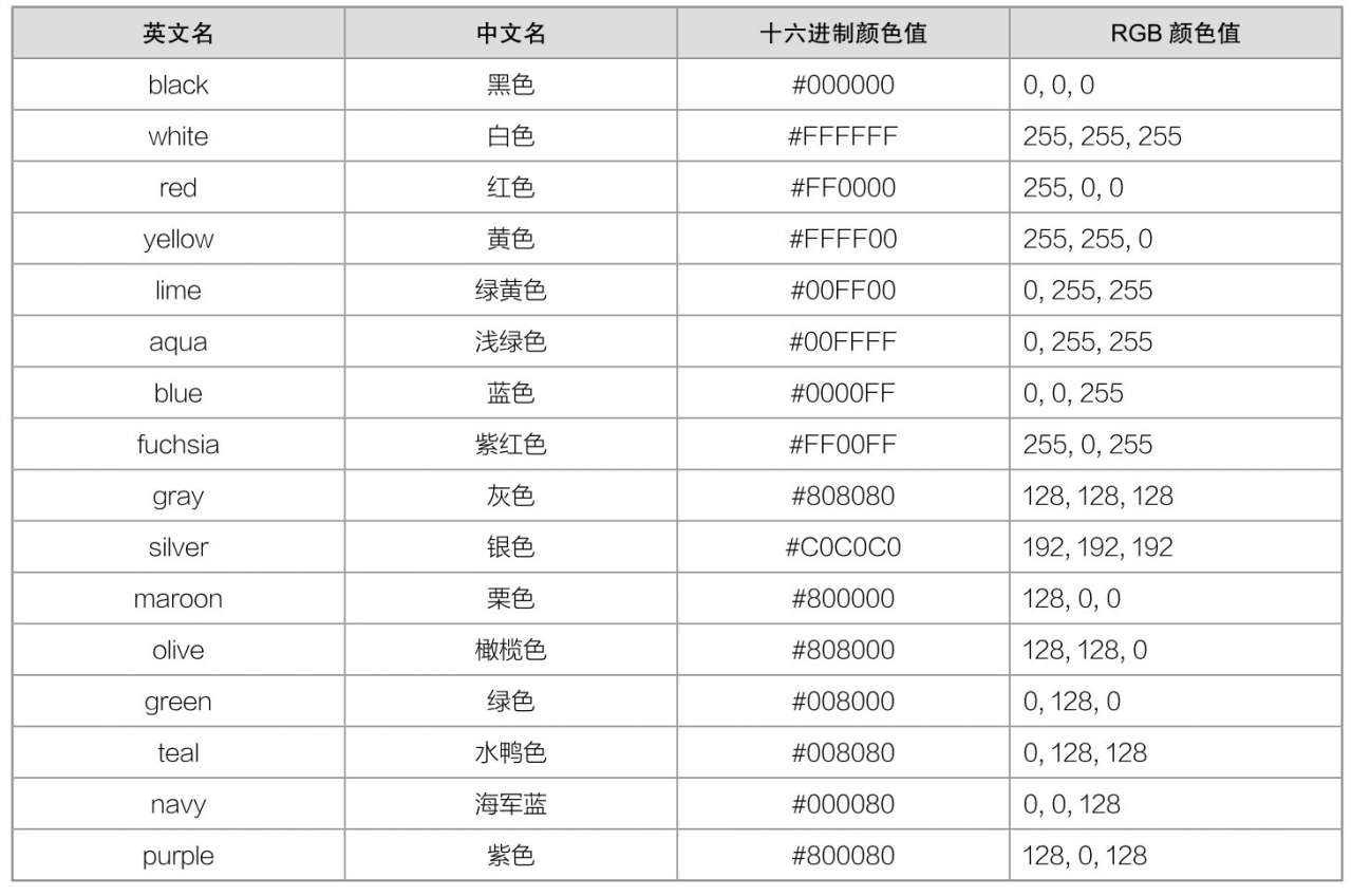
关键字 & 十六进制 & RGB
W3C十六色
opacity 透明度
语法
opacity: 数值;
说明
在CSS3中,我们可以使用opacity属性来定义元素的透明度。
opacity属性取值是一个数值,取值范围为0.0~1.0。其中0.0表示完全透明,1.0表示完全不透明。
opacity属性不仅作用于元素的背景颜色,还会作用于内部所有子元素以及文本内容。
使用
<!DOCTYPE html>
<html>
	<head>
		<meta charset="utf-8" />
		<title></title>
		<style type="text/css">
			a {
				display: inline-block;
				padding: 5px 10px;
				font-family: 微软雅黑;
				color: white;
				background-color: hotpink;
				cursor: pointer;
			}

			a:hover {
				opacity: 0.6;
			}
		</style>
	</head>
	<body>
		<a>hello world</a>
	</body>
</html>
RGBA 颜色
语法
rgba(R,G,B,A)
说明
RGBA就是在RGB基础上增加了一个透明度通道Alpha。
R,指的是红色值(Red);G,指的是绿色值(Green);B,指的是蓝色值(Blue);A,指的是透明度(Alpha)。
R、G、B这三个参数可以为整数,取值范围为0255,也可以为百分比,取值范围为0%100%。参数A为透明度,跟opacity属性是一样的,取值范围为0.0~1.0。
写法
rgba(255, 255, 0, 0.5)
rgba(50%, 80%, 50%, 0.5)
使用
<!DOCTYPE html>
<html>
<head>
<meta charset="utf-8" />
<title></title>
<style type="text/css">
* {
padding: 0;
margin: 0;
}
ul {
display: inline-block;
list-style-type: none;
width: 200px;
}
li {
height: 30px;
line-height: 30px;
font-size: 20px;
font-weight: bold;
text-align: center;
}
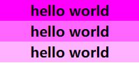
/*第1个li,透明度为1.0*/
li:first-child {
background-color: rgba(255, 0, 255, 1.0);
}
/*第2个li,透明度为0.6*/
li:nth-child(2) {
background-color: rgba(255, 0, 255, 0.6);
}
/*第3个li,透明度为0.3*/
li:last-child {
background-color: rgba(255, 0, 255, 0.3);
}
</style>
</head>
<body>
<ul>
<li>hello world</li>
<li>hello world</li>
<li>hello world</li>
</ul>
</body>
</html>
CSS3 渐变
线性渐变
语法
background: linear-gradient(方向, 开始颜色, 结束颜色)
方向取值
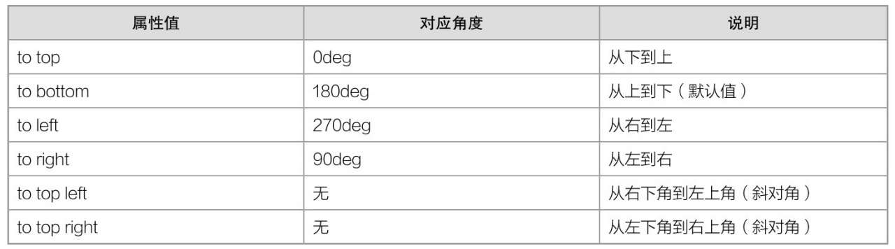
说明
线性渐变使用的是background属性,而不是background-color属性。如果使用background-color属性,则无效。
使用
<!DOCTYPE html>
<html>
	<head>
		<meta charset="utf-8" />
		<title></title>
		<style type="text/css">
			div {
				width: 100px;
				height: 36px;
				line-height: 36px;
				text-align: center;
				border: 1px solid #DADADA;
				border-radius: 5px;
				font-family: "微软雅黑";
				cursor: pointer;
			}

			#box1 {
				background: linear-gradient(to bottom, #F8F8F8, #DCDCDC);
			}

			#box2 {
				background: linear-gradient(to bottom, #FFC559, #FFAF19);
			}
		</style>
	</head>
	<body>
		<div id="box1">渐变按钮1</div><br>
		<div id="box2">渐变按钮2</div>
	</body>
</html>

径向渐变
语法
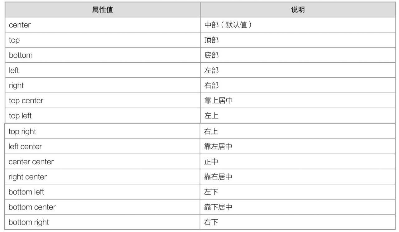
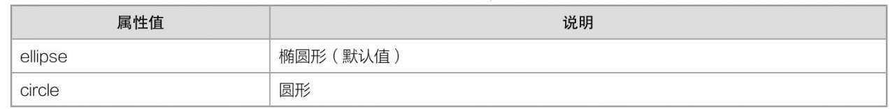
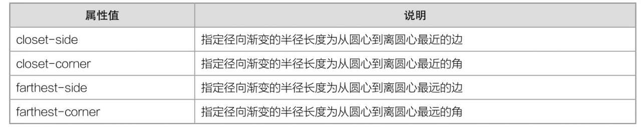
background: radial-gradient(position, shape size, 开始颜色, 结束颜色)
说明
position和shape size都是可选参数。如果省略,则表示采用默认值。start-color和stop-color都是必选参数,可以有多个颜色值。
Chrome和Firefox只能识别以-webkit-作为前缀的径向渐变属性。
position取值
shape取值
size取值
使用
<!DOCTYPE html>
<html>
	<head>
		<meta charset="utf-8" />
		<title></title>
		<style type="text/css">
			div {
				width: 160px;
				height: 160px;
				color: white;
				background: -webkit-radial-gradient(yellow, orangered);
			}
		</style>
	</head>
	<body>
		<div></div>
	</body>
</html>