目录
css三角
鼠标样式
例子:页码模块
溢出文字表示方式
margin负值运用
css三角强化
css三角
css三角中:line-height:0和font-size:0是防止兼容性的问题
jd {
    position: relative;
    width: 120px;
    height: 249px;
    background-color:pink;
}

.jd span {
    position:absolute;
    right:15px;
    top:-10px;
    width:0;
    height:0;
    line-height:0;
    font-size:0;
}
鼠标样式
1 更改用户鼠标样式:
<ul>
<li style="cursor:default;"></li>
<li style="cursor:pointer;"></li>
<li style="cursor:move;"></li>
<li style="cursor:text;"></li>
</ul>
2 去除输入框表格蓝色边框outline
input,textarea {
    outline: none;
}
<input type="text">
3 让textarea无法修改大小
textarea {
    resize:none;
}
<textarea name="" id=""></textarea>
4 vertical-align 设置图片或者表单和文字垂直对齐
vertical-align:baseline默认父元素基线对齐;
top,middle,bottom
5 vertical-align: bottom
vertical-align只针对行内或者行内块元素有效
文本域属于行内块元素
textarea {
    vertical-align: middle;
    默认是基线对齐

}
这样能使得当左边是图片右边是文字时候,文字在左边图片中间的位置
bug:图片底侧会有空白缝隙,由于行内块元素和文字基线对齐
解决: 1 给图片添加vertical-align:middle,top,bottom
2 display: block
例子:页码模块
<!DOCTYPE html>
<html lang="en">
<head>
<meta charset="UTF-8">
<meta name="viewport" content="width=device-width, initial-scale=1.0">
<title>Document</title>
<style>
.box a {
/* 必然有大小但是只有行内块才有大小 */
display: inline-block;
width: 36px;
height: 36px;
background: color #f7f7f7;
/* 里面文字水平居中垂直居中去掉下划线 */
border: 1px solid #ccc;
text-decoration: none;
line-height: 36px;
text-align: center;
color: black;
font-size: 14px;
}
.box .prev,
.box .next {
width: 85px;
}
.box .current {
border: none;
background-color: #fff;
}
.box input {
height: 36px;
width: 45px;
border: 1px solid #ccc;
outline: none;
}
.box button {
height: 40px;
width: 45px;
border: 1px solid #ccc;
}
</style>
</head>
<body>
<div class="box">
<a href="#" class="prev"><<上一页</a>
<a href="#" class="current">2</a>
<a href="#">3</a>
<a href="#">4</a>
<a href="#">5</a>
<a href="#">6</a>
<a href="#" class="elp">7</a>
<a href="#" class="next">>>下一页</a>
到第
<input type="text">
页
<button>确定</button>
</div>
</body>
</html>溢出文字表示方式
溢出的文字省略号显示:
1 单行文本溢出显示省略号
white-space: nowrap;
强制一行内显示文本
overflow:hidden
超出部分隐藏
文字用省略号替代超出的部分
text-overflow:ellipsis;
<style>
        .ti {
            width: 40px;
            height: 40px;
            background-color: pink;
            white-space: nowrap;
            overflow: hidden;
            text-overflow: ellipsis;
        }
    </style>
    <div class="ti">
        abcddddddddddddddd
    </div>
2 多行文本溢出显示省略号
display: -webkit-box;
弹性伸缩盒子模型显示
-webkit-line-clamp: 2;这表示省略号出现在第二行
设置或检索伸缩盒对象的子元素排列方式
-webkit-box-orient: vertival;
overflow:hidden;
text-oveflow: ellipsis;
display: -webkit-box;
-webkit-line-clamp:2;
-webkit-box-orient:vertical;
margin负值运用
后面盒子压住前面盒子
ul>li{$}*5

<style>
        ul li {
            float: left;
            list-style: none;
            width: 200px;
            height: 200px;
            border: 2px solid red;
            margin-left: -2px;
            /* 这里是-2,因为边框是2px */
        }
    </style>
鼠标经过某个盒子后提高当前盒子的层级:
没有定位加相对定位,只能相对定位,其他定位不占位置,有定位,加z-index
position: relative;
border: 1px solid blue;
z-index:1;压住别的盒子
<style>
        ul li {
            position: relative;
            float: left;
            list-style: none;
            width: 200px;
            height: 200px;
            border: 2px solid red;
            margin-left: -2px;
            /* 这里是-2,因为边框是2px */
        }

        ul li:hover {
            border: 2px solid blue;
            z-index: 1;

        }
</style>水平居中:行内块的父亲添加text-align:center
那么这个盒子里所有行内元素和行内块元素都会水平居中
css三角强化
.box {
    把上边框宽度调大
	border-top: 100px solid transparent;
	border-right: 50px solid blue;
	border-bottom: 0 solid blue;
	border-left:0 solid green;
	左边和下边边框宽度为0
}
简写:
width:0
height:0
border-color: transparent red transparent transparent
上右下左
border-style: solid;
border-width: 22px 8px 0 0;
<!DOCTYPE html>
<html lang="en">
<head>
<meta charset="UTF-8">
<meta name="viewport" content="width=device-width, initial-scale=1.0">
<title>Document</title>
<style>
/* .box {
border-top: 100px solid transparent;
border-right: 50px solid blue;
border-bottom: 0 solid blue;
border-left: 0 solid green;
/* margin: 0 auto; */
/* } */
.price {
width: 160px;
height: 24px;
border: 1px solid red;
margin: 0 auto;
line-height: 24px;
text-align: center;
}
.miaosha {
position: relative;
float: left;
width: 80px;
height: 100%;
background-color: palevioletred;
text-align: center;
}
.miaosha i {
position: absolute;
right: 0;
/* top: 0; */
bottom: 0;
width: 0;
height: 0;
border-color: transparent #fff transparent transparent;
/* 上右下左 */
border-style: solid;
border-width: 24px 12px 0 0;
}
.origin {
text-decoration: line-through;
font-size: 12px;
color: gray;
}
</style>
</head>
<body>
<div class="box">
</div>
<div class="price">
<span class="miaosha">$100<i></i></span>
<!--这个三角差点因为没放span里所以无法显示,而且想让三角贴着父容器即span显示,需要span加上relative而i加上absolute-->
<span class="origin">$200</span>
<!-- line-height继承的,两个span都要垂直居中,直接给他们父元素添加line-height -->
</div>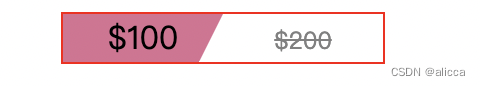
![[Docker]十.Docker Swarm讲解](https://img-blog.csdnimg.cn/6afd2128bcd349adaeacd34687608462.png)