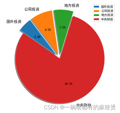
需求描述
根据已有的数据绘制一个占比图,期望能对其中的部分占比成分进行突出显示。
原始数据如下:
国外投资(5%)、公司投资(8%)、地方投资(7%)、中央财政(80%),
最终效果如下:
代码
import matplotlib.pyplot as plt
import matplotlib

pieFigure = plt.figure(figsize=(8, 8))

assetTypes = ["国外投资", "公司投资", "地方投资", "中央财政"]
assetScale = [0.05, 0.08, 0.07, 0.8]

pieAxes = pieFigure.subplots()
pies = pieAxes.pie(assetScale, explode=[0.1, 0.1, 0.1, 0], labels=assetTypes, shadow=True, startangle=145, counterclock=False,
                   autopct="%1.1f%%")
# Set chinese font in every wedge.
wedgeFontProperties = matplotlib.font_manager.FontProperties(family="SimHei", size=15)
for p in pies[1]:
    p.set_fontproperties(wedgeFontProperties)
# Set scale font size in every wedge
scaleFontProperties = matplotlib.font_manager.FontProperties(family="SimHei", size=12)
for scale in pies[2]:
    scale.set_fontproperties(scaleFontProperties)
# Draw the legend
pieLegend = pieAxes.legend(assetTypes)
legendFontProperties = matplotlib.font_manager.FontProperties(family="SimHei", size=12)
for t in pieLegend.get_texts():
    t.set_font_properties(legendFontProperties)

# save the figure. Optinal.
pieFigure.savefig("d://pie.jpeg")


![[黑马程序员SpringBoot2]——开发实用篇2](https://img-blog.csdnimg.cn/c40032139270428b875922c903517c31.png)