<!DOCTYPE html>
<html lang="en">
<head>
    <meta charset="UTF-8">
    <title>太极图</title>
    <style>
        .box{
            box-sizing: border-box;
            width: 400px;
            height: 400px;
            margin: 50px auto;
            border: 1px solid black;
            position: relative;

            border-radius: 50%;
            overflow: hidden;

            /*旋转动画1: 添加旋转方式*/
            /*transform-origin: center;*/
            /*transition: transform 1s;*/
            /*transform: rotate(90deg);*/

            /*旋转动画2: 添加持续动画方式*/
            animation: run 10ms linear infinite;
        }

        .box:hover{
            /*旋转动画1: 设置鼠标悬浮时旋转角度*/
            /*transform: rotate(360deg);*/

            /*旋转动画2: 设置鼠标悬浮时动画停止*/
            animation-play-state: paused;
        }

        /*旋转动画2: 设置动画工作方式*/
        @keyframes run{
				from{transform: rotate(0deg);}
				to{transform: rotate(360deg);}
        }

        .box .top{
            box-sizing: border-box;
            width: 100% ;
            height: 50%;
            background-color: black;

            display: flex;
            align-items: flex-end;
        }
        .box .top .top_one{
            box-sizing: border-box;
            width: 50%;
            height: 50%;
            background-color: white;
            border-top-left-radius: 100px;
            border-top-right-radius: 100px;
        }
        .box .bottom{
            box-sizing: border-box;
            width: 100% ;
            height: 50%;
            background-color: white;

            display: flex;
            flex-direction: row-reverse;
            align-items: flex-start;
        }

        .box .bottom .bottom_one{
            box-sizing: border-box;
            width: 50%;
            height: 50%;
            background-color: black;
            border-bottom-left-radius: 100px;
            border-bottom-right-radius: 100px;
        }

        .left_cir{
            position: absolute;
            top: 150px;
            left: 75px;
            width: 50px;
            height: 50px;
            background-color: black;
            border-radius: 50%;
        }
        .right_cir{
            position: absolute;
            top: 150px;
            right: 75px;
            width: 50px;
            height: 50px;
            background-color: white;
            border-radius: 50%;
        }
    </style>
</head>
<body>
    <div class="box">

        <div class="top">
            <div class="top_one"></div>
        </div>
        <div class="bottom">
            <div class="bottom_one"></div>
        </div>

        <div class="left_cir"></div>
        <div class="right_cir"></div>

    </div>

</body>
</html>
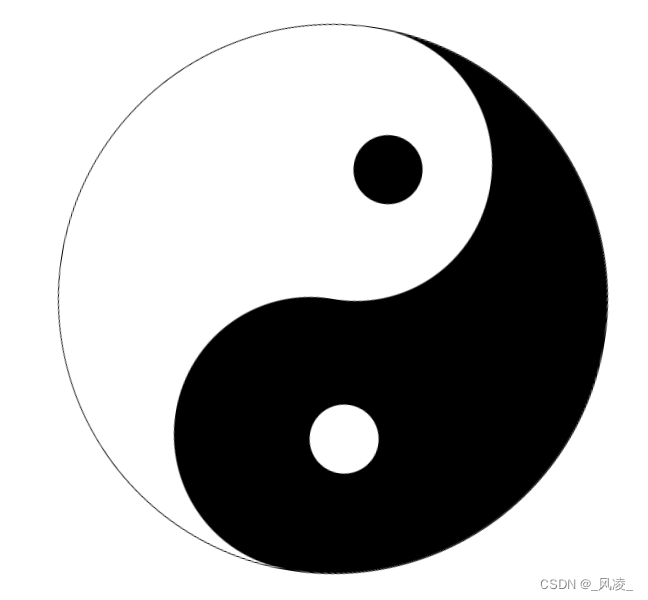
利用HTML和CSS3新特性实现太极图旋转