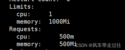
最近遇到一个有意思的东西,需要制作一个如下图的背景:

如果使用js或者canvas应该是比较简单的,正好最近在使用sass,那么纯sass能否实现这种效果呢?来试一下
首先来生成这些点:
  <div class="content">
    <div class="div1"></div>
  </div>
<style lang="scss" scoped>
$size: 5px;


.content {
  height: 100vh;
  width: 100vw;
  background-color: #000;
  .div1 {
      height: $size;
      width: $size;
      border-radius: 50%;
  }
}

</style>
我们将宽度和高度作为变量抽取出来,方便最终效果的时候统一调整,但是现在只有一个点,其他的该怎么办,好在CSS里有个图形阴影box-shadow,它允许你对一个图形创造多个阴影,只需要用,隔开即可,比如:
.div1{
    box-shadow: 0vh 0vw 0 #fff,
    39vw 30vh 2px #fff,
    58vw 35vh 2px #fff,
    40vw 50vh 2px #fff
}
数量解决了,但是这么手写会累死个好人的,所幸sass里支持循环还有函数,我们创建一个函数来生成box-shadow对应的值:
<style lang="scss" scoped>
@function createShadow($n) {
  $shadow: 0vh 0vw 0 #fff;
  @for $_ from 0 through $n {
    $x: unquote("#{random(100)}vw");
    $y: unquote("#{random(100)}vh");
    $shadow: unquote("#{$shadow}, #{$x} #{$y} 2px #fff");
  }
  @return $shadow;
}
</style>
使用@function可以声明函数,这里需要接受一个参数,也就是我们需要生成的阴影数量。
内部声明$shadow变量,初始的阴影我不希望显示,所以宽高都设置为0。
然后使用@for来进行循环,在循环内部,每一次我们都生成一个随机的x和y坐标。randomheunquote是sass内置的函数,具体可以参考random和unquote,简单来说random可以生成一个0到参数之间的随机数,不指定的话默认0~1之间。sass里也可以使用类似js中的模板语法,但是注意是用#{}绑定变量。不适用unquote的话,生成的是类似“33vw”这种带双引号的形式,使用unquote就是去掉字符串的双引号。最后在里面反复拼接$shadow,使用@return返回最终的结果
我们再重新修改一下上面的代码
<style lang="scss" scoped>
$size: 5px;
@function createShadow($n) {
  $shadow: 0vh 0vw 0 #fff;
  @for $_ from 0 through $n {
    $x: unquote("#{random(100)}vw");
    $y: unquote("#{random(100)}vh");
    $shadow: unquote("#{$shadow}, #{$x} #{$y} 2px #fff");
  }
  @return $shadow;
}

.content {
  height: 100vh;
  width: 100vw;
  background-color: #000;
  .div1 {
      height: $size;
      width: $size;
      border-radius: 50%;
      // 使用函数生成大量的shadow
      box-shadow: createShadow(40);
      // 增加动画效果
      animation-name: shadowAnimation;
      animation-duration: 4s;
      animation-timing-function: ease-in-out;
      animation-iteration-count: infinite;
  }
}

@keyframes shadowAnimation {
  0% {
    opacity: 1;
  }
  50% {
    opacity: 0;
  }
  100% {
    opacity: 1;
  }
}
</style>
我们又实用了css里的动画做了一个关键帧,简单的做一下不透明度的切换。
但是现在阴影会同时消失和出现,效果十分生硬。既然通用的方法已经抽离,我们多做几个div的阴影,给不同的div增加一个动画的延时效果,就能缓解这种生硬的过渡。最终的完整代码如下:
<template>
  <div class="content">
    <div class="div1"></div>
    <div class="div2"></div>
    <div class="div3"></div>
    <div class="div4"></div>
  </div>
</template>

<style lang="scss" scoped>
$size: 5px;
@function createShadow($n) {
  $shadow: 0vh 0vw 0 #fff;
  @for $_ from 0 through $n {
    $x: unquote("#{random(100)}vw");
    $y: unquote("#{random(100)}vh");
    $shadow: unquote("#{$shadow}, #{$x} #{$y} 2px #fff");
  }
  @return $shadow;
}

@mixin shadow {
  height: $size;
  width: $size;
  border-radius: 50%;
  box-shadow: createShadow(40);
  animation-name: shadowAnimation;
  animation-duration: 4s;
  animation-timing-function: ease-in-out;
  animation-iteration-count: infinite;
}

.content {
  height: 100vh;
  width: 100vw;
  background-color: #000;
  .div1 {
    @include shadow;
    animation-delay: 0s;
  }
  .div2 {
    @include shadow;
    animation-delay: 1s;
  }
  .div3 {
    @include shadow;
    animation-delay: 2s;
  }
  .div4 {
    @include shadow;
    animation-delay: 3s;
  }

}
@keyframes shadowAnimation {
  0% {
    opacity: 1;
  }
  50% {
    opacity: 0;
  }
  100% {
    opacity: 1;
  }
}
</style>
我们做了四个div,并且每个div的大部分内容都差不多,只有延时需要调整,所以我们使用@mixin抽离通用部分,之后每个div里只需要使用@include引用即可,再分别给每个div设置延时,即可实现最终效果。
不知道这些sass里好用的技巧,你用过吗?