一.实现左侧菜单绑定
效果图:

1.首先需要在项目中创建 mvvm 的架构模式
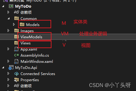
- 创建 Models ,放置实体类。
实体类需要继承自Prism 框架的 BindableBase,目的是让实体类支持数据的动态变更!
- 例如: 系统导航菜单实体类
/ <summary>
	/// 系统导航菜单实体类
	/// </summary>
public class MenuBar:BindableBase
 {
		private string icon;

		/// <summary>
		/// 菜单图标
		/// </summary>
		public string Icon
		{
get { return icon; }
set { icon = value; }
		}

		private string title;

		/// <summary>
		/// 菜单名称
		/// </summary>
		public string Title
		{
get { return title; }
set { title = value; }
		}

		private string nameSpace;

		/// <summary>
		/// 菜单命名空间
		/// </summary>
		public string NameSpace
		{
get { return nameSpace; }
set { nameSpace = value; }
		}

}- 创建View文件夹 放置前端显示页面 。例如:创建首页:MainView.xaml
- 创建ViewModel 文件夹,放置前端逻辑处理类。意思是:有前端页面同时,也要有对应的后台业务逻辑处理类。例如:MainViewModel

- 使用了Prism 框架,一些视图或类的定义都是有约定的。例如:视图统一使用xxxView 结尾。视图模形统一使用xxxViewModel 结尾。这样做的原因是:第一规范,第二,方便使用 Prism 进行动态的方式绑定上下文的时候,能自动找到对应类。
- Prism 动态上下文绑定方式,引入命名空间,把 AutoWireViewModel 设置成 True
 xmlns:prism="http://prismlibrary.com/"
 prism:ViewModelLocator.AutoWireViewModel="True"
2.创建MainViewModel 逻辑处理类
MainViewModel 类同样也需要继承自Prism 框架的 BindableBase
- 创建左侧菜单的数据,需要使用到一个动态的属性集合 ObservableCollection 来存放菜单的数据

- 创建菜单数据
    public class MainViewModel: BindableBase
    {
        public MainViewModel()
        {
            MenuBars=new ObservableCollection<MenuBar>();
            CreateMenuBar();
        }
        private ObservableCollection<MenuBar> menuBars;

        public ObservableCollection<MenuBar> MenuBars
        {
            get { return menuBars; }
            set { menuBars = value; RaisePropertyChanged(); }
        }
        void CreateMenuBar()
        {
            MenuBars.Add(new MenuBar() { Icon="Home",Title="首页",NameSpace="IndexView"});
            MenuBars.Add(new MenuBar() { Icon = "NotebookCheckOutline", Title = "待办事项", NameSpace = "ToDoView" });
            MenuBars.Add(new MenuBar() { Icon = "NotebookPlusOutline", Title = "忘备录", NameSpace = "MemoView" });
            MenuBars.Add(new MenuBar() { Icon = "Cog", Title = "设置", NameSpace = "SettingsView" });
        }
    }
- NameSpace:主要用于导航
- Icon:是Material DesignThemes UI 框架里面的图标名称
3.MainView.xaml 前端绑定数据
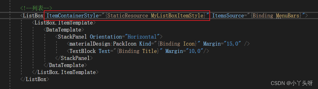
- 列表数据的绑定,使用ListBox 的自定义模板,也就是 ListBox.ItemTemplate,并且写法是固定的
<!--列表-->
<ListBox>
    <ListBox.ItemTemplate>
        <DataTemplate>
            <!--在这里添加内容数据-->
        </DataTemplate>
    </ListBox.ItemTemplate>
</ListBox>- 例如:结合上面创建MainViewModel 类,给MainView.xaml 渲染数据
<!--列表-->
<ListBox ItemsSource="{Binding MenuBars}">
    <ListBox.ItemTemplate>
        <DataTemplate>
            <StackPanel Orientation="Horizontal">
                <materialDesign:PackIcon Kind="{Binding Icon}" Margin="15,0" />
                <TextBlock Text="{Binding Title}" Margin="10,0"/>
            </StackPanel>
        </DataTemplate>
    </ListBox.ItemTemplate>
</ListBox>- MainView.xaml 添加动态绑定 上下文
xmlns:prism="http://prismlibrary.com/"
prism:ViewModelLocator.AutoWireViewModel="True"
注意:项目中的MainWindow.xaml 已经改成了MainView.xaml,并且把启动页设置成 MainView了

- 最终项目结构

4.左侧菜单样式调整
- 在App.xaml 资源文件中,更改默认的主题颜色

- 更改左侧列表选择的样式
重写自定义样式
- 在App.xaml 文件中 资源字典 ResourceDictionary 节点中,设置Style 属性来进行样式重写
Style 使用方式
- TargetType :设置作用的目标类型
- Setter :设计器,里面有2个常用属性,分别是Property 和Value。用来改变设置作用的目标类型一些属性的值
- key: 通过指定的key 来使用重写的样式
例如:设置ListBoxItem 属性中的最小行高为40
<Style TargetType="ListBoxItem">
    <Setter Property="MinHeight" Value="40"/>
</Style>
3. Property 中有一个特别的属性:Template。用于改变控件的外观样式。并且也有固定的写法
<Setter Property="Template">
    <Setter.Value>
        <ControlTemplate TargetType="{x:Type ListBoxItem}">

        </ControlTemplate>
    </Setter.Value>
</Setter>
TargetType 有2种写法
- 一种是直接用Style 设置一些属性,可以这样写 TargetType="ListBoxItem"
- 另外一种写法是,当需要使用到自定义模板,也就是要改变控件的外观样式时,Property 设置的值为 Template,里面TargetType 写法就变成这样 TargetType="{x:Type ListBoxItem}"
- 使用自定义的模板时,需要使用到一个属性 ContentPresenter,把原有模板的属性原封不动的投放到自定义模板。
4. 触发器,它按条件应用属性值或执行操作
如果使用Template 自定义控件样式后,需要搭配触发器进行使用。
例如:
<ControlTemplate TargetType="{x:Type ListBoxItem}">
    <Grid>
        <!--内容最左侧的样式-->
        <Border x:Name="borderHeader"/>
        <!--内容选中的样式-->
        <Border x:Name="border"/>
        <!--内容呈现,使用自定义模板时,不加该属性,原先的内容无法呈现-->
        <ContentPresenter
            HorizontalAlignment="{TemplateBinding HorizontalAlignment}"
            VerticalAlignment="{TemplateBinding VerticalContentAlignment}"/>
    </Grid>
     <!--触发器-->
    <ControlTemplate.Triggers>
        <!--如果是选中状态-->
        <Trigger Property="IsSelected" Value="True">
            <!--第一个Border 设置边框样式-->
            <Setter Property="BorderThickness" TargetName="borderHeader" Value="4,0,0,0"/>
            <!--第一个Border 设置边框颜色,value 动态绑定主要是为了适应主题颜色更改时,边框也着变-->
            <Setter Property="BorderBrush" TargetName="borderHeader" Value="{DynamicResource PrimaryHueLightBrush}"/>
            <!--第二个border 设置选中的样式-->
            <Setter Property="Background" TargetName="border" Value="{DynamicResource PrimaryHueLightBrush}"/>
            <!--第二个border 设置选中的透明度-->
            <Setter Property="Opacity" TargetName="border" Value="0.2"/>
        </Trigger>
        <!--鼠标悬停触发器,如果鼠标悬停时-->
        <Trigger Property="IsMouseOver" Value="True">
            <!--第二个border 设置选中的样式-->
            <Setter Property="Background" TargetName="border" Value="{DynamicResource PrimaryHueLightBrush}"/>
            <!--第二个border 设置选中的透明度-->
            <Setter Property="Opacity" TargetName="border" Value="0.2"/>
        </Trigger>
    </ControlTemplate.Triggers>
</ControlTemplate>
5. 样式写完后,需要在MainView.xmal 的ListBox中使用这个样式资源文件,通过指定Key 来使用。
二.源码
1.MainView.xaml
<Window x:Class="MyToDo.Views.MainView"
        xmlns="http://schemas.microsoft.com/winfx/2006/xaml/presentation"
        xmlns:x="http://schemas.microsoft.com/winfx/2006/xaml"
        xmlns:d="http://schemas.microsoft.com/expression/blend/2008"
        xmlns:mc="http://schemas.openxmlformats.org/markup-compatibility/2006"
        xmlns:local="clr-namespace:MyToDo"
        xmlns:prism="http://prismlibrary.com/"
        prism:ViewModelLocator.AutoWireViewModel="True"
        WindowStyle="None" WindowStartupLocation="CenterScreen" AllowsTransparency="True"
         Style="{StaticResource MaterialDesignWindow}"
        TextElement.Foreground="{DynamicResource MaterialDesignBody}"
        Background="{DynamicResource MaterialDesignPaper}"
        TextElement.FontWeight="Medium"
        TextElement.FontSize="14"
        FontFamily="{materialDesign:MaterialDesignFont}"
        mc:Ignorable="d"
        xmlns:materialDesign="http://materialdesigninxaml.net/winfx/xaml/themes"
        Title="MainWindow" Height="768" Width="1280">
    <materialDesign:DialogHost DialogTheme="Inherit"
                           Identifier="RootDialog"
                           SnackbarMessageQueue="{Binding ElementName=MainSnackbar, Path=MessageQueue}">

        <materialDesign:DrawerHost IsLeftDrawerOpen="{Binding ElementName=MenuToggleButton, Path=IsChecked}">
            <!--左边菜单-->
            <materialDesign:DrawerHost.LeftDrawerContent>
                <DockPanel MinWidth="220" >

                    <!--头像-->
                    <StackPanel DockPanel.Dock="Top" Margin="0,20">
                        <Image Source="/Images/user.jpg" Width="50" Height="50">
                            <Image.Clip>
                                <EllipseGeometry Center="25,25" RadiusX="25" RadiusY="25" />
                            </Image.Clip>
                        </Image>
                        <TextBlock Text="WPF gg" Margin="0,10" HorizontalAlignment="Center" />
                    </StackPanel>

                    <!--列表-->
                    <ListBox ItemContainerStyle="{StaticResource MyListBoxItemStyle}" ItemsSource="{Binding MenuBars}">
                        <ListBox.ItemTemplate>
                            <DataTemplate>
                                <StackPanel Orientation="Horizontal" Background="Transparent">
                                    <materialDesign:PackIcon Kind="{Binding Icon}" Margin="15,0" />
                                    <TextBlock Text="{Binding Title}" Margin="10,0"/>
                                </StackPanel>
                            </DataTemplate>
                        </ListBox.ItemTemplate>
                    </ListBox>


                </DockPanel>
            </materialDesign:DrawerHost.LeftDrawerContent>

            <DockPanel >
                <!--导航条色块-->
                <materialDesign:ColorZone Padding="16" x:Name="ColorZone"
                                materialDesign:ElevationAssist.Elevation="Dp4"
                                DockPanel.Dock="Top"
                                Mode="PrimaryMid">
                    <DockPanel LastChildFill="False">
                        <!--上左边内容-->
                        <StackPanel Orientation="Horizontal">
                            <ToggleButton x:Name="MenuToggleButton"
                          AutomationProperties.Name="HamburgerToggleButton"
                          IsChecked="False"
                          Style="{StaticResource MaterialDesignHamburgerToggleButton}" />

                            <Button Margin="24,0,0,0"
                    materialDesign:RippleAssist.Feedback="{Binding RelativeSource={RelativeSource Self}, Path=Foreground, Converter={StaticResource BrushRoundConverter}}"
                    Command="{Binding MovePrevCommand}"
                    Content="{materialDesign:PackIcon Kind=ArrowLeft,
                                                      Size=24}"
                    Foreground="{Binding RelativeSource={RelativeSource AncestorType={x:Type FrameworkElement}}, Path=(TextElement.Foreground)}"
                    Style="{StaticResource MaterialDesignToolButton}"
                    ToolTip="Previous Item" />

                            <Button Margin="16,0,0,0"
                    materialDesign:RippleAssist.Feedback="{Binding RelativeSource={RelativeSource Self}, Path=Foreground, Converter={StaticResource BrushRoundConverter}}"
                    Command="{Binding MoveNextCommand}"
                    Content="{materialDesign:PackIcon Kind=ArrowRight,
                                                      Size=24}"
                    Foreground="{Binding RelativeSource={RelativeSource AncestorType={x:Type FrameworkElement}}, Path=(TextElement.Foreground)}"
                    Style="{StaticResource MaterialDesignToolButton}"
                    ToolTip="Next Item" />
                            <TextBlock Margin="16,0,0,0"
                             HorizontalAlignment="Center"
                             VerticalAlignment="Center"
                             AutomationProperties.Name="Material Design In XAML Toolkit"
                             FontSize="22"
                             Text="笔记本" />
                        </StackPanel>
                        <!--上右边图标-->
                        <StackPanel DockPanel.Dock="Right" Orientation="Horizontal">
                            <Image Source="/Images/user.jpg" Width="25" Height="25">
                                <Image.Clip>
                                    <EllipseGeometry Center="12.5,12.5" RadiusX="12.5" RadiusY="12.5" />
                                </Image.Clip>
                            </Image>
                            <Button x:Name="btnMin" Style="{StaticResource MaterialDesignFlatMidBgButton}">
                                <materialDesign:PackIcon Kind="MoveResizeVariant" />
                            </Button>
                            <Button x:Name="btnMax" Style="{StaticResource MaterialDesignFlatMidBgButton}">
                                <materialDesign:PackIcon Kind="CardMultipleOutline" />
                            </Button>
                            <Button x:Name="btnClose" Style="{StaticResource MaterialDesignFlatMidBgButton}" Cursor="Hand">
                                <materialDesign:PackIcon Kind="WindowClose" />
                            </Button>
                        </StackPanel>
                    </DockPanel>

                </materialDesign:ColorZone>


            </DockPanel>
        </materialDesign:DrawerHost>
    </materialDesign:DialogHost>
</Window>
2.MainViewModel
namespace MyToDo.ViewModels
{
    public class MainViewModel: BindableBase
    {
        public MainViewModel()
        {
            MenuBars=new ObservableCollection<MenuBar>();
            CreateMenuBar();
        }
        private ObservableCollection<MenuBar> menuBars;

        public ObservableCollection<MenuBar> MenuBars
        {
            get { return menuBars; }
            set { menuBars = value; RaisePropertyChanged(); }
        }
        void CreateMenuBar()
        {
            MenuBars.Add(new MenuBar() { Icon="Home",Title="首页",NameSpace="IndexView"});
            MenuBars.Add(new MenuBar() { Icon = "NotebookCheckOutline", Title = "待办事项", NameSpace = "ToDoView" });
            MenuBars.Add(new MenuBar() { Icon = "NotebookPlusOutline", Title = "忘备录", NameSpace = "MemoView" });
            MenuBars.Add(new MenuBar() { Icon = "Cog", Title = "设置", NameSpace = "SettingsView" });
        }
    }
}
3.App.xaml
<prism:PrismApplication x:Class="MyToDo.App"
             xmlns="http://schemas.microsoft.com/winfx/2006/xaml/presentation"
             xmlns:x="http://schemas.microsoft.com/winfx/2006/xaml"
             xmlns:local="clr-namespace:MyToDo"
             xmlns:materialDesign="http://materialdesigninxaml.net/winfx/xaml/themes"
             xmlns:prism="http://prismlibrary.com/">
    <Application.Resources>
        <ResourceDictionary>
            <ResourceDictionary.MergedDictionaries>
                <materialDesign:BundledTheme BaseTheme="Dark" PrimaryColor="DeepPurple" SecondaryColor="Lime" />
                <ResourceDictionary Source="pack://application:,,,/MaterialDesignThemes.Wpf;component/Themes/MaterialDesignTheme.Defaults.xaml" />
            </ResourceDictionary.MergedDictionaries>
            <Style x:Key="MyListBoxItemStyle" TargetType="ListBoxItem">
                <Setter Property="MinHeight" Value="40"/>
                <Setter Property="Template">
                    <Setter.Value>
                        <ControlTemplate TargetType="{x:Type ListBoxItem}">
                            <Grid>
                                <!--内容最左侧的样式-->
                                <Border x:Name="borderHeader"/>
                                <!--内容选中的样式-->
                                <Border x:Name="border"/>
                                <!--内容呈现,使用自定义模板时,不加该属性,原先的内容无法呈现-->
                                <ContentPresenter
                                    HorizontalAlignment="{TemplateBinding HorizontalAlignment}"
                                    VerticalAlignment="{TemplateBinding VerticalContentAlignment}"/>
                            </Grid>
                             <!--触发器-->
                            <ControlTemplate.Triggers>
                                <!--如果是选中状态-->
                                <Trigger Property="IsSelected" Value="True">
                                    <!--第一个Border 设置边框样式-->
                                    <Setter Property="BorderThickness" TargetName="borderHeader" Value="4,0,0,0"/>
                                    <!--第一个Border 设置边框颜色,value 动态绑定主要是为了适应主题颜色更改时,边框也着变-->
                                    <Setter Property="BorderBrush" TargetName="borderHeader" Value="{DynamicResource PrimaryHueLightBrush}"/>
                                    <!--第二个border 设置选中的样式-->
                                    <Setter Property="Background" TargetName="border" Value="{DynamicResource PrimaryHueLightBrush}"/>
                                    <!--第二个border 设置选中的透明度-->
                                    <Setter Property="Opacity" TargetName="border" Value="0.2"/>
                                </Trigger>
                                <!--鼠标悬停触发器,如果鼠标悬停时-->
                                <Trigger Property="IsMouseOver" Value="True">
                                    <!--第二个border 设置选中的样式-->
                                    <Setter Property="Background" TargetName="border" Value="{DynamicResource PrimaryHueLightBrush}"/>
                                    <!--第二个border 设置选中的透明度-->
                                    <Setter Property="Opacity" TargetName="border" Value="0.2"/>
                                </Trigger>
                            </ControlTemplate.Triggers>
                        </ControlTemplate>
                    </Setter.Value>
                </Setter>
            </Style>
        </ResourceDictionary>
    </Application.Resources>
</prism:PrismApplication>