一、自定义轮播图组件、自动注册
以首页轮播图组件为例。
1、创建组件文件src/components/my-swipper.vue
代码如下:
<template>
	<view>
		<view class="uni-margin-wrap">
			<swiper class="swiper" circular :indicator-dots="indicatorDots" :autoplay="autoplay" :interval="interval"
				:duration="duration">
				<swiper-item>
					<view class="swiper-item uni-bg-red">A</view>
				</swiper-item>
				<swiper-item>
					<view class="swiper-item uni-bg-green">B</view>
				</swiper-item>
				<swiper-item>
					<view class="swiper-item uni-bg-blue">C</view>
				</swiper-item>
			</swiper>
		</view>

	</view>
</template>

<script lang="ts">
export default {
    data() {
        return {
            background: ['color1', 'color2', 'color3'],
            indicatorDots: true,
            autoplay: true,
            interval: 2000,
            duration: 500
        }
    },
    methods: {
        changeIndicatorDots(e) {
            this.indicatorDots = !this.indicatorDots
        },
        changeAutoplay(e) {
            this.autoplay = !this.autoplay
        },
        intervalChange(e) {
            this.interval = e.target.value
        },
        durationChange(e) {
            this.duration = e.target.value
        }
    }
}
</script>

<style>
	.uni-margin-wrap {
		width: 690rpx;
		width: 100%;
	}
	.swiper {
		height: 300rpx;
	}
	.swiper-item {
		display: block;
		height: 300rpx;
		line-height: 300rpx;
		text-align: center;
    color: white;
	}
  .uni-bg-red{
    background-color: red;
  }
  .uni-bg-green{
    background-color: green;
  }
  .uni-bg-blue{
    background-color: blue;
  }
</style>
2、在pages.json中配置自动注册,添加配置代码"^my-(.*)": "@/components/my-$1.vue"
{
	"easycom": {
		"autoscan": true,
		"custom": {
			// uni-ui 规则如下配置
			"^uni-(.*)": "@dcloudio/uni-ui/lib/uni-$1/uni-$1.vue",
			// 自定义组件,配置自动导入
			"^my-(.*)": "@/components/my-$1.vue"
		}
	},
    // ... //
}
3、在页面中直接使用<my-navbar/>
不用再手动import
<template>
  <my-navbar/>
  <view class="content">
    <image mode="aspectFill" class="logo" src="/static/logo.png" />
    <view class="text-area">
      <text class="title">{{ title }}</text>
    </view>
  </view>
</template>
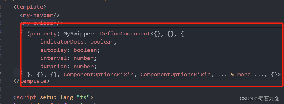
4、配置ts类型提示
在组件目录components创建文件components.d.ts,内容如下,
import MySwipper from "./my-swipper.vue";
declare module '@vue/runtime-core' {
    export interface GlobalComponents {
        MySwipper: typeof MySwipper,
    }
}
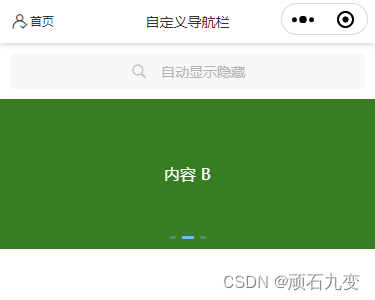
二、增加轮播图指示点组件
uni-swiper-dot组件在swiper 基础上面增加了丰富的指示点样式。
UniHelper为我们提供了各种组件的类型声明,可以直接使用。如下面change事件中的ev参数 ev: UniHelper.SwiperOnChangeEvent。
使用轮播图指示点组件需要把swiper组件的默认指示点(indicator-dots)设置为false,否则会出现两层指示点。
核心参数
- mode:指示点的类型,可选值:default 、round 、nav 、 indexes
- current:当前指示点索引,必须是通过 swiper 的 change 事件获取到的 e.detail.current
- dotsStyles:指示点样式
- info:轮播图的数据,通过数组长度决定指示点个数
- field:mode 为 nav 时,显示的内容字段(mode = nav 时必填)
<template>
	<view>
		<view class="uni-margin-wrap">
			<uni-swiper-dot class="uni-swiper-dot-box" @clickItem=clickItem :info="info" :current="current" :mode="mode"
				:dots-styles="dotsStyles" field="content">
				<swiper class="swiper" circular :indicator-dots="indicatorDots" :autoplay="autoplay" :interval="interval"
					:current="swiperDotIndex" :duration="duration" @change="onchange">
					<swiper-item v-for="(item, index) in info">
						<view :class="'swiper-item ' + item.colorClass">{{ item.content }}</view>
					</swiper-item>
				</swiper>
			</uni-swiper-dot>
		</view>
	</view>
</template>
<script lang="ts">
export default {
	data() {
		return {
			indicatorDots: false,
			autoplay: true,
			interval: 2000,
			duration: 500,
			info: [{
				colorClass: 'uni-bg-red',
				content: '内容 A'
			},
			{
				colorClass: 'uni-bg-green',
				content: '内容 B'
			},
			{
				colorClass: 'uni-bg-blue',
				content: '内容 C'
			}
			],
			modeIndex: -1,
			styleIndex: -1,
			current: 0,
			mode: 'default',//default, dot, round, nav, indexes
			dotsStyles: {
				backgroundColor: 'rgba(83, 200, 249,0.3)',
				border: '1px rgba(83, 200, 249,0.3) solid',
				color: '#fff',
				selectedBackgroundColor: 'rgba(83, 200, 249,0.9)',
				selectedBorder: '1px rgba(83, 200, 249,0.9) solid'
			},
			swiperDotIndex: 0
		}
	},
	methods: {
		onchange(ev: UniHelper.SwiperOnChangeEvent) {
			this.current = ev.detail.current
		},
		clickItem(e: number) {
			this.swiperDotIndex = e
		}
	}
}
</script>
参考
- https://uniapp.dcloud.net.cn/component/uniui/uni-swiper-dot.html