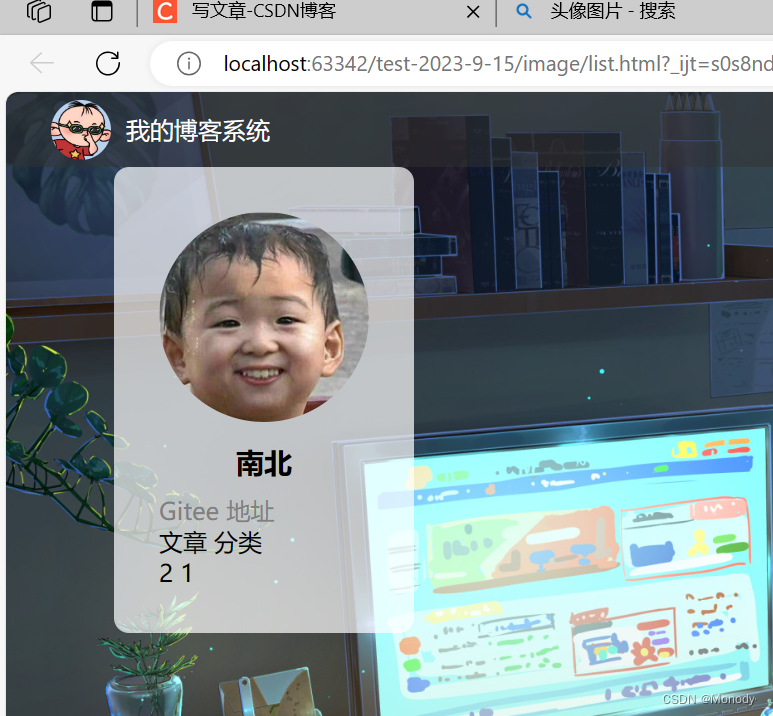
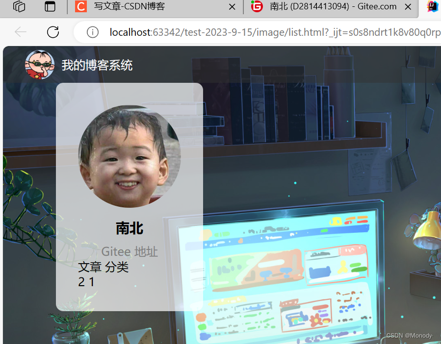
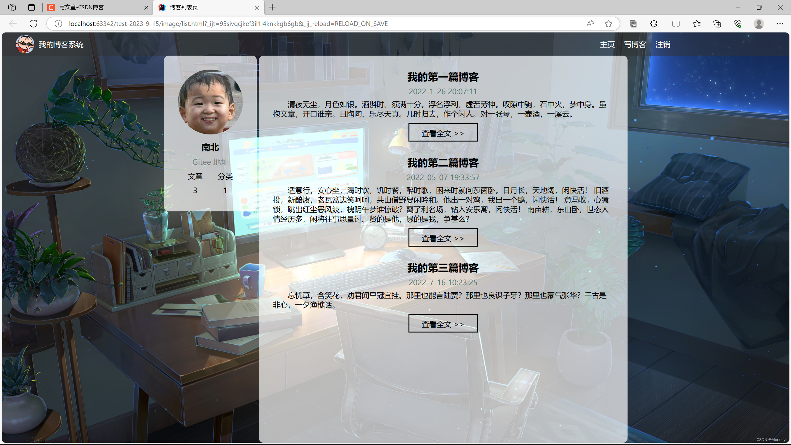
效果展示
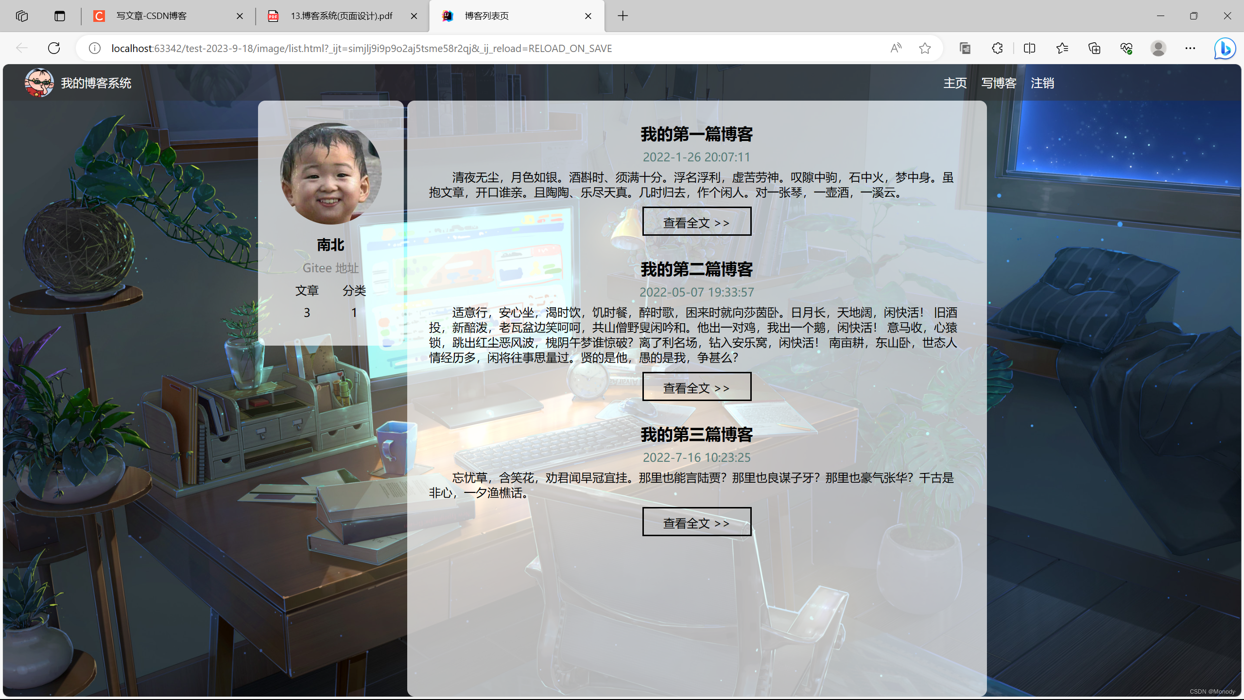
博客列表页
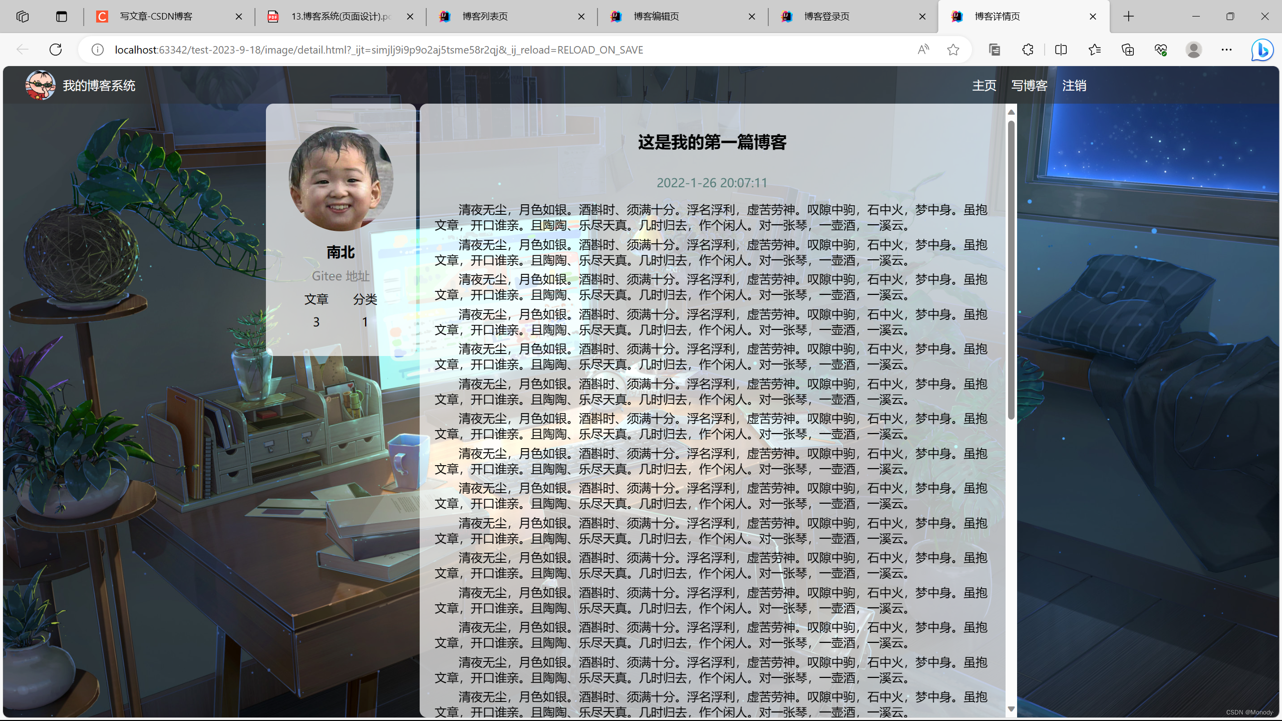
博客详情页
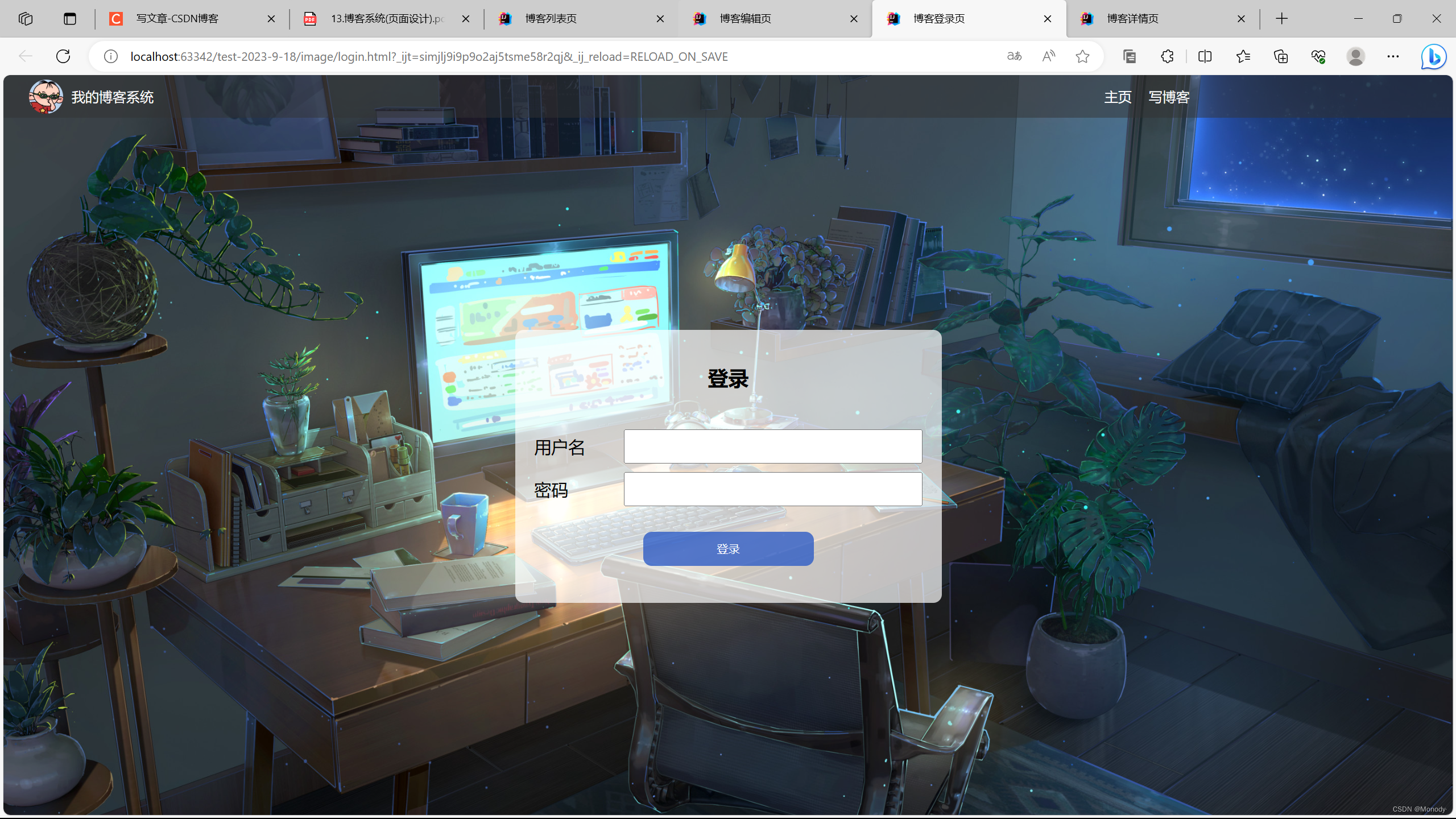
博客登录页
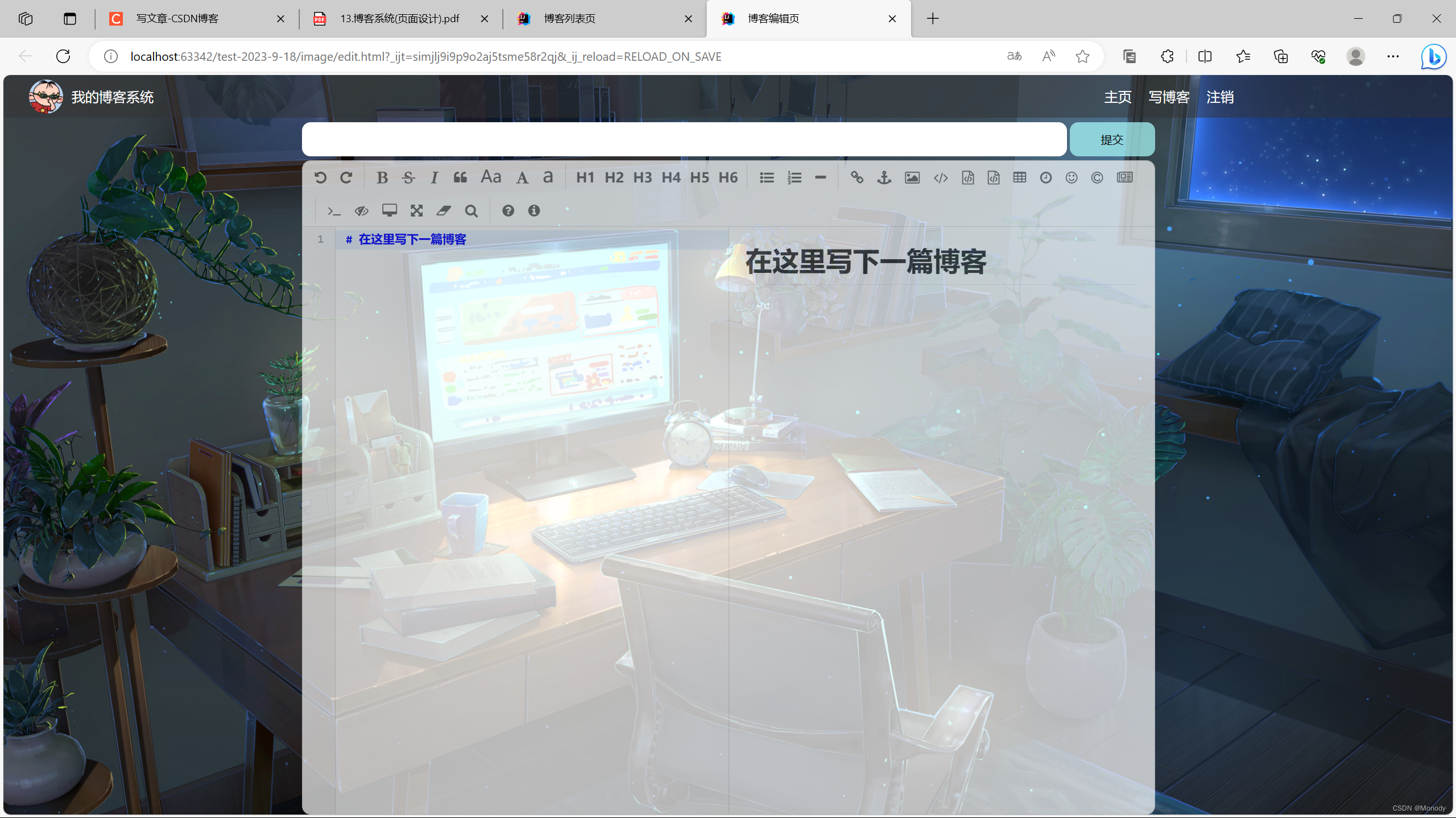
博客编辑页
主要分成四个页面:
- 博客列表页
显示出都有哪些博客 - 博客详情页
展示博客的详细正文 - 博客登录页
进行登录操作 - 博客编辑页
有一个 markdown 编译器,可以编写博客内容
1.实现博客列表页
1.背景设计
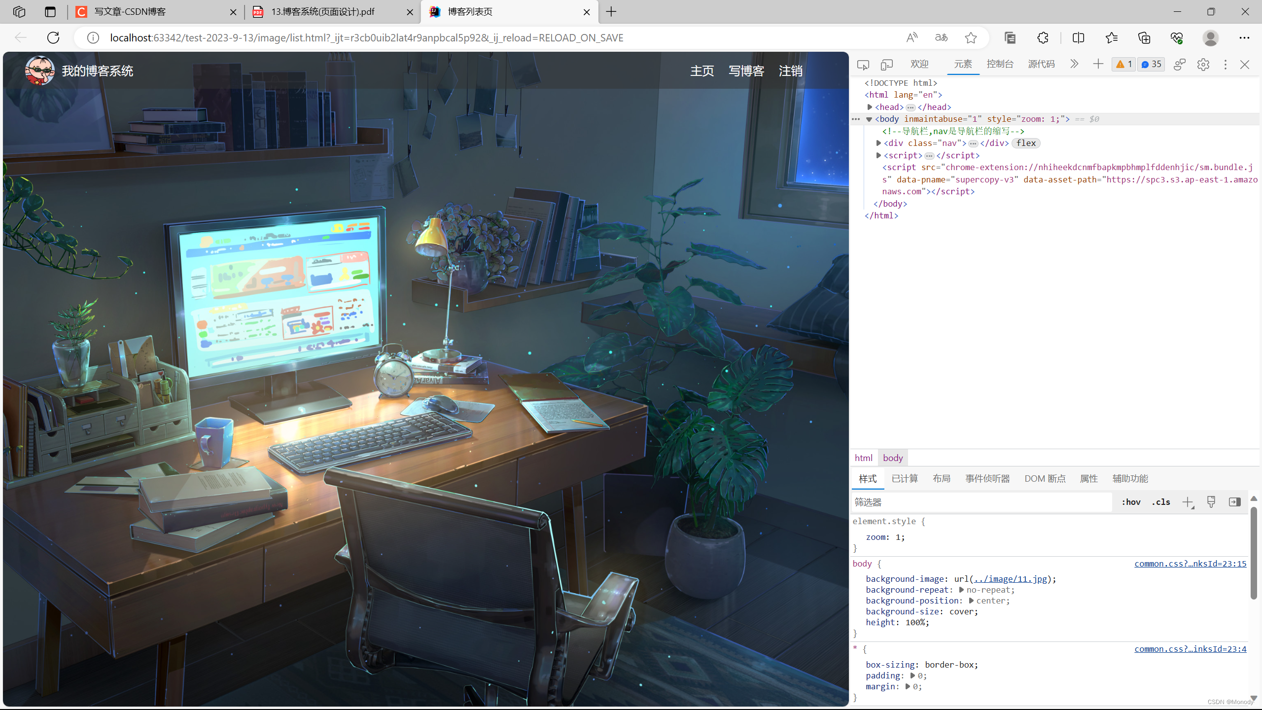
body {
    /*注意这里相对路径的写法*/
    background-image: url("../image/11.jpg");
    background-repeat: no-repeat;
    background-position: center;
    /*让元素尽可能填满整个元素*/
    background-size: cover;
}
在这里,我们在给body设计背景图
但是此时body的高度是0
需要给body设计高度,才能正确显示
height: 1000px;
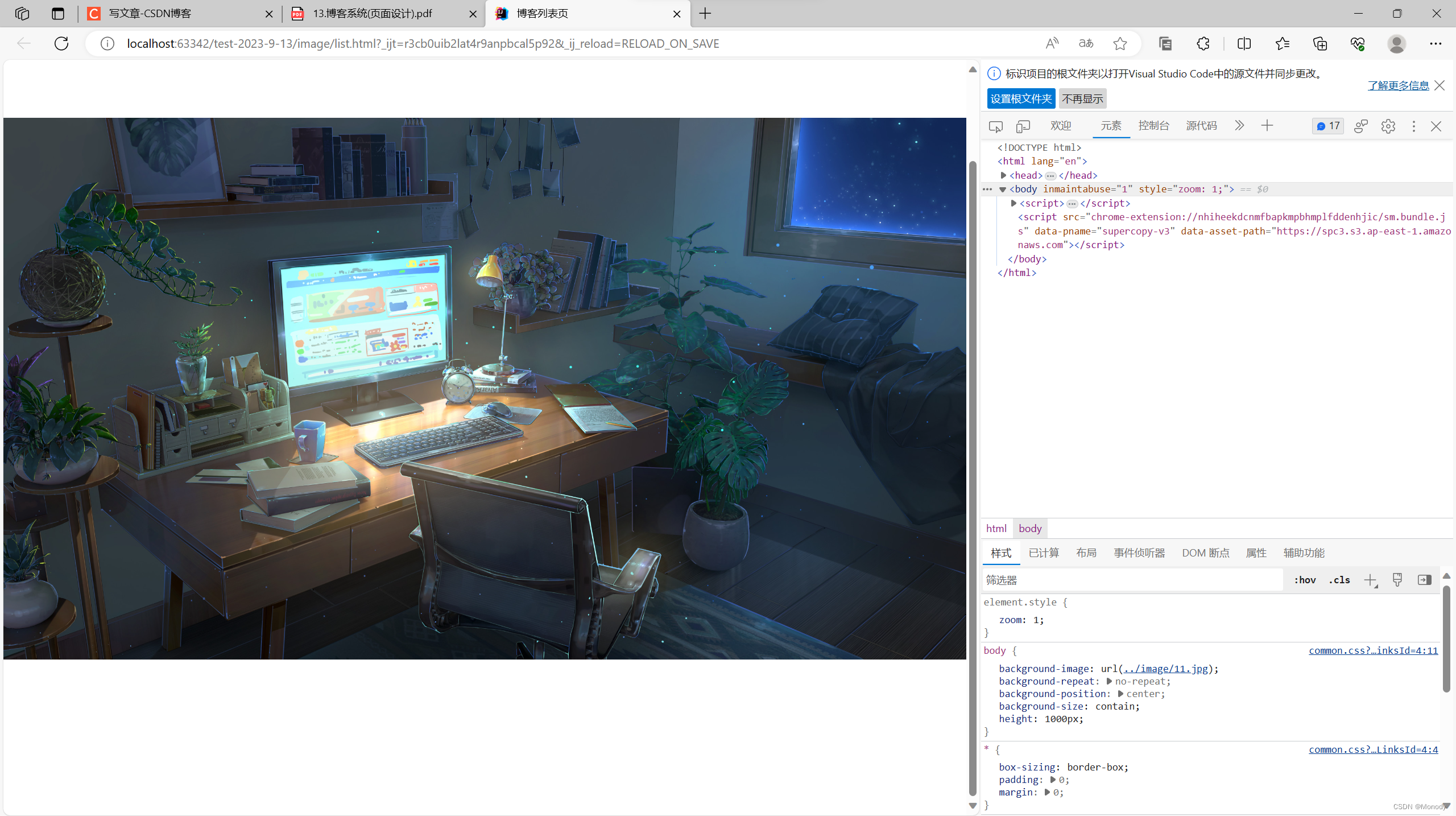
此时发现,如果给body设置固定高度,不能适应窗口大小,我们更希望body和浏览器窗口一样大!
html {
    height: 100%;
}
body {
    /*注意这里相对路径的写法*/
    background-image: url("../image/11.jpg");
    background-repeat: no-repeat;
    background-position: center;
    /*让元素尽可能填满整个元素*/
    background-size: cover;

    height: 100%;
}
height: 100%;
代表了当前元素的高度和父元素的高度一样~
按照当前html代码的写法
body的父元素是html元素.
html的父元素是浏览器窗口~~
此时再让body和html一样高body和浏览器窗口就一样高了!!
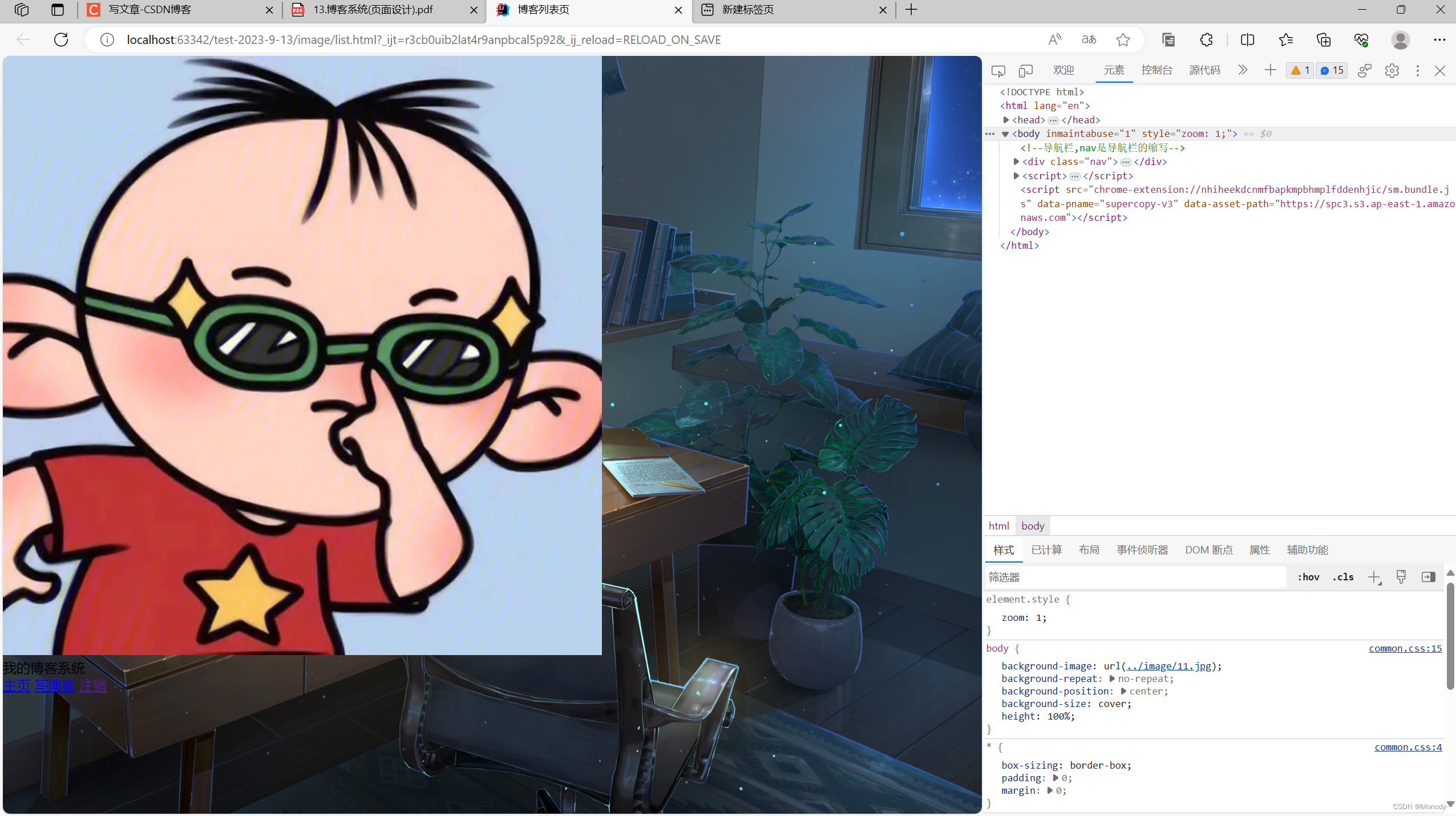
2.编写导航栏
本质上就是div,使用弹性布局,把里面的内容水平方向排列~
<!--导航栏,nav是导航栏的缩写-->
    <div class="nav">
        <!--logo-->
        <img src="1.jpg" alt="">
        <!---->
        <div class="title" >我的博客系统</div>
        <a href="list.html">主页</a>
        <a href="edit.html.html">写博客</a>
        <!--注销 这里的地址后面提到-->
        <a href="">注销</a>
    </div>
我们把样式加入后
/*导航栏*/
.nav {
    /*导航栏一般都是50px*/
    height: 50px;
    background-color: rgba(50,50,50,0.5);
    color: white;

    /*使用弹性布局,让里面的元素能够水平方向排列*/
    display: flex;
    align-items: center;
}

/*导航栏中的logo*/
.nav img {
    width: 40px;
    height: 40px;
    /*左右设置外边距,有一些缝隙*/
    margin-left: 30px;
    margin-right: 10px;
    /*设置圆角矩形,变成圆形*/
    border-radius: 20px;
}

.nav a {
    color: white;
    /*去掉a标签的下划线*/
    text-decoration: none;
    /*此处使用内边距把多个链接分出距离来*/
    padding: 0 10px;
}

.nav .spacer {
    width: 65%;

}
<body>
    <!--导航栏,nav是导航栏的缩写-->
    <div class="nav">
        <!--logo-->
        <img src="1.jpg" alt="">
        <!---->
        <div class="title" >我的博客系统</div>
        <!--只是一个空白,用来把后面的链接挤过去(这是一个简单粗暴地写法)-->
        <div class="spacer"></div>
        <a href="list.html">主页</a>
        <a href="edit.html.html">写博客</a>
        <!--注销 这里的地址后面提到-->
        <a href="">注销</a>
    </div>
</body>
3.编写主体部分
<!--页面主体部分-->
    <div class="container">
        <!--左侧信息-->
        <div class="container-left">

        </div>
        <!--右侧信息-->
        <div class="container-right">

        </div>
    </div>
/*页面的主题部分,也称为"版心"*/
.container {
    /*设置成固定宽度,水平居中*/
    width: 1000px;
    margin-left: auto;
    margin-right: auto;

    /*设置高度,和浏览器一样高*/
    height: 100%;
    background-color: gray;
}
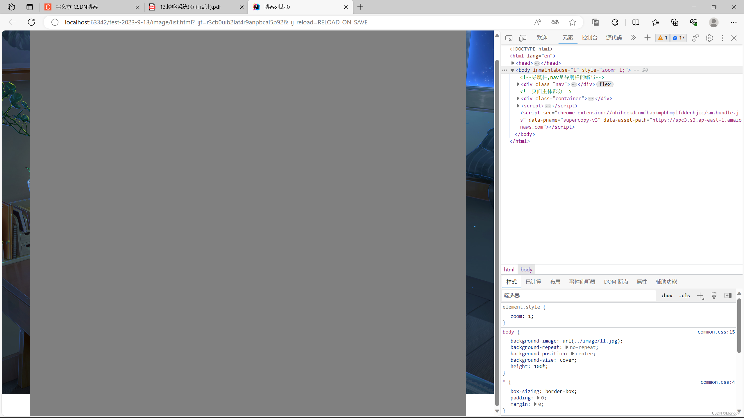
发现给版心设置高度,不能直接100%,而是需要在100%的基础上,去掉一个导航栏的高度
    /*设置高度,和浏览器一样高*/
    height: calc(100% - 50px);
注意减号两边必须加空格,否则浏览器无法识别!!!
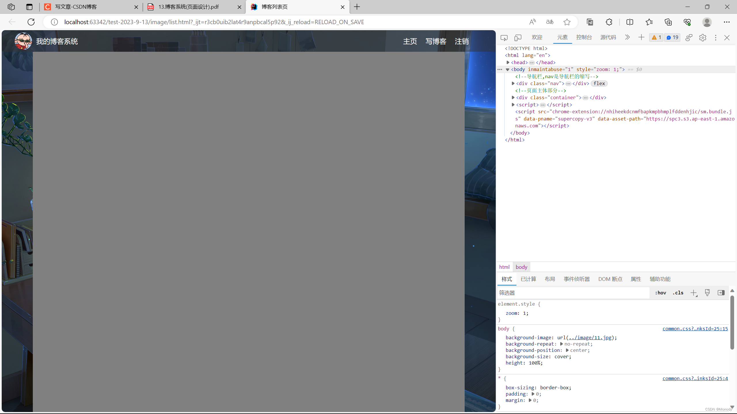
此时高度合适
/*页面的主体部分,也称为"版心"*/
.container {
    /*设置成固定宽度,水平居中*/
    width: 1000px;
    margin-left: auto;
    margin-right: auto;

    /*设置高度,和浏览器一样高*/
    height: calc(100% - 50px);
    background-color: gray;

    display: flex;
}

.container-left {
    height: 100%;
    width: 200px;
    background-color: red;
}

.container-right {
    height: 100%;
    /*留出来5px的缝隙*/
    width: 795px;
    background-color: aqua;
}

我们想留缝隙在中间,结果现在缝隙在最右边
/*页面的主体部分,也称为"版心"*/
.container {
    /*设置成固定宽度,水平居中*/
    width: 1000px;
    margin-left: auto;
    margin-right: auto;

    /*设置高度,和浏览器一样高*/
    height: calc(100% - 50px);
    background-color: gray;

    display: flex;

    /*让里面的元素可以等间距铺开*/
    justify-content: space-between;
}
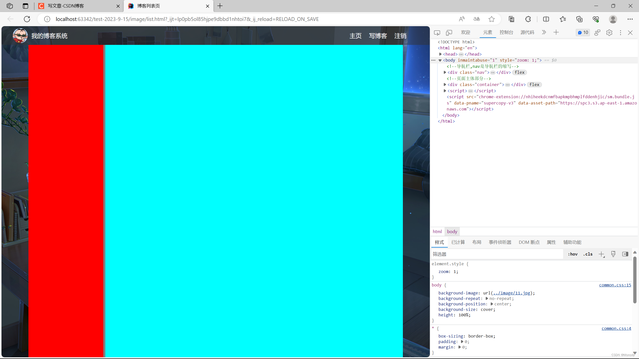
这样就让缝隙在中间了
/*设置用户信息区域*/
.card {
    background-color: rgba(255,255,255,0.7);
    border-radius: 10px;
    padding: 30px;
}

/*设置用户头像*/
.card img {
    /*整个 .card 的宽度是200px .card 设置成四个方向的内边距,30px. */
    /*剩下能放图片的空间就是140px*/
    width: 140px;
    height: 140px;
    border-radius: 70px;
}

/*设置用户名*/
.card h3 {
    text-align: center;
    /*这里使用内边距,把用户名和头像,撑开一个边距,使用外边距也可以*/
    padding: 10px;
}

.card a {
    text-align: center;
    /*文字颜色设置*/
    color: gray;
    /*去掉下划线*/
    text-decoration: none;
}
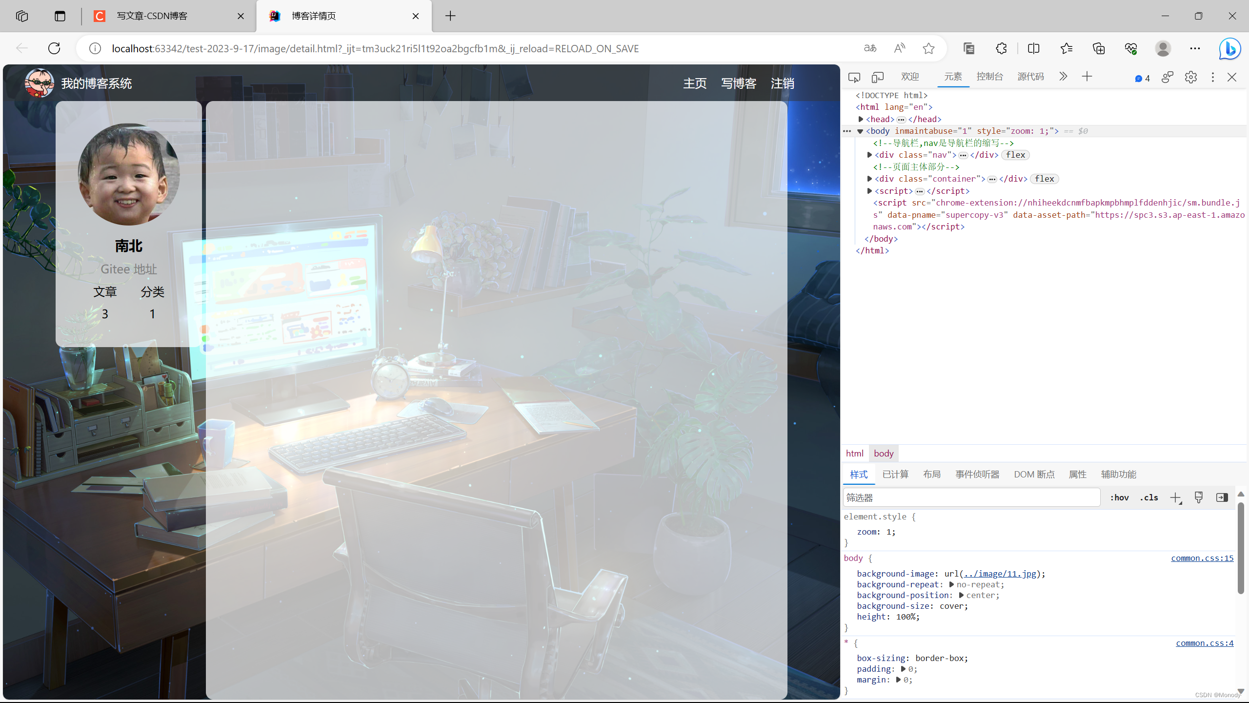
<div class="container-left">
            <!--这个div标识整个用户信息的区域-->
            <div class = "card">
                <!--用户头像-->
                <img src = "3.jpg" alt = "">
                <!--用户名-->
                <h3>南北</h3>
                <!-- Gitee 地址-->
                <a href="https://gitee.com/D2814413094">Gitee 地址</a>
                <!--统计信息-->
                <div class="counter">
                    <span>文章</span>
                    <span>分类</span>
                </div>
                <div class="counter">
                    <span>2</span>
                    <span>1</span>
                </div>

            </div>
当我们设置Gitee 地址 居中是发现并没有居中,是因为它不是块级元素,需要把a标签转换成块级标签。
.card a {
    text-align: center;
    /*文字颜色设置*/
    color: gray;
    /*去掉下划线*/
    text-decoration: none;
    /*需要把a标签转换成块级标签,上述文字水平居中才有意义*/
    display: block;
}
<!--右侧信息-->
<div class="container-right">
<!--这个div表示一个博客-->
<div class="blog">
<!--博客标题-->
<div class="title">我的第一篇博客</div>
<!--博客的发布时间-->
<div class="data">2022-1-26 20:07:11</div>
<!--博客的摘要-->
<div class="desc">
<!--使用lorem 生成一段随机的字符串-->
清夜无尘,月色如银。酒斟时、须满十分。浮名浮利,虚苦劳神。叹隙中驹,石中火,梦中身。虽抱文章,开口谁亲。且陶陶、乐尽天真。几时归去,作个闲人。对一张琴,一壶酒,一溪云。
</div>
<!--html中不能直接写大于号,大于号可能会被当成标签的一部分-->
<!-->是大于号,&It是小于号-->
<a href="detail.html?blog=1">查看全文 >></a>
</div>
<div class="blog">
<!--博客标题-->
<div class="title">我的第二篇博客</div>
<!--博客的发布时间-->
<div class="data">2022-05-07 19:33:57</div>
<!--博客的摘要-->
<div class="desc">
<!--使用lorem 生成一段随机的字符串-->
适意行,安心坐,渴时饮,饥时餐,醉时歌,困来时就向莎茵卧。日月长,天地阔,闲快活!
旧酒投,新醅泼,老瓦盆边笑呵呵,共山僧野叟闲吟和。他出一对鸡,我出一个鹅,闲快活!
意马收,心猿锁,跳出红尘恶风波,槐阴午梦谁惊破?离了利名场,钻入安乐窝,闲快活!
南亩耕,东山卧,世态人情经历多,闲将往事思量过。贤的是他,愚的是我,争甚么?
</div>
<!--html中不能直接写大于号,大于号可能会被当成标签的一部分-->
<!-->是大于号,&It是小于号-->
<a href="detail.html?blog=1">查看全文 >></a>
</div>
<div class="blog">
<!--博客标题-->
<div class="title">我的第三篇博客</div>
<!--博客的发布时间-->
<div class="data">2022-7-16 10:23:25</div>
<!--博客的摘要-->
<div class="desc">
<!--使用lorem 生成一段随机的字符串-->
忘忧草,含笑花,劝君闻早冠宜挂。那里也能言陆贾?那里也良谋子牙?那里也豪气张华?千古是非心,一夕渔樵话。
</div>
<!--html中不能直接写大于号,大于号可能会被当成标签的一部分-->
<!-->是大于号,&It是小于号-->
<a href="detail.html?blog=1">查看全文 >></a>
</div>
</div>
/*专门写博客列表页的专属样式*/

/*设置整个blog div的样式*/
.blog {
    padding: 10px;
}

/*设置博客的标题*/
.blog .title {
    font-size: 22px;
    text-align: center;
    font-weight: 900;
}

/*设置发布时间*/
.blog .data {
    text-align: center;
    color: rgb(86,125,121);
    padding: 7px 0;
}

/*设置摘要部分*/
.blog .desc {
    /*em也是一个单位,和px是并列的,1em == 一个文字的大小*/
    text-indent: 2em;
}

.blog a {
    /*改成块级元素,此时才能够设置尺寸*/
    display: block;
    width: 150px;
    height: 40px;
    border: 2px solid black;

    /*把里面的文字修改一下颜色,和下划线*/
    color: black;
    text-align: center;
    text-decoration: none;

    /*当文字行高和元素高度一样时候,文字恰好是垂直居中的*/
    line-height: 40px;

    /*水平居中*/
    margin: 10px auto;

    /*加上背景切换的过度效果 all 表示针对所有变化都进行过渡,0.7s 过度的时间是2s*/
    transition: all 0.7s;
}

/*是一个伪类选择器,不是选中元素,而是选中元素的某种状态*/
/*:hover 就是选中了元素被鼠标悬停的状态*/
.blog a:hover {
    background-color: rgb(42,91,180);
    color: white;
}
效果展示
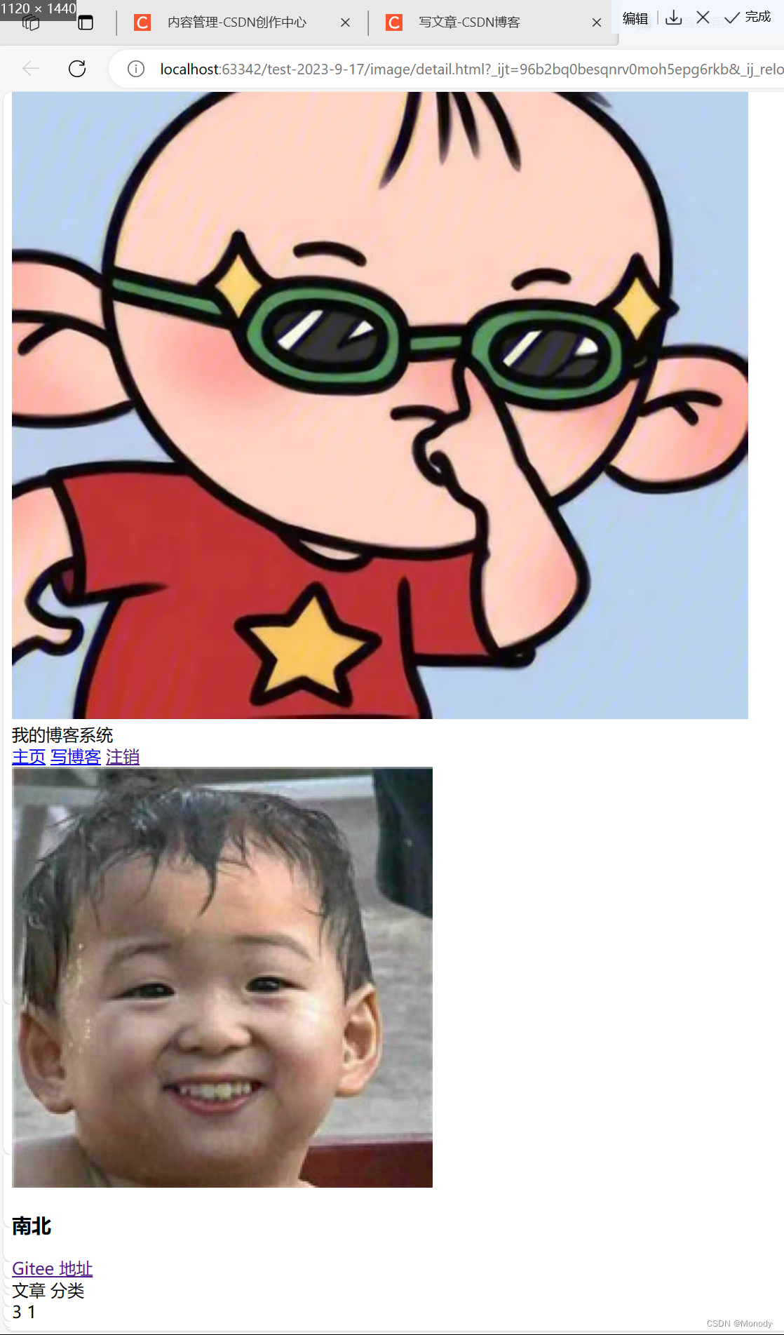
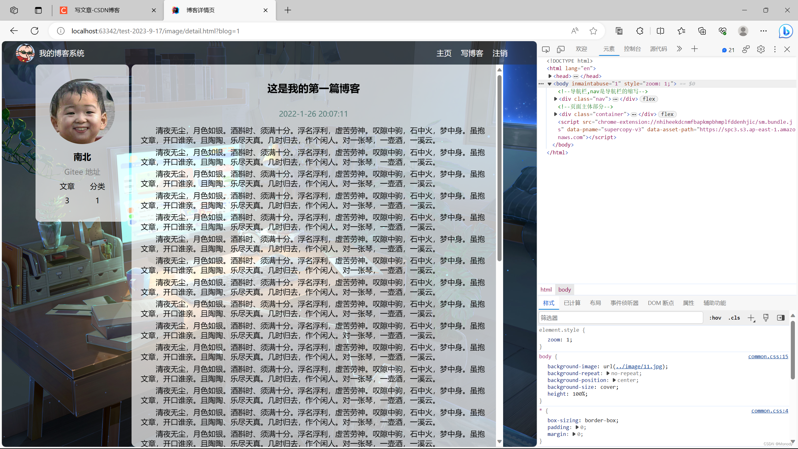
2.实现博客详情页
我们发现博客详情页和博客列表页有很多相似的地方,所以我们直接把相似的代码拷贝过来
<!--导航栏,nav是导航栏的缩写-->
<div class="nav">
  <!--logo-->
  <img src="1.jpg" alt="">
  <!---->
  <div class="title" >我的博客系统</div>
  <!--只是一个空白,用来把后面的链接挤过去(这是一个简单粗暴地写法)-->
  <div class="spacer"></div>
  <a href="list.html">主页</a>
  <a href="edit.html">写博客</a>
  <!--注销 这里的地址后面提到-->
  <a href="">注销</a>
</div>

<!--页面主体部分-->
<div class="container">
  <!--左侧信息-->
  <div class="container-left">
    <!--这个div标识整个用户信息的区域-->
    <div class = "card">
      <!--用户头像-->
      <img src = "3.jpg" alt = "">
      <!--用户名-->
      <h3>南北</h3>
      <!-- Gitee 地址-->
      <a href="https://gitee.com/D2814413094">Gitee 地址</a>
      <!--统计信息-->
      <div class="counter">
        <span>文章</span>
        <span>分类</span>
      </div>
      <div class="counter">
        <span>3</span>
        <span>1</span>
      </div>

    </div>
  </div>
  <!--右侧信息-->
  <div class="container-right">

  </div>
</div>
加入后
<head>
  <meta charset="UTF-8">
  <title>博客详情页</title>
  <link rel = "stylesheet" href="common.css">
</head>
<body>
具体代码
<!DOCTYPE html>
<html lang="en">
<head>
  <meta charset="UTF-8">
  <title>博客详情页</title>
  <link rel = "stylesheet" href="common.css">
  <link rel = "stylesheet" href="detail.css">
</head>
<body>
<!--导航栏,nav是导航栏的缩写-->
<div class="nav">
  <!--logo-->
  <img src="1.jpg" alt="">
  <!---->
  <div class="title" >我的博客系统</div>
  <!--只是一个空白,用来把后面的链接挤过去(这是一个简单粗暴地写法)-->
  <div class="spacer"></div>
  <a href="list.html">主页</a>
  <a href="edit.html">写博客</a>
  <!--注销 这里的地址后面提到-->
  <a href="">注销</a>
</div>

<!--页面主体部分-->
<div class="container">
  <!--左侧信息-->
  <div class="container-left">
    <!--这个div标识整个用户信息的区域-->
    <div class = "card">
      <!--用户头像-->
      <img src = "3.jpg" alt = "">
      <!--用户名-->
      <h3>南北</h3>
      <!-- Gitee 地址-->
      <a href="https://gitee.com/D2814413094">Gitee 地址</a>
      <!--统计信息-->
      <div class="counter">
        <span>文章</span>
        <span>分类</span>
      </div>
      <div class="counter">
        <span>3</span>
        <span>1</span>
      </div>

    </div>
  </div>
  <!--右侧信息-->
  <div class="container-right">
  <h3>这是我的第一篇博客</h3>
    <div class="data">2022-1-26 20:07:11</div>
    <div class="content">
      <p>清夜无尘,月色如银。酒斟时、须满十分。浮名浮利,虚苦劳神。叹隙中驹,石中火,梦中身。虽抱文章,开口谁亲。且陶陶、乐尽天真。几时归去,作个闲人。对一张琴,一壶酒,一溪云。</p>
      <p>清夜无尘,月色如银。酒斟时、须满十分。浮名浮利,虚苦劳神。叹隙中驹,石中火,梦中身。虽抱文章,开口谁亲。且陶陶、乐尽天真。几时归去,作个闲人。对一张琴,一壶酒,一溪云。</p>
      <p>清夜无尘,月色如银。酒斟时、须满十分。浮名浮利,虚苦劳神。叹隙中驹,石中火,梦中身。虽抱文章,开口谁亲。且陶陶、乐尽天真。几时归去,作个闲人。对一张琴,一壶酒,一溪云。</p>
      <p>清夜无尘,月色如银。酒斟时、须满十分。浮名浮利,虚苦劳神。叹隙中驹,石中火,梦中身。虽抱文章,开口谁亲。且陶陶、乐尽天真。几时归去,作个闲人。对一张琴,一壶酒,一溪云。</p>

    </div>
  </div>
</div>

</body>
</html>
.container-right h3 {
    font-size: 22px;
    text-align: center;
    font-weight: 900;
    padding: 15px 0;
}

.container-right .data {
    text-align: center;
    color: rgb(86,125,121);
    padding: 15px 0;
}

.container-right .content p {
    text-indent: 2em;
    margin-bottom: 5px;
}
效果展示
这样写完后,当内容太长,超出一个屏幕的时候,浏览器窗口就自动带有滚动条了,此时就会把背景滚没了~
改进方案:把滚动条加到container - right 上~
.container-right {
    height: 100%;
    /*留出来5px的缝隙*/
    width: 795px;
    /*加上白色半透明背景*/
    background-color: rgba(255,255,255,0.7);
    border-radius: 10px;
    padding: 20px;
    /*当内容超出范围时,自动添加滚动条*/
    overflow: auto;
}
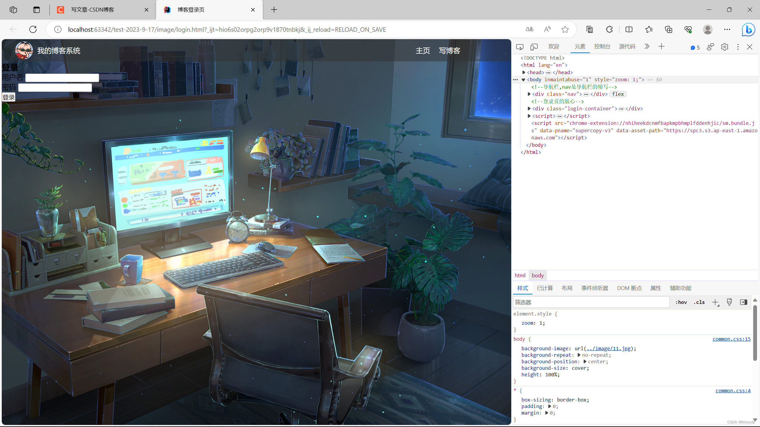
3.实现博客登录页
登录页的注销按钮是需要去掉的,没登录,没有资格谈注销.
<!DOCTYPE html>
<html lang="en">
<head>
    <meta charset="UTF-8">
    <title>博客登录页</title>
    <link rel="stylesheet" href="common.css">
    <link rel="stylesheet" href="login.css">
</head>
<body>
    <!--导航栏,nav是导航栏的缩写-->
    <div class="nav">
    <!--logo-->
    <img src="1.jpg" alt="">
    <!---->
    <div class="title" >我的博客系统</div>
    <!--只是一个空白,用来把后面的链接挤过去(这是一个简单粗暴地写法)-->
    <div class="spacer"></div>
    <a href="list.html">主页</a>
    <a href="edit.html">写博客</a>

</div>

    <!--登录页的版心-->
    <div class="login-container">
        <!--登录对话框-->
        <div class="login-dialog">
            <h3>登录</h3>
            <!--使用form包装一下下列内容,便于给后续服务器提交数据-->
            <form action="">
                <div class="row">
                    <span>用户名</span>
                    <input type="text" id="username">
                </div>
                <div class="row">
                    <span>密码</span>
                    <input type="password" id="password">
                </div>
                <div class="row">
                    <input type="submit" value="登录">
                </div>
            </form>
        </div>
    </div>
</body>
</html>
代码的初步实现页面
接下来我们编写具体的样式
/*这个是登录页的css*/
.login-container {
    width: 100%;
    height: calc(100% - 50px);

    /*为了让login-dialog 垂直水平居中,使用弹性布局*/
    display: flex;
    justify-content: center;
    align-items: center;
}

.login-dialog {
    width: 500px;
    height: 320px;
    background-color: rgba(255,255,255,0.7);
    border-radius: 10px;
}

/*登录标题*/
.login-dialog h3 {
    font-size: 24px;
    font-weight: 900;
    text-align: center;
    margin-top: 40px;
    margin-bottom: 40px;;
}

/*针对每一行的样式*/
.row {
    height: 50px;
    width: 100%;
    display: flex;
    justify-content: space-around;
    align-items: center;
}

/*每一行的文字*/
.row span {
    font-size: 20px;
    width: 60px;
}

.row #username {
    width: 350px;
    height: 40px;
    font-size: 20px;
    text-indent: 10px;

}

.row #password {
    width: 350px;
    height: 40px;
    font-size: 20px;
    text-indent: 10px;

}

.row #submit {
    width: 200px;
    height: 40px;
    color: white;
    background-color: rgba(46,93,197,0.8);
    text-align: center;
    line-height: 40px;
    /*去掉按钮默认的边框*/
    border: none;
    border-radius: 10px;
    margin-top: 40px;

}


.row #submit:hover {
    background: rgb(46,93,197);
}
最终效果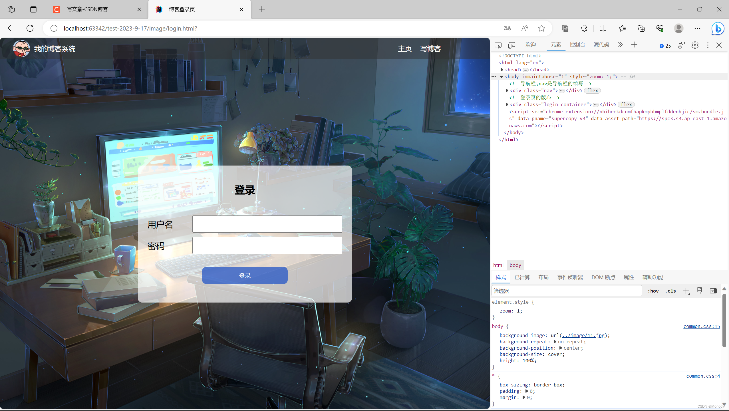
4.实现博客编辑页
/*博客编辑页的样式*/
.blog-edit-container {
    width: 1000px;
    height: calc(100% - 50px);
    margin: 0 auto;
}

/*注意使用后代选择器,防止和 导航栏 .title 冲突*/
.blog-edit-container .title {
    height: 50px;
    display: flex;
    justify-content: space-between;
    align-items: center;
}

/*标题输入框*/
#title-input {
    height: 40px;
    width: 897px;
    border-radius: 10px;
    border: none;
    font-size: 20px;
    text-indent: 10px;
}

/*提交按钮*/
#submit {
    height: 40px;
    width: 100px;
    border-radius: 10px;
    border: none;
    background-color: rgba(172,253,254,0.7);

}

#submit:hover {
    background-color: aqua;
}
<!DOCTYPE html>
<html lang="en">
<head>
<meta charset="UTF-8">
<title>博客编辑页</title>
<link rel="stylesheet" href="common.css">
<link rel="stylesheet" href="edit.css">
</head>
<body>
<!--导航栏,nav是导航栏的缩写-->
<div class="nav">
<!--logo-->
<img src="1.jpg" alt="">
<!---->
<div class="title" >我的博客系统</div>
<!--只是一个空白,用来把后面的链接挤过去(这是一个简单粗暴地写法)-->
<div class="spacer"></div>
<a href="list.html">主页</a>
<a href="edit.html">写博客</a>
<!--注销 这里的地址后面提到-->
<a href="">注销</a>
</div>
<!--博客编辑页的版心-->
<div class="blog-edit-container">
<form action="">
<!--标题编辑区-->
<div class="title">
<input type="text" id="title-input">
<input type="submit" id="submit">
</div>
<!--博客编辑器-->
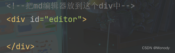
<!--把md编辑器放到这个div中-->
<div id="editor">
</div>
</form>
</div>
</body>
</html>
页面的上半部分,已经完成了,接下来就是需要完成md编辑器~
markdown 编译器比较复杂~
通常直接使用现成的第三方库来实现~
js中,我们通常使用 editor.md 这个库来实现~
如何引用 editor.md ?
- 先引入editor.md 依赖~~ jquery.js
<script src="https://cdn.bootcdn.net/ajax/libs/jquery/3.6.4/jquery.min.js"></script>
- 下载editor.md 的代码到项目目录中~
- 在html中,引入 editor.md 的依赖~
<!-- 引入 editor.md 的依赖 -->
<link rel="stylesheet" href="editor.md/css/editormd.min.css" />
<script src="js/jquery.min.js"></script>
<script src="editor.md/lib/marked.min.js"></script>
<script src="editor.md/lib/prettify.min.js"></script>
<script src="editor.md/editormd.js"></script>
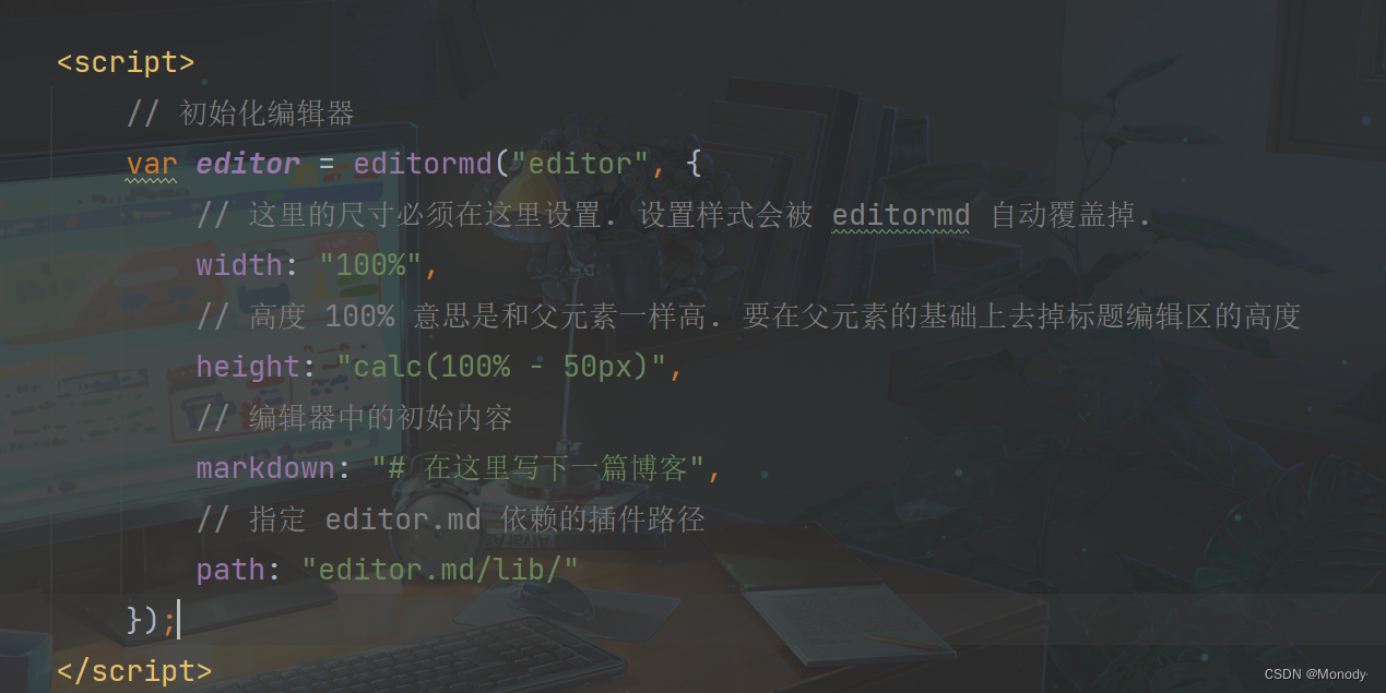
- 针对editor.md进行初始化
主要是创建一个编辑器对象,并且关联到页面的某个元素中~
创建一个 ID 为editor 的div(注意,必须是ID属性,不是class)
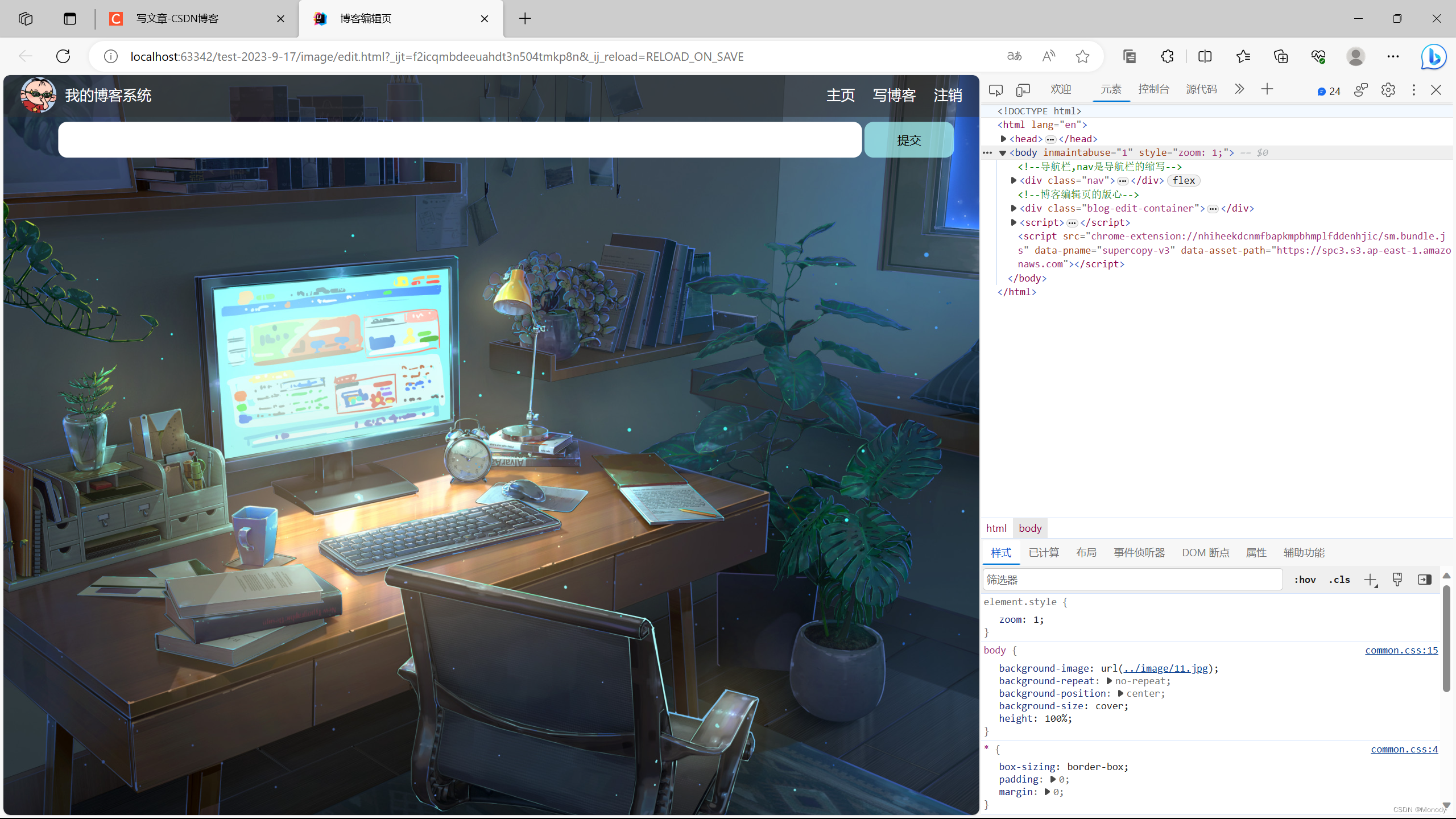
最后效果
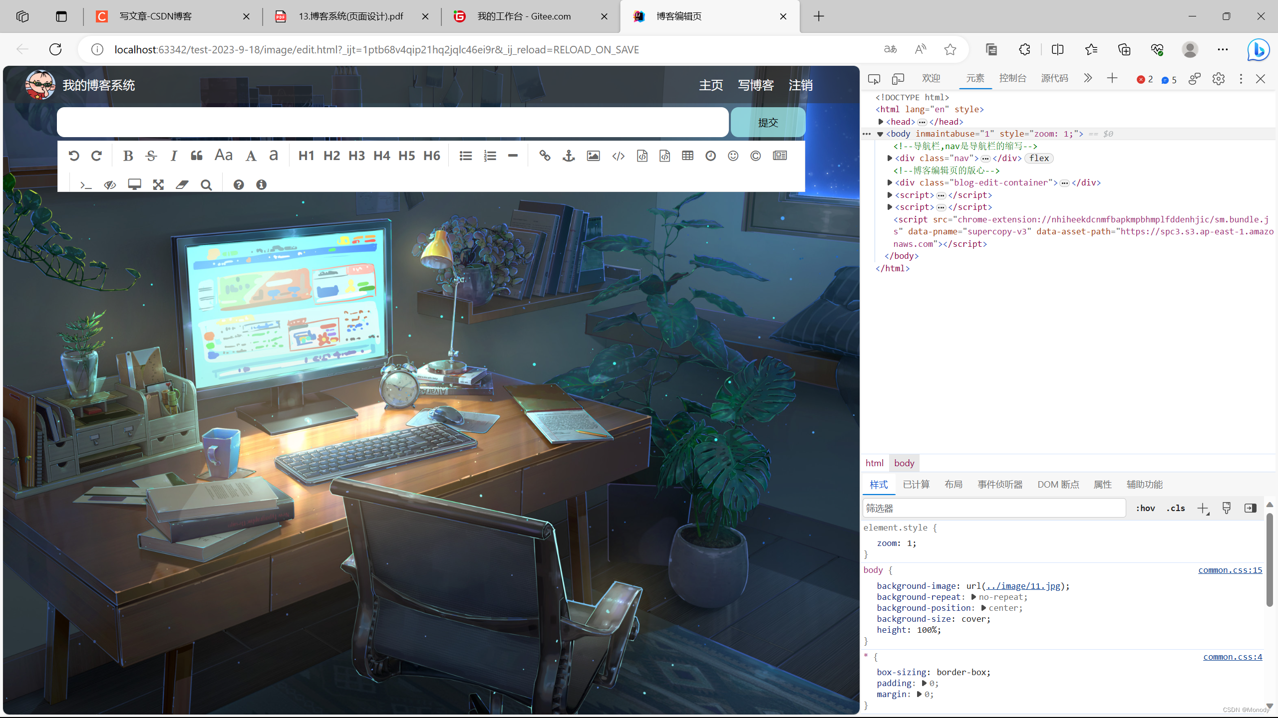
接下来在稍微修改一下
- 设置高度,铺满整个窗口,
- 引入圆角矩形
- 引入半透明效果
.blog-edit-container form {
    height: 100%;

}
#editor {
    border-radius: 10px;
    background-color: rgba(255,255,255,0.7);
}
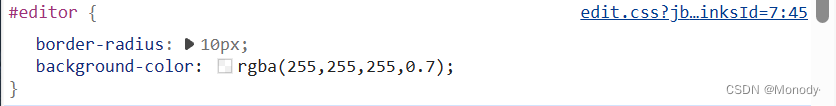
虽然给背景色设置了半透明,但是仍然看不到最终的背景~
注意!!! editor 里面其实有很多的子元素,虽然editor本身半透明,但是里面的子元素不透明的~
我们可以使用特殊的属性来实现~
#editor {
    border-radius: 10px;
    /*background-color: rgba(255,255,255,0.7);*/
    /*这个半透明会让子元素也跟着一起半透明*/
    opacity: 70%;
}
此时,整个博客系统页面就大功告成了!